


🚀一、Text/Span
在HarmonyOS中,Text/Span组件是文本控件中的一个关键部分。Text控件可以用来显示文本内容,而Span只能作为Text组件的子组件显示文本内容。
Text/Span组件的用法非常简单和直观。我们可以通过Text组件来显示普通文本,也可以通过Span组件来实现。
🔎1.创建文本
语法说明:
Text(content?: string | Resource)
文本内容。包含子组件Span时不生效,显示Span内容,并且此时text组件的样式不生效。
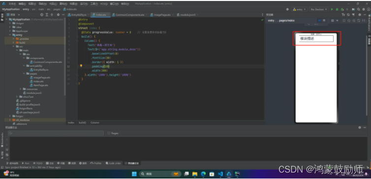
使用:
@Entry
@Component
struct Index {
  build() {
    Column() {
      Text('我是一段文本')
      Text($r('app.string.module_desc'))
        .baselineOffset(0)
        .fontSize(30)
        .border({ width: 1 })
        .padding(10)
        .width(300)
    }.width('100%').height('100%')
  }
}
🔎2.添加子组件
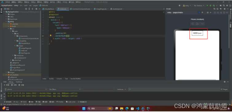
🦋2.1 Span
在文本处理中,Span通常用于表示文本中的一部分。例如,在一个字符串中找到一个单词,可以使用Span表示这个单词在字符串中的位置和大小。Span还可以用于对文本进行修改,例如替换一个单词或插入新的文本。
HarmonyOS中的Span也表示文本不过是嵌入Text中的
@Entry
@Component
struct Index {
  build() {
    Column() {
      Text('我是Text') {
        Span('我是Span')
      }
      .padding(10)
      .borderWidth(1)
    }.width('100%').height('100%')
  }
}
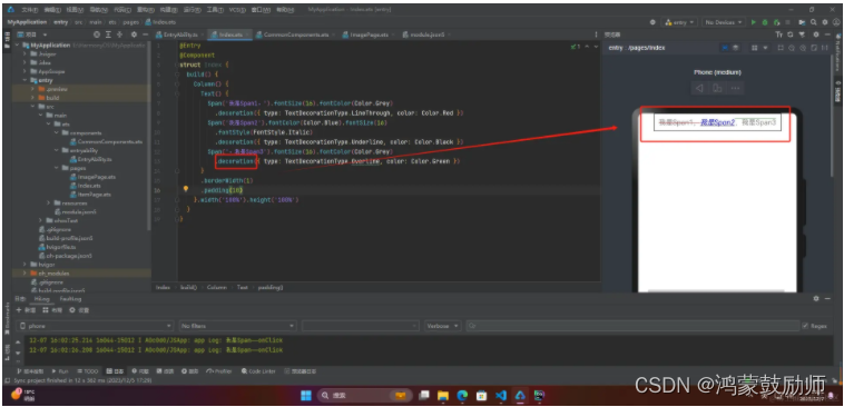
🦋2.2 decoration
Span的decoration属性用于设置文字的装饰效果,可以取以下值:
●Underline:下划线
●LineThrough:删除线
●Overline:上划线
@Entry
@Component
struct Index {
  build() {
    Column() {
      Text() {
        Span('我是Span1,').fontSize(16).fontColor(Color.Grey)
          .decoration({ type: TextDecorationType.LineThrough, color: Color.Red })
        Span('我是Span2').fontColor(Color.Blue).fontSize(16)
          .fontStyle(FontStyle.Italic)
          .decoration({ type: TextDecorationType.Underline, color: Color.Black })
        Span(',我是Span3').fontSize(16).fontColor(Color.Grey)
          .decoration({ type: TextDecorationType.Overline, color: Color.Green })
      }
      .borderWidth(1)
      .padding(10)
    }.width('100%').height('100%')
  }
}
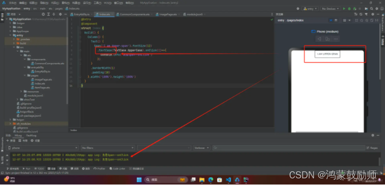
🦋2.3 textCase
textCase设置文字一直保持大写或者小写状态
@Entry
@Component
struct Index {
  build() {
    Column() {
      Text() {
        Span('I am Upper-span').fontSize(12)
          .textCase(TextCase.UpperCase).onClick(()=>{
            console.info('我是Span——onClick')
          })
      }
      .borderWidth(1)
      .padding(10)
    }.width('100%').height('100%')
  }
}
🔎3.自定义文本样式
🦋3.1 textAlign
textAlign属性用于设置文本在其容器中的水平对齐方式。
@Entry
@Component
struct Index {
  build() {
    Column() {
      Text('左对齐')
 最低0.47元/天 解锁文章


 扫一扫
扫一扫


 1010
1010

 被折叠的 条评论
为什么被折叠?
被折叠的 条评论
为什么被折叠?
 到【灌水乐园】发言


