


文章目录
前言
Text是文本组件,通常用于展示用户的视图,如显示文章的文字。具体用法可参考Text。
一、Text控件
1.1 创建文本
Text可通过以下两种方式来创建:
string字符串
Text('我是一段文本')


引用Resource资源
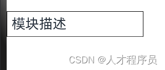
资源引用类型可以通过$r创建Resource类型对象,文件位置为/resources/base/element/string.json。
Text($r('app.string.module_desc'))
  .baselineOffset(0)
  .fontSize(30)
  .border({ width: 1 })
  .padding(10)
  .width(300)

其中fontSize为字体大小
baselineOffset为基线偏移(关于基线请自行查阅资料)
padding内间距
1.2 添加子组件
添加子组件
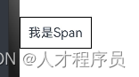
Span只能作为Text组件的子组件显示文本内容。可以在一个Text内添加多个Span来显示一段信息,例如产品说明书、承诺书等。
创建Span
Span组件需要写到Text组件内,单独写Span组件不会显示信息,Text与Span同时配置文本内容内容时,Span内容覆盖Text内容。
Text('我是Text') {
  Span('我是Span')
}
.padding(10)
.borderWidth(1)

文本装饰线和样式
文本装饰线
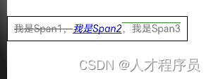
通过decoration设置文本装饰线及颜色。
Text() {
  Span('我是Span1,').fontSize(16).fontColor(Color.Grey)
    .decoration({ type: TextDecorationType.LineThrough, color: Color.Red })
  Span('我是Span2').fontColor(Color.Blue).fontSize(16)
    .fontStyle(FontStyle.Italic)
    .decoration({ type: TextDecorationType.Underline, color: Color.Black })
  Span(',我是Span3').fontSize(16).fontColor(Color.Grey)
    .decoration({ type: TextDecorationType.Overline, color: Color.Green })
}
.borderWidth(1)
.padding(10)

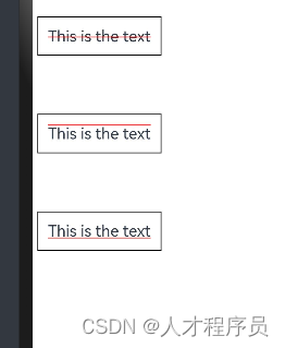
TextDecorationType.LineThrough从中间穿过
TextDecorationType.Underline下划线
TextDecorationType.Overline在文本上面的线
设置文字一直保持大写/小写
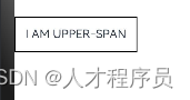
通过textCase设置文字一直保持大写或者小写状态。
Text() {
  Span('I am Upper-span').fontSize(12)
    .textCase(TextCase.UpperCase)
}
.borderWidth(1)
.padding(10)

TextCase.UpperCase为大写
TextCase.LowerCase为小写
添加事件。
由于Span组件无尺寸信息,事件仅支持点击事件onClick。
Text() {
  Span('I am Upper-span').fontSize(12)
    .textCase(TextCase.UpperCase)
    .onClick(()=>{
      console.info('我是Span——onClick')
    })
}

1.3 自定义文本样式
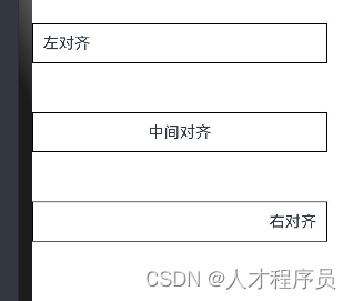
文本对齐
通过textAlign属性设置文本对齐样式。
Text('左对齐')
  .width(300)
  .textAlign(TextAlign.Start)
  .border({ width: 1 })
  .padding(10)
Text('中间对齐')
  .width(300)
  .textAlign(TextAlign.Center)
  .border({ width: 1 })
  .padding(10)
Text('右对齐')
  .width(300)
  .textAlign(TextAlign.End)
  .border({ width: 1 })
  .padding(10)

textAlign属性设置即可
长文本处理
通过textOverflow属性控制文本超长处理,textOverflow需配合maxLines一起使用(默认情况下文本自动折行)。
Text('This is the setting of textOverflow to Clip text content This is the setting of textOverflow to None text content. This is the setting of textOverflow to Clip text content This is the setting of textOverflow to None text content.')
  .width(250)
  .textOverflow({ overflow: TextOverflow.None })
  .maxLines(1)
  .fontSize(12)
  .border({ width: 1 }).padding(10)
Text('我是超长文本,超出的部分显示省略号。I am an extra long text, with ellipses displayed for any excess。')
  .width(250)
  .textOverflow({ overflow: TextOverflow.Ellipsis })
  .maxLines(1)
  .fontSize(12)
  .border({ width: 1 }).padding(10)

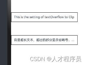
TextOverflow.None为直接截断,即超出部分不显示
TextOverflow.Ellipsis为超出部分用…代替
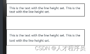
设置行高
通过lineHeight属性设置文本行高。
Text('This is the text with the line height set. This is the text with the line height set.')
  .width(300).fontSize(12).border({ width: 1 }).padding(10)
Text('This is the text with the line height set. This is the text with the line height set.')
  .width(300).fontSize(12).border({ width: 1 }).padding(10)
  .lineHeight(20)

使用lineHeight属性即可设置
行高即使两行文本间的间距
通过decoration属性设置文本装饰线样式及其颜色。
Text('This is the text')
  .decoration({
    type: TextDecorationType.LineThrough,
    color: Color.Red
  })
  .borderWidth(1).padding(10).margin(5)
Text('This is the text')
  .decoration({
    type: TextDecorationType.Overline,
    color: Color.Red
  })
  .borderWidth(1).padding(10).margin(5)
Text('This is the text')
  .decoration({
    type: TextDecorationType.Underline,
    color: Color.Red
  })
  .borderWidth(1).padding(10).margin(5)

和前面的Span设置装饰线一样,这里不多赘述
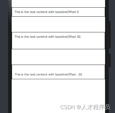
通过baselineOffset属性设置文本基线的偏移量。
Text('This is the text content with baselineOffset 0.')
  .baselineOffset(0)
  .fontSize(12)
  .border({ width: 1 })
  .padding(10)
  .width('100%')
  .margin(5)
Text('This is the text content with baselineOffset 30.')
  .baselineOffset(30)
  .fontSize(12)
  .border({ width: 1 })
  .padding(10)
  .width('100%')
  .margin(5)

Text('This is the text content with baselineOffset -20.')
  .baselineOffset(-20)
  .fontSize(12)
  .border({ width: 1 })
  .padding(10)
  .width('100%')
  .margin(5)

baselineOffset使用这个属性设置即可
通过letterSpacing属性设置文本字符间距。
Text('This is the text content with letterSpacing 0.')
  .letterSpacing(0)
  .fontSize(12)
  .border({ width: 1 })
  .padding(10)
  .width('100%')
  .margin(5)
Text('This is the text content with letterSpacing 3.')
  .letterSpacing(3)
  .fontSize(12)
  .border({ width: 1 })
  .padding(10)
  .width('100%')
  .margin(5)
Text('This is the text content with letterSpacing -1.')
  .letterSpacing(-1)
  .fontSize(12)
  .border({ width: 1 })
  .padding(10)
  .width('100%')
  .margin(5)

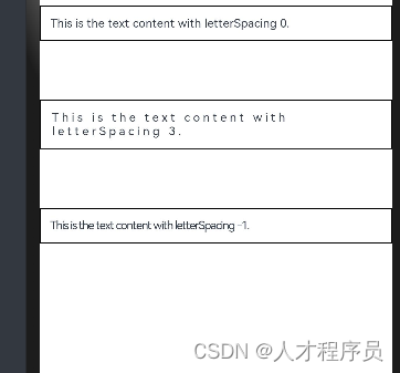
letterSpacing使用这个属性设置即可
minFontSize、maxFontSize设置
通过minFontSize与maxFontSize自适应字体大小,minFontSize设置文本最小显示字号,maxFontSize设置文本最大显示字号,minFontSize与maxFontSize必须搭配同时使用,以及需配合maxline或布局大小限制一起使用,单独设置不生效。
Text('我的最大字号为30,最小字号为5,宽度为250,maxLines为1')
  .width(250)
  .maxLines(1)
  .maxFontSize(30)
  .minFontSize(5)
  .border({ width: 1 })
  .padding(10)
  .margin(5)
Text('我的最大字号为30,最小字号为5,宽度为250,maxLines为2')
  .width(250)
  .maxLines(2)
  .maxFontSize(30)
  .minFontSize(5)
  .border({ width: 1 })
  .padding(10)
  .margin(5)
Text('我的最大字号为30,最小字号为15,宽度为250,高度为50')
  .width(250)
  .height(50)
  .maxFontSize(30)
  .minFontSize(15)
  .border({ width: 1 })
  .padding(10)
  .margin(5)
Text('我的最大字号为30,最小字号为15,宽度为250,高度为100')
  .width(250)
  .height(100)
  .maxFontSize(30)
  .minFontSize(15)
  .border({ width: 1 })
  .padding(10)
  .margin(5)

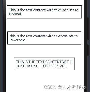
通过textCase属性设置文本大小写。
Text('This is the text content with textCase set to Normal.')
  .textCase(TextCase.Normal)
  .padding(10)
  .border({ width: 1 })
  .padding(10)
  .margin(5)

// 文本全小写展示
Text('This is the text content with textCase set to LowerCase.')
  .textCase(TextCase.LowerCase)
  .border({ width: 1 })
  .padding(10)
  .margin(5)

// 文本全大写展示
Text('This is the text content with textCase set to UpperCase.')
  .textCase(TextCase.UpperCase)
  .border({ width: 1 })
  .padding(10)
  .margin(5)

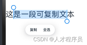
通过copyOption属性设置文本是否可复制粘贴。
Text("这是一段可复制文本")
  .fontSize(30)
  .copyOption(CopyOptions.InApp)

1.4 添加事件
Text组件可以添加通用事件,可以绑定onClick、onTouch等事件来响应操作。
Text('点我')
  .onClick(()=>{
      console.info('我是Text的点击响应事件');
   })

二、示例代码
// xxx.ets
@Entry
@Component
struct TextExample {
  build() {
    Column() {
      Row() {
        Text("1").fontSize(14).fontColor(Color.Red).margin({ left: 10, right: 10 })
        Text("我是热搜词条1")
          .fontSize(12)
          .fontColor(Color.Blue)
          .maxLines(1)
          .textOverflow({ overflow: TextOverflow.Ellipsis })
          .fontWeight(300)
        Text("爆")
          .margin({ left: 6 })
          .textAlign(TextAlign.Center)
          .fontSize(10)
          .fontColor(Color.White)
          .fontWeight(600)
          .backgroundColor(0x770100)
          .borderRadius(5)
          .width(15)
          .height(14)
      }.width('100%').margin(5)

      Row() {
        Text("2").fontSize(14).fontColor(Color.Red).margin({ left: 10, right: 10 })
        Text("我是热搜词条2 我是热搜词条2 我是热搜词条2 我是热搜词条2 我是热搜词条2")
          .fontSize(12)
          .fontColor(Color.Blue)
          .fontWeight(300)
          .constraintSize({ maxWidth: 200 })
          .maxLines(1)
          .textOverflow({ overflow: TextOverflow.Ellipsis })
        Text("热")
          .margin({ left: 6 })
          .textAlign(TextAlign.Center)
          .fontSize(10)
          .fontColor(Color.White)
          .fontWeight(600)
          .backgroundColor(0xCC5500)
          .borderRadius(5)
          .width(15)
          .height(14)
      }.width('100%').margin(5)

      Row() {
        Text("3").fontSize(14).fontColor(Color.Orange).margin({ left: 10, right: 10 })
        Text("我是热搜词条3")
          .fontSize(12)
          .fontColor(Color.Blue)
          .fontWeight(300)
          .maxLines(1)
          .constraintSize({ maxWidth: 200 })
          .textOverflow({ overflow: TextOverflow.Ellipsis })
        Text("热")
          .margin({ left: 6 })
          .textAlign(TextAlign.Center)
          .fontSize(10)
          .fontColor(Color.White)
          .fontWeight(600)
          .backgroundColor(0xCC5500)
          .borderRadius(5)
          .width(15)
          .height(14)
      }.width('100%').margin(5)

      Row() {
        Text("4").fontSize(14).fontColor(Color.Grey).margin({ left: 10, right: 10 })
        Text("我是热搜词条4 我是热搜词条4 我是热搜词条4 我是热搜词条4 我是热搜词条4")
          .fontSize(12)
          .fontColor(Color.Blue)
          .fontWeight(300)
          .constraintSize({ maxWidth: 200 })
          .maxLines(1)
          .textOverflow({ overflow: TextOverflow.Ellipsis })
      }.width('100%').margin(5)
    }.width('100%')
  }
}

总结
以上就是今天要讲的内容,本文介绍了Text和Span的使用,Text和Span的关系,本文章包括了鸿蒙开发文档中所有的内容:文本显示Text/Span


 1010
1010


 被折叠的 条评论
为什么被折叠?
被折叠的 条评论
为什么被折叠?
 到【灌水乐园】发言


