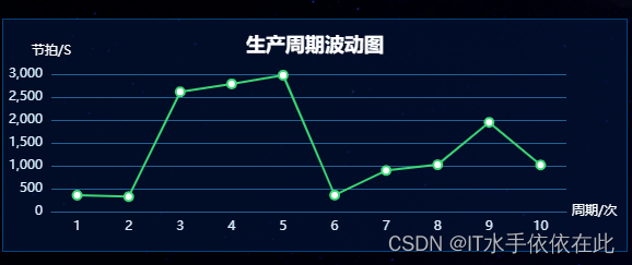
echarts简单的单折线图样式简记

折线图

**var myChart

  var option = {
                tooltip: {
                    trigger: 'axis',   //鼠标移动到焦点时显示对应数据                                  
                },
                //设置canvas内部表格的内距
                grid: {
                    x: 70,
                    y: 40,
                    x2: 20,
                    y2: 50,
                },
                xAxis: {
                    type: 'category',
                    data: [10,22,33],    //x轴显示数据
                   axisLabel: {    //坐标轴刻度标签的相关配置
                       show: true,
                       textStyle: {        
                           color: '#D9EFFF'
                       }
                   },
                   axisTick: {   //不展示坐标刻度
                  show: false
                     }
                   axisLine: {     //坐标轴轴线相关配置
                       lineStyle: {
                           color: '#266090',//轴线颜色
                       }
                   },
                   splitLine: {    //分隔线
                       show: false, //网格线显隐
                       lineStyle: {
                           color: '#266090',//网格线颜色
                           width: 1,
                           // type: 'dashed'// 网格线样式虚线
                       },
                   },
                },
                yAxis: {
                    type: 'value',
                    axisLabel: {      
                        formatter: '{value}(%) ' ,  //给每个y轴都加上百分比的单位
                         textStyle: {                           //y轴上文字的样式:
                            color: '#D9EFFF'
                        }
                    },
                    axisLine: {
                        lineStyle: {
                            color: '#266090',//轴线颜色
                        },
                     
                    },
                    splitLine: {
                        show: true, //网格线显隐
                        lineStyle: {
                            color: '#266090',//网格线颜色
                            width: 1,
                            // type: 'dashed'//虚线
                        },
                    },
                },
                series: [{     //填充的样式
                    data: [33.33,44.44,55.55],  //y轴数据填充
                    type: 'line',
                    smooth: true   //折线是否采用光滑形式
                }],
                color:['#fff']   //折线条颜色
            };
            myChart = echarts.init(document.getElementById('line-data'));
            myChart.setOption(option);**

相应样式

    **1.鼠标移动到坐标轴时 触发显示相应数据内容**
     tooltip: {
                    trigger: 'axis',   //适用柱状图 折线图
                    trigger:'item', //适用饼图  散点图                                  
                },

来自官网截图

     **2.  设置canvas内部表格的内距  设置表格大小**
              grid: {
                    x: 70,   //图表左边 距离左边的位移
                    y: 40,  //图表上边 距离上边的距离
                    x2: 20,  //图表右边 距离右边的距离
                    y2: 50,  //图表下边 距离下边的距离
                },
              通过x、y、x2、y2可以自定义的设置折线图的大小

3.xy轴文字样式、和轴线样式

               3.xy轴文字样式、轴线样式、网格样式
               axisLabel: {      // 文字样式
                        formatter: '{value}(%) ' ,  //给每个y轴都加上百分比的单位
                        color:'#fff',  //也可通过在textStyle里面的color设置
                    },
                    axisLine: {   //轴线样式
                        lineStyle: {             
                            color: '#266090',//轴线颜色 (必须在linestyle里面设置)
                        },
                    },
                    splitLine: {
                        show: true, //网格线显隐
                        lineStyle: {
                            color: '#266090',//网格线颜色
                            width: 1,
                            // type: 'dashed' //虚线    solid实线  dotted 点虚线
                        },
                    },

在这里插入图片描述

根据页面大小重布局图表

  //重布局大小
            setTimeout(function () {
                window.onresize = function () {
                    myChart.resize();
                }
            }, 200)

轮播展示高亮数据

 //轮播展示
            var currentIndex = -1;
            if (option.series.length !== 0) {
                timer = setInterval(function () {

                    var dataLen = option.series[0].data.length;
                    // 取消之前高亮的图形
                    myChart.dispatchAction({
                        type: 'downplay',
                        seriesIndex: 0, //表示series中的第几个data数据循环展示
                        dataIndex: currentIndex
                    });
                    currentIndex = (currentIndex + 1) % dataLen; //+1表示每次跳转一个
                    // 高亮当前图形
                    myChart.dispatchAction({
                        type: 'highlight',
                        seriesIndex: 0,
                        dataIndex: currentIndex
                    });
                    // 显示 tooltip
                    myChart.dispatchAction({
                        type: 'showTip',
                        seriesIndex: 0,
                        dataIndex: currentIndex
                    })
                }, 2000);
            }

在这里插入图片描述

  • 2
    点赞
  • 0
    收藏
    觉得还不错? 一键收藏
  • 0
    评论

“相关推荐”对你有帮助么?

  • 非常没帮助
  • 没帮助
  • 一般
  • 有帮助
  • 非常有帮助
提交
评论
添加红包

请填写红包祝福语或标题

红包个数最小为10个

红包金额最低5元

当前余额3.43前往充值 >
需支付:10.00
成就一亿技术人!
领取后你会自动成为博主和红包主的粉丝 规则
hope_wisdom
发出的红包
实付
使用余额支付
点击重新获取
扫码支付
钱包余额 0

抵扣说明:

1.余额是钱包充值的虚拟货币,按照1:1的比例进行支付金额的抵扣。
2.余额无法直接购买下载,可以购买VIP、付费专栏及课程。

余额充值