


参考学姐整理[第一条](https://blog.csdn.net/weixin_43903204/article/details/108817059?spm=1001.2014.3001.5501)
注:本文父、子元素设为
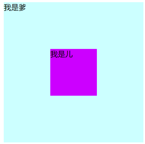
<div class="parent"><span>我是爹</span>
    <div class="child">我是儿</div>
</div>
最爱用的margin:auto
父元素相对定位,子元素绝对定位,top/left/right/bottom都设为0,margin直接auto
.parent {
  height: 300px;
  width: 300px;
  background-color: #cff;
  position: relative;
}
.child {
  height: 100px;
  width: 100px;
  background-color: #c0f;
  position: absolute;
  top: 0;
  left: 0;
  right: 0;
  bottom: 0;
  margin: auto;
}
父子元素尺寸已知、计算尺寸
父元素设置相对定位,子元素设置绝对定位,子元素需设置top/left/margin-left/margin-top,
left: 50%; top: 50%; 使元素的左上角移到父元素中间
margin-left: 负子元素宽度的一半;
margin-top: 负子元素高度的一半; 使元素往左上移一半元素的宽高。
.parent {
  height: 300px;
  width: 300px;
  background-color: #cff;
  position: relative;
}
.child {
  height: 100px;
  width: 100px;
  background-color: #c0f;
  position: absolute;
  top: 100px;/*或50%*/
  left: 100px;
  margin-left: -50px;
  margin-top: -50px;
}
效果同上
不算尺寸、利用平移
父元素设置相对定位,子元素设置绝对定位,子元素需设置top/left/transform:translateX/Y
注意translate写在一句中,也是负值,这样不用计算具体的像素值
.parent {
  height: 300px;
  width: 300px;
  background-color: #cff;
  position: relative;
}
.child {
  height: 100px;
  width: 100px;
  background-color: #c0f;
  position: absolute;
  top: 50%;left:50%;
  transform: translateX(-50%) translateY(-50%) ;
}
效果同上上
table-cell
display:table-celltext-align:center;
vertical-align:middle;
.parent {
  height: 300px;
  width: 300px;
  background-color: #cff;
  position: relative;
  display: table-cell;
  text-align:center;
  vertical-align:middle;
}
flex弹性盒子
display: flex;
justify-content: center;
align-items: center;
.parent {
  height: 300px;
  width: 300px;
  background-color: #cff;
  position: relative;
  display: flex;
  justify-content: center;
  align-items: center;
}
注意用display的两种方法都会导致父元素的文字也居中,被子元素覆盖

父元素文字被覆盖处理方法
把父元素文字放入span中,设为绝对定位使文字出来
span { position: absolute; top: 0; left:0; }
这样就能把文字脱离文档流,顺利显示出来


 1万+
1万+


 被折叠的 条评论
为什么被折叠?
被折叠的 条评论
为什么被折叠?
 到【灌水乐园】发言


