


iris
【机器学习的数学原理和算法实践 5.6】
import numpy as np
import matplotlib.pyplot as plt
# sklearn.decomposition.PCA 主要用于非线性数据的降维的KernelPCA
# 【参考:[sklearn.decomposition.PCA-scikit-learn中文社区](https://scikit-learn.org.cn/view/610.html)】
from sklearn import datasets, decomposition
def load_data():
iris = datasets.load_iris()
return iris.data, iris.target
def test_PCA(*data):
x, y = data
pca = decomposition.PCA(n_components=None)
pca.fit(x) # 拟合模型
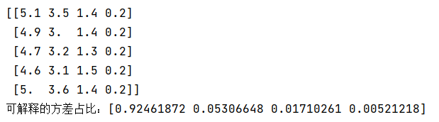
print('可解释的方差占比:%s' % str(pca.explained_variance_ratio_)) # 所选择的每个组成部分所解释的方差百分比。
x, y = load_data()
print(x[0:5])
test_PCA(x, y) # 可见有四个维度 前两个维度特征比较显著,可以考虑从4维降到2维
def plot_data(*data):
    x, y = data
    flg = plt.figure()  # 新建画布
    ax = flg.add_subplot(1, 1, 1)  # 添加子图
    colors = ((1, 0, 0), (0, 1, 0), (0, 0, 1),
             (0.5, 0.5, 0.5), (0, 0.5, 0.5), (0.5, 0, 0.5), (0.5, 0.5, 0),
             (0, 0.7, 0.3), (0.4, 0.4, 0.2))
    # 去除数组中的重复数字,并进行排序之后返回 array([0,1,2])
    for label,color in zip(np.unique(y),colors):
        position= y==label # array([True,True,...])
        ax.scatter(x[position,0],x[position,1],label='target=%d'%label,color=color)
    ax.set_xlabel('x[0]')
    ax.set_ylabel('y[0]')
    ax.legend(loc='best')
    plt.rcParams['font.sans-serif']=['SimHei']
    ax.set_title('样本原始分布图')
    plt.show()

plot_data(x,y)

def plot_PCA(*data):
    x, y = data
    pca = decomposition.PCA(n_components=2)  # PCA降维后的特征维度数目 2
    x_r=pca.fit_transform(x)  # 用X拟合模型,对X进行降维
    flg = plt.figure()  # 新建画布
    ax = flg.add_subplot(1, 1, 1)  # 添加子图
    colors = ((1, 0, 0), (0, 1, 0), (0, 0, 1),
             (0.5, 0.5, 0.5), (0, 0.5, 0.5), (0.5, 0, 0.5), (0.5, 0.5, 0),
             (0, 0.7, 0.3), (0.4, 0.4, 0.2))
    for label,color in zip(np.unique(y),colors):
        position=y==label
        ax.scatter(x_r[position,0],x_r[position,1],label='target=%d'%label,color=color)
    ax.set_xlabel('x[0]')
    ax.set_ylabel('y[0]')
    ax.legend(loc='best')
    plt.rcParams['font.sans-serif']=['SimHei']
    ax.set_title('PCA降维后样本分布图')
    plt.show()

plot_PCA(x,y) # PCA降维后样本分布图 可以看到降维后样本分布效果比较符合预期


 2173
2173


 被折叠的 条评论
为什么被折叠?
被折叠的 条评论
为什么被折叠?
 到【灌水乐园】发言


