


之前在移动端项目中需要用到这个特效,然后顺便封装成插件(spread.js)方便使用
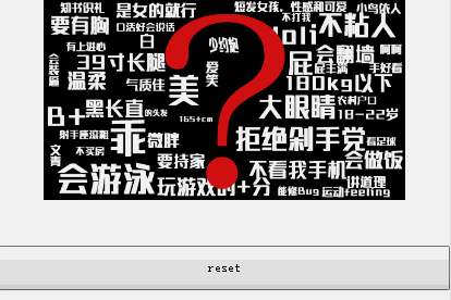
二话不说先上gif图
依赖库
因为是在项目需求下开发的交互插件,所以需要依赖下面的库和预编译工具,日后有时间会抽离出来。
- flexible.js
手淘推崇的移动设备适配方案,说到底就是ios设备retina屏幕的dpi设置+js获取设备物理像素动态设置rem基准值,因此需要在html文档头部引入js文件,单纯引入这个js文件,在弱网络下会出现一些小问题(详见上一篇博客)。
现在手淘依旧使用这个解决方案,其如何解决这个弱网络下的问题有待考究~
最近的项目都用伸缩盒模型(flex布局)+媒体查询解决设备适配问题,颇有良效,目的在于最大减少文件请求量。
- less
css预编译工具less在此就不用多说啦,上下两层元素的width、height值设置需要比较严谨,我在less文件头部用两个变量来存储。
思路
先贴html代码:
<section id="container">
    <!-- 被覆盖在下层的图片 -->
    <img class="img-blow" src="../image/female-cover.png" alt="img-blow">
    <!-- 覆盖在顶层的图片 -->
    <div id="img-cover">
        <img id="img-self" src="../image/male-cover.png" alt="img-cover">
    </div>
</section>
一看就懂,不过是在顶层图片外嵌div设置overflow就ok啦,然而关键在于外层div的动画过渡要用哪一种方法实现?
最初打算用transform:scale()来控制圆的缩放,毕竟transform-origin属性可以轻易设置变形原点。然而,子元素也会跟随父元素同时transform!
瞬间想到的解决方法是:
1、transform:none ——然而此方法对子元素禁止转换不起作用。
2、反向transform的转换属性 ——然而这种方法只对线性变换起作用,譬如rotate、translate等,对scale并不起作用!
最后,只能乖乖用js控制外层div和图片的width、height值了,同时因为变形原点的问题,还需要对元素的位置(margin)控制,使视觉上在变换过程中两张图片是丝毫不动的。
最后便产生了以下繁琐不停操作dom的代码:
/*
 *  spread.js
 *  author: junrey
 *  date: 16/5/19
 *  descrition: 基于rem布局,rem基准值 = device-width/10
*/

function Spread(json) {
    this.imgWidth =  json.imgWidth;
    this.imgRatio = json.imgRatio;
    this.cycleFinalWidth =  json.cycleFinalWidth;
    this.coverObj = document.getElementById(json.cover);
    this.belowObj = document.getElementById(json.below);
    this.containerObj = document.getElementById(json.container);
    this.resetObj = document.getElementById(json.reset);

    this.init = function () {
        this.imgStartTop =  - this.divStartTop;
        this.imgStartLeft =  - this.divStartLeft - this.imgWidth / 2;
        //  此公式主要解决圆通过改变width、height来transition时候的非圆心放大的问题
        this.divStopTop =  this.divStartTop - this.imgWidth / this.imgRatio - ( (this.cycleFinalWidth - 10) / 5 * 3 );
        this.divStopLeft =  this.divStartLeft - this.cycleFinalWidth / 2;
        this.imgStopTop =  this.imgStartTop + this.imgWidth / this.imgRatio + ( (this.cycleFinalWidth - 10) / 5 * 3 );
        this.imgStopLeft =  this.imgStartLeft + this.cycleFinalWidth / 2;

        this.coverObj.style.width = '0rem';
        this.coverObj.style.height = '0rem';
        this.coverObj.style.marginTop = this.divStartTop + 'rem';
        this.coverObj.style.marginLeft = this.divStartLeft + 'rem';

        this.belowObj.style.marginTop = this.imgStartTop + 'rem';
        this.belowObj.style.marginLeft = this.imgStartLeft + 'rem';
    }

    this.SpreadShow =  function () {
        this.coverObj.style.transition = 'all ' + json.time + 's linear 0s';
        this.coverObj.style.visibility = 'visible';
        this.coverObj.style.width = this.cycleFinalWidth + 'rem';
        this.coverObj.style.height = this.cycleFinalWidth + 'rem';
        this.coverObj.style.marginTop = this.divStopTop + 'rem';
        this.coverObj.style.marginLeft = this.divStopLeft + 'rem';

        this.belowObj.style.transition = 'all ' + json.time + 's linear 0s';
        this.belowObj.style.visibility = 'visible';
        this.belowObj.style.marginTop = this.imgStopTop + 'rem';
        this.belowObj.style.marginLeft = this.imgStopLeft + 'rem';
    }
    this.SpreadHide =  function () {
        this.coverObj.style.overflow = 'hidden';
        this.coverObj.style.visibility = 'hidden';
        this.coverObj.style.width = '0rem';
        this.coverObj.style.height = '0rem';
        this.coverObj.style.marginTop = this.divStartTop + 'rem';
        this.coverObj.style.marginLeft = this.divStartLeft + 'rem';

        this.belowObj.style.visibility = 'hidden';
        this.belowObj.style.marginTop = this.imgStartTop + 'rem';
        this.belowObj.style.marginLeft = this.imgStartLeft + 'rem';
        var that = this;
        setTimeout(function () {
            that.coverObj.style.transition = '';
            that.belowObj.style.transition = '';
        },json.time*1000);
    }
    this.ImgShow = function () {
        this.coverObj.style.overflow = 'visible';
    }
    this.Run = function () {
        var timeFlag = true;
        var showFlage = false;
        var that = this;
        this.containerObj.addEventListener('touchstart', function(e) {
            if (timeFlag == true && showFlage == false) {
                that.divStartTop = e.touches[0].clientY / rem - json.containerTop;
                that.divStartLeft = e.touches[0].clientX / rem - that.imgWidth / 2 - json.containerLeft;
                that.init();
                setTimeout(function () {
                    that.SpreadShow();
                    showFlage = true;
                },100);
                setTimeout(function () {
                    that.ImgShow();
                },1100);
                timeFlag = false;
                setTimeout(function (e) {
                    timeFlag = true;
                }, 1100);
            }
        });
        this.resetObj.addEventListener('click', function (e) {
            if (timeFlag == true) {
                that.SpreadHide();
                showFlage = false;
                timeFlag = false;
                setTimeout(function (e) {
                    timeFlag = true;
                }, 1100);
            }
        });
    }
}
本人技穷,前端涉世未深,各位如果对这类型特效的实现有更好的方法,或在代码组织上有更好的意见,欢迎交流!
Usage
- html
<section id="container">
    <!-- 被覆盖在下层的图片 -->
    <img class="img-blow" src="../image/female-cover.png" alt="img-blow">
    <!-- 覆盖在顶层的图片 -->
    <div id="img-cover">
        <img id="img-self" src="../image/male-cover.png" alt="img-cover">
    </div>
</section>- js
var spread = new Spread({
    // 覆盖在下层图片的宽度,单位:rem
    'imgWidth': 8,
    // 覆盖在下层图片的长宽比
    'imgRatio': 550/306,
    // 圆覆盖层的最终transform宽度,单位:rem
    'cycleFinalWidth': 15,
    // 最外层container的top(or margin-top)值,单位:rem
    'containerTop': 0,
    // 最外层container的left(or margin-left)值,单位:rem
    'containerLeft': 1,
    // transition持续时间,单位:s
    'time': 1,
    // 圆覆盖层div的id
    'cover': 'img-cover',
    // 覆盖在下层图片的id
    'below': 'img-self',
    // 最外层元素id
    'container': 'container',
    // 收缩事件触发按钮id
    'reset': 'reset'
});
spread.Run();- less
这两个变量务必设置:
// 图片宽度
@img-width: 8rem;
// 图片长宽比
@img-ratio: 550/306;项目用gulp构建,整个文件放在我的github上,渴求各位交流~


 4812
4812

 被折叠的 条评论
为什么被折叠?
被折叠的 条评论
为什么被折叠?
 到【灌水乐园】发言


