


echarts使用步骤:
1.安装
npm install echarts --save
或
npm install echarts@4.9.0 --save // 带版本号
2. 方法(1) 在main.js中全局引入并注册
// import echarts from 'echarts'
import * as echarts from 'echarts'
Vue.prototype.$echarts=echarts
方法(2) 局部引用(页面script)
import * as echarts from 'echarts'
3. 创建容器(直接在template里面写上 div容器)
<div id="myChart" ref="myChart" style="width: 100%;height:480px;"></div>4.配置表格数据(data中)
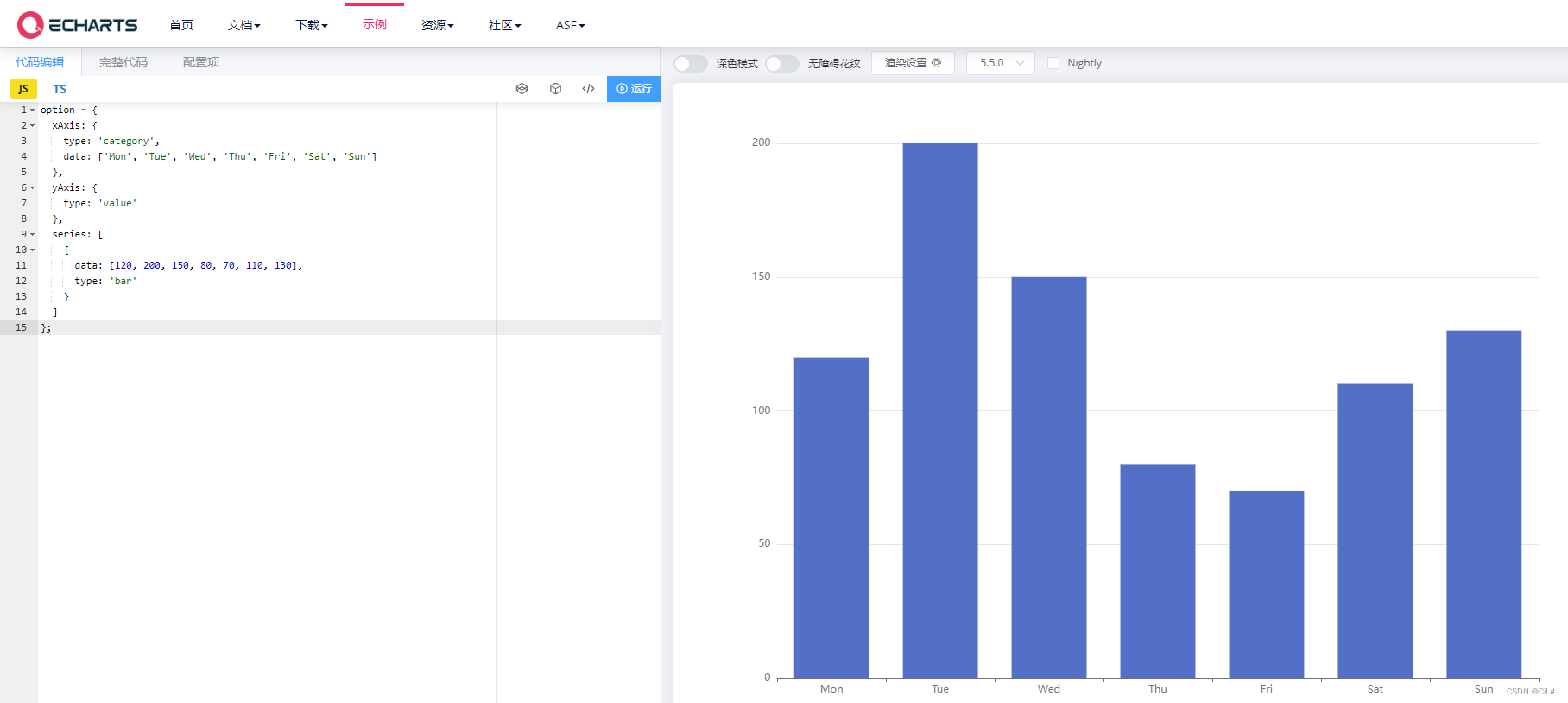
option = {
  xAxis: {
    type: 'category',
    data: ['Mon', 'Tue', 'Wed', 'Thu', 'Fri', 'Sat', 'Sun']
  },
  yAxis: {
    type: 'value'
  },
  series: [
    {
      data: [120, 200, 150, 80, 70, 110, 130],
      type: 'bar'
    }
  ]
};
在官网复制修改数据即可
5.绘制图表(methods)
getChart(){
      // 在步骤2的方法1中 通过 this.$echarts.init方法初始化echarts实例并使用 setOption 方法注册图表配置项和数据
      let myChart = this.$echarts.init(document.getElementById("myChart"));
      myChart.setOption(this.option);
}
6.展示图表
需要讲“绘制图表代码的函数,挂载到mounted”
  mounted() {
    this.getChart();
  },
以上是方法。
示例:
【1】 echarts双y轴柱状图
效果:
代码:
<template>
    <div class="echarts-box">
      <div id="barChart" ref="barChart" :style="barStyle"></div>
    </div>
</template>
<script>
// import * as echarts from 'echarts' // 方法2 局部引用
export default {
 data () {
    return {
        barStyle: { height: '480px', with: '100%' }, // echarts宽高
        echartsData: [
            {
                "percent": 18.32,
                "month": 1,
                "year": 2024,
                "value": 27.89340
            },
            {
                "percent": 16.58,
                "month": 2,
                "year": 2024,
                "value": 25.24960
            },
            {
                "percent": 17.18,
                "month": 3,
                "year": 2024,
                "value": 26.15560
            },
            {
                "percent": 14.19,
                "month": 4,
                "year": 2024,
                "value": 21.61190
            },
            {
                "percent": 19.76,
                "month": 5,
                "year": 2024,
                "value": 30.09200
            },
            {
                "percent": 14.65,
                "month": 6,
                "year": 2024,
                "value": 22.30440
            }
        ],
        optionEcharts: {
        // backgroundColor: '#23243a',
        tooltip: { // 提示框组件
          trigger: 'axis',
          axisPointer: {
            type: 'shadow',
            label: {
              backgroundColor: '#6a7985'
            }
          },
          textStyle: {
            color: '#fff',
            fontStyle: 'normal',
            fontFamily: '微软雅黑',
            fontSize: 12
          }
        },
        grid: {
          left: '1%',
          right: '4%',
          bottom: '6%',
          top: 30,
          padding: '0 0 10 0',
          containLabel: true
        },
        legend: {// 图例组件,颜色和名字
          itemGap: 16,
          itemWidth: 18,
          itemHeight: 10,
          data: [{
            name: '流入'
          },
          {
            name: '流出'
          }],
          textStyle: {
            color: '#999',
            fontStyle: 'normal',
            fontFamily: '微软雅黑',
            fontSize: 12
          }
        },
        xAxis: [
          {
            type: 'category',
            boundaryGap: true, // 坐标轴两边留白
            // data: xData,
            data: [],
            axisLabel: { // 坐标轴刻度标签的相关设置。
              interval: 0, // 设置为 1,表示『隔一个标签显示一个标签』
              margin: 15,
              textStyle: {
                color: '#a8aab0',
                fontStyle: 'normal',
                fontFamily: '微软雅黑',
                fontSize: 12
              }
            },
            axisTick: {// 坐标轴刻度相关设置。
              show: false
            },
            axisLine: {// 坐标轴轴线相关设置
              lineStyle: {
                color: '#ccc'
              }
            },
            splitLine: { // 坐标轴在 grid 区域中的分隔线。
              show: false
            }
          }
        ],
        yAxis: [
          {
            type: 'value',
            name: '单位: Kwh',
            nameTextStyle: {
              color: '#999',
              fontSize: 12
            },
            position: 'left',
            splitNumber: 0,
            min: 0,
            max: 0, // lMax
            interval: 0, // lInterval
            axisLabel: {
              show: true,
              textStyle: {
                color: '#a8aab0',
                fontStyle: 'normal',
                fontFamily: '微软雅黑',
                fontSize: 12
              }
            },
            axisLine: {
              show: true,
              lineStyle: {
                color: '#ccc'
              }
            },
            axisTick: {
              show: false
            },
            splitLine: {
              show: true,
              lineStyle: {
                color: ['#000'],
                opacity: 0.06
              }
            }

          },
          {
            type: 'value',
            name: '单位: %',
            nameTextStyle: {
              color: '#999',
              fontSize: 12
            },
            position: 'right',
            splitNumber: 0,
            min: 0,
            max: 0, // rMax
            interval: 0, // rInterval
            axisLabel: {
              show: true,
              textStyle: {
                color: '#a8aab0',
                fontStyle: 'normal',
                fontFamily: '微软雅黑',
                fontSize: 12
              }
            },
            axisLine: {
              show: true,
              lineStyle: {
                color: '#ccc'
              }
            },
            axisTick: {
              show: false
            },
            splitLine: {
              show: true,
              lineStyle: {
                color: ['#000'],
                opacity: 0.06
              }
            }
          }
        ],
        series: [
          {
            name: '流入',
            type: 'bar',
            yAxisIndex: 0, // 使用的 y 轴的 index,在单个图表实例中存在多个 y轴的时候有用
            // data: yValue,
            data: [],
            barWidth: 20,
            // barGap:0,//柱间距离
            label: {// 图形上的文本标签
              normal: {
                show: true,
                position: 'top',
                textStyle: {
                  color: '#a8aab0',
                  fontStyle: 'normal',
                  fontFamily: '微软雅黑',
                  fontSize: 12
                }
              }
            },
            itemStyle: {// 图形样式
              normal: {
                color: '#bfc'
              }
            }
          },
          {
            name: '流出',
            type: 'bar',
            yAxisIndex: 1, // 使用的 y 轴的 index,在单个图表实例中存在多个 y轴的时候有用
             // data: yPercent,
            data: [],
            barWidth: 20,
            // barGap:0.2,//柱间距离
            label: {// 图形上的文本标签
              normal: {
                show: true,
                position: 'top',
                textStyle: {
                  color: '#a8aab0',
                  fontStyle: 'normal',
                  fontFamily: '微软雅黑',
                  fontSize: 12
                }
              }
            },
            itemStyle: {// 图形样式
              normal: {
                color: '#bcf'
              }
            }
          }
        ]
      },
      xData: [],
      yValue: [],
      yPercent: [],
      splitNumber: 0,
      lMax: 0,
      lInterval: 0,
      rMax: 0,
      rInterval: 0,
    }
 },
 mounted () {
   this.$nextTick(() => {
     this.getEcharts()
   })
 },
 methods: {
   getEcharts () {
      // 此处本来是直接调用接口的,这里就写点假数据

      this.xData = []
      this.yValue = []
      this.yPercent = []
      if(this.echartsData&&this.echartsData.length>0) {
        this.echartsData.map((i) => {
          this.xData.push(i.year + '年' + i.month + '月')
          this.yValue.push(i.value)
          this.yPercent.push(i.percent)
        })
      }
      if (this.$refs.barChart) {
          // 配置图表数据
          this.optionEcharts.xAxis.data = []
          this.optionEcharts.xAxis.data = this.xData

          // 设置双y轴的辅助线对齐
          // 1.计算最大值和最小值
          this.lMax = Number(Math.max(...this.yValue))
          // this.lMin = Number(Math.min(...this.yValue))
          this.rMax = Number(Math.max(...this.yPercent))
          // this.rMin = Number(Math.min(...this.yPercent))
          // 2.最大值向上取整,最小值向下取整,让显示的数据为10的倍数或100的倍数整数显示。
          lMax = Math.ceil(this.lMax / 10) * 10
          // this.lMin = Math.floor(this.lMin / 10) * 10
          this.rMax = Math.ceil(this.rMax / 100) * 100
          // this.rMin = Math.floor(this.rMin / 10) * 10
          // 3.计算分隔间隔
          this.splitNumber = 10
          this.lInterval = this.lMax / this.splitNumber
          this.rInterval = this.rMax / this.splitNumber
          // 或
          // this.lMax= Math.ceil(Math.ceil(Math.max(...this.yValue)) / 10) * 10
          // this.lInterval = Math.ceil(Math.ceil(Math.max(...this.yValue)) / 10)
          // this.rMax = Math.ceil(Math.ceil(Math.max(...this.yPercent)) / 10) * 10
          // this.rInterval = Math.ceil(Math.ceil(Math.max(...this.yPercent)) / 10)

          this.optionEcharts.series[0].data = []
          this.optionEcharts.series[1].data = []
          this.optionEcharts.series[0].data = this.yValue
          this.optionEcharts.series[1].data = this.yPercent

          // 遇到数据更新,视图未更新两种解决方法 --解决echarts数据更新,页面不刷新问题
          // 方法一:
          // // // 初始化绘制图表的echarts实例
          // // const barcharts = echarts.init(this.$refs.barChart) // 局部引用
          // const barcharts = this.$echarts.init(this.$refs.barChart) // 全局引用
          // barcharts.clear()
          // // 对实例对象进行配置
          // barcharts.setOption(this.optionEcharts)
          // -------
          // 方法二
          // 初始化绘制图表的echarts实例
          // const barcharts = echarts.init(this.$refs.barChart)  // 局部引用
          const barcharts = this.$echarts.init(this.$refs.barChart) // 全局引用
          // 对实例对象进行配置
          barcharts.setOption(this.optionEcharts, true)
      }
   }
 }
}
</script>
<style lang="scss" scoped>
.echarts-box {
  width: 100%;
  height: 480px;
}
</style>


 524
524

 被折叠的 条评论
为什么被折叠?
被折叠的 条评论
为什么被折叠?
 到【灌水乐园】发言


