


7.29 今天的作业是响应式企业官网开发,包括nav、home、bbs、html5、BootStrap、course、app、contact、footer等9个部分。
本来应该昨天就做好的,拖延症犯了拖到了今天,足足写了两天T T
源码在这里https://github.com/1298582274/tiber-junkfood.git
开始之前记得到bootstrap官网上下载css和js的文件,引入到自己的网页中。
一、nav导航栏部分
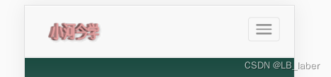
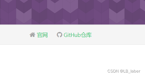
作业要求完成效果如下图所示

可以看出分为左右两块,左边是logo,右边是导航栏。在pc端要求全显示,在手机端要求右边导航栏收起为一个按钮,点击后下拉导航栏。这里用到.navbar-toggle、collapsed、data-toggle、data-target这四个。
- .navbar-toggle:用来设置该按钮作为下拉导航栏的切换按钮
- collapsed:当浏览器的窗口宽度小于768px时,将设置为collapse样式的div元素内的所有其它元素都折叠起来,以一个列表的形式显示
- data-toggle:需要对该按钮进行的事件(比如我这里是collapse,意思就是对目标元素进行折叠)
- data-target:需要进行事件的目标(比如我这里是.cps,对应的是下面代码右侧内容中的父级div的类名cps)
最后,<span class="icon-bar"></span> 是指一个横线,这里写三个出来后的效果就会是三条横线,具体可在bootstrap官网查看。
<!-- 导航条 -->
    <nav class="navbar navbar-default navbar-fixed-top">
        <div class="container-fluid">
            <!-- 左侧内容 -->
            <div class="navbar-header">
                <!-- 菜单按钮 -->
                <button type="button" class="navbar-toggle collapsed" data-toggle="collapse" data-target=".cps">
                    <span class="icon-bar"></span>
                    <span class="icon-bar"></span>
                    <span class="icon-bar"></span>
                </button>
                <!-- 动态Logo -->
                <a href="#home"><img src="/img/logo.gif" alt="" class="navbar-brand"></a>
            </div>

            <!-- 右侧内容 -->
            <div class="collapse navbar-collapse cps">
                <ul class="nav navbar-nav navbar-right">
                    <li><a href="#home"><span class="glyphicon glyphicon-home"></span>首页</a></li>
                    <li><a href="#bbs"><span class="glyphicon glyphicon-bullhorn"></span>论坛</a></li>
                    <li><a href="#html5"><span class="glyphicon glyphicon-heart-empty"></span>前端开发</a></li>
                    <li><a href="#course"><span class="glyphicon glyphicon-thumbs-up"></span>最新课程</a></li>
                    <li><a href="#app"><span class="glyphicon glyphicon-fire"></span>移动App</a></li>
                    <li><a href="#contact"><span class="glyphicon glyphicon-earphone"></span>联系我们</a></li>
                </ul>
            </div>
        </div>
    </nav>
/* h1-h6加粗 */
h1,h2,h3,h4,h5,h6 {
    font-weight: bold;
}

/* 导航栏 */
.container-fluid {
    padding: 0 20px;
}

.navbar-header button {
    margin-top: 15px;
}

.navbar-header img {
    height: 70px;
    margin-left: 15px;
    padding: 0;
}

.collapse ul {
    margin-top: 10px;
}

.collapse span {
    margin-right: 5px;
}
最终效果如下

二、其余部分
剩下的部分都很简单了,这里就不多赘述。
    <!-- 首页 -->
    <section id="home" >
        <div class="mask">
            <div class="container wow animate__animated animate__bounceIn">
                <div class="row">
                    <div class="col-md-12">
                        <p>本套课程适用于:1.WEB开发人员;2.网站维护人员、管理人员</p>
                        <p>培训技能的目标:使用Bootstrap框架快速构建响应式网页,颠覆传统WEB前端!</p>
                        <img src="/img/php.jpg" alt="" class="img-responsive center-block">
                    </div>
                </div>
            </div>
        </div>
    </section>
    <!-- 论坛 -->
    <section id="bbs">
        <div class="container">
            <div class="row">
                <div class="col-md-4 col-sm-12 wow animate__animated animate__fadeInLeft">
                    <img src="/img/a.png" alt="" class="img-responsive center-block">
                    <h3>Android开发</h3>
                    <p>Android开发技术交流、问题求助、实战案例分享</p>
                </div>
                <div class="col-md-4 col-sm-12 wow animate__animated animate__fadeIn" data-wow-delay="1s">
                    <img src="/img/i.png" alt="" class="img-responsive center-block">
                    <h3>iOS开发</h3>
                    <p>iOS开发技术交流,海量iOS实战干货分享</p>
                </div>
                <div class="col-md-4 col-sm-12 wow animate__animated animate__fadeInRight" data-wow-delay="1s">
                    <img src="/img/b.png" alt="" class="img-responsive center-block">
                    <h3>嵌入式底层开发</h3>
                    <p>底层嵌入式开发、实战案例等技术交流讨论</p>
                </div>
            </div>
        </div>
    </section>
    <section id="html5">
        <div class="container">
            <div class="row">
                <div class="col-md-6 col-sm-12 wow animate__animated animate__fadeInLeft">
                    <h2>HTML5前端开发</h2>
                    <p>一线资深前端开发工程师倾情打造!祝你完成普通程序员到优秀工程师的华丽升级!</p>
                    <p><span class="glyphicon glyphicon-grain"></span>使用HTML5与CSS3技术轻松实现设备自适应展示。</p>
                    <p><span class="glyphicon glyphicon-grain"></span>清晰明了的语义代码结构,更高的可读性、更利于页面维护。</p>
                </div>
                <div class="col-md-6 col-sm-12 wow animate__animated animate__fadeInRight">
                    <img src="/img/html5.jpg" alt="" class="img-responsive center-block">
                </div>
            </div>
        </div>
    </section>
    <section id="BootStrap">
        <div class="container">
            <div class="row">
                <div class="col-md-6 col-sm-12 wow animate__animated animate__fadeInLeft">
                    <img src="/img/Bootstrap.jpg" alt="" class="img-responsive center-block">
                </div>
                <div class="col-md-6 col-sm-12 wow animate__animated animate__fadeInRight">
                    <h2>Bootstrap实战视频教程</h2>
                    <p>Bootstrap时最受欢迎的HTML、CSS和JS框架,用于开发响应式布局、移动设备优先的WEB项目</p>
                    <p><span class="glyphicon glyphicon-grain"></span>你的网站和应用能在Bootstrap的帮助下通过同一份代码快速、有效适配手机、平板、PC设备</p>
                    <p><span class="glyphicon glyphicon-grain"></span>Bootstrap提供了全面、美观的文档,你能在这里找到关于HTML元素、HTML和CSS组件、jQuery插件方面的所有详细文档</p>
                </div>
            </div>
        </div>
    </section>
    <section id="course">
        <div class="container wow animate__animated animate__fadeIn">
            <div class="row">
                <div class="col-md-12 col-sm-12">
                    <h2>最新课程</h2>
                </div>
                <div class="col-md-3 col-sm-12">
                    <div class="content">
                        <img src="/img/swift.jpg" alt="Swift语言学习" class="img-responsive center-block">
                        <button type="button" class="btn btn-default">加入学习</button>
                    </div>
                </div>

            </div>
        </div>
    </section>
    <section id="app">
        <div class="container">
            <div class="row">
                <div class="col-md-6 col-sm-12 wow animate__animated animate__fadeInLeft">
                    <h2>移动app</h2>
                    <p>全新UI交互,与新网站数据同步,更加丰富的课程,开启精彩无限,语音搜索课程,喊出你想要的课程,一键收藏,方便自己重复学习,离线下载课程,在哪都能开!</p>
                    <button type="button" class="btn btn-default"><span class="glyphicon glyphicon-save"></span>iPhone版</button>
                    <button type="button" class="btn btn-default"><span class="glyphicon glyphicon-save"></span>Android版</button>
                </div>
                <div class="col-md-6 col-sm-12 wow animate__animated animate__fadeInRight">
                    <img src="/img/app-banner.jpg" alt="" class="img-responsive">
                </div>
            </div>
        </div>
    </section>
    <section id="footer">
        <div class="mask">
            <div class="container wow animate__animated animate__fadeIn">
                <div class="row">
                    <div class="col-md-6 col-sm-12">
                        <h2><span class="glyphicon glyphicon-send"></span>联系我</h2>
                        <p>xxx是xxx旗下一个IT线上线下教育平台,目前已有30万注册用户,10万以上APP下载量,
                            5000小时视频内容,我们从不说空话,专注于IT在线教育,脱离传统教育的束缚,让你走到哪学到哪,想学就学。
                        </p>
                        <p><span class="glyphicon glyphicon-home"></span>地址:xx市xx区xxxxxxxxxx</p>
                        <p><span class="glyphicon glyphicon-earphone"></span>联系电话:1234567890</p>
                        <p><span class="glyphicon glyphicon-envelope"></span>邮箱123456789@123.com</p>
                    </div>
                    <div class="col-md-6 col-sm-12">
                        <div class="col-md-6 col-sm-6">
                            <input type="text" class="form-control" placeholder="您的姓名">
                        </div>
                        <div class="col-md-6 col-sm-6">
                            <input type="text" class="form-control" placeholder="您的邮箱">
                        </div>
                        <div class="col-md-12 col-sm-12">
                            <input type="text" class="form-control" placeholder="标题">
                            <textarea class="form-control" rows="5" placeholder="留言内容"></textarea>
                            <button type="button" class="btn btn-default">提交</button>
                        </div>
                    </div>
                </div>
            </div>
        </div>

    </section>
/* 首页 */
#home {
    background-image: url(/img/home-bg.jpg);
    background-size: cover;
    margin-top: 70px;
    text-align: center;
}
    /* 遮罩 */
.mask {
    width: 100%;
    height: 100%;
    background-color: rgba(0,0,0,.6);
    padding: 70px 0;
}

#home p {
    color: #fff;
}

/* 论坛 */
#bbs {
    text-align: center;
    padding: 50px 0;
}

#bbs .col-md-4 {
    padding: 20px 0;
}

#bbs .col-md-4:hover {
    background-color: #eee;
    box-shadow: 1px 1px 2px #999;
}

/* 前端开发 */
#html5,#BootStrap {
    padding: 70px 0;
}
#html5 {
    background-color: #eee;
}

#html5 p ,#BootStrap p {
    margin-bottom: 20px;
}

#html5 span ,#BootStrap span {
    width: 32px;
    height: 32px;
    border-radius: 15px;
    background-color: rgb(34, 207, 181);
    text-align: center;
    line-height: 32px;
    margin-right: 5px;
    color: #fff;
}

/* 最新课程 */
#course {
    padding: 70px 0;
    text-align: center;
    background-color: #eee;
}

#course .content {
    margin-top: 45px;
    background-color: #fff;
}

#course button {
    color: rgb(34, 207, 181);
    border-color: rgb(34, 207, 181);
    margin: 15px 0;
    border-radius: 0%;
}

#course button:hover {
    color: #fff;
    background-color: rgb(34, 207, 181);
}

/* app */
#app {
    padding: 70px 0;
}

#app p {
    margin-top: 20px;
}

#app button {
    width: 150px;
    background-color: rgb(34, 207, 181);
    color: white;
    border-color: rgb(34, 207, 181);
    border-radius: 0%;
}

#app span {
    margin-right: 5px;
}

/* 联系我们 */
#footer {
    background-image: url(/img/contact-bg.png);
    color: #fff;
}

#footer span {
    margin-right: 5px;
}

#footer p {
    margin: 25px 0;
}

#footer input,#footer textarea {
    margin-bottom: 20px;
    border-radius: 0%;
}

#footer input {
    height: 50px;
}

#footer button {
    width: 200px;
    border-radius: 0%;
    background-color: rgb(34, 207, 181);
    color: #fff;
    border-color: rgb(34, 207, 181);
}
最终效果如下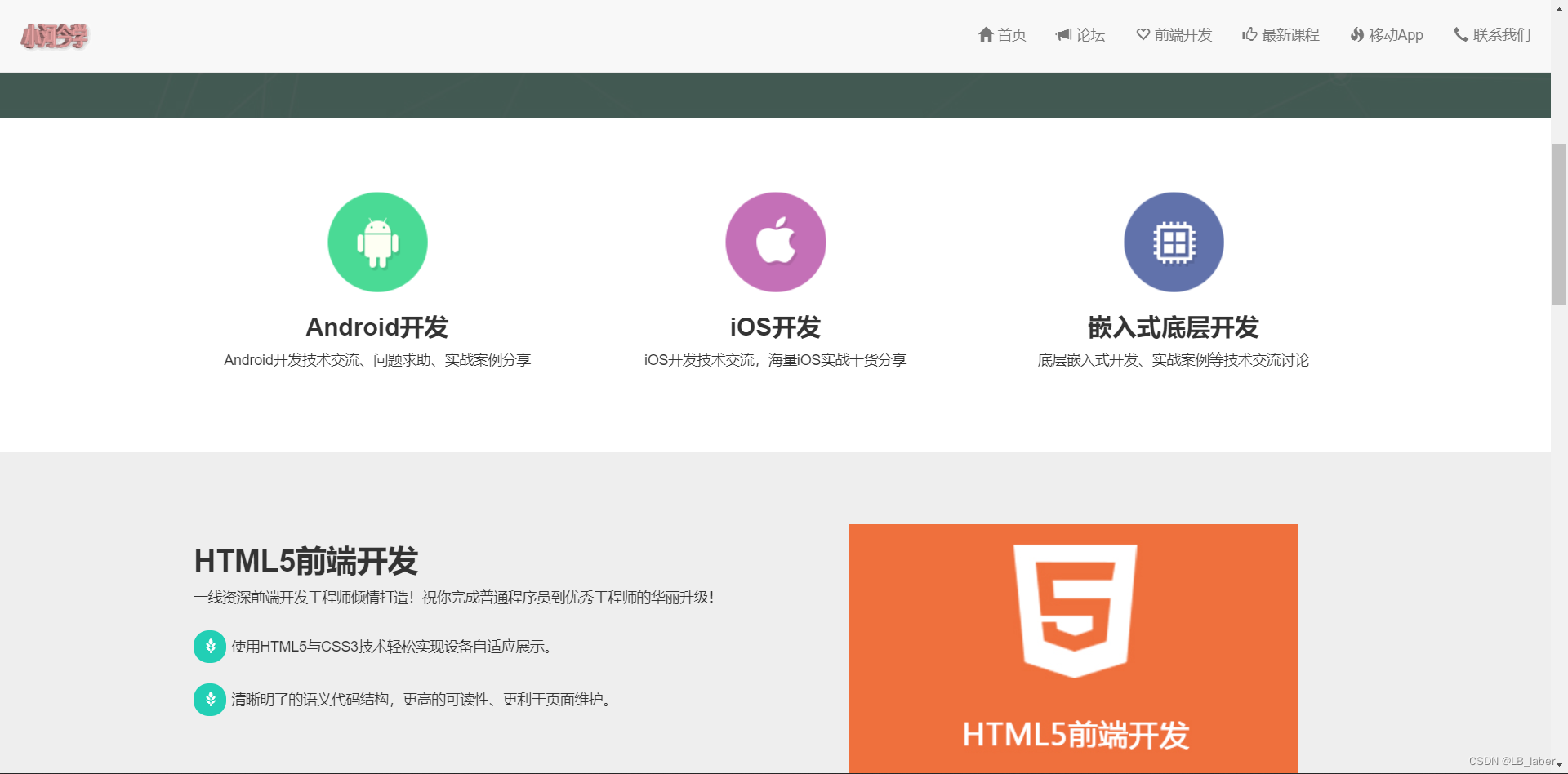
三、animate动画+wow动画
1、animate动画的引入和使用
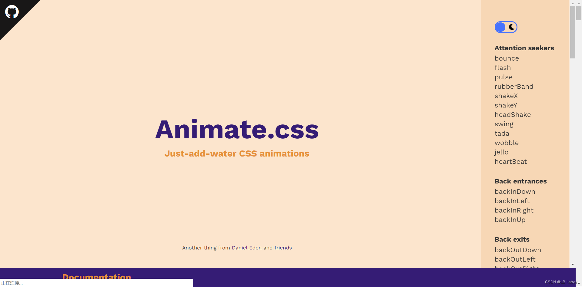
首先进到BootCDN官网,进入后搜索animate,复制他的link到自己的文件中。
<link href="https://cdn.bootcdn.net/ajax/libs/animate.css/4.1.1/animate.css" rel="stylesheet">
接着可以在这里打开animate的官网进行查看,或者点击这里animate官网
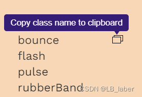
打开官网后可以清楚的看到右侧栏的动画,点击后可以在正中央看到动画效果,选择想要的动画后鼠标稍微右移一点可以出现一个复制的按钮,点击后即可复制该动画的类名,之后再添加到你想要添加动画的元素上。
注意,在引入到元素类名中时,要在该复制的类名前面在加上一个类名 animate__animated,否则无法实现动画效果。
<div class="container wow animate__animated animate__bounceIn">
2、wow动画的引入和使用
同样在BootCDN官网上搜索wow,对其的js进行引入,具体步骤如上述引入animate类似。
接着进到wow的官网,下拉之后有一个阅读文档,点击后有详细的如何安装wow.js的步骤以及如何使用,这里就不多赘述。
四、导航栏的定位偏移和点击跳转后导航栏不会自动收起的解决
所有内容都写完之后我发现每次点击导航栏进行跳转后,定位都会下移,忽略我给出的padding-top:70px。在这里需要用到jquery.singlePageNav.min.js,引入该文件后,js部分如下。
<script src="/js/jquery.singlePageNav.min.js"></script>
<script>
// 设置导航跳转偏移值
    $('nav').singlePageNav({
        offset:70
    });
<script/>
接着我发现导航栏点击跳转后不会自动收起,一直挡在前面,直到再次点击按钮后才会收起,因此解决方案如下。
//点击小屏幕菜单跳转后立即关闭菜单
<script>
    $('.navbar-collapse li').click(function(){
        $('.navbar-collapse').collapse('hide');
    });
<script/>
以上就是全部内容了


 139
139


 被折叠的 条评论
为什么被折叠?
被折叠的 条评论
为什么被折叠?
 到【灌水乐园】发言


