


动画模块其他属性下
<!DOCTYPE html>
<html lang="en">
<head>
<meta charset="UTF-8">
<title>其他属性下</title>
<style>
* {
margin: 0;
padding: 0;
}
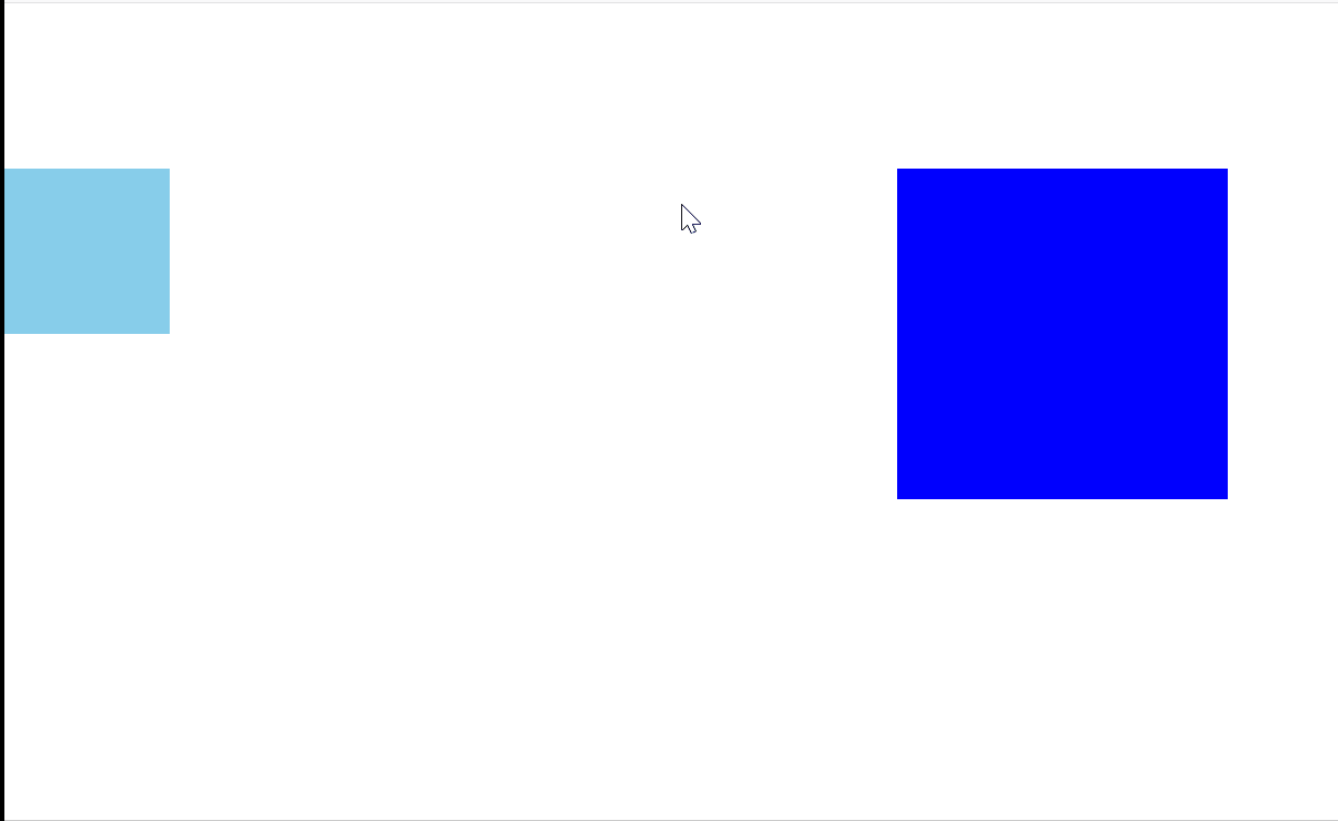
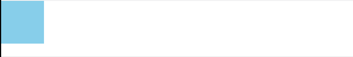
.box1 {
width: 100px;
height: 100px;
background-color: skyblue;
animation-name: sport;
animation-duration: 5s;
position: absolute;
}
@keyframes sport {
0% {
left: 0;
top: 0;
}
25% {
left: 300px;
top: 0;
}
50% {
left: 300px;
top: 300px;
}
75% {
left: 0;
top: 300px;
}
100% {
left: 0;
top: 0;
}
}
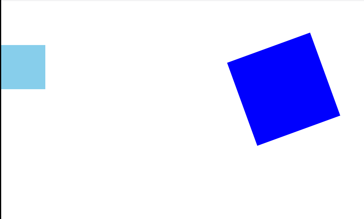
.box2 {
width: 200px;
height: 200px;
margin: 100px auto;
background-color: blue;
animation-name: myRotate;
animation-duration: 5s;
animation-delay: 2s;
}
@keyframes myRotate {
0% {
transform: rotate(10deg);
}
50% {
transform: rotate(40deg);
}
100% {
transform: rotate(70deg);
}
}
</style>
</head>
<body>
<div class="box1"></div>
<div class="box2"></div>
</body>
</html>
通过我们观察,动画是有一定的状态的
1.等待状体
2.执行状态
3.结束状态
animation-fill-mode 属性
规定动画在等待状态和结束状态的样式
其属性值是由逗号分隔的一个或多个填充模式关键词。
语法
animation-fill-mode : none | forwards | backwards | both;
| 值 | 描述 |
|---|---|
| none | 不改变默认行为。 |
| forwards | 当动画完成后,保持最后一个属性值(在最后一个关键帧中定义)。 |
| backwards | 在 animation-delay 所指定的一段时间内,在动画显示之前,应用开始属性值(在第一个关键帧中定义)。 |
| both | 向前和向后填充模式都被应用。 |
forwards就规定动画完成后保持到最后一帧的画面
backwards就规定等待状态下,直接将画面换成第一帧,没有那种间断感,比如说从0%开始就是旋转50°,如果不设置该属性,会在第一帧从0°跳到50°,如果设置了等待状态直接变成第一帧50°
both是两个同时设置。
添加
animation-fill-mode: both;
连写格式
animation 属性
格式
animation: name duration timing-function delay iteration-count direction;
animation:动画名称 动画时长 动画运行速率 动画延迟时长 动画执行次数 是否需要往返动画
animation 属性是一个简写属性,用于设置六个动画属性:
- animation-name
- animation-duration
- animation-timing-function
- animation-delay
- animation-iteration-count
- animation-direction
除了 animation-play-state 属性。
<!DOCTYPE html>
<html lang="en">
<head>
    <meta charset="UTF-8">
    <title>动画连写</title>
    <style>
        * {
            margin: 0;
            padding: 0;
        }

        div {
            width: 100px;
            height: 100px;
            background-color: skyblue;
            animation: move 3s linear 1s 2 alternate;
        }

        @keyframes move {
            from {
                margin-left: 0;
            }

            to {
                margin-left: 500px;
            }
        }


    </style>
</head>
<body>
<div></div>
</body>
</html>
连写格式的简写
animation: name duration
只要能构成三要素就可以执行动画,有动画名,设置动画样式 有执行时间即可。


 115
115


 被折叠的 条评论
为什么被折叠?
被折叠的 条评论
为什么被折叠?
 到【灌水乐园】发言


