


第1章 引言
CSS编码技巧
尽量减少代码重复
当某些值相互依赖时,应该把它们的相互关系用代码表达出来。
font-size: 20px;
line-height: 30px;

font-size: 20px;
line-height: 1.5;
相信你的眼睛,而不是数字
在字体设计领域上,圆形的字形与矩形字形相比,需要稍微放大一些。
关于响应式网页设计
媒体查询会增加维护成本,应该把媒体查询作为最后的手段,媒体查询能做的是修补某个特定分辨率下的特定问题。
媒体查询的断点不应该由具体的设备来决定,而是根据设计自身来决定。
一些避免不必要的媒体查询的方法:
- 使用百分比长度来取代固定长度,或者使用视口布局,它们的值解析为视口宽度或高度的百分比。
- 当需要在较大分辨率下得到固定宽度时,使用max-width而不是width,因为它可以适应较小的分辨率,而无须使用媒体查询。
- 不要忘记为替换元素(比如img、object、video、iframe等)设置一个max-width,值为100%。
- 通过
background-size: cover将背景图片完整地铺满一个容器。在移动网页中通过css把一张大图缩小显示往往是不太明智的。 - 当图片(或其他元素)以行列式进行布局时,让视口的宽度来决定列的数量。弹性盒布局或者
display: inline-block加上常规的文本折行行为,都可以实现这一点。 - 在使用多列文本时,指定
column-width(列宽)而不是指定column-count(列数),这样它就可以在较小的屏幕上自动显示为单列布局。
总的思路是最大努力实现弹性可伸缩的布局,并在媒体查询的各个断点区间内指定相应的尺寸。
合理使用简写
简写是一种良好的防卫性编码方式,可以抵御未来的风险。
展开式属性与简写属性的配合使用也是非常有用的,可以让代码更加DRY。
第2章 背景与边框
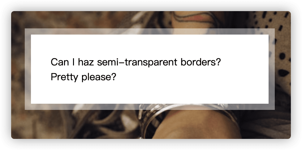
1. 半透明边框
难题
border: 10px solid hsla(0, 0%, 100%, .5);
background: white;
上面的属性并没有棒法实现半透明边框。
解决方案
border: 10px solid hsla(0,0%,100%,.5);
background: white;
background-clip: padding-box;
由于背景图默认会渗透到边框,所以边框不会出现半透明,通过设置背景图只延伸到padding,就可以正确显示半透明边框了。
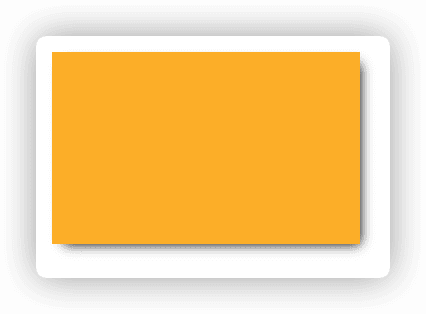
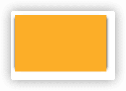
2. 多重边框
box-shadow方案
通过指定多个投影来生成多重边框。
div {
	width: 100px;
	height: 60px;
	margin: 25px;
	background: yellowgreen;
	box-shadow: 0 0 0 10px #655,
            0 0 0 15px deeppink,
            0 2px 5px 15px rgba(0,0,0,.6);
}
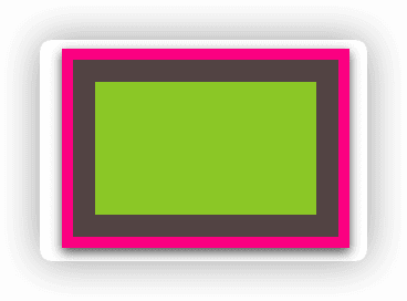
注意事项:
- 投影不会影响布局,而且也不会受到
box-sizing属性的影响。 - 创建的是假边框,所以不会响应鼠标事件,比如悬停或点击。
outline方案
div {
	width: 100px;
	height: 60px;
	margin: 25px;
	background: yellowgreen;
	border: 10px solid #655;
	outline: 5px solid deeppink;
}
3.灵活的背景定位
background-position的扩展语法方案
在偏移量前面指定关键字
div {
	background: url(https://source.unsplash.com/random/40x40)
	            no-repeat bottom right #58a;
	background-position: right 20px bottom 10px;

	/* Styling */
	max-width: 10em;
	min-height: 5em;
	padding: 20px;
	color: white;
	font: 100%/1 sans-serif;
}
background-origin方案
background-position默认是以padding box为准。
div {
	background: url(https://source.unsplash.com/random/40x40)
	            no-repeat bottom right #58a;
	background-origin: content-box;

	/* Styling */
	max-width: 10em;
	min-height: 5em;
	padding: 10px;
	color: white;
	font: 100%/1 sans-serif;
}
calc()方案
div {
	background: url(https://source.unsplash.com/random/40x40)
	            no-repeat bottom right #58a;
	background-position: calc(100% - 20px) calc(100% - 10px);

	/* Styling */
	max-width: 10em;
	min-height: 5em;
	padding: 10px;
	color: white;
	font: 100%/1 sans-serif;
}
4. 边框内圆角
使用outline或box-shadow。
div {
	outline: .6em solid #655;
	box-shadow: 0 0 0 .4em #655;

	max-width: 10em;
	border-radius: .8em;
	padding: 1em;
	margin: 1em;
	background: tan;
	font: 100%/1.5 sans-serif;
}
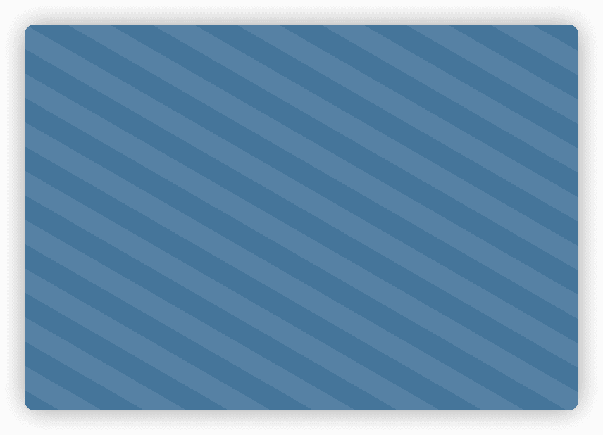
5. 条纹背景
解决方案
linear-gradient如果多个色标具有相同位置,就会产生一个无限小的过渡区域,从效果上看,颜色会在那个位置突然变化。
如果某个色标的位置值比整个列表中在它之前的色标位置值都要小,则该色标的位置值会被设置为它前面所有色标位置值的最大值。
background: linear-gradient(#fb3 50%, #58a 0%);
background-size: 100% 30px;
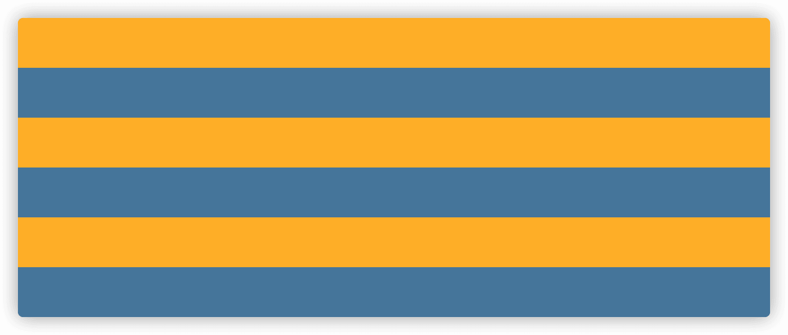
垂直条纹
background: linear-gradient(90deg, #fb3 50%, #58a 0%);
background-size: 100px 100%;
斜向条纹
background: linear-gradient(45deg,
              #fb3 25%, #58a 0, #58a 50%,
              #fb3 0, #fb3 75%, #58a 0);
background-size: 42.4px 42.4px;
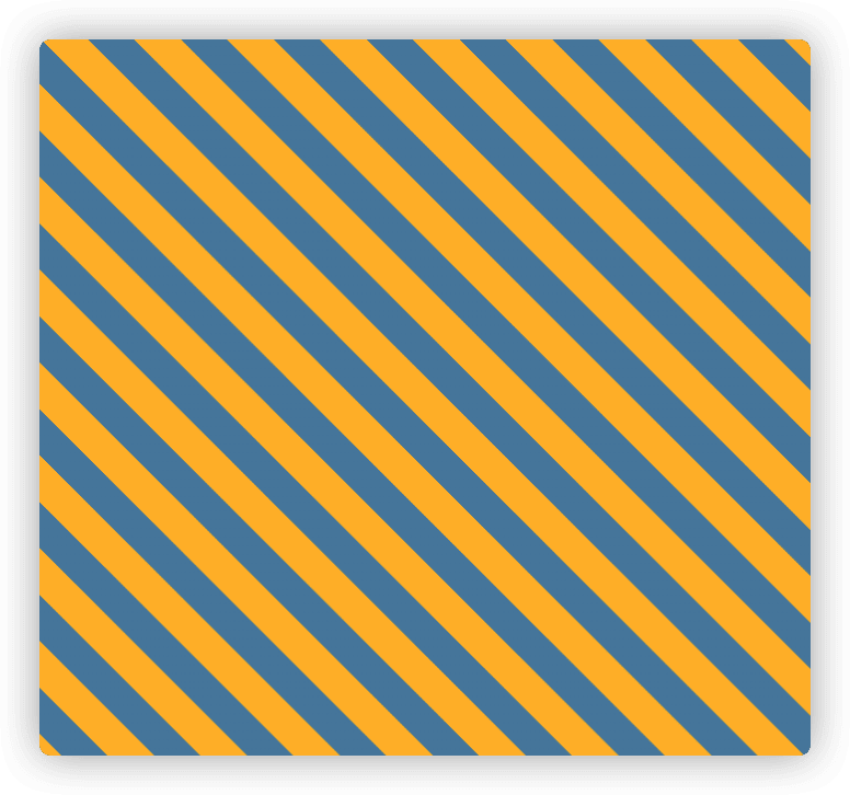
更好的斜向条纹
上面的方法只能控制在45deg,如果要改成其他角度,需要全部调整,比较麻烦。
可以通过repeating-linear-gradient无限重复色值来达到更好的效果。
background: repeating-linear-gradient(60deg,
              #fb3, #fb3 15px,
              #58a 0, #58a 30px);
height: 100%;
灵活的同色系条纹
如果条纹色属于同一色系,那么可以使用背景色来等到浅色条纹,可以减少后期的维护成本。
background: #58a;
background-image: repeating-linear-gradient(30deg,
              hsla(0,0%,100%,.1), hsla(0,0%,100%,.1) 15px,
              transparent 0, transparent 30px);

height: 100vh;
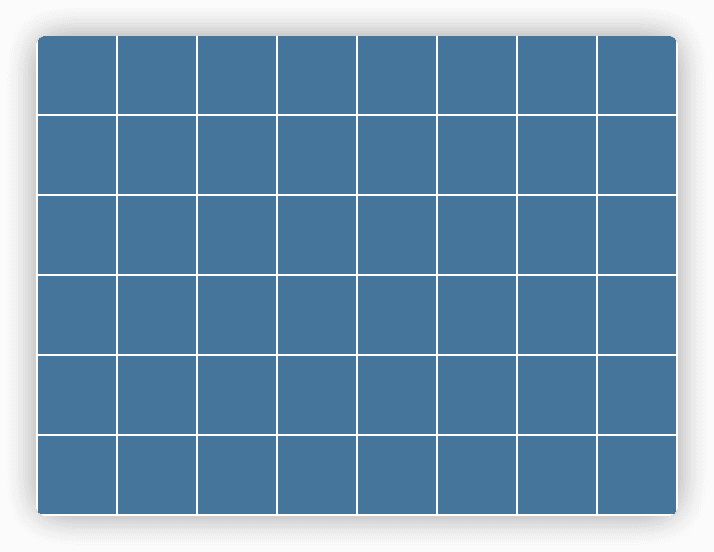
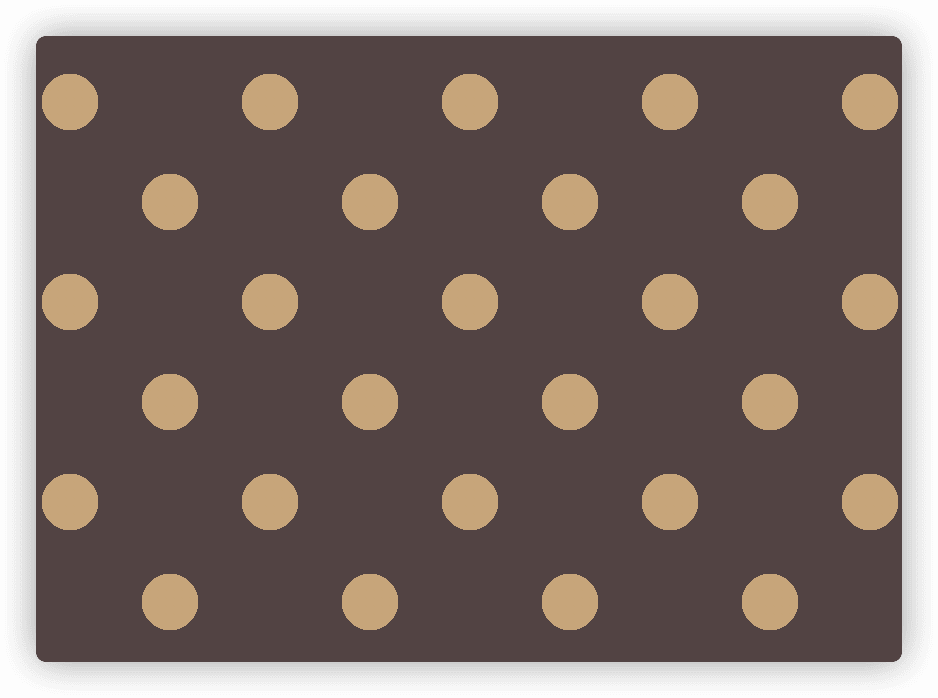
6. 复杂的背景图案
网格
background: #58a;
background-image: linear-gradient(white 1px, transparent 0),
	linear-gradient(90deg, white 1px, transparent 0);
background-size: 40px 40px;
波点
background: #655;
background-image: radial-gradient(tan 20%, transparent 0),
                  radial-gradient(tan 20%, transparent 0);
background-size: 100px 100px;
background-position: 0 0, 50px 50px;
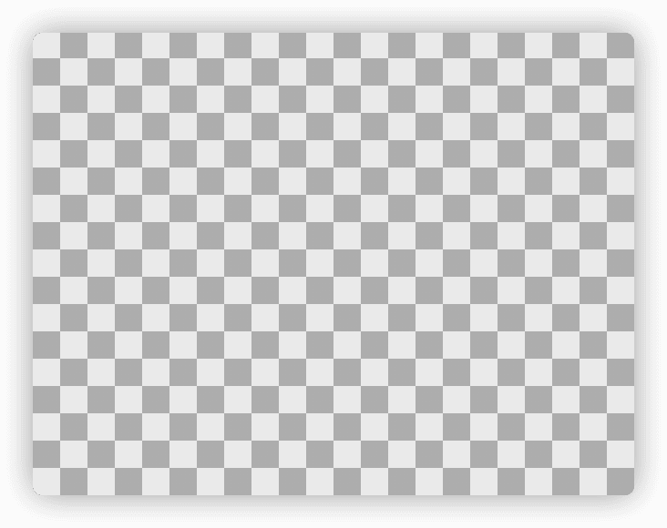
棋盘
background: #eee;
background-image: linear-gradient(45deg, #bbb 25%, transparent 0),linear-gradient(45deg, transparent 75%,#bbb 0), linear-gradient(45deg, #bbb 25%, transparent 0),linear-gradient(45deg, transparent 75%,#bbb 0);
background-position:0 0, 15px 15px, 15px 15px, 30px 30px;
background-size: 30px 30px;
background: #eee;
background-image:
	linear-gradient(45deg, rgba(0,0,0,.25) 25%, transparent 0, transparent 75%, rgba(0,0,0,.25) 0),
	linear-gradient(45deg, rgba(0,0,0,.25) 25%, transparent 0, transparent 75%, rgba(0,0,0,.25) 0);
background-position: 0 0, 15px 15px;
background-size: 30px 30px;

min-height: 100%;
使用svg实现
background: #eee url('data:image/svg+xml,\
            <svg xmlns="http://www.w3.org/2000/svg" width="100" height="100" fill-opacity=".25" >\
            <rect x="50" width="50" height="50" />\
            <rect y="50" width="50" height="50" />\
            </svg>');
background-size: 30px 30px;
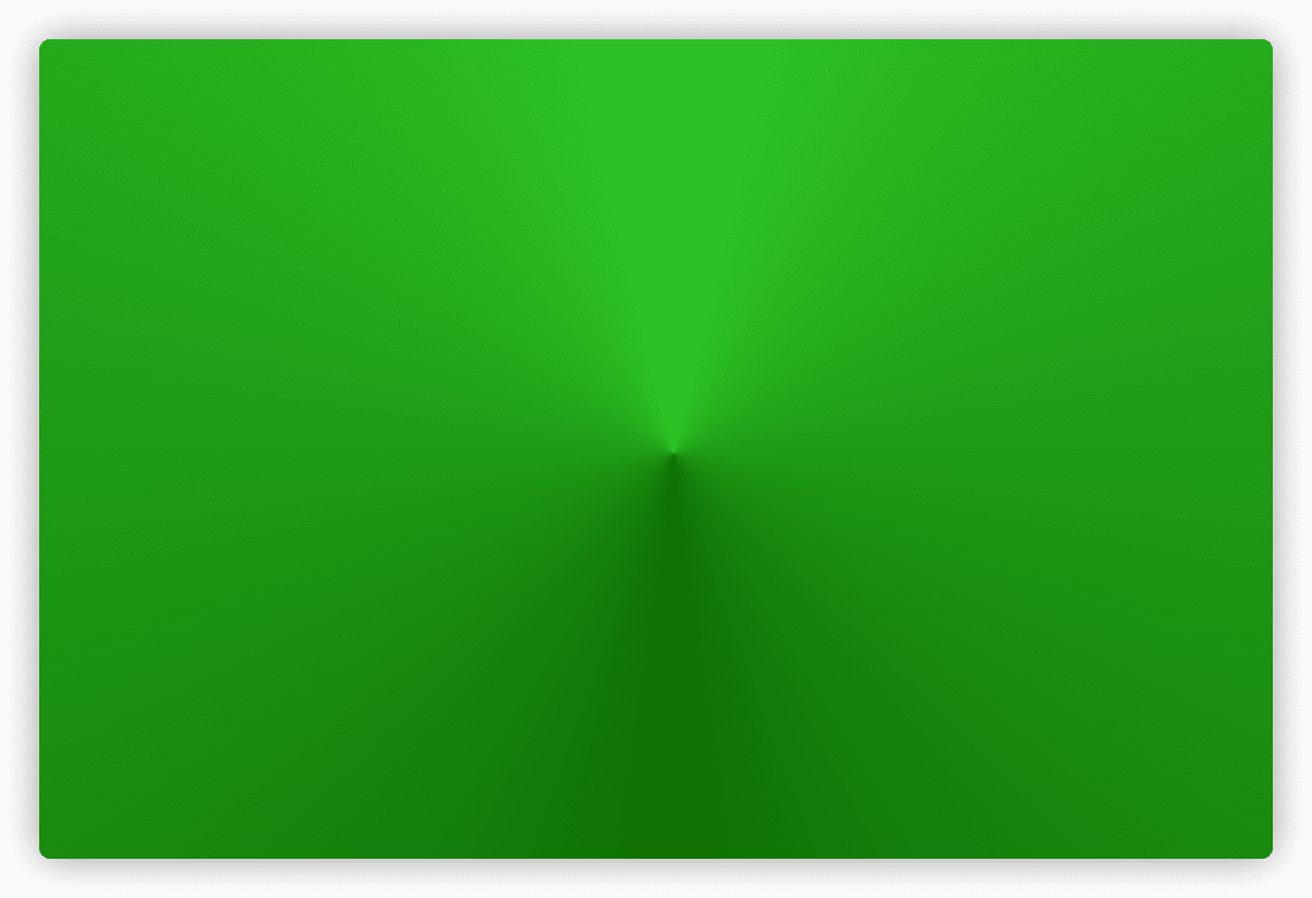
角向渐变
background: red;
background: conic-gradient(limegreen, green, limegreen);
min-height: 100%;
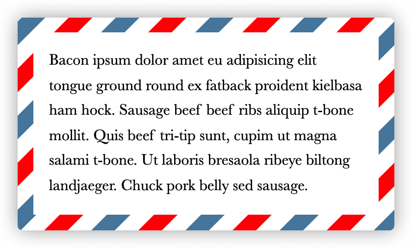
8. 连续的图像边框
div {
	padding: 1em;
	border: 1em solid transparent;
	background: linear-gradient(white, white) padding-box,
	            repeating-linear-gradient(-45deg, red 0, red 12.5%, transparent 0, transparent 25%,
	              #58a 0, #58a 37.5%, transparent 0, transparent 50%) 0 / 6em 6em;

	max-width: 20em;
	font: 100%/1.6 Baskerville, Palatino, serif;
}
第3章 形状
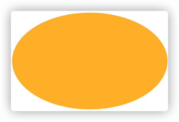
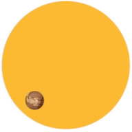
9. 自适应的椭圆
如果它的宽高相等,就显示为一个圆;如果宽高不等,就显示为一个椭圆。
解决方案
div {
	width: 16em;
	height: 10em;
	background: #fb3;
	border-radius: 100px;
}
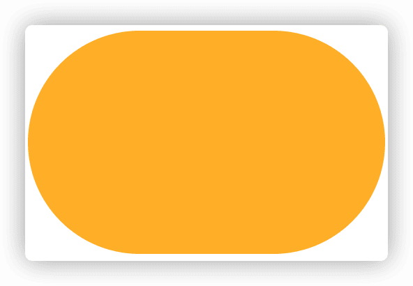
div {
	width: 16em;
	height: 10em;
	background: #fb3;
	border-radius: 50%;
}
半椭圆
div {
	width: 16em;
	height: 10em;
	background: #fb3;
	border-radius: 50% / 100% 100% 0 0;
}
四分之一椭圆
div {
	display: inline-block;
	width: 16em;
	height: 10em;
	margin: 1em;
	background: #fb3;
	border-radius: 100% 0 0 0;
}

10. 平行四边形
嵌套元素方案
.button { transform: skewX(45deg); }
.button > div { transform: skewX(-45deg); }

.button {
	display: inline-block;
	padding: .5em 1em;
	border: 0;
  margin: .5em;
	background: #58a;
	color: white;
	text-transform: uppercase;
	text-decoration: none;
	font: bold 200%/1 sans-serif;
}
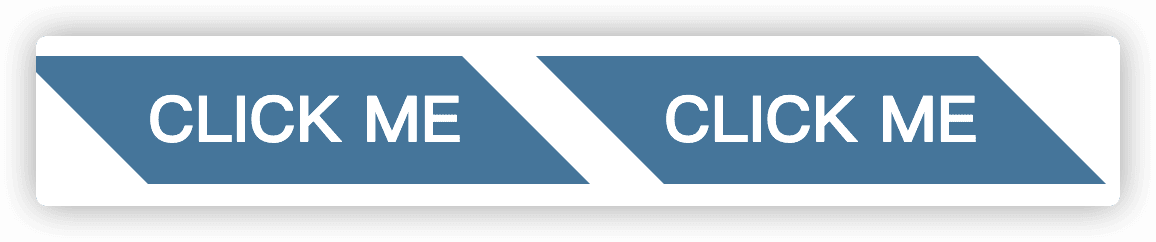
伪元素方案
.button {
	position: relative;
	display: inline-block;
	padding: .5em 1em;
	border: 0; margin: .5em;
	background: transparent;
	color: white;
	text-transform: uppercase;
	text-decoration: none;
	font: bold 200%/1 sans-serif;
}

.button::before {
	content: ''; /* To generate the box */
	position: absolute;
	top: 0; right: 0; bottom: 0; left: 0;
	z-index: -1;
	background: #58a;
	transform: skew(45deg);
}
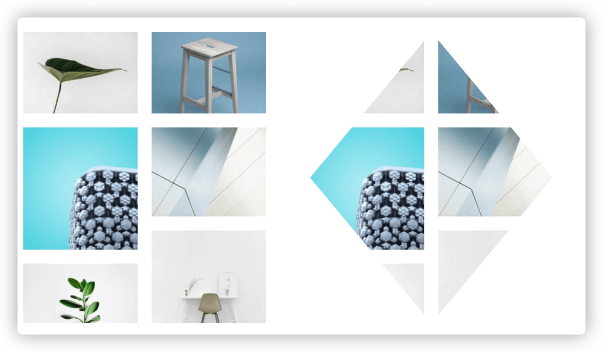
11. 菱形图片
基于变形的方案
.diamond {
	width: 250px;
	height: 250px;
	transform: rotate(45deg);
	overflow: hidden;
	margin: 100px;
}

.diamond img {
	max-width: 100%;
	transform: rotate(-45deg) scale(1.42);
	z-index: -1;
	position: relative;
}
裁切路径方案
img {
	max-width: 250px;
	margin: 20px;=
	-webkit-clip-path: polygon(50% 0, 100% 50%, 50% 100%, 0 50%);
	clip-path: polygon(50% 0, 100% 50%, 50% 100%, 0 50%);
	transition: 1s;
}

img:hover {
	-webkit-clip-path: polygon(0 0, 100% 0, 100% 100%, 0 100%);
	clip-path: polygon(0 0, 100% 0, 100% 100%, 0 100%);
}
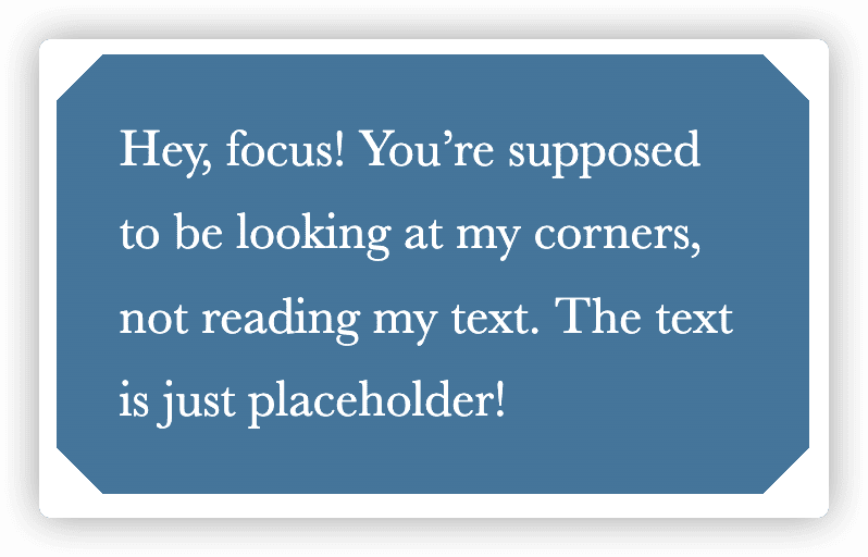
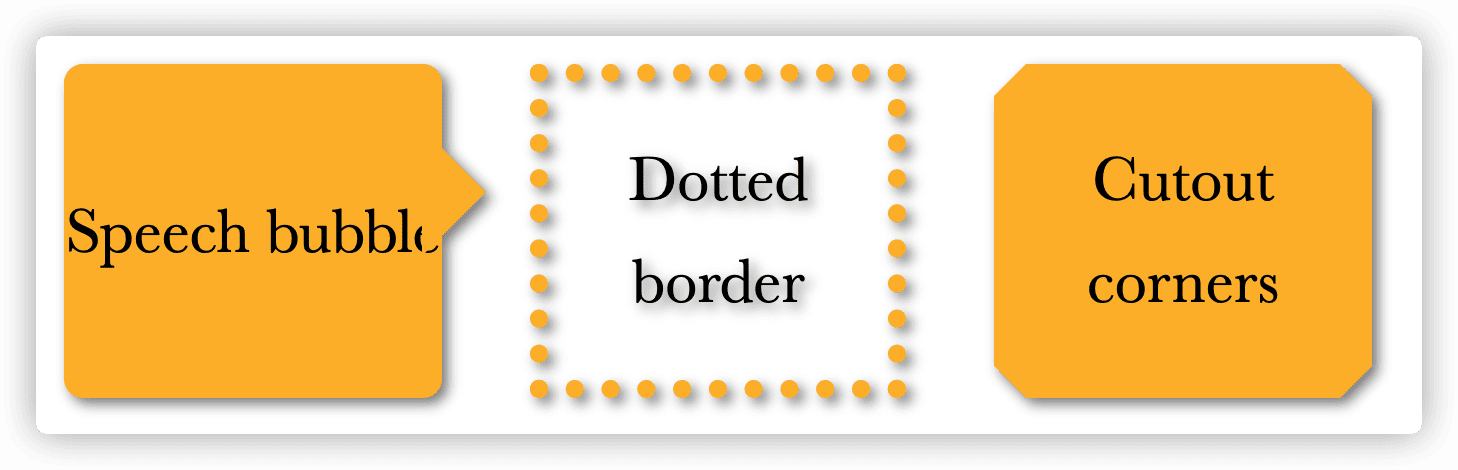
12. 切角效果
解决方案
div {
	background: #58a;
	background: linear-gradient(135deg, transparent 15px, #58a 0) top left,
	            linear-gradient(-135deg, transparent 15px, #58a 0) top right,
	            linear-gradient(-45deg, transparent 15px, #58a 0) bottom right,
	            linear-gradient(45deg, transparent 15px, #58a 0) bottom left;
	background-size: 50% 50%;
	background-repeat: no-repeat;

	padding: 1em 1.2em;
	max-width: 12em;
	color: white;
	font: 150%/1.6 Baskerville, Palatino, serif;
}
弧形切角
div {
	background: #58a;
	background:	radial-gradient(circle at top left, transparent 15px, #58a 0) top left,
	            radial-gradient(circle at top right, transparent 15px, #58a 0) top right,
	            radial-gradient(circle at bottom right, transparent 15px, #58a 0) bottom right,
	            radial-gradient(circle at bottom left, transparent 15px, #58a 0) bottom left;
	background-size: 50% 50%;
	background-repeat: no-repeat;

	padding: 1em 1.2em;
	max-width: 12em;
	color: white;
	font: 130%/1.6 Baskerville, Palatino, serif;
}
裁切路径方案
div {
	background: #58a;
	-webkit-clip-path:
		polygon(20px 0, calc(100% - 20px) 0, 100% 20px, 100% calc(100% - 20px),
		calc(100% - 20px) 100%,
		20px 100%, 0 calc(100% - 20px), 0 20px);
	clip-path:
	 		polygon(20px 0, calc(100% - 20px) 0, 100% 20px, 100% calc(100% - 20px),
	 		calc(100% - 20px) 100%,
	 		20px 100%, 0 calc(100% - 20px), 0 20px);

	padding: 1em 1.2em;
	max-width: 12em;
	color: white;
	font: 150%/1.6 Baskerville, Palatino, serif;
}
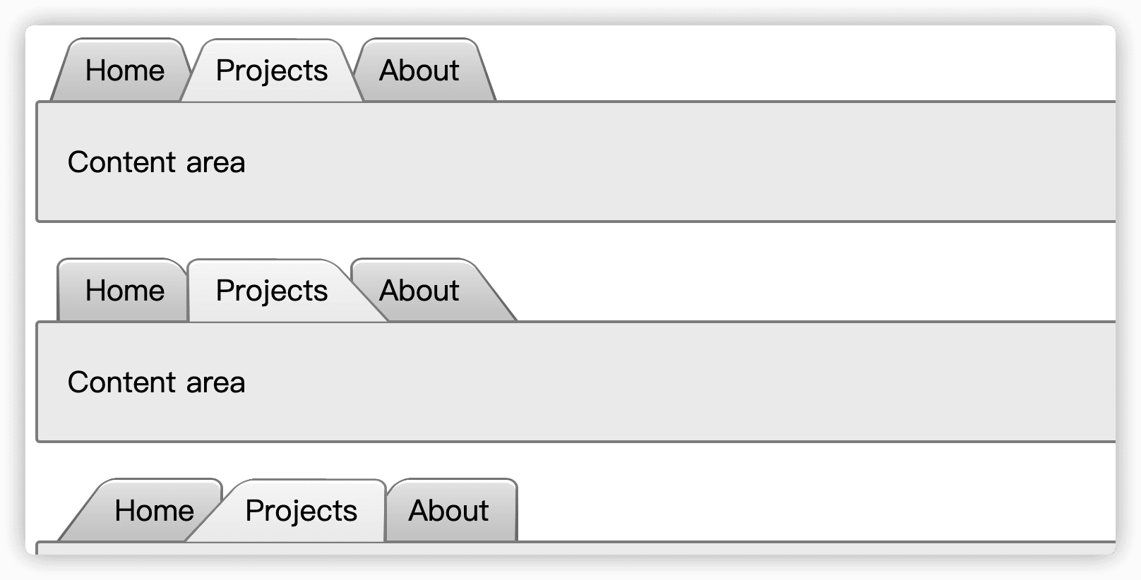
13. 梯形标签页
解决方案
在元素的伪元素上使用3D变形,通过拉长y轴和设置以底部作为transform-origin而产生视觉上的梯形效果。
nav > a {
	position: relative;
	display: inline-block;
	padding: .3em 1em 0;
	color: inherit;
	text-decoration: none;
	margin: 0 -.3em;
}

nav > a::before,
main {
	border: .1em solid rgba(0,0,0,.4);
}

nav a::before {
	content: ''; /* To generate the box */
	position: absolute;
	top: 0; right: 0; bottom: 0; left: 0;
	z-index: -1;
	border-bottom: none;
	border-radius: .5em .5em 0 0;
	background: #ccc linear-gradient(hsla(0,0%,100%,.6), hsla(0,0%,100%,0));
	box-shadow: 0 .15em white inset;
	transform: scale(1.1, 1.3) perspective(.5em) rotateX(5deg);
	transform-origin: bottom;
}

nav a.selected { z-index: 2;}

nav a.selected::before {
	background-color: #eee;
	margin-bottom: -.08em;
}

main {
	display: block;
	margin-bottom: 1em;
	background: #eee;
	padding: 1em;
	border-radius: .15em;
}

nav.left > a::before {
	transform: scale(1.2, 1.3) perspective(.5em) rotateX(5deg);
	transform-origin: bottom left;
}

nav.right { padding-left: 2em; }

nav.right > a::before {
	transform: scale(1.2, 1.3) perspective(.5em) rotateX(5deg);
	transform-origin: bottom right;
}
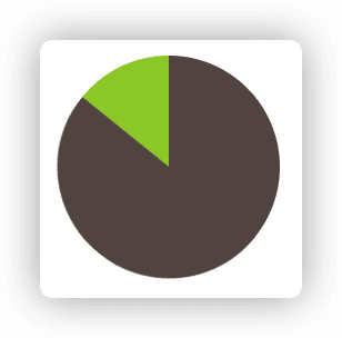
14. 简单的饼图
基于trasnform的解决方案
.pie {
	width: 100px; height: 100px;
	border-radius: 50%;
	background: yellowgreen;
	background-image: linear-gradient(to right, transparent 50%, currentColor 0);
	color: #655;
}

.pie::before {
	content: '';
	display: block;
	margin-left: 50%;
	height: 100%;
	border-radius: 0 100% 100% 0 / 50%;
	background-color: inherit;
	transform-origin: left;
	animation: spin 3s linear infinite, bg 6s step-end infinite;
}

@keyframes spin {
	to { transform: rotate(.5turn); }
}
@keyframes bg {
	50% { background: currentColor; }
}
第4章 视觉效果
15 单侧投影
单侧投影
使用box-shadow的第四个参数来使用单侧投影
div {
	width: 1.6in;
	height: 1in;
	background: #fb3;
  /* 向下偏移5px,模糊半径4px,缩小半径4px */
	box-shadow: 0 5px 4px -4px black;
}
邻边投影
div {
	width: 1.6in;
	height: 1in;
	background: #fb3;
	box-shadow: 3px 3px 6px -3px black;
}
两侧投影
基于单侧投影实现运用两次
div {
	width: 1.6in;
	height: 1in;
	background: #fb3;
	box-shadow: 5px 0 5px -5px black,
	           -5px 0 5px -5px black;
}
16 不规则投影
难题
当元素添加了一些伪元素或半透明的装饰之后,它就有些力不从心了,因为box-shadow会忽视透明部分
解决方案
使用滤镜效果的filter属性,配合drop-shadow()函数使用。
缺点是当在任何非透明的部分都会被一视同仁的加上投影,比如文本也加上了投影。
filter: drop-shadow(.1em .1em .1em rgba(0,0,0,.5));
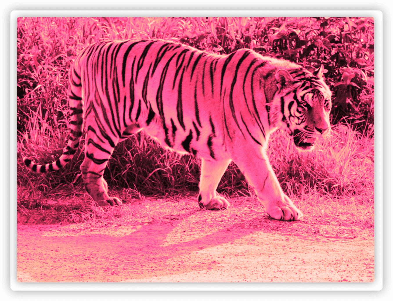
17 染色效果
将图片置成单色或灰色,当hover时显示全色。
基于滤镜的方案
使用多个滤镜组合,先使用sepia()给图片增加一种降饱和度的橙黄色染色效果,再使用saturate()滤镜给每个像素提升饱和度,最后再加上hue-rotate()滤镜,把每个像素的色相以指定的度数进行偏移。
filter: sepia() saturate(4) hue-rotate(295deg);
基于混合模式的方案
使用mix-blend-mode为整个元素设置混合模式,background-blend-mode为每层背景单独指定混合模式。
两种选择
- 需要把图片包裹在一个容器中,并把容器的背景色设置为我们想要的主色调。
- 不用图片元素,而是用
<div>元素,把这个元素的第一层背景设置为要染色的图片,并把第二层的背景设置为我们想要的主色调。
<div style="background-image:url(https://s4.ax1x.com/2021/12/08/ogqKYt.png)" class="tinted-image"></div>
/**
 * Color tinting — with blending modes
 */

.tinted-image {
	width: 640px; height: 440px;
	background-size: cover;
	background-color: hsl(335, 100%, 50%);
	background-blend-mode: luminosity;
	transition: .5s background-color;
}

.tinted-image:hover {
	background-color: transparent;
}
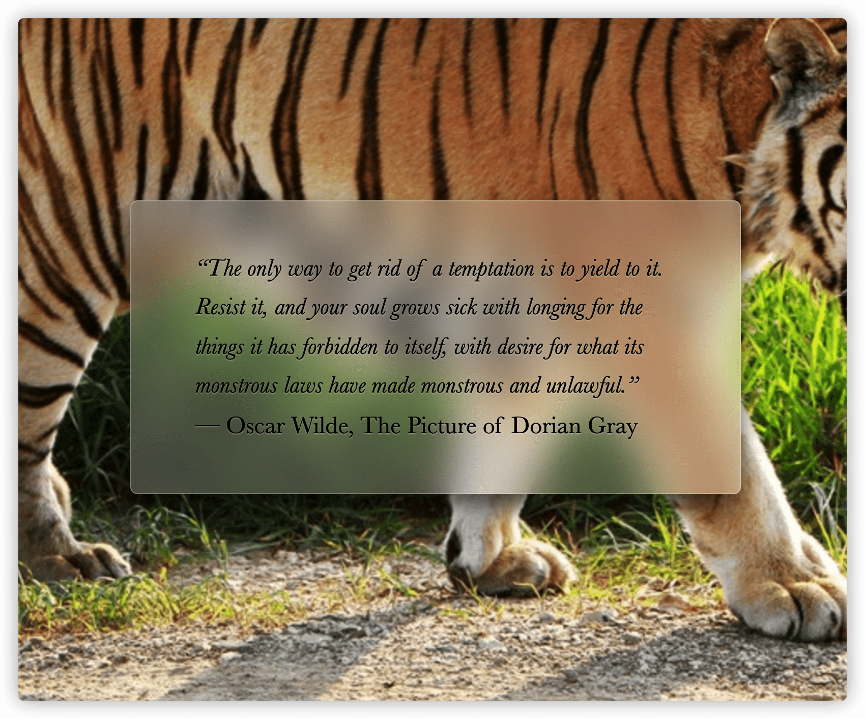
18 毛玻璃效果
解决方案
使用滤镜的blur()属性,对一个伪元素进行处理,然后将其定位到元素的下层,它的背景将会无缝匹配<body>的背景。
<main>
  <blockquote>“The only way to get rid of a temptation is to yield to it. Resist it, and your soul grows sick with longing for the things it has forbidden to itself, with desire for what its monstrous laws have made monstrous and unlawful.”
  <footer>— <cite>Oscar Wilde, The Picture of Dorian Gray</cite></footer>
  </blockquote>
</main>
/**
 * Frosted glass effect
 */

body {
	min-height: 100vh;
	box-sizing: border-box;
	margin: 0;
	padding-top: calc(50vh - 6em);
	font: 150%/1.6 Baskerville, Palatino, serif;
}

body, main::before {
	background: url("https://s4.ax1x.com/2021/12/08/ogqKYt.png") 0 / cover fixed;
}

main {
	position: relative;
	margin: 0 auto;
	padding: 1em;
	max-width: 23em;
	background: hsla(0,0%,100%,.25) border-box;
	overflow: hidden;
	border-radius: .3em;
	box-shadow: 0 0 0 1px hsla(0,0%,100%,.3) inset,
	            0 .5em 1em rgba(0, 0, 0, 0.6);
	text-shadow: 0 1px 1px hsla(0,0%,100%,.3);
}

main::before {
	content: '';
	position: absolute;
	top: 0; right: 0; bottom: 0; left: 0;
	margin: -30px;
	z-index: -1;
	-webkit-filter: blur(20px);
	filter: blur(20px);
}
19 折角效果
45°折角的解决方案
先使用渐变色创建一个斜面切角,然后再使用渐变色增加一个暗色的三角形来实现翻折效果。
/**
 * Folded corner effect
 */

div {
	width: 12em;
	background: #58a; /* Fallback */
	background:
		linear-gradient(to left bottom, transparent 50%, rgba(0,0,0,.4) 0) right top no-repeat,
		linear-gradient(-135deg, transparent 1.4em, #58a 0);
	background-size: 2em 2em, auto;

	padding: 2em;
	color: white;
	font: 100%/1.6 Baskerville, Palatino, serif;
}
其他角度的解决方案
通过正弦、余弦及勾股定理算出边的长度。使用伪元素实现,因为需要用到翻转。
/**
 * Folded corner effect — at an angle
 */

div {
	position: relative;
	width: 12em;
	background: #58a; /* Fallback */
	background: linear-gradient(-150deg, transparent 1.5em, #58a 0);
	padding: 2em;
	color: white;
	font: 100%/1.6 Baskerville, Palatino, serif;
	border-radius: .5em;
}

div::before {
	content: '';
	position: absolute;
	top: 0; right: 0;
	width: 1.73em; height: 3em;
	background: linear-gradient(to left bottom, transparent 50%, rgba(0,0,0,.2) 0, rgba(0,0,0,.4)) 100% 0 no-repeat;
	transform: translateY(-1.3em)  rotate(-30deg);
	transform-origin: bottom right;
	border-bottom-left-radius: .5em;
	box-shadow: -.2em .2em .3em -.1em rgba(0,0,0,.15)
}
/* 使用预处理器实现DRY */
@mixin folded-corner($background, $size, $angle: 30deg) {
  position: relative;
  background: $background; /* Fallback */
  background: linear-gradient($angle - 180deg, transparent $size, $background 0);
  border-radius: .5em;

  $x: $size / sin($angle);
  $y: $size / cos($angle);

  &::before {
      content: '';
      position: absolute;
      top: 0; right: 0;
      background: linear-gradient(to left bottom, transparent 50%, rgba(0,0,0,.2) 0, rgba(0,0,0,.4)) 100% 0 no-repeat;
      width: $y;
      height: $x;
      transform: translateY($y - $x) rotate(2*$angle - 90deg);
      transform-origin: bottom right;
      border-bottom-left-radius: inherit;
      box-shadow: -.2em .2em .3em -.1em rgba(0,0,0,.15);
  }
}
第5章 字体排印
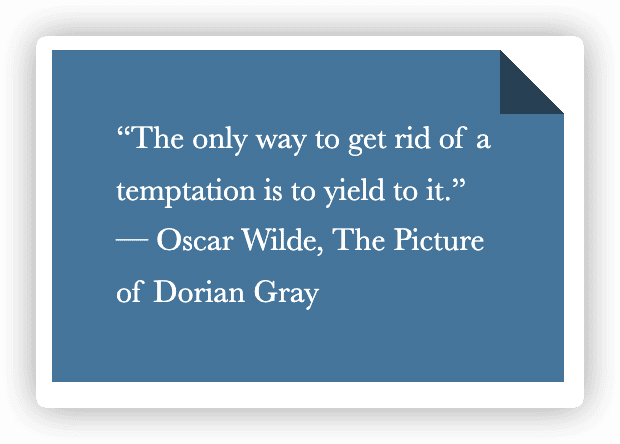
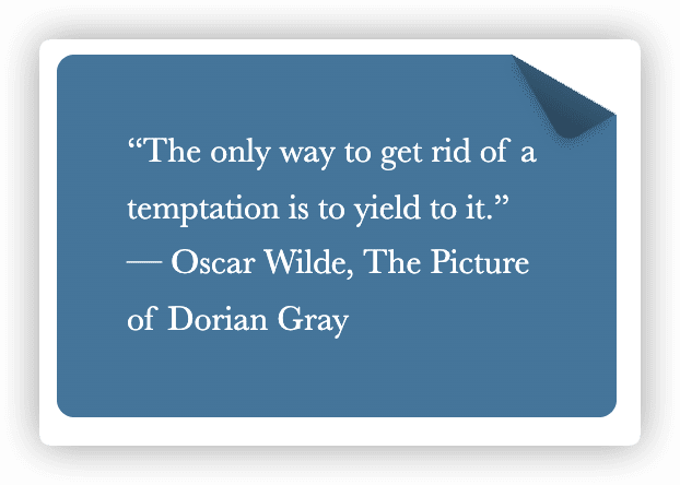
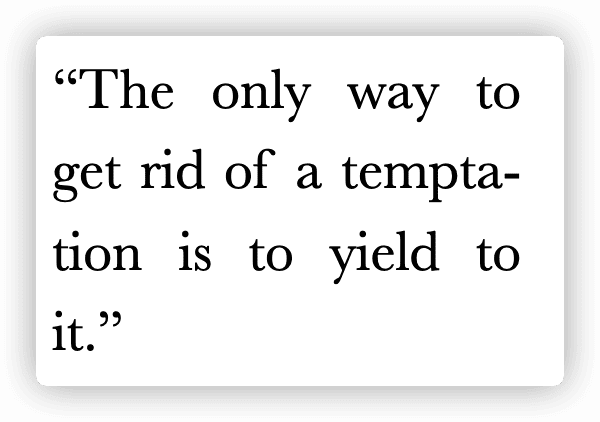
20 连字符断行
解决方案
使用CSS3新提供的hyphens属性实现断词折行效果。
<div lang="en">“The only way to get rid of a temptation is to yield to it.”</div>
/**
 * Hyphenation
 */

width: 8.7em;
font: 180%/1.4 Baskerville, serif;
text-align: justify;
hyphens: auto;
21 插入换行
解决方案
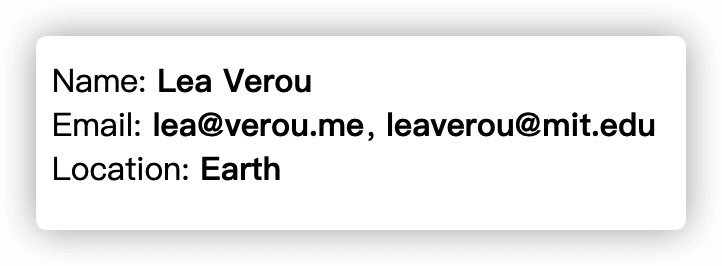
Unicode字符的0x000A代表换行符,在CSS中,这个字符可以写作"\000A"或"\A"。
在dt元素前面使用伪元素添加换行符,再使用white-space: pre去掉空白符。
<dl>
	<dt>Name:</dt>
	<dd>Lea Verou</dd>

	<dt>Email:</dt>
	<dd>lea@verou.me</dd>
	<dd>leaverou@mit.edu</dd>

	<dt>Location:</dt>
	<dd>Earth</dd>
</dl>
/**
 * Inserting line breaks
 */

dt, dd {
	display: inline;
	margin: 0;
}

dd {
	font-weight: 600;
}

dd + dt::before {
	content: '\A';
	white-space: pre;
}

dd + dd::before {
	content: ', ';
	font-weight: normal;
	margin-left: -.25em;
}
22 文本行的斑马条纹
解决方案
使用line-gradient创建条纹背景,背景大小是行高的2倍,因为每个背景贴片需要覆盖两行代码,再通过background-origin设置背景图片跟着内容定位。
pre {
	padding: .5em;
	line-height: 1.5;
	background: hsl(20, 50%, 95%);
	background-image: linear-gradient(
	                  rgba(120,0,0,.1) 50%, transparent 0);
	background-size: auto 3em;
	background-origin: content-box;
	font-family: Consolas, Monaco, monospace;
}

23 调整tab的宽度
难题
在浏览器中使用tab缩进会占用8个字符造成太宽。
解决方案
使用CSS3提供tab-size可以控制tab的缩进尺寸(默认是8)。
tab-size: 4

24 连字
解决方案
通过CSS3的font-variant-ligatures控制连字效果的开关。
font-variant-ligatures默认值为normal,表示在渲染时会使用常用的连字,连字的效果取决于字体,语言和脚本。
body {
	font: 200%/1.6 "Adobe Caslon Pro", Baskerville, serif;
  /* 开启所有可能的连字 */
	font-variant-ligatures: common-ligatures discretionary-ligatures historical-ligatures;
}
25 华丽的&符号
解决方案
font-family的回退机制对单个字符也有效,如果某款字体可用,但仅包括某几个字符,那它就只会用来显示这几个字符,其他字符会回退到其他字体。
如果想要针对本地字体来实现针对某个字符的显示,可以使用unicode-range描述符,它的语法基于Unicode码位,如果我们想要为字符增加斜体,需要找到字体的“PostScript名称”。
/**
 * Fancy Ampersands
 */

@font-face {
	font-family: Ampersand;
	src: local('Baskerville-Italic'), local('GoudyOldStyleT-Italic'), local('Garamond-Italic'), local('Palatino-Italic');
  /* U+加上字符的unicode编码 */
	unicode-range: U+26;
}

h1 {
	font-family: Ampersand, Helvetica, sans-serif;
}

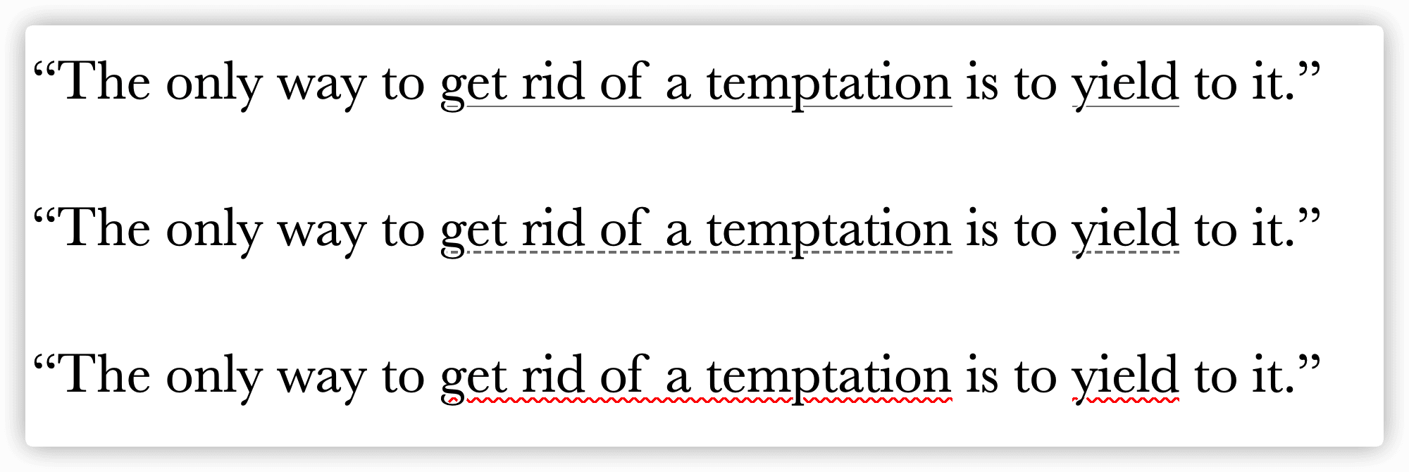
26 自定义下划线
难题
使用CSS的text-decoration: underline定义的文本下划线不支持自定义样式(目前已支持!)。
text-decoration-linetext-decoration-colortext-decoration-style
解决方案
使用background-image配合linear-gradient生成下划线,再使用text-shadow防止下划线穿过字母的降部。
a {
	background: linear-gradient(gray, gray) no-repeat;
	background-size: 100% 1px;
	background-position: 0 1.03em;
	text-shadow: .05em 0 white, -.05em 0 white;
}

p:nth-child(2) a {
	background: linear-gradient(90deg, gray 66%, transparent 0) repeat-x;
	background-size: .2em 2px;
	background-position: 0 1em;
}

p:nth-child(3) a {
	background: linear-gradient(45deg, transparent 40%, red 0, red 60%, transparent 0) 0 1em,
				linear-gradient(-45deg, transparent 40%, red 0, red 60%, transparent 0) .1em 1em;
	background-repeat: repeat-x;
	background-size: .2em .1em;
	text-shadow: .05em 0 white, -.05em 0 white;
}
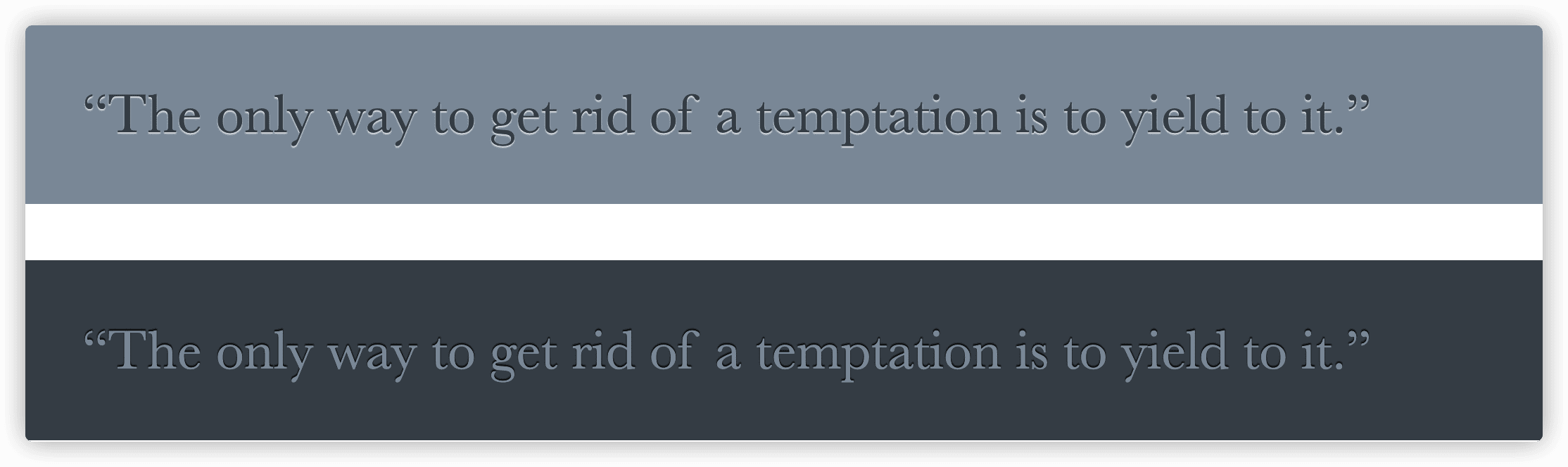
27 现实中的文字效果
凸版印刷效果
在浅色背景上使用深色文字时,文字底部的浅色投影(或者出现在顶部的暗色投影)会让人产生物体是凹进平面内的错觉;而出现在底部的暗色投影(或者出现在顶部的浅色投影)会让人产生物体从平面凸起的错觉。
而深色背景浅色文字下,需要反过来,给文字顶部加深色效果才是凸起的错觉。
p {
	padding: .8em 1em;
	background: hsl(210, 13%, 60%);
	color: hsl(210, 13%, 30%);
	text-shadow: 0 1px 1px hsla(0,0%,100%,.8);
}

p + p {
	background: hsl(210, 13%, 30%);
	color: hsl(210, 13%, 60%);
	text-shadow: 0 -1px 1px black;
}
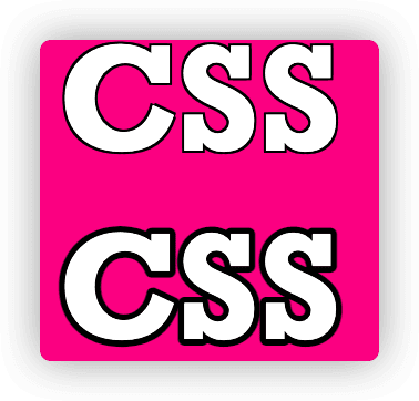
空心字效果
方案一
通过多个text-shadow为这些投影加上不同方向的少量偏移。
h1:first-child { text-shadow: 1px 1px black, -1px -1px black, 1px -1px black, -1px 1px black; }
方案二
通过svg来实现
<h1><svg overflow="visible" width="2em" height="1.2em"><use xlink:href="#css" /><text id="css" y="1em">CSS</text></svg></h1>
h1 text { fill: currentColor }
h1 use {
	stroke: black;
	stroke-width: 6;
	stroke-linejoin: round;
}
文字外发光效果
通过text-shadow重叠几层,不需要考虑偏移和颜色,只需和文字保持一致。
a {
	color: #ffc;
	text-decoration: none;
	transition: 1s;
}

a:hover { text-shadow: 0 0 .1em, 0 0 .3em; }
文字凸起效果
思路是使用一长串累加的投影,不设模糊并以1px的跨度逐渐错开,使颜色逐渐变暗,然后在底部加一层强烈模糊的暗投影。
body {
	background: #58a;
	color: white;
	text-shadow: 0 1px hsl(0,0%,85%),
	             0 2px hsl(0,0%,80%),
	             0 3px hsl(0,0%,75%),
	             0 4px hsl(0,0%,70%),
	             0 5px hsl(0,0%,65%),
	             0 5px 10px black;
	font: bold 500%/1 Rockwell, serif;
}
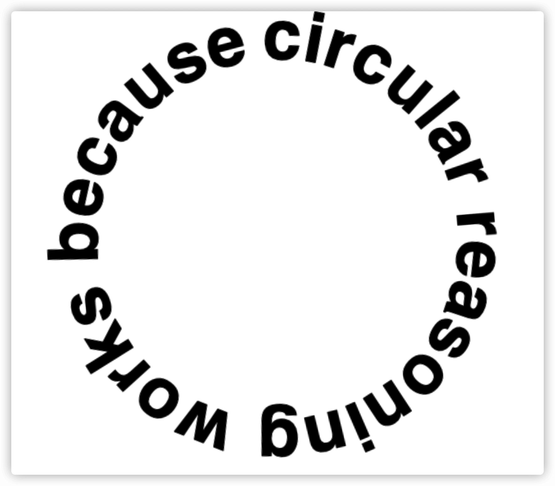
28 环形文字
解决方案
使用内联SVG。
第6章 用户体验
29 选用合适的鼠标光标
难题
桌面应用中鼠标指针的用户体验效果在网页应用中往往被忽视。
解决方案
1.提示禁用状态
如果控件无法交互,应该加上禁用。
:disabled, [disabled], [aria-disabled="true"] {
	cursor: not-allowed;
}
2.隐藏鼠标光标
在不少场景下,比如播放视频时,隐藏鼠标确实能带来可用性的提升。
cursor: none;
30 扩大可点击区域
难题
没有人愿意对一个狭小的按钮尝试点按很多次。
解决方案
通过添加透明边框扩大,然后再通过background-clip把背景限制在内边距内,如果要为按钮添加边框,可以通过box-shadow。
button {
	border: 10px solid transparent;
	background-clip: padding-box;
	box-shadow: 0 0 0 1px rgba(0,0,0,.3) inset;
	cursor: pointer;
}
伪元素同样也可以实现效果。
button {
	position: relative;
	padding: .3em .5em;
	background: #58a;
	border-radius: 50%;
	border: 1px solid rgba(0,0,0,.3);
	box-shadow:  0 .1em .2em -.05em rgba(0,0,0,.5);
	color: white;
	font: bold 150%/1 sans-serif;
	cursor: pointer;
}

button::before {
	content: '';
	position: absolute;
	top: -10px; right: -10px;
	bottom: -10px; left: -10px;
}
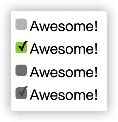
31 自定义复选框
难题
原生复选框和单选框暂时还不支持自定义样式。
解决方案
使用CSS3新提供的:checked伪类,当复选框被选中时触发。当<label>元素与复选框关联之后,也可以起到触发开关的作用,我们可以为它添加生成性内容(伪元素),并基于复选框的状态来为其设置样式,最后通过绝对定位把原复选框隐藏。
<input type="checkbox" id="awesome" autofocus />
<label for="awesome">Awesome!</label>
<br />
<input type="checkbox" id="awesome2" checked />
<label for="awesome2">Awesome!</label>
<br />
<input type="checkbox" id="awesome3" disabled />
<label for="awesome3">Awesome!</label>
<br />
<input type="checkbox" id="awesome4" checked disabled />
<label for="awesome4">Awesome!</label>
	/**
 * Custom checkboxes
 */

input[type="checkbox"] {
	position: absolute;
	clip: rect(0,0,0,0);
}

input[type="checkbox"] + label::before {
	content: '\a0';
	display: inline-block;
	vertical-align: .2em;
	width: .8em;
	height: .8em;
	margin-right: .2em;
	border-radius: .2em;
	background: silver;
	text-indent: .15em;
	line-height: .65;
}

input[type="checkbox"]:checked + label::before {
	content: '\2713';
	background: yellowgreen;
}

input[type="checkbox"]:focus + label::before {
	box-shadow: 0 0 .1em .1em #58a;
}

input[type="checkbox"]:disabled + label::before {
	background: gray;
	box-shadow: none;
	color: #555;
	cursor: not-allowed;
}
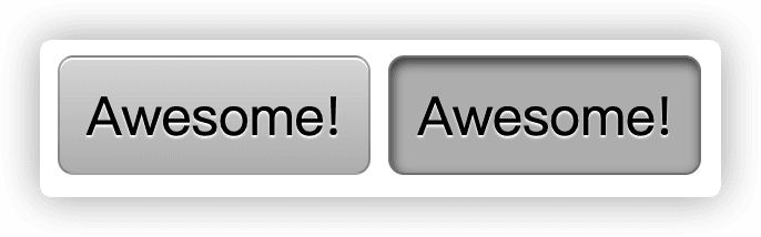
开关式按钮
可以利用“复选框hack”方式来模拟。
<input type="checkbox" id="awesome" autofocus />
<label for="awesome">Awesome!</label>

<input type="checkbox" id="awesome2" checked />
<label for="awesome2">Awesome!</label>
/**
 * Toggle buttons
 */

input[type="checkbox"] {
	position: absolute;
	clip: rect(0,0,0,0);
}

input[type="checkbox"] + label {
	display: inline-block;
	padding: .35em .5em .2em;
	background: #ccc;
	background-image: linear-gradient(#ddd, #bbb);
	border: 1px solid rgba(0,0,0,.2);
	border-radius: .3em;
	box-shadow: 0 1px white inset;
	text-align: center;
	text-shadow: 0 1px 1px white;
	cursor: pointer;
}

input[type="checkbox"]:checked + label,
input[type="checkbox"]:active + label {
	box-shadow: .04em .1em .2em rgba(0,0,0,.6) inset;
	border-color: rgba(0,0,0,.3);
	background: #bbb;
}
32 通过阴影来弱化背景
难题
很多时候,我们需要通过一层半透明的遮罩层来把后面的一切整体调暗,以便凸显某个特定的UI元素。很多做法都是通过添加一个额外的overlay类的元素来用于遮挡。
伪元素方案
可以用伪元素来消除额外的HTML元素。
body.dimmed::before {
  position: fixed;
  top: 0;
  left: 0;
  right: 0;
  bottom: 0;
  z-index: 1;
  background-color: rgba(0, 0, 0, .8);
}
这个方案的缺点是无法对遮罩层的Z轴进行细粒度的控制,也无法在伪元素上绑定独立的事件处理程序。
box-shadow方案
使用box-shadow的扩张参数把元素的投影向各个方向延伸放大,生成一个巨大的投影,不偏移也不模糊。
box-shadow: 0 0 0 50vmax rgba(0, 0, 0, .8);
缺点:
- 当我们滚动页面时,遮罩层的边缘会露出来,除非设置固定定位。
- 遮罩层无法阻止鼠标交互。
backdrop方案
使用<dialog>元素的::backdrop伪元素。
dialog::backdrop {
	background: rgba(0,0,0,.8)
}
缺点:兼容性一般,基本不会使用原生的<dialog>元素。
33 通过模糊来弱化背景
解决方案
把页面除了关键元素之外的一切都包裹起来,然后对这个容器进行模糊处理。
main.de-emphasized {
	filter: blur(3px);
}
34 滚动提示
解决方案
通过CSS提供的background-attachment属性来实现背景阴影的显示与隐藏,从而达到提示用户的作用。原理是通过白色遮罩层盖住黑色阴影的遮罩层。
background: linear-gradient(white 15px, hsla(0,0%,100%,0)) 0 0 / 100% 50px,
            radial-gradient(at top, rgba(0,0,0,.2), transparent 70%) 0 0 / 100% 15px;
background-repeat: no-repeat;
background-attachment: local, scroll;
35 交互式的图片对比控件
CSS resize方案
利用CSS3新增的resize,可以对元素进行大小调整。放两张图片,一张在上层,一张在下层,调整上层图片的尺寸,从而可以进行图片的对比。
.image-slider > div {
	position: absolute;
	top: 0; bottom: 0; left: 0;
	width: 50%;
	max-width: 100%;
	overflow: hidden;
	resize: horizontal;
}
范围输入控件方案
使用input: range控件来控制上层图片的伸缩。
暂时不推荐使用此方案,因为每个浏览器的范围控件渲染的样式不统一。
第7章 结构与布局
36 自适应内部元素
难题
让元素的宽度由内部因素决定。
解决方案
使用CSS3新提供的为width和height属性定义新的关键字min-content,这个关键字将解析为这个容器内部最大的不可断行元素的宽度。
div {
  width: min-content;
  margin: auto
}
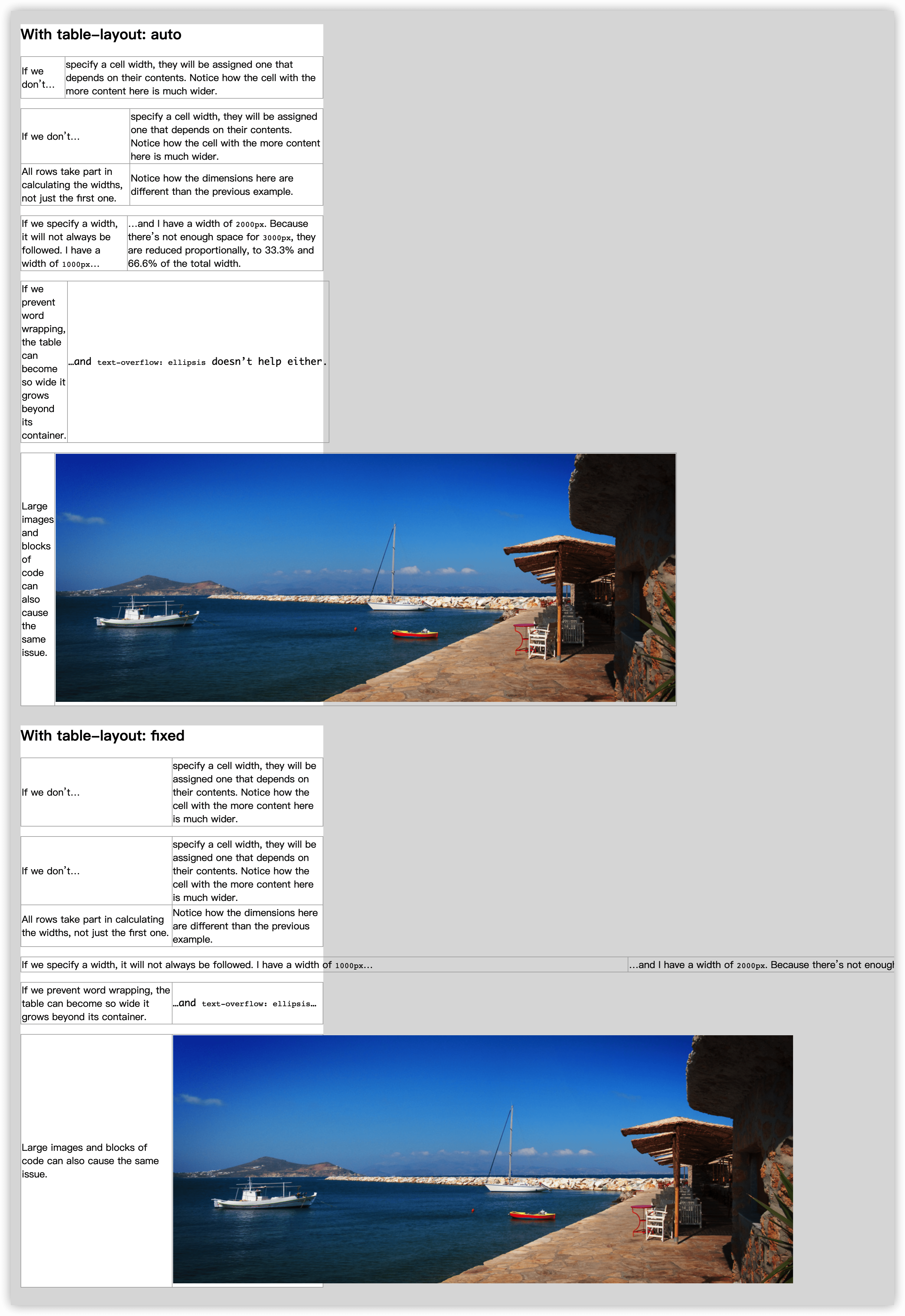
37 精确控制表格列宽
难题
表格布局效果的不可预测性。
解决方案
table-layout属性默认值为auto,行为模式是自动表格布局算法,不过它接收另一个值fixed,简称固定表格布局算法,这个值的行为就是将更多的控制权交给开发者,我们设置的样式也会直接起作用,表格的内容并不会影响单元格的宽度。
38 根据兄弟元素的数量来设置样式
难题
根据兄弟元素的总数来为它们设置样式。
解决方案
伪类:only-child等效于:first-child:last-child,相当于
li:first-child:nth-last-child(1) {}
所以选中一个正好有四个列表项的列表中的第一个列表项和它之后的所有兄弟元素相当于
li:first-child:nth-last-child(4), li:first-child:nth-last-child(4) ~ li {}
可以利用预处理器
@mixin n-items($n) {
  &:first-child:nth-last-child(#{$n}),
  &:first-child:nth-last-child(#{$n}) ~ &{
    @content;
  }
}

li {
  @include n-items(4) {
    /* 属性写这里 */
  }
}
根据兄弟元素的数量范围来匹配元素
在nth-child中使用n+b的形式表达式来选中第b个开始的所有子元素。
li:first-child:nth-last-child(n+4),
li:first-child:nth-last-child(n+4) ~ li {
  /* 当列表至少包含四项时,命中所有列表项 */
}
li:first-child:nth-last-child(-n+4),
li:first-child:nth-last-child(-n+4) ~ li {
  /* 当列表至多包含四项时,命中所有列表项 */
}
li:first-child:nth-last-child(n+2):nth-last-child(-n+6),
li:first-child:nth-last-child(n+2):nth-last-child(-n+6) ~ li {
  /* 当列表包含2~6项时,命中所有列表项 */
}
39 满幅的背景,定宽的内容
难题
背景宽度满幅,内容宽度固定
解决方案
通过CSS3新提供的calc函数来替代margin: auto。
padding: 1em calc(50% - 350px);
40 垂直居中
基于绝对定位的解决方案
	position: absolute;
	top: 50%;
	left: 50%;
	transform: translate(-50%, -50%);
基于视口单位的解决方案
margin: 50vh auto 0;
transform: translateY(-50%);
它只适用于在视口中居中的场景。
基于Flexbox的解决方案
display: flex;
align-items: center;
41 紧贴底部的页脚
难题
页脚不能像我们期望中那样“紧贴”在视口的最底部,而是紧跟在内容的下方。
固定高度的解决方案
通过计算页脚的高度,让页脚“固定”到底部。
更灵活的解决方案
body {
	display: flex;
	flex-direction: column;
	min-height: 100vh;
}

main {
	flex: 1;
}
第8章 过渡与动画
42 缓动效果
难题
回弹效果可以用在尺寸变化和角度变化。
弹跳动画
动画曲线:ease-in、ease-out、ease-in-out和linear。
cubic-bezier(x1, y1, x2, y2)函数,允许我们指定自定义的调速曲线。
弹跳动画是一个在下落时先慢后快,在上升时先快后慢的过程。
弹性过渡
在使用过渡而不使用动画的情况下,通过cubic-bezier(x1, y1, x2, y2)函数在垂直方向上突破0~1区间,从而让过渡达到低于0或高于100%的程序。
input:not(:focus) + .callout:not(:hover) {
	transform: scale(0);
	transition: .25s transform;
}

.callout {
	transition: .5s cubic-bezier(.25,.1,.3,1.5) transform;
	transform-origin: 1.4em -.4em;
}
43 逐帧动画
解决方案
使用step()调速函数实现逐帧动画。
animation: loader 1s infinite steps(8);
44 闪烁效果
解决方案
实现文字的平滑闪烁。
@keyframes blink-2 { to { color: transparent; } }

.blink-smooth-2 {
  animation: .5s blink-2 infinite;
  animation-direction: alternate;
}
45 打字动画
难题
一段文本中的字符逐个显现,模拟出一种打字的效果。
解决方案
为文字添加动画,动画从width: 0开始,逐步显示每个字符,steps()需要根据字符的长度来填写,width使用ch单位,1ch表示一个“0”的宽度,在等宽字体中,每个字符的宽度都相等,最后使用另外一个动画来显示字符的光标闪烁。
@keyframes typing {
	from { width: 0 }
}

@keyframes caret {
	50% { border-right-color: transparent; }
}

h1 {
	font: bold 200% Consolas, Monaco, monospace;
	/*width: 8.25em;*/
	width: 15ch;
	white-space: nowrap;
	overflow: hidden;
	border-right: .05em solid;
	animation: typing 8s steps(15),
	           caret 1s steps(1) infinite;
}
46 状态平滑的动画
解决方案
使用animation-play-state实现动画的暂停和播放。
@keyframes panoramic {
	to { background-position: 100% 0; }
}

.panoramic {
	width: 150px; height: 150px;
	background: url('http://c3.staticflickr.com/3/2671/3904743709_74bc76d5ac_b.jpg');
	background-size: auto 100%;
	animation: panoramic 10s linear infinite alternate;
	animation-play-state: paused;
}

.panoramic:hover, .panoramic:focus {
	animation-play-state: running;
}
47 沿环形路径平移的动画
难题
使用css实现头像围绕着一个圆转动。
需要两个元素的解决方案
通过使用两个元素,外层应用旋转动画,而内层应用反方向来抵消,从而达到一个内层静态的效果。
@keyframes spin {
	to { transform: rotate(1turn); }
}

.avatar {
	animation: spin 3s infinite linear;
	transform-origin: 50% 150px;
}

.avatar > img {
	animation: inherit;
	animation-direction: reverse;
}
单个元素的解决方案
transform-origin只是一个语法糖,每个transform-origin都可以被两个translate()模拟出来。
transform: rotate(30deg);
transform-origin: 200px 300px;

/* 等价于 */
transform: translate(200px, 300px) rotate(30deg) translate(-200px, -300px);
transform-origin: 0 0;
由于变形函数并不是彼此独立的,每个变形函数并不是只对这个元素进行变形,而且会把整个元素的坐标系统进行变形。
@keyframes spin {
  from {
    transform: rotate(0turn)
      translateY(-150px) translateY(50%)
      rotate(1turn)
  }
  to {
    transform: rotate(1turn)
      translateY(-150px) translateY(50%)
      rotate(0turn);
  }
}

.avatar {
  animation: spin 3s infinite linear;
}


 扫一扫
扫一扫


 775
775

 被折叠的 条评论
为什么被折叠?
被折叠的 条评论
为什么被折叠?
 到【灌水乐园】发言


