


将数据库数据提取出来,显示成曲线图(饼状、柱状或立体图)是项目中最常见的需求。 网上搜索到的解决方法,大多归为两类,一种是利用ActiveX组件,另一种是使用.net框架自带的画图的类。前者开发比较方便,但浏览时需要用户下载ActiveX插件(而这个往往是忌讳的,插件带毒)。后者,需要你自己写绘图、生成图片的类库,不过在开源社区已有不少的项目针对这个问题,做出了实现。ZedGraph是其中之一,网上的评论大多如是说:使用方便,易上手。
ZedGraph是c#编写的类库,提供了用户控件和web控件。官网的例子提供了在windows窗体上显示图片的源码,而如何将它应用到web项目中,却没有任何介绍(或许是我没找到),web控件才是项目中有价值的东东。一番搜索后,搂到了一些实现,确实!它已经封装到相当优秀的程度,举个例子:
我们在画曲线图的时候,往往为如何设计X、Y轴的坐标而头疼,如何设置它数值范围、设置单元间距等,才能让我们的数据显示得尽量完整和精确。而它的设计是,只要你提供数据,X/Y轴的问题不用管——它会找出数据范围,然后设置合理的显示域和单元间距。下面是一个简单的实现,将数据库数据生成一张曲线图和柱状图,如此它便可以被这样的方式,显示到页面上:
 <
body
>
<
img
src
="Pic.aspx"
>
</
body
>
<
body
>
<
img
src
="Pic.aspx"
>
</
body
>
首先,你需要将两个dll引用至你的工程,ZedGraph.dll和ZedGraph.web.dll。接下来,是你要生成图片的页面,暂且命名为pic.aspx,将它的html标签部分去掉,添加ZEDGRAPHWEB控件:
Inherits = " Herbalife.HelpDesk.UI.ReportManage.PurchaseReport.PriceTimePic " %>
<% @ Register TagPrefix = " zgw " Namespace = " ZedGraph.Web " Assembly = " ZedGraph.Web " %>
< ZGW:ZEDGRAPHWEB id ="ZG" runat ="server" width ="500" Height ="375" RenderMode ="RawImage" />
然后,我们到pic.aspx.cs下,添加包引用:using ZedGraph; using ZedGraph.Web;,添加控件对象的声明:protected ZedGraph.Web.ZedGraphWeb ZG;。接下来在InitializeComponent()方法中注册一个事件:
this .ZG.RenderGraph += new ZedGraph.Web.ZedGraphWebControlEventHandler( this .OnRenderGraph);
下面便是绘图方法了:
{
GraphPane myPane = masterPane[ 0 ];
// Title
myPane.Title.Text = " 供应商 价格-时间曲线图 " ;
myPane.XAxis.Title.Text = " 时间 " ;
myPane.YAxis.Title.Text = " 价格 " ;
// 坐标对集合
PointPairList line = new PointPairList();
// 取数据部分
DataTable dt = GetData();
// 将数据转为(X,Y)坐标对
for ( int i = 0 ;i < dt.Rows.Count;i ++ )
{
/*
* 添加坐标对,需要将X/Y值全部转为double类型。原本以为他们会支持DateTime类型。
* 个人觉得还是很有必要的,毕竟很多图都是时间-**曲线图,有需求。
*/
string date = Convert.ToDateTime(dt.Rows[i][ " RecTime " ]).ToString( " yyyyMMdd " );
line.Add(Convert.ToDouble(date), Convert.ToDouble(dt.Rows[i][ " Price " ]));
}
// 绘制曲线
LineItem li = myPane.AddCurve( " aaa " ,line, Color.Blue);
masterPane.AxisChange(g);
}
效果图如下:
CSDN的图片上传貌似有问题,后面博客的图片会覆盖前面博客的图片。
由于日期类型转换成double型,结果X轴还是比较难看的。目前正在研究它的类库,应该可以更改的。
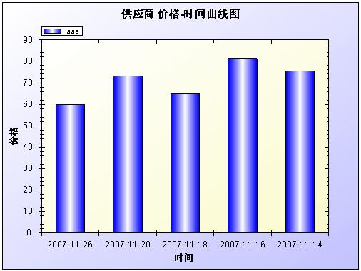
饼状图,则需要修改OnRenderGraph方法:
{
GraphPane myPane = masterPane[ 0 ];
// Title
myPane.Title.Text = " 供应商 价格-时间曲线图 " ;
myPane.XAxis.Title.Text = " 时间 " ;
myPane.YAxis.Title.Text = " 价格 " ;
// 坐标对集
PointPairList line = new PointPairList();
DataTable dt = GetData();
for ( int i = 0 ;i < dt.Rows.Count;i ++ )
{
string date = Convert.ToDateTime(dt.Rows[i][ " RecTime " ]).ToString( " yyyyMMdd " );
line.Add(Convert.ToDouble(date), Convert.ToDouble(dt.Rows[i][ " Price " ]));
}
BarItem myCurve = myPane.AddBar( " aaa " , line, Color.Blue);
myCurve.Bar.Fill = new Fill(Color.Blue, Color.White, Color.Blue);
myPane.XAxis.MajorTic.IsBetweenLabels = true ;
// X轴Label
string [] labels = new string [dt.Rows.Count];
for ( int i = 0 ;i < dt.Rows.Count;i ++ )
ls[i] = Convert.ToDateTime(dt.Rows[i][ " RecTime " ]).ToString( " yyyy/MM/dd " );
myPane.XAxis.Scale.TextLabels = labels;
myPane.XAxis.Type = AxisType.Text;
// 颜色填充
myPane.Fill = new Fill(Color.White, Color.FromArgb( 200 , 200 , 255 ), 45.0f );
myPane.Chart.Fill = new Fill(Color.White, Color.LightGoldenrodYellow, 45.0f );
masterPane.AxisChange(g);
}
效果图:


 2917
2917


 被折叠的 条评论
为什么被折叠?
被折叠的 条评论
为什么被折叠?
 到【灌水乐园】发言


