


经由慕课网相关课程学习总结
二、《网页布局基础》
一、基础概念
- W3C标准:由万维网联盟制定的一系列标准:包括:
结构化标准语言(HTML和XML);
表现标准语言(CSS);
行为标准语言(DOM和ECMAScript)。
倡导结构,样式,行为分离。
CSS中的定位机制:
- 标准文档流(Normal flow):从上到下,从左到右,输出文档内容,由块级元素(从左到右撑满页面,独占一行;触碰到页面边缘时,会自动换行。常见块级元素:div、lu、li、d、dt、p……)和行级元素(能在同一行内显示,不会改变HTML文档结构。常见行级元素:span、strong、img、input……)组成。
- 浮动(Floats):
- 绝对定位(Absolute positioning):
盒子模型:网页布局的基石,有四部分组成:
边框(border)、外边距(margin)、内边距(padding)、盒子中的内容(content)。如下图:
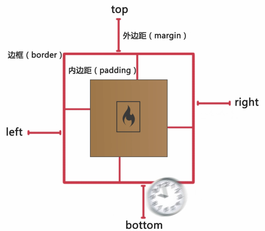
盒子的尺寸=边框+外边距+内边距+盒子中的内容尺寸
注:块级元素和行级元素都是盒子模型。
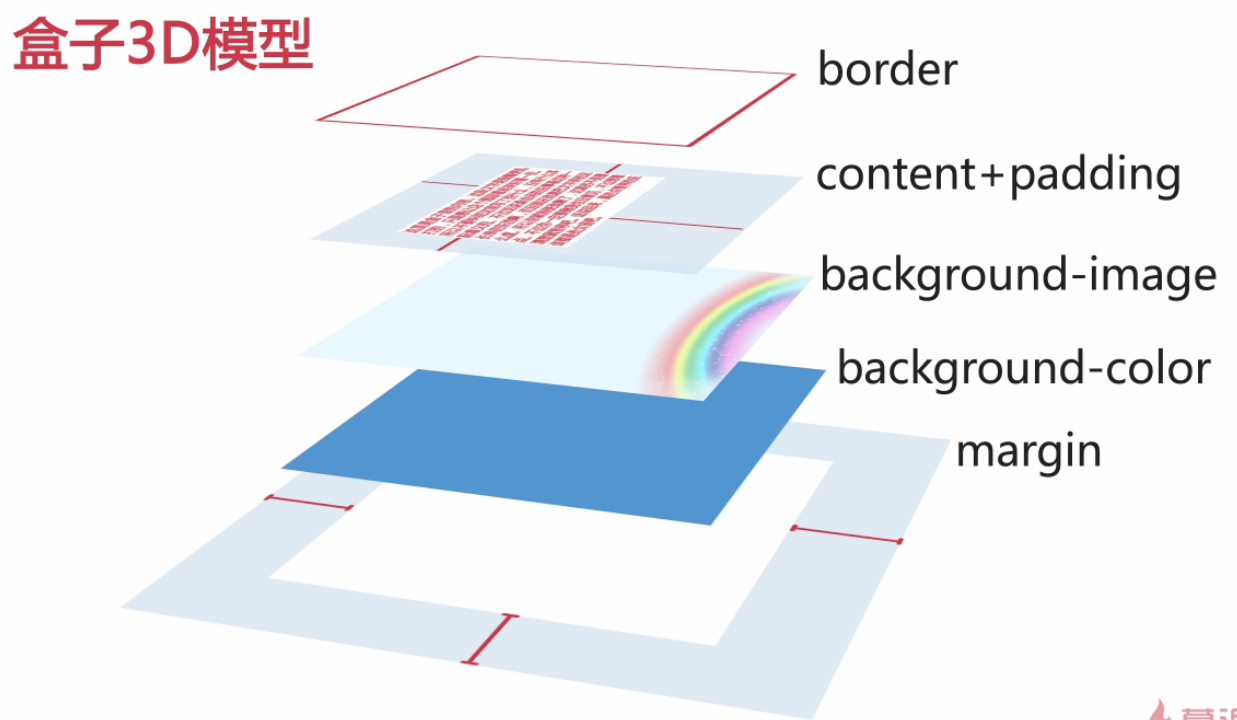
盒子3D模型:
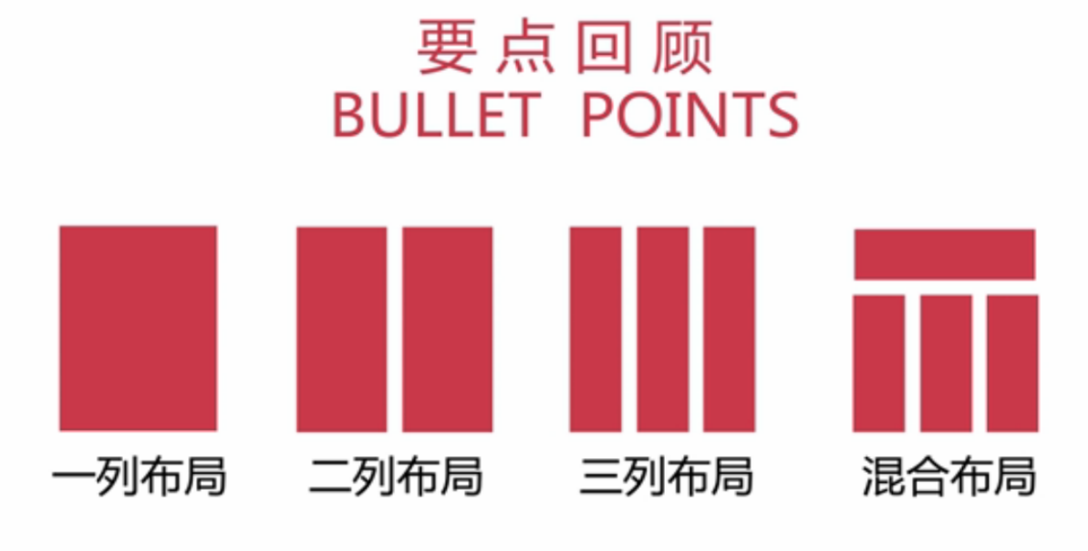
- 常见页面布局及解决方案:
二、自动居中一列布局
关键词:标准文档流,块级元素,margin属性
自动居中一列布局需要设置margin左右值为auto,而且一定要设置宽度为一个定值。
auto会根据浏览器的宽度自动地设置两边的外边距
如果想让页面自动居中,当设置margin属性为auto的时候,不能再设置浮动和绝对定位属性
代码示例:
一列布局固定:
<!DOCTYPE html PUBLIC "-//W3C//DTD XHTML 1.0 Transitional//EN" "http://www.w3.org/TR/xhtml1/DTD/xhtml1-transitional.dtd">
<html xmlns="http://www.w3.org/1999/xhtml">
<head>
<meta http-equiv="Content-Type" content="text/html; charset=utf-8" />
<title>一列布局</title>
<style>
    body{ margin:0; padding:0; font-size:30px}
    div{ text-align:center; font-weight:bold}
    .head, .main, .footer{ width:960px; margin:0 auto} /*margin属性及具体的宽度*/
    .head{ height:100px; background:#ccc}
    .main{ height:600px; background:#FCC}
    .footer{ height:50px; background:#9CF}
</style>
</head>

<body>
    <div class="head">head</div>
    <div class="main">main</div>
    <div class="footer">footer</div>
</body>
</html>DEMO:http://Lovejulyer.github.io/Source_Code/Blog_demo/Codes2/yilieguding.html
一列布局自适应:
<!DOCTYPE html PUBLIC "-//W3C//DTD XHTML 1.0 Transitional//EN" "http://www.w3.org/TR/xhtml1/DTD/xhtml1-transitional.dtd">
<html xmlns="http://www.w3.org/1999/xhtml">
<head>
<meta http-equiv="Content-Type" content="text/html; charset=utf-8" />
<title>一列布局</title>
<style>
    body{ margin:0; padding:0; font-size:30px; font-weight:bold}
    div{ text-align:center; line-height:50px}
    .head, .main, .footer{
    width:80%;margin:0 auto} /*margin属性及定宽为百分比*/
    .head{ height:100px; background:#ccc}
    .main{ height:600px; background:#FCC}
    .footer{ height:50px; background:#9CF}
</style>
</head>

<body>
    <div class="head">head</div>
    <div class="main">main</div>
    <div class="footer">footer</div>
</body>
</html>DEMO:http://Lovejulyer.github.io/Source_Code/Blog_demo/Codes2/yiliezishiying.html
三、横向两列布局
浮动布局:CSS中规定的第二种定位机制;能够实现横向多列布局;通过设置float属性实现。
float属性:left | right | none
特点:元素会左移,或右移,直至触碰到容器为止。
注:设置了浮动的元素,仍旧处于文档流中。当元素没用设置宽度值。若设置了浮动属性,元素的宽度随内容的变化而变化。当元素设置浮动属性后,会对相邻的元素产生影响,相邻元素特指相邻后面的元素。
清除浮动的方法:
clear属性——常用clear:both;clear:left;或者clear:right;同时设置width:100%(或固定宽度)+overflow:hidden;
横向两列布局是网页布局最常见的方式之一
主要应用技能:
float属性——使纵向排列的块级元素,横向排列
margin属性——设置两列之间的间距
注:(1)当父包含块缩成一条时,用clear:both方法清除浮动无效,它一般用于紧邻后面的元素的清除浮动。
(2)div块的高度一般不需要设置。
代码示例
两列居中固定
<!DOCTYPE html PUBLIC "-//W3C//DTD XHTML 1.0 Transitional//EN" "http://www.w3.org/TR/xhtml1/DTD/xhtml1-transitional.dtd">
<html xmlns="http://www.w3.org/1999/xhtml">
<head>
<meta http-equiv="Content-Type" content="text/html; charset=utf-8" />
<title>二列布局</title>
 最低0.47元/天 解锁文章


 1776
1776


 被折叠的 条评论
为什么被折叠?
被折叠的 条评论
为什么被折叠?
 到【灌水乐园】发言


