


css动画-animation
一、构成
animation: name duration timing-function delay iteration-count direction fill-mode;
- name: 动画名字(绑定keyframes名称)
- duration: 动画完成所花费时间
- timing-function: 动画的速度曲线
- delay: 动画开始前的延迟时间
- interation-count: 动画播放次数
- direction: 是否轮流反向播放动画
- fill-mode: 填充模式
1.1、name
需要绑定一个动画规则: keyframes。例:
.item {
	animation-name: changeColor;
}
@keyframes changeColor {
	0% {
		color: #fff;
	}
	100% {
		color: #f5f5f5;
	}
}
1.2、duration
动画完成所花费时间,默认为0,当为0时动画不生效,以秒(s)或毫秒(ms)计数
**注意:**当数值为0时,也要加上单位
1.3、timing-function
| 值 | 描述 |
|---|---|
| lineat | 从头到尾速度相同 |
| ease | 默认。动画以低速开始,然后逐渐加快,在结束前 变慢 |
| ease-in | 动画以低速开始 |
| ease-out | 动画以低速结束 |
| ease-in-out | 动画以低速开始何结束 |
| cubic-bezier(n,n,n,n) | 在 cubic-bezier 函数中自己的值。可能的值是从 0 到 1 的数值。 |
除了上述官方的默认值外,还可以使用steps,把动画效果分成特定的几桢
animation-timimg-function: steps(number, end); // steps(number, start)
- steps(number, end) 以动画初始状态为第一桢
- steps(number, start) 以动画第一次执行效果为第一帧
- 当动画只分成两桢时,使用step-end, step-start
1.4、delay
默认为0,即刻生效,以秒(s)或毫秒(ms)计数。生效允许负值,-2s 使动画马上开始,但跳过 2 秒进入动画。
**注意:**当数值为0时,也要加上单位
1.5、iteration-count
| 值 | 描述 |
|---|---|
| n | 动画播放次数 |
| infinite | 动画无线循环播放 |
1.6、direction
| 值 | 描述 |
|---|---|
| normal | 动画正常播放 |
| alternate | 动画轮流反向播放 |
1.7、fill-mode
| 值 | 描述 |
|---|---|
| none | 不改变默认行为 |
| forwards | 当动画完成后,保持最后一个属性值(在最后一个关键帧中定义) |
| backwards | 在 animation-delay 所指定的一段时间内,在动画显示之前,应用开始属性值(在第一个关键帧中定义) |
| both | 向前和向后填充模式都被应用。 |
二、实例
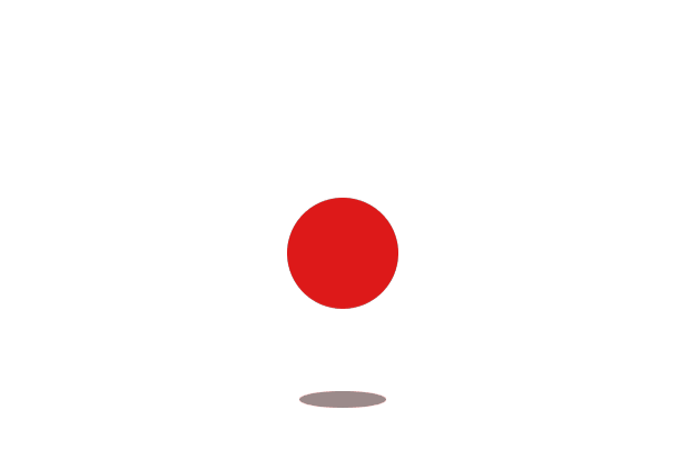
2.1 跳动的小球
效果:
html:
<div class="mian">
    <div class="ball"></div>
    <div class="shadow"></div>
</div>
css:
 .mian {
     width: 100vw;
     height: 100vh;
     display: flex;
     align-items: center;
     justify-content: center;
}
.ball {
    width: 100px;
    height: 100px;
    background: #dd1919;
    border-radius: 50%;
    animation: debounce 2s ease 0s infinite alternate none;
}
.shadow {
    width: 100px;
    height: 20px;
    background-color: #5d4141;
    position: absolute;
    transform: translateY(50px);
    z-index: -1;
    border-radius: 50%;
    opacity: 1;
    animation: shadow 2s ease 0s infinite alternate none;
}
@keyframes debounce {
    to {
        transform: translateY(-200px);
    }
}
@keyframes shadow {
    to {
        opacity: 0.1;
        width: 50px;
        height: 10px;
    }
}


 3941
3941


 被折叠的 条评论
为什么被折叠?
被折叠的 条评论
为什么被折叠?
 到【灌水乐园】发言


