


一、选中显示下划线
1. style
 <Style x:Key="UnderlineRadioButton" TargetType="RadioButton">
        <Setter Property="Width" Value="50"/>
        <Setter Property="Height" Value="30"/>
        <Setter Property="Cursor" Value="Hand"/>
        <Setter Property="Template">
            <Setter.Value>
                <ControlTemplate TargetType="RadioButton">
                    <Border Background="Transparent" Width="{TemplateBinding Width}" Height="{TemplateBinding Height}">
                        <StackPanel>
                            <Border Background="{TemplateBinding Background}" CornerRadius="10" Width="{TemplateBinding Width}" Height="20">
                                <ContentPresenter x:Name="contentPresenter" RecognizesAccessKey="True" VerticalAlignment="Center" HorizontalAlignment="Center" SnapsToDevicePixels="{TemplateBinding SnapsToDevicePixels}"/>
                            </Border>
                            <Line X1="0" Y1="0" X2="{TemplateBinding Width}" Y2="0" Margin="0,5" x:Name="line1" Stroke="{TemplateBinding Foreground}" StrokeThickness="1"/>
                        </StackPanel>
                    </Border>
                    <ControlTemplate.Triggers>
                        <Trigger Property="IsChecked" Value="True">
                            <Setter TargetName="line1" Property="Visibility" Value="Visible"/>
                        </Trigger>
                        <Trigger Property="IsChecked" Value="False">
                            <Setter TargetName="line1" Property="Visibility" Value="Collapsed"/>
                        </Trigger>
                    </ControlTemplate.Triggers>
                </ControlTemplate>
            </Setter.Value>
        </Setter>
        <Style.Triggers>
            <Trigger Property="IsChecked" Value="True">
                <Setter Property="Opacity" Value="0.8"/>
            </Trigger>
        </Style.Triggers>
    </Style>
2.demo
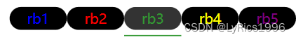
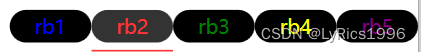
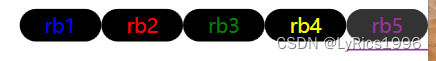
 <WrapPanel Margin="0,10">
    <RadioButton Content="rb1"  Style="{StaticResource UnderlineRadioButton}"  Background="Black" Foreground="Blue"/>
    <RadioButton Content="rb2"  Style="{StaticResource UnderlineRadioButton}"  Background="Black" Foreground="Red"/>
    <RadioButton Content="rb3"  Style="{StaticResource UnderlineRadioButton}"  Background="Black" Foreground="Green"/>
    <RadioButton Content="rb4"  Style="{StaticResource UnderlineRadioButton}"  Background="Black" Foreground="Yellow"/>
    <RadioButton Content="rb5"  Style="{StaticResource UnderlineRadioButton}"  Background="Black" Foreground="Purple"/>
</WrapPanel>
3.效果
二、带图标的单选按钮
1. RadioButton2
using System;
using System.Collections.Generic;
using System.Linq;
using System.Text;
using System.Threading.Tasks;
using System.Windows.Controls;
using System.Windows.Media;
using System.Windows;

namespace lyrics.ui.Controls.ButtonCustom
{
    internal class RadioButton2 : RadioButton
    {
        static RadioButton2()
        {
            DefaultStyleKeyProperty.OverrideMetadata(typeof(RadioButton2), new FrameworkPropertyMetadata(typeof(RadioButton2)));
        }

        #region Icon
        public static readonly DependencyProperty IconProperty =
            DependencyProperty.Register("Icon", typeof(Geometry), typeof(RadioButton2), new PropertyMetadata(default(Geometry)));

        public Geometry Icon
        {
            get => (Geometry)GetValue(IconProperty);
            set => SetValue(IconProperty, value);
        }
        public static readonly DependencyProperty Icon2Property =
    DependencyProperty.Register("Icon2", typeof(Geometry), typeof(RadioButton2), new PropertyMetadata(default(Geometry)));

        public Geometry Icon2
        {
            get => (Geometry)GetValue(Icon2Property);
            set => SetValue(Icon2Property, value);
        }
        public static readonly DependencyProperty IconWidthProperty =
    DependencyProperty.Register("IconWidth", typeof(double), typeof(RadioButton2), new PropertyMetadata(default(double)));

        public double IconWidth
        {
            get => (double)GetValue(IconWidthProperty);
            set => SetValue(IconWidthProperty, value);
        }

        public static readonly DependencyProperty IconHeightProperty =
DependencyProperty.Register("IconHeight", typeof(double), typeof(RadioButton2), new PropertyMetadata(default(double)));

        public double IconHeight
        {
            get => (double)GetValue(IconHeightProperty);
            set => SetValue(IconHeightProperty, value);
        }
        #endregion
    }
}
2. Style
  <Style x:Key="IconRadioButton" TargetType="cbtn:RadioButton2">
        <Setter Property="Template">
            <Setter.Value>
                <ControlTemplate TargetType="cbtn:RadioButton2">
                    <Border Background="{TemplateBinding Background}" CornerRadius="10">
                        <StackPanel Orientation="Horizontal">
                            <Path x:Name="icon1" Data="{TemplateBinding Icon}" Width="{TemplateBinding IconWidth}" Height="{TemplateBinding IconHeight}" Fill="{TemplateBinding Foreground}" Stroke="{TemplateBinding Foreground}" StrokeThickness="1" SnapsToDevicePixels="True" Stretch="Uniform"/>
                            <Path x:Name="icon2" Data="{TemplateBinding Icon2}" Width="{TemplateBinding IconWidth}" Height="{TemplateBinding IconHeight}" Fill="{TemplateBinding Foreground}"  Stroke="{TemplateBinding Foreground}" StrokeThickness="1" SnapsToDevicePixels="True" Stretch="Uniform"/>
                            <TextBlock x:Name="tb" Text="{TemplateBinding Name}" Background="{TemplateBinding Background}" Foreground="{TemplateBinding Foreground}" VerticalAlignment="Center"/>
                            <ContentPresenter x:Name="contentPresenter" RecognizesAccessKey="True" VerticalAlignment="Center" SnapsToDevicePixels="{TemplateBinding SnapsToDevicePixels}"/>
                        </StackPanel>
                    </Border>
                    <ControlTemplate.Triggers>
                        <Trigger Property="IsChecked" Value="True">
                            <Setter TargetName="icon1" Property="Visibility" Value="Collapsed"/>
                            <Setter TargetName="icon2" Property="Visibility" Value="Visible"/>
                            <Setter TargetName="tb" Property="Visibility" Value="Collapsed"/>
                            <Setter TargetName="contentPresenter" Property="Visibility" Value="Visible"/>
                        </Trigger>
                        <Trigger Property="IsChecked" Value="False">
                            <Setter TargetName="icon1" Property="Visibility" Value="Visible"/>
                            <Setter TargetName="icon2" Property="Visibility" Value="Collapsed"/>
                            <Setter TargetName="tb" Property="Visibility" Value="Visible"/>
                            <Setter TargetName="contentPresenter" Property="Visibility" Value="Collapsed"/>
                        </Trigger>
                    </ControlTemplate.Triggers>
                </ControlTemplate>
            </Setter.Value>
        </Setter>
        <Style.Triggers>
            <Trigger Property="IsChecked" Value="True">
                <Setter Property="Opacity" Value="0.4"/>
            </Trigger>
        </Style.Triggers>
    </Style>
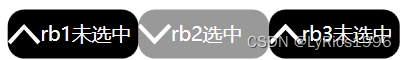
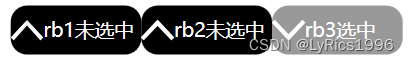
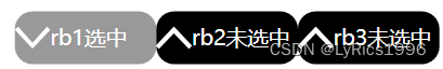
3. Demo
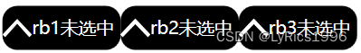
  <cbtn:RadioButton2 Content="rb1选中" x:Name="rb1未选中" Width="80" Height="30" Background="Black" Foreground="White" Style="{StaticResource IconRadioButton}"
                                     Icon="{StaticResource UpGeometry}" Icon2="{StaticResource DownGeometry}" IconWidth="20" IconHeight="20"/>
                    <cbtn:RadioButton2 Content="rb2选中" x:Name="rb2未选中" Width="80" Height="30" Background="Black" Foreground="White" Style="{StaticResource IconRadioButton}"
                                     Icon="{StaticResource UpGeometry}" Icon2="{StaticResource DownGeometry}" IconWidth="20" IconHeight="20"/>
                    <cbtn:RadioButton2 Content="rb3选中" x:Name="rb3未选中" Width="80" Height="30" Background="Black" Foreground="White" Style="{StaticResource IconRadioButton}"
                                     Icon="{StaticResource UpGeometry}" Icon2="{StaticResource DownGeometry}" IconWidth="20" IconHeight="20"/>
4.效果


 2348
2348


 被折叠的 条评论
为什么被折叠?
被折叠的 条评论
为什么被折叠?
 到【灌水乐园】发言


