葡萄酒质量和时间关系

import numpy as np 
import matplotlib.pyplot as plt
from sklearn.linear_model import LinearRegression
from sklearn.model_selection import train_test_split
# 载入数据
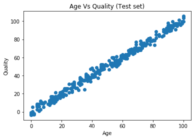
data = np.genfromtxt('linear.csv', delimiter=',')
# 画图
plt.scatter(data[1:,0],data[1:,1])
plt.title('Age Vs Quality (Test set)')
plt.xlabel('Age')
plt.ylabel('Quality')
plt.show()

# 数据拆分
x_train, x_test, y_train, y_test = train_test_split(data[1:, 0], data[1:, 1], test_size = 0.3)
# 1D->2D,给数据增加一个维度,主要是训练模型的时候,函数要求传入2维的数据
x_train = x_train[:, np.newaxis]
x_test = x_test[:, np.newaxis]
# 训练模型
model = LinearRegression()
model.fit(x_train, y_train)
LinearRegression(copy_X=True, fit_intercept=True, n_jobs=None,
         normalize=False)
# 训练集的散点图
plt.scatter(x_train, y_train, color = 'b')
# 模型对训练集的预测结果
plt.plot(x_train,model.predict(x_train), color ='r' , linewidth=5)
# 画表头和xy坐标描述
plt.title('Age Vs Quality (Training set)')
plt.xlabel('Age')
plt.ylabel('Quality')
plt.show()

# 测试集的散点图
plt.scatter(x_test, y_test, color = 'b')
# 模型对测试集的预测结果
plt.plot(x_test,model.predict(x_test), color ='r', linewidth=5)
# 画表头和xy坐标描述
plt.title('Age Vs Quality (Test set)')
plt.xlabel('Age')
plt.ylabel('Quality')
plt.show()

在这里插入图片描述


  • 0
    点赞
  • 2
    收藏
    觉得还不错? 一键收藏
  • 打赏
    打赏
  • 0
    评论

“相关推荐”对你有帮助么?

  • 非常没帮助
  • 没帮助
  • 一般
  • 有帮助
  • 非常有帮助
提交
评论
添加红包

请填写红包祝福语或标题

红包个数最小为10个

红包金额最低5元

当前余额3.43前往充值 >
需支付:10.00
成就一亿技术人!
领取后你会自动成为博主和红包主的粉丝 规则
hope_wisdom
发出的红包

打赏作者

Mrrunsen

你的鼓励将是我创作的最大动力

¥1 ¥2 ¥4 ¥6 ¥10 ¥20
扫码支付:¥1
获取中
扫码支付

您的余额不足,请更换扫码支付或充值

打赏作者

实付
使用余额支付
点击重新获取
扫码支付
钱包余额 0

抵扣说明:

1.余额是钱包充值的虚拟货币,按照1:1的比例进行支付金额的抵扣。
2.余额无法直接购买下载,可以购买VIP、付费专栏及课程。

余额充值