


reshipping from https://www.analyticsvidhya.com/blog/2016/02/7-important-model-evaluation-error-metrics/
Introduction
Predictive Modeling works on constructive feedback principle. You build a model. Get feedback from metrics, make improvements and continue until you achieve a desirable accuracy. Evaluation metrics explain the performance of a model. An important aspects of evaluation metrics is their capability to discriminate among model results.
Many ingenuous analyst, don’t even check model accuracy. Once they are finished building a model, they hurriedly map predicted values on unseen data. This is an incorrect approach.
Simply, building a predictive model is not your motive. But, creating and selecting a model which gives high accuracy on out of sample data. Hence, it is crucial to check accuracy of the model prior to computing predicted values.
In our industry, we consider different kinds of metrics to evaluate our models. The choice of metric completely depends on the type of model and the implementation plan of the model. After you are finished building your model, these 7 metrics will help you in evaluating your model accuracy. Considering the rising popularity of cross – validation, I’ve also mentioned its principles in this article.

Table of Contents
- Confusion Matrix
- Gain and Lift Chart
- Kolmogorov Smirnov Chart
- AUC – ROC
- Gini Coefficient
- Concordant – Discordant Ratio
- Root Mean Squared Error
- Cross Validation (Not a metric though!)

Warming up: Types of Predictive models
When we talk about predictive models, we are talking either about a regression model (continuous output) or a classification model (nominal or binary output). The evaluation metrics used in each of these models are different.
In classification problems, we use two types of algorithms (dependent on the kind of output it creates):
- Class output : Algorithms like SVM and KNN create a class output. For instance, in a binary classification problem, the outputs will be either 0 or 1. However, today we have algorithms which can convert these class outputs to probability. But these algorithms are not well accepted by the statistics community.
- Probability output : Algorithms like Logistic Regression, Random Forest, Gradient Boosting, Adaboost etc. give probability outputs. Converting probability outputs to class output is just a matter of creating a threshold probability.
In regression problems, we do not have such inconsistencies in output. The output is always continuous in nature and requires no further treatment.
Illustrative Example
For classification model evaluation metric discussion, I have used my predictions for the problem BCI challenge on Kaggle (link) . The solution of the problem is irrelevant for the discussion, however the final predictions on the training set has been used for this article. The predictions made for this problem were probability outputs which have been converted to class outputs assuming a threshold of 0.5 .
1. Confusion Matrix
A confusion matrix is an N X N matrix, where N is the number of classes being predicted. For the problem in hand, we have N=2, and hence we get a 2 X 2 matrix. Here are a few definitions, you need to remember for a confusion matrix :
- Accuracy : the proportion of the total number of predictions that were correct.
- Positive Predictive Value or Precision : the proportion of positive cases that were correctly identified.
- Negative Predictive Value : the proportion of negative cases that were correctly identified.
- Sensitivity or Recall : the proportion of actual positive cases which are correctly identified.
- Specificity : the proportion of actual negative cases which are correctly identified.
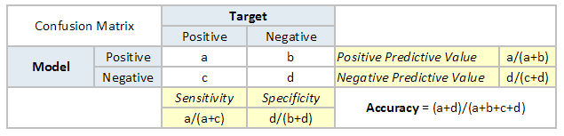

The accuracy for the problem in hand comes out to be 88%. As you can see from the above two tables, the Positive predictive Value is high, but negative predictive value is quite low. Same holds for Senstivity and Specificity. This is primarily driven by the threshold value we have chosen. If we decrease our threshold value, the two pairs of starkly different numbers will come closer.
In general we are concerned with one of the above defined metric. For instance, in a pharmaceutical company, they will be more concerned with minimal wrong positive diagnosis. Hence, they will be more concerned about high Specificity. On the other hand an attrition model will be more concerned with Senstivity.Confusion matrix are generally used only with class output models.
2. Gain and Lift charts
Gain and Lift chart are mainly concerned to check the rank ordering of the probabilities. Here are the steps to build a Lift/Gain chart:
Step 1 : Calculate probability for each observation
Step 2 : Rank these probabilities in decreasing order.
Step 3 : Build deciles with each group having almost 10% of the observations.
Step 4 : Calculate the response rate at each deciles for Good (Responders) ,Bad (Non-responders) and total.
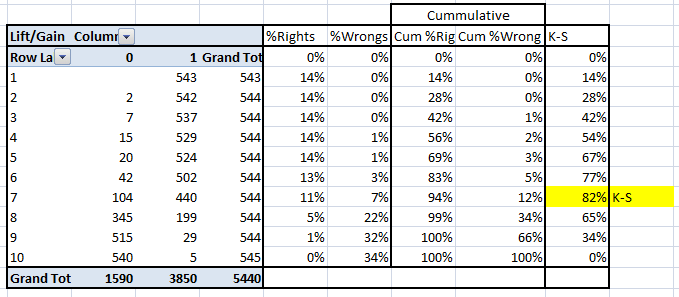
You will get following table from which you need to plot Gain/Lift charts:
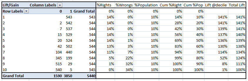
This is a very informative table. Cumulative Gain chart is the graph between Cumulative %Right and Cummulative %Population. For the case in hand here is the graph :
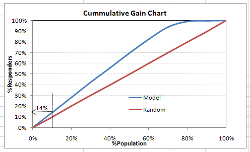
This graph tells you how well is your model segregating responders from non-responders. For example, the first decile however has 10% of the population, has 14% of responders. This means we have a 140% lift at first decile.
What is the maximum lift we could have reached in first decile? From the first table of this article, we know that the total number of responders are 3850. Also the first decile will contains 543 observations. Hence, the maximum lift at first decile could have been 543/3850 ~ 14.1%. Hence, we are quite close to perfection with this model.
Let’s now plot the lift curve. Lift curve is the plot between total lift and %population. Note that for a random model, this always stays flat at 100%. Here is the plot for the case in hand :
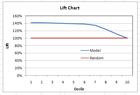
You can also plot decile wise lift with decile number :
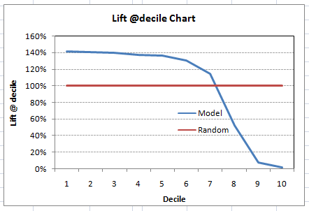
What does this graph tell you? It tells you that our model does well till the 7th decile. Post which every decile will be skewed towards non-responders. Any model with lift @ decile above 100% till minimum 3rd decile and maximum 7th decile is a good model. Else you might consider over sampling first.
Lift / Gain charts are widely used in campaign targeting problems. This tells us till which decile can we target customers for an specific campaign. Also, it tells you how much response do you expect from the new target base.
3. Kolomogorov Smirnov chart
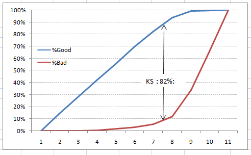
K-S or Kolmogorov-Smirnov chart measures performance of classification models. More accurately, K-S is a measure of the degree of separation between the positive and negative distributions. The K-S is 100, if the scores partition the population into two separate groups in which one group contains all the positives and the other all the negatives.
On the other hand, If the model cannot differentiate between positives and negatives, then it is as if the model selects cases randomly from the population. The K-S would be 0. In most classification models the K-S will fall between 0 and 100, and that the higher the value the better the model is at separating the positive from negative cases.
For the case in hand, following is the table :
We can also plot the %Cumulative Good and Bad to see the maximum separation. Following is a sample plot :
The metrics covered till here are mostly used in classification problems. Till here, we learnt about confusion matrix, lift and gain chart and kolmogorov-smirnov chart. Let’s proceed and learn few more important metrics.
4. Area Under the ROC curve (AUC – ROC)
This is again one of the popular metrics used in the industry. The biggest advantage of using ROC curve is that it is independent of the change in proportion of responders. This statement will get clearer in the following sections.
Let’s first try to understand what is ROC (Receiver operating characteristic) curve. If we look at the confusion matrix below, we observe that for a probabilistic model, we get different value for each metric.
Hence, for each sensitivity, we get a different specificity.The two vary as follows:
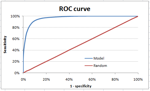
The ROC curve is the plot between sensitivity and (1- specificity). (1- specificity) is also known as false positive rate and sensitivity is also known as True Positive rate. Following is the ROC curve for the case in hand.
Let’s take an example of threshold = 0.5 (refer to confusion matrix). Here is the confusion matrix :
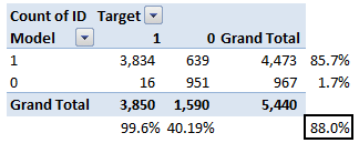
As you can see, the sensitivity at this threshold is 99.6% and the (1-specificity) is ~60%. This coordinate becomes on point in our ROC curve. To bring this curve down to a single number, we find the area under this curve (AUC).
Note that the area of entire square is 1*1 = 1. Hence AUC itself is the ratio under the curve and the total area. For the case in hand, we get AUC ROC as 96.4%. Following are a few thumb rules:
- .90-1 = excellent (A)
- .80-.90 = good (B)
- .70-.80 = fair (C)
- .60-.70 = poor (D)
- .50-.60 = fail (F)
We see that we fall under the excellent band for the current model. But this might simply be over-fitting. In such cases it becomes very important to to in-time and out-of-time validations.
Points to Remember:
1. For a model which gives class as output, will be represented as a single point in ROC plot.
2. Such models cannot be compared with each other as the judgement needs to be taken on a single metric and not using multiple metrics. For instance, model with parameters (0.2,0.8) and model with parameter (0.8,0.2) can be coming out of the same model, hence these metrics should not be directly compared.
3. In case of probabilistic model, we were fortunate enough to get a single number which was AUC-ROC. But still, we need to look at the entire curve to make conclusive decisions. It is also possible that one model performs better in some region and other performs better in other.
Advantages of using ROC
Why should you use ROC and not metrics like lift curve?
Lift is dependent on total response rate of the population. Hence, if the response rate of the population changes, the same model will give a different lift chart. A solution to this concern can be true lift chart (finding the ratio of lift and perfect model lift at each decile). But such ratio rarely makes sense for the business.
ROC curve on the other hand is almost independent of the response rate. This is because it has the two axis coming out from columnar calculations of confusion matrix. The numerator and denominator of both x and y axis will change on similar scale in case of response rate shift.
5. Gini Coefficient
Gini coefficient is sometimes used in classification problems. Gini coefficient can be straigh away derived from the AUC ROC number. Gini is nothing but ratio between area between the ROC curve and the diagnol line & the area of the above triangle. Following is the formulae used :
Gini = 2*AUC – 1
Gini above 60% is a good model. For the case in hand we get Gini as 92.7%.
6. Concordant – Discordant ratio
This is again one of the most important metric for any classification predictions problem. To understand this let’s assume we have 3 students who have some likelihood to pass this year. Following are our predictions :
A – 0.9
B – 0.5
C – 0.3
Now picture this. if we were to fetch pairs of two from these three student, how many pairs will we have? We will have 3 pairs : AB , BC, CA. Now, after the year ends we saw that A and C passed this year while B failed. No, we choose all the pairs where we will find one responder and other non-responder. How many such pairs do we have?
We have two pairs AB and BC. Now for each of the 2 pairs, the concordant pair is where the probability of responder was higher than non-responder. Whereas discordant pair is where the vice-versa holds true. In case both the probabilities were equal, we say its a tie. Let’s see what happens in our case :
AB – Concordant
BC – Discordant
Hence, we have 50% of concordant cases in this example. Concordant ratio of more than 60% is considered to be a good model. This metric generally is not used when deciding how many customer to target etc. It is primarily used to access the model’s predictive power. For decisions like how many to target are again taken by KS / Lift charts.
7. Root Mean Squared Error (RMSE)
RMSE is the most popular evaluation metric used in regression problems. It follows an assumption that error are unbiased and follow a normal distribution. Here are the key points to consider on RMSE:
- The power of ‘square root’ empowers this metric to show large number deviations.
- The ‘squared’ nature of this metric helps to deliver more robust results which prevents cancelling the positive and negative error values. In other words, this metric aptly displays the plausible magnitude of error term.
- It avoids the use of absolute error values which is highly undesirable in mathematical calculations.
- When we have more samples, reconstructing the error distribution using RMSE is considered to be more reliable.
- RMSE is highly affected by outlier values. Hence, make sure you’ve removed outliers from your data set prior to using this metric.
- As compared to mean absolute error, RMSE gives higher weightage and punishes large errors.
RMSE metric is given by:
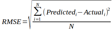
where, N is Total Number of Observations.
Beyond these 7 metrics, there is another method to check the model performance. These 7 methods are statistically prominent in data science. But, with arrival of machine learning, we are now blessed with more robut methods of model selection. Yes! I’m talking about Cross Validation.
Though, cross validation isn’t a really a evaluation metric which is used openly to communicate model accuracy. But, the result of cross validation provides good enough intuitive result to generalize the performance of a model.
Let’s now understand cross validation in detail.


 2196
2196

 被折叠的 条评论
为什么被折叠?
被折叠的 条评论
为什么被折叠?
 到【灌水乐园】发言


