


本文介绍3个plotly非常实用的高级操作范例:
1,绘制时间序列设置滑块;
2,绘制地图设置高德底图;
3,使用dash构建交互面板;
公众号后台回复关键词:plotly,获取本文jupyter notebook 源代码~
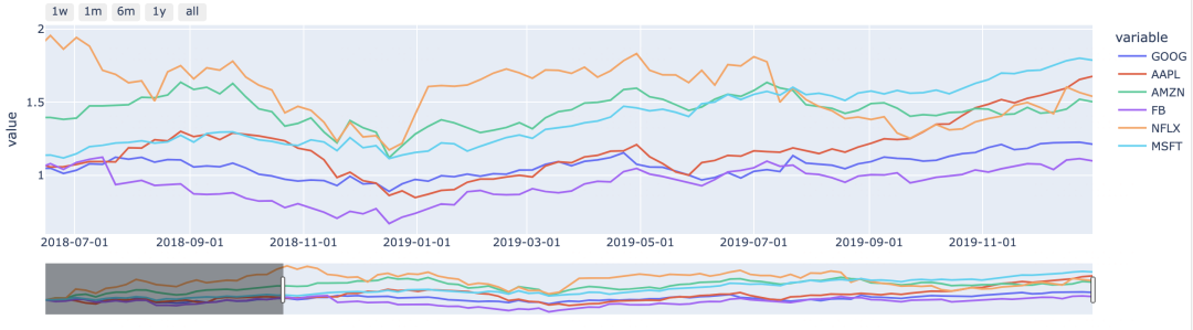
一,绘制时间序列设置滑块
可以使用一个滑块来选择绘图时间范围。
import plotly.express as px
dfdata = px.data.stocks()

fig = px.line(data_frame=dfdata, x = 'date',y = ['GOOG', 'AAPL', 'AMZN', 'FB', 'NFLX', 'MSFT'])
fig.update_xaxes(dtick="M2",tickformat="%Y-%m-%d",rangeslider=dict(visible=True),
             rangeselector={'buttons': [{'count': 7,
               'label': '1w',
               'step': 'day',
               'stepmode': 'backward'},
              {'count': 1, 'label': '1m', 'step': 'month', 'stepmode': 'backward'},
              {'count': 6, 'label': '6m', 'step': 'month', 'stepmode': 'backward'},
              {'count': 1, 'label': '1y', 'step': 'year', 'stepmode': 'backward'},
              {'step': 'all'}]}
            )
fig.update_layout(#autosize=True,
    #width=1000,
    #height=600,
    margin=dict(
        r=0, t=0, l=0, b=0, pad=0)
    )
fig.show()
fig.write_html('test.html')
效果如下:
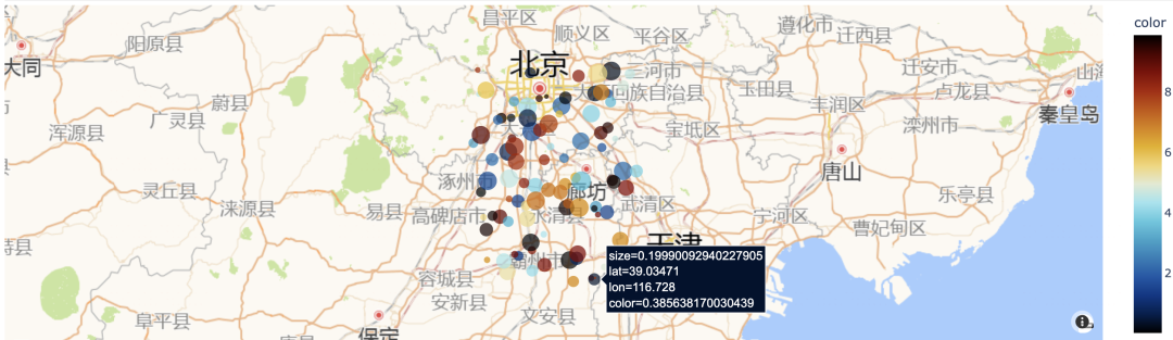
二,绘制地图设置高德底图
plotly绘制地图可以使用高德底图。
import plotly.express as px
dfdata = pd.DataFrame({'lat': 39 + np.random.rand(100),
                        'lon': 116+np.random.rand(100),
                       'color': 10*np.random.rand(100),
                       'size': 0.5*np.random.rand(100),
                      })

fig = px.scatter_mapbox(dfdata, lat="lat",
                        lon="lon", color="color",
                        size="size",
                        color_continuous_scale=px.colors.cyclical.IceFire,
                        size_max=15, zoom=10
                       )
basemap_layer = [
    dict(
        below="traces",
        sourcetype="raster",
        sourceattribution="高德地图",
        source=[
            "http://wprd01.is.autonavi.com/appmaptile?x={x}&y={y}&z={z}&lang=zh_cn&size=1&scl=1&style=7"
        ]
    )
]

fig.update_mapboxes(style='white-bg',zoom=7,layers=basemap_layer)
fig.update_layout(margin=dict(r=0, t=0, l=0, b=0, pad=0))
fig.show()
效果如下:
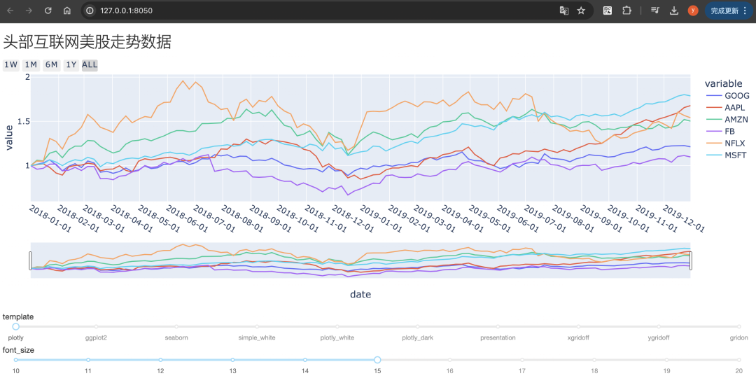
三,使用dash构建交互面板
使用plotly的dash可以让做出非常丰富的前端交互效果。
详情参考:https://dash.plotly.com/
import dash
from dash import Dash, dcc, html, Input, Output
import plotly.express as px


external_stylesheets = ['https://codepen.io/chriddyp/pen/bWLwgP.css']

template_list = ['plotly','ggplot2', 'seaborn', 'simple_white',
         'plotly_white', 'plotly_dark', 'presentation', 'xgridoff',
         'ygridoff', 'gridon']

# 1,生成示例数据
dfdata = px.data.stocks()


# 2, 创建Dash app
app = Dash(__name__,external_stylesheets=external_stylesheets)

# 3, 设计页面布局
app.layout = html.Div([
    html.H3(children='头部互联网美股走势数据'),
    dcc.Graph(id='stock-plot'),
    html.Br(),
    html.Label('template'),
    dcc.Slider(
        id='template',
        min=0,
        max=len(template_list)-1,
        value=0,
        marks={i: template_list[i] for i in range(len(template_list))},
        step=1
    ),
    html.Label('font_size'),
    dcc.Slider(
        id='font_size',
        min=10,
        max=20,
        value=15,
        marks={i: str(i) for i in range(10,21)},
        step=1
    )

])

# 4, 编写回调函数
@app.callback(
    Output(component_id='stock-plot', component_property='figure'),
    [Input(component_id='template',  component_property='value'),
     Input(component_id='font_size', component_property='value')
    ]
)
def update_figure(template,font_size):
    fig = px.line(data_frame=dfdata, x = 'date',y = ['GOOG', 'AAPL', 'AMZN', 'FB', 'NFLX', 'MSFT'])
    fig.update_xaxes(dtick="M1",tickformat="%Y-%m-%d",rangeslider=dict(visible=True),
                 rangeselector={'buttons': [{'count': 7,
                   'label': '1w',
                   'step': 'day',
                   'stepmode': 'backward'},
                  {'count': 1, 'label': '1m', 'step': 'month', 'stepmode': 'backward'},
                  {'count': 6, 'label': '6m', 'step': 'month', 'stepmode': 'backward'},
                  {'count': 1, 'label': '1y', 'step': 'year', 'stepmode': 'backward'},
                  {'step': 'all'}]}
                )
    fig.layout.template = template_list[template]
    fig.update_layout(autosize=True,
        #width=1000,
        #height=600,
        margin=dict(
            r=0, t=0, l=0, b=0, pad=0)
        )
    fig.update_layout({"font.size":font_size})
    return fig


# 5, 运行交互页面
if __name__ == '__main__':
    app.run_server(debug=True)
    #app.run(jupyter_mode="tab") #'inline', 'external', 'jupyterlab', 'tab'
运行上述代码,会弹出一个可以交互的网页,效果如下:
猜你喜欢:


 327
327

 被折叠的 条评论
为什么被折叠?
被折叠的 条评论
为什么被折叠?
 到【灌水乐园】发言


