


如何使用flex布局?
设置父容器为display:fiex,如 :
<!DOCTYPE html>
<html>
<head>
<style>
.f1{
width: 500px;
border: 2px solid #aaaaaa;
}
.f2,
.f3,
.f4{
width: 200px;
height: 200px;
background-color: blueviolet;
}
.f3{
background-color: yellowgreen;
}
.f1{
display: flex; <!--这里!-->
}
</style>
</head>
<body>
<div class="f1">
<div class="f2"></div>
<div class="f3"></div>
<div class="f4"></div>
<div class="f3"></div>
<div class="f4"></div>
<div class="f3"></div>
</div>
</body>
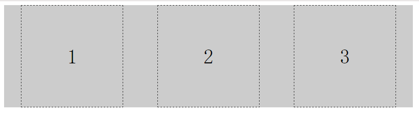
</html>运行效果 :

flex布局特性
当父元素装不下子元素时,子元素会被缩放。(如上面的例子)不管我增加多少个子元素,都能在一行内展示。
设置子元素不缩放
使用flex-shrink属性,可以设置子元素不缩放。如 :
<!DOCTYPE html>
<html>
<head>
<style>
.f1{
width: 500px;
border: 2px solid #aaaaaa;
}
.f2,
.f3,
.f4{
width: 200px;
height: 200px;
background-color: blueviolet;
flex-shrink: 0; <!--0为不缩放,1为缩放。默认值是1-->
}
.f3{
background-color: yellowgreen;
}
.f1{
display: flex;
}
</style>
</head>
<body>
<div class="f1">
<div class="f2"></div>
<div class="f3"></div>
<div class="f4"></div>
<div class="f3"></div>
<div class="f4"></div>
<div class="f3"></div>
</div>
</body>
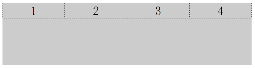
</html>子元素在主轴的排列方式 (主轴 : x轴、水平方向)
子元素在主轴的排列方式有4种,分别是 :
row:从左向右 (默认这个~~)

row-reverse从右往左:从右往左
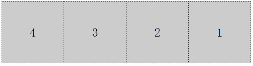
column:从上往下

column-reverse:从下往上

下面我们以子元素“从右往左”排列举一个例子 :
<!DOCTYPE html>
<html>
<head>
    <style>
        .f1{
            width: 800px;
            height: 200px;
            background-color: #cccccc;
            display: flex;
            flex-direction:row-reverse; <!--子元素从右往左排列-->
        }
        .item{
            width: 200px;
            height: 200px;
            border: 1px dashed #333333;
            box-sizing: border-box;
            font-size: 40px;
            text-align: center;
            line-height: 200px;
        }
    </style>
</head>
<body>
   <div class="f1">
       <div class="item">1</div>
       <div class="item">2</div>
       <div class="item">3</div>
       <div class="item">4</div>
   </div>
</body>
</html>
子元素在主轴上的对其方式
子元素在主轴上对其方式有5种,分别是 :
flex-start:靠近起点
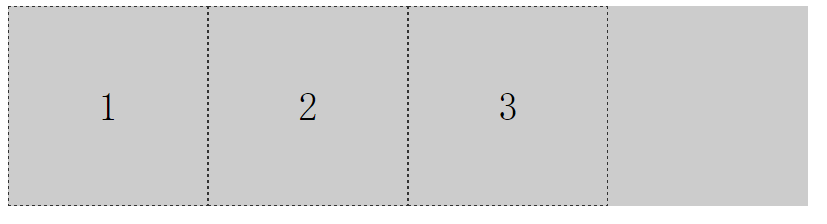
center :居中
flex-end :靠近终点
space-between : 两端对齐

space-around : 每个子元素两侧的间隔都相等
例子 :
<!DOCTYPE html>
<html>
<head>
<style>
.f1{
width: 800px;
background-color: #cccccc;
display: flex;
flex-direction: row;
justify-content: space-between; <!--两端对齐-->
}
.item{
width: 200px;
height: 200px;
border: 1px dashed #333333;
box-sizing: border-box;
font-size: 40px;
text-align: center;
line-height: 200px;
}
</style>
</head>
<body>
<div class="f1">
<div class="item">1</div>
<div class="item">2</div>
<div class="item">3</div>
</div>
</body>
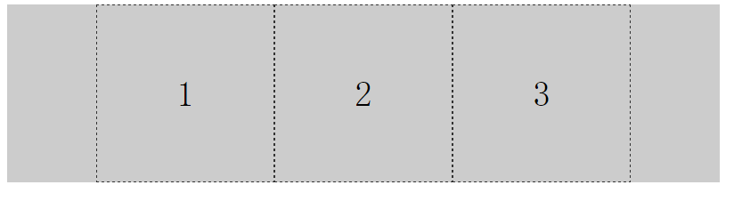
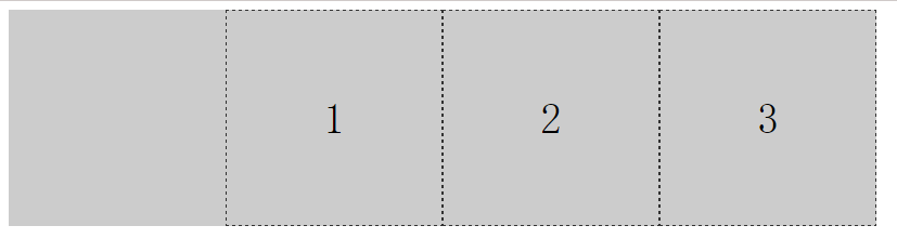
</html>子元素在交叉轴的对其方式 (交叉轴:y轴、竖直方向)
子元素在交叉轴的对其方式有3种,分别是 :
flex-start:起点 (默认是这个~~)
center:居中

flex-end:终点

下面我们以子元素“居中”对其举一个例子 :
<!DOCTYPE html>
<html>
<head>
    <style>
        .f1{
            width: 800px;
            height: 200px;
            background-color: #cccccc;
            display: flex;
            align-items: center;  <!--子元素居中对其-->
        }
        .item{
            width: 200px;
            height: 50px;
            border: 1px dashed #333333;
            box-sizing: border-box;
            font-size: 40px;
            text-align: center;
            line-height: 50px;
        }
    </style>
</head>
<body>
   <div class="f1">
       <div class="item">1</div>
       <div class="item">2</div>
       <div class="item">3</div>
       <div class="item">4</div>
   </div>
</body>
</html>
子元素换行方式
当子元素超出父元素的宽度时,默认是不换行的,子元素各个会被缩放。这里可以使用flex-wrap属性,设置子元素如何换行。
flex-wrap有2个值,分别是 :
wrap:最后一个元素会被挤下来
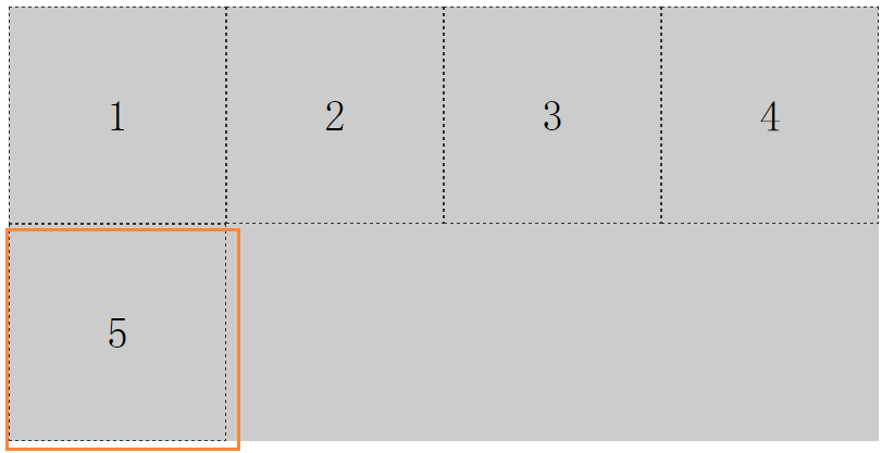
wrap-reverse:最后一个元素会被挤上去
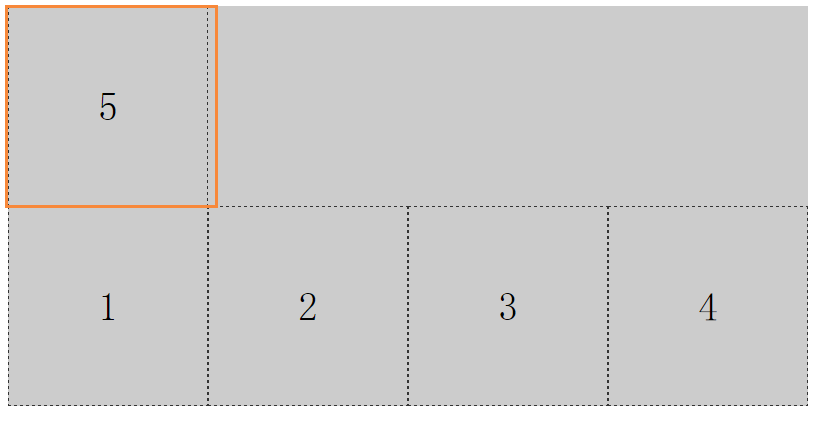
例子 :
<!DOCTYPE html>
<html>
<head>
<title>flex换行</title>
<style>
.f1{
width: 800px;
background-color: #cccccc;
display: flex;
flex-direction: row;
flex-wrap: wrap-reverse; <!--最后一个元素会被挤上去-->
}
.item{
width: 200px;
height: 200px;
border: 1px dashed #333333;
box-sizing: border-box;
font-size: 40px;
text-align: center;
line-height: 200px;
}
</style>
</head>
<body>
<div class="f1">
<div class="item">1</div>
<div class="item">2</div>
<div class="item">3</div>
<div class="item">4</div>
<div class="item">5</div>
</div>
</body>
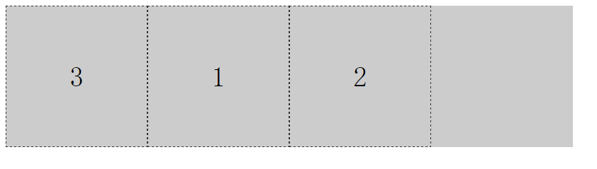
</html>子元素排序
使用order属性,可以为某个子元素设置排序。数值越小,排序越靠前,默认为0
例子:
<!DOCTYPE html>
<html>
<head>
    <style>
        .f1{
            width: 800px;
            height: 200px;
            background-color: #cccccc;
            display: flex;
            flex-direction: row;
        }
        .item{
            width: 200px;
            height: 200px;
            border: 1px dashed #333333;
            box-sizing: border-box;
            font-size: 40px;
            text-align: center;
            line-height: 200px;
        }
        .ff{
            order: -1; <!--这里-->
        }
    </style>
</head>
<body>
   <div class="f1">
       <div class="item">1</div>
       <div class="item">2</div>
       <div class="item ff">3</div>
   </div>
</body>
</html>
运行效果 :


 扫一扫
扫一扫
 228
228

 被折叠的 条评论
为什么被折叠?
被折叠的 条评论
为什么被折叠?
 到【灌水乐园】发言


