


CSS浮动(Float)是CSS中的一个重要特性,主要用于控制元素的布局和定位。通过设置元素的float属性,可以使元素向左或向右移动,其周围的元素也会重新排列。浮动通常用于创建文本环绕效果,或者在布局中让元素并排显示。
浮动
浮动可以改变元素标签默认的排序方式。
浮动最典型的应用:可以让多个块级元素一行内排列显示。
网页布局第一准则:多个块级元素纵向排列找标准流,多个块级元素横向排列找浮动。
什么是浮动?
float 属性用于创建浮动框,将其移到一边,直到左边缘或右边缘触及包含块或另一个浮动框边缘。
| 属性值 | 描述 |
| none | 元素不浮动(默认) |
| left | 元素向左浮动 |
| right | 元素向右浮动 |
 <style>
        .left {
            width: 200px;
            height: 200px;
            background-color: pink;
            float: left;

        }

        .right {
            width: 200px;
            height: 200px;
            background-color: burlywood;
            float: left;
        }
    </style>
</head>

<body>
    <div class="left">1</div>
    <div class="right">2</div>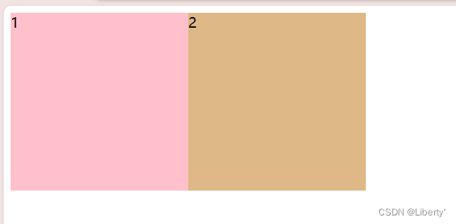
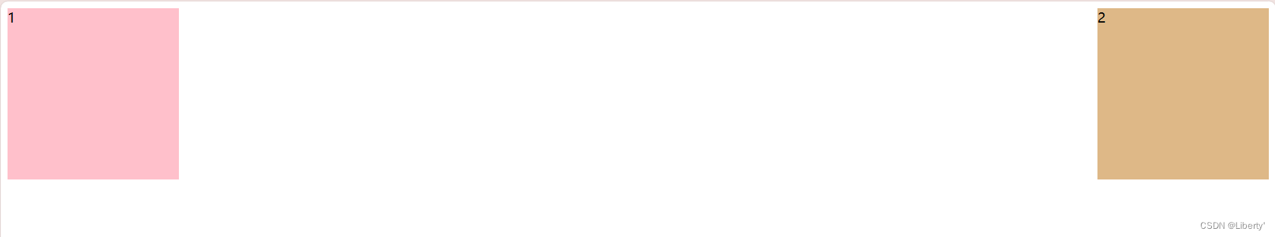
.right {
            width: 200px;
            height: 200px;
            background-color: burlywood;
            /*第二个盒子向右浮动*/
            float: right;
        }
浮动的特性 *
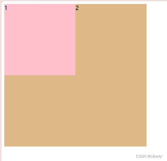
浮动元素会脱离标准流(脱标)
1.脱离标准的普通流的控制(浮)移动到指定位置(动)
2.浮动的盒子不再保留原先的位置
<style>
        .box1 {
            width: 200px;
            height: 200px;
            background-color: pink;
            /* 如果只给第一个盒子加浮动,第二个盒子不添加,第二个盒子就会脱离原来的位置 */
            float: left;
        }

        .box2 {
            width: 400px;
            height: 400px;
            background-color: burlywood;

        }
    </style>
</head>

<body>
    <div class="box1">1</div>
    <div class="box2">2</div>
</body>
浮动元素一行显示并且元素顶部对齐
如果多个盒子都设置了浮动,则它们会按照属性值一行内显示并且顶端对齐排列。
<style>
        div {
            height: 100px;
            width: 100px;

        }

        .box1 {
            background-color: red;
            float: left;

        }

        .box2 {
            background-color: orange;
            float: left;
        }

        .box3 {
            background-color: yellow;
            float: left;
        }

        .box4 {
            background-color: green;
            float: left;
        }
    </style>
</head>

<body>
    <div class="box1">1</div>
    <div class="box2">2</div>
    <div class="box3">3</div>
    <div class="box4">4</div>
</body>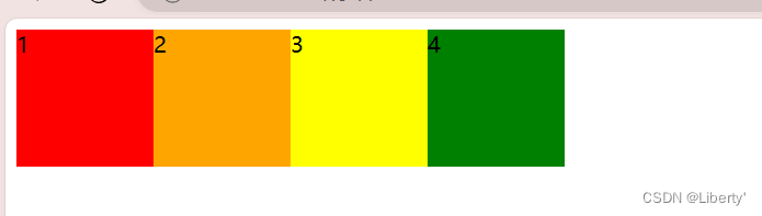
浮动元素会具有行内块元素的特性
任何元素都可以浮动,不管原先是什么模式的元素,添加浮动之后具有行内块元素相似的特性。
 <style>
        span,
        div {
            width: 200px;
            height: 100px;
            background-color: pink;
            /* 如果行内元素有了浮动,则不需要转换块级/行内块元素就可以直接给高度和宽度 */
            float: left;
        }

        p {
            background-color: purple;
            height: 150px;
            float: left;
        }
    </style>
</head>

<body>
    <span>1</span>
    <span>2</span>

    <div>3</div>
    <div>4</div>

    <p>ppppppppp</p>
</body>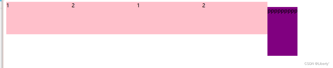
浮动的盒子经常和标准流父级搭配使用
为了约束浮动元素位置,网页布局一般采取的策略是:
先用标准流的父元素排列上下位置,之后内部子元素采取浮动排列左右位置,符合网页布局第一准则。
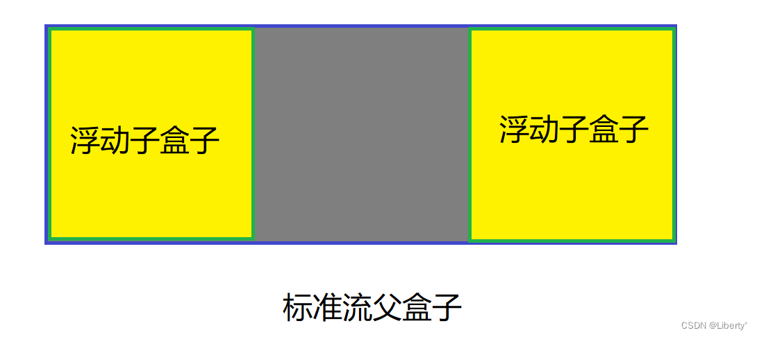
<style>
        .father {
            height: 200px;
            width: 600px;
            margin: 100px auto;
            background-color: pink;
        }

        .son1 {
            height: 200px;
            width: 200px;
            background-color: red;
            float: left;

        }

        .son2 {
            height: 200px;
            width: 200px;
            background-color: green;
            float: right;
        }
    </style>
</head>


<body>
    <div class="father">
        <div class="son1"></div>
        <div class="son2"></div>
    </div>
</body>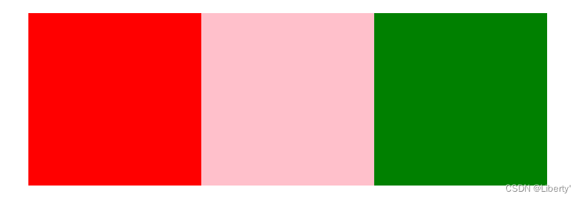
盒子布局案例

<style>
        * {
            margin: 0;
            padding: 0;
        }

        .box {
            width: 1226px;
            height: 615px;
            margin: 100px auto;
            background-color: pink;
        }

        .left {
            width: 234px;
            height: 615px;
            background-color: purple;
            float: left;
        }

        .right {
            width: 992px;
            height: 615px;
            background-color: skyblue;
            float: left;
        }

        .box .right div {
            width: 234px;
            height: 300px;
            background-color: green;
            float: left;
            margin-left: 14px;
            margin-bottom: 14px;
        }
    </style>
</head>

<body>
    <div class="box">
        <div class="left"></div>
        <div class="right">
            <div></div>
            <div></div>
            <div></div>
            <div></div>

            <div></div>
            <div></div>
            <div></div>
            <div></div>
        </div>
    </div>
</body>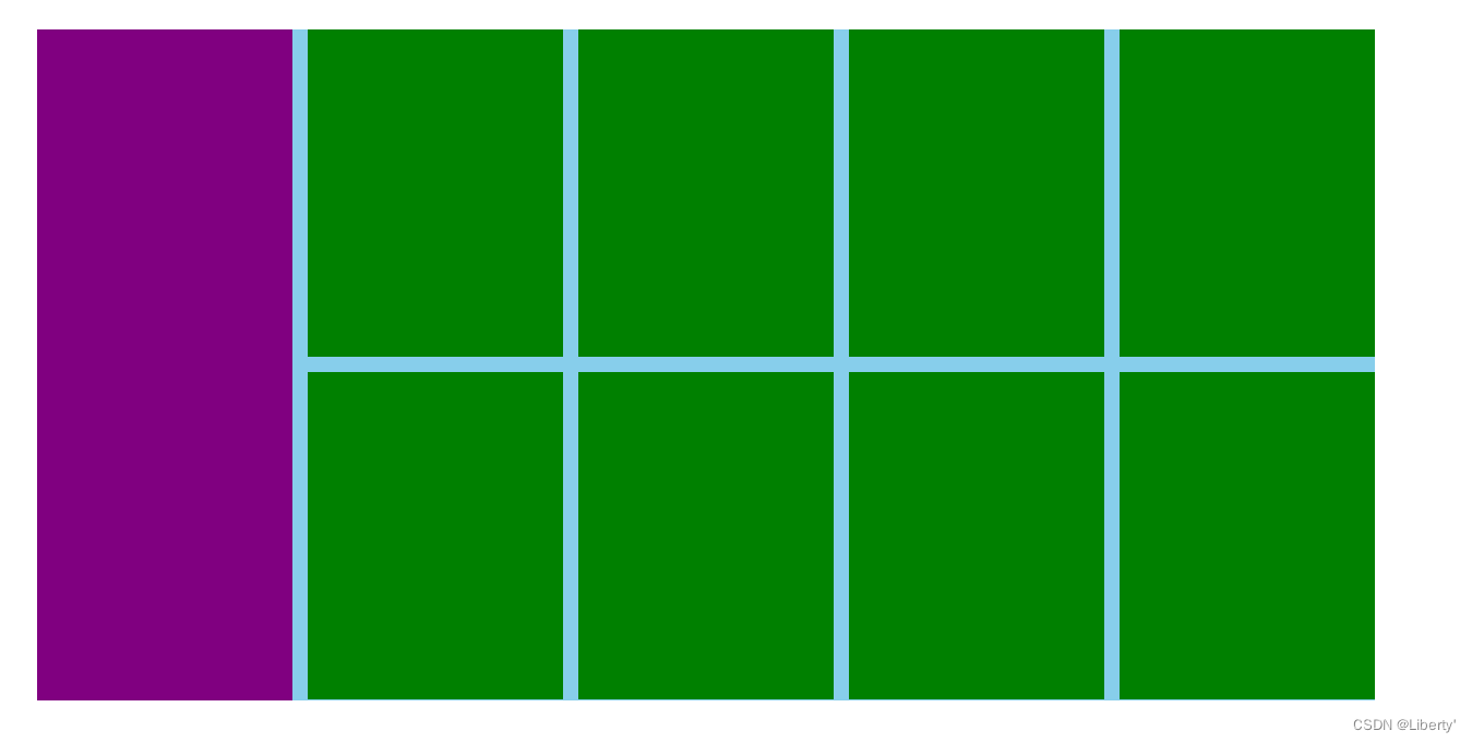
网页布局

 <style>
        * {
            margin: 0;
            padding: 0;
        }

        .top {
            height: 50px;
            background-color: gray;
        }

        .banner {
            width: 980px;
            height: 150px;
            margin: 10px auto;
            background-color: gray;
        }

        .boxes {
            height: 300px;
            width: 980px;
            background-color: #fff;
            margin: 10px auto;

        }

        .boxes .small {
            width: 237.5px;
            height: 90px;
            background-color: gray;
            float: left;
            margin-right: 10px;
            margin-bottom: 10px;

        }

        .boxes .big {
            width: 237.5px;
            height: 200px;
            background-color: gray;
            float: left;
            margin-right: 10px;
            margin-bottom: 10px;
        }

        .boxes .ko {
            margin-right: 0;
        }

        .footer {
            height: 200px;
            background-color: gray;
        }
    </style>


</head>

<body>

    <div class="top"></div>
    <div class="banner"></div>
    <div class="boxes">
        <div class="small"></div>
        <div class="small"></div>
        <div class="small"></div>
        <div class="small ko"></div>

        <div class="big"></div>
        <div class="big"></div>
        <div class="big"></div>
        <div class="big ko"></div>
    </div>
    <div class="footer"></div>
</body>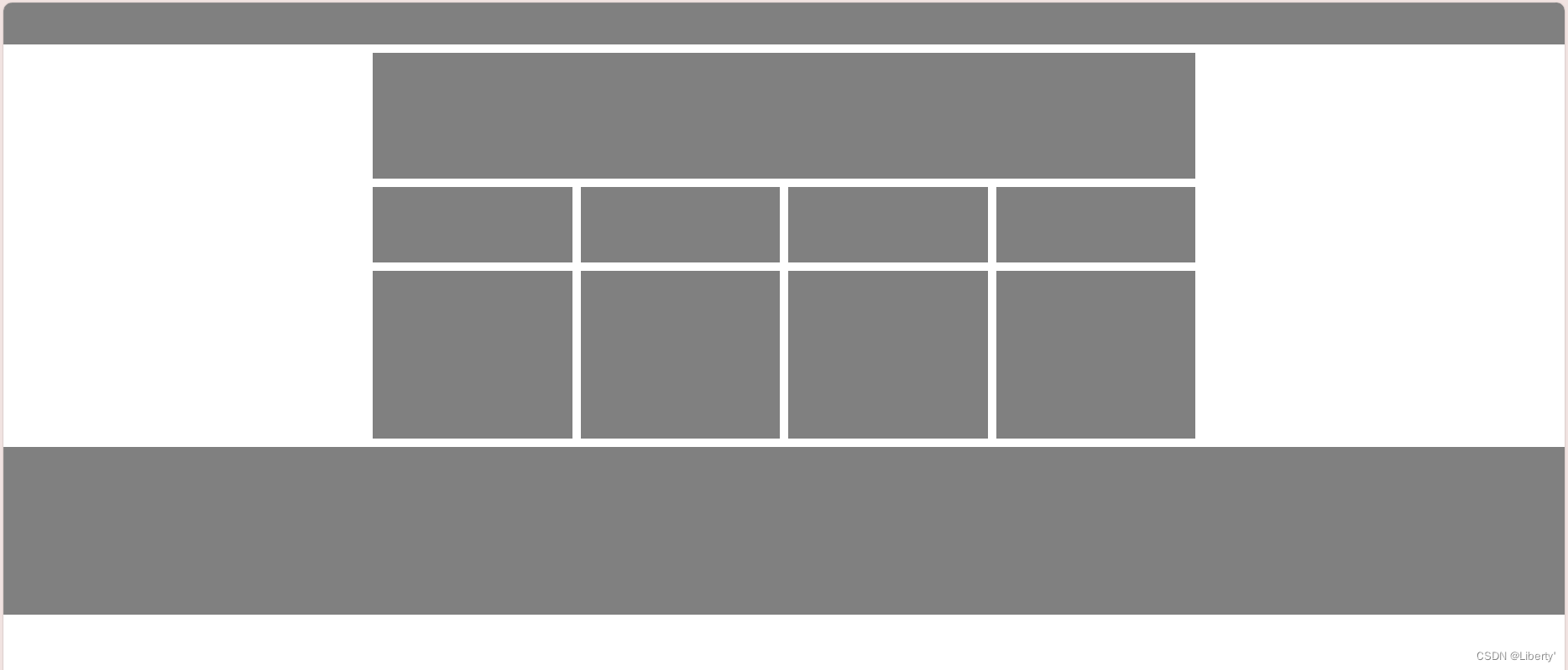
清除浮动
清除浮动(Clearing Floats)是CSS布局中常见的问题,因为浮动元素(使用 float 属性的元素)不会占据文档流的正常空间,这可能导致父元素的高度塌陷,或者其他布局问题。
语法:选择器{clear: 属性值}
| 属性值 | 描述 |
| left | 不允许左侧有浮动元素(清除左侧浮动的影响) |
| right | 不允许右侧有浮动元素(清除右侧浮动的影响) |
| both | 同时清除左右两侧浮动的影响 |
清除浮动本质
清除浮动的本质是清除浮动元素造成的影响
如果父盒子本身有高度 ,则不需要清除浮动
清除浮动之后, 父级就会根据浮动的子盒子自动检测高度。父级有了高度,就不会影响下面的标准流了
额外标签法
额外标签法也称为隔墙法,是W3C推荐的做法
额外标签法会在浮动元素末尾添加一个空的标签。例如<div style="clear.both></div>,或者其他标签。
优点:通俗易懂,书写方便
缺点:添加许多无意义的标签,结构化差。
注意:要求这个新的空标签必须是块级元素。
<style>
        .box1 {
            width: 300px;
            height: 100px;
            background-color: skyblue;
            float: left;
        }

        .box2 {
            width: 100px;
            height: 100px;
            background-color: pink;
            float: left;
        }

        .box3 {
            width: 600px;
            height: 100px;
            background-color: black;
        }

        .clear {
            /* 清除浮动 */
            clear: both;
        }
    </style>
</head>

<body>
    <div>
        <div class="box1"></div>
        <div class="box2"></div>
        <!-- 额外标签法 -->
        <!-- 隔墙法,就是在最后一个浮动的子元素后面添加一个额外标签添加清除浮动样式. -->
        <!-- 实际工作可能会遇到但是不常用 -->
        <div class="clear"></div>
    </div>

    <div class="box3"></div>
</body>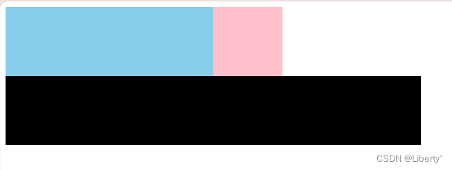
1.清除浮动本质是?
清除浮动的本质是清除浮动元素脱离标准流造成的影响
2.清除浮动策略是?
闭合浮动。只让浮动在父盒子内部影响,不影响父盒子外面的其他盒子.
3.额外标签法?
隔墙法,就是在最后一个浮动的子元素后面添加一个额外标签添加清除浮动样式.
实际工作可能会遇到但是不常用
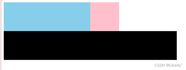
清除浮动之父元素overflow
可以给父级添加overflow属性,将其属性值设置为hidden, auto 或 scroll。
优点:代码简洁
缺点:无法显示溢出的部分
<style>
        .big_box {
            overflow: auto;
        }

        .box1 {
            width: 300px;
            height: 100px;
            background-color: skyblue;
            float: left;
        }

        .box2 {
            width: 100px;
            height: 100px;
            background-color: pink;
            float: left;
        }

        .box3 {
            width: 600px;
            height: 100px;
            background-color: black;
        }
    </style>
</head>

<body>
    <div class="big_box">
        <div class="box1"></div>
        <div class="box2"></div>
    </div>

    <div class="box3"></div>
</body>
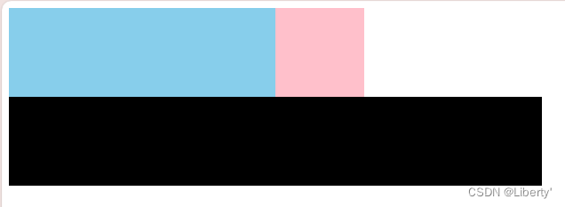
清除元素之after伪元素
优点:结构简单
缺点:照顾低版本浏览器
 .clearfix::after {
            content: "";
            display: block;
            height: 0;
            clear: both;
            visibility: hidden;

        }

        .clearfix {
            /* 兼容低版本浏览器IE6,7 */
            *zoom: 1;
        }
<style>
.clearfix::after {
content: "";
display: block;
height: 0;
clear: both;
visibility: hidden;
}
.clearfix {
/* 兼容低版本浏览器IE6,7 */
*zoom: 1;
}
.box1 {
width: 300px;
height: 100px;
background-color: skyblue;
float: left;
}
.box2 {
width: 100px;
height: 100px;
background-color: pink;
float: left;
}
.box3 {
width: 600px;
height: 100px;
background-color: black;
}
</style>
</head>
<body>
<div class="clearfix">
<div class="box1"></div>
<div class="box2"></div>
</div>
<div class="box3"></div>
</body>
清除浮动之双伪元素
 .clearfix::before,
        .clearfix::after {
            content: "";
            display: table;
        }

        .clearfix::after {
            clear: both;
        }

        .clearfix {
            zoom: 1;
        }
<style>
.clearfix::before,
.clearfix::after {
content: "";
display: table;
}
.clearfix::after {
clear: both;
}
.clearfix {
zoom: 1;
}
.box1 {
width: 300px;
height: 100px;
background-color: skyblue;
float: left;
}
.box2 {
width: 100px;
height: 100px;
background-color: pink;
float: left;
}
.box3 {
width: 600px;
height: 100px;
background-color: black;
}
</style>
</head>
<body>
<div class="clearfix">
<div class="box1"></div>
<div class="box2"></div>
</div>
<div class="box3"></div>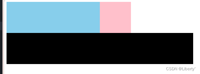


 977
977


 被折叠的 条评论
为什么被折叠?
被折叠的 条评论
为什么被折叠?
 到【灌水乐园】发言


