


弹性盒子布局(Flexbox)是CSS3引入的一种新的布局模式,它提供了一种更加有效的方式来设计、布局和对齐容器中的项目,即使容器的大小动态改变或者项目的数量未知。
弹性盒子布局的主要特点是能够轻松地在不同的屏幕大小和设备上实现一致的布局,通过为父容器(弹性容器)设置display: flex;或display: inline-flex;来定义。弹性容器内的子元素(弹性项)会自动成为容器的成员,并按照弹性盒子的规则进行布局。
弹性盒子布局有以下主要优点:
-
灵活性:弹性盒子布局可以轻松地适应不同屏幕尺寸和设备,无论是桌面设备还是移动设备。
-
方向性:可以设置主轴的方向(水平或垂直),从而决定弹性项是水平排列还是垂直排列。
-
对齐方式:可以轻松地在主轴和交叉轴上对齐弹性项,包括两端对齐、居中、空间分布等。
-
顺序调整:通过
order属性,可以改变弹性项在容器中的排列顺序。 -
弹性:弹性项可以根据需要增长或缩小,以适应可用空间。
-
包裹:如果弹性项在主轴上超出了容器的空间,可以设置弹性容器是否允许弹性项换行显示。
弹性盒子布局由两部分组成:弹性容器(flex container)和弹性项(flex items)。弹性容器通过一系列CSS属性来控制其子元素(弹性项)的布局,而弹性项则自动成为容器的成员并遵循容器的布局规则。
在弹性盒子布局中,有一些关键的CSS属性,如flex-direction、justify-content、align-items、flex-wrap、flex-grow、flex-shrink和flex-basis等,这些属性可以用来控制弹性容器和弹性项的行为和外观。
总之,弹性盒子布局是一种强大而灵活的布局模式,可以帮助开发人员更轻松地创建适应性强、易于维护的网页布局。
flex术语
| 序号 | 简记 | 术语 |
| 1 | 二成员 | 容器和项目(container / item) |
| 2 | 二根轴 | 主轴与交叉轴(main-axis / cross-axis) |
| 3 | 二根线 | 起始线与结束线(flex-start / flex-end) |
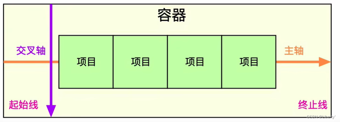
弹性容器属性
flex-direction- 定义主轴的方向,即弹性项默认的排列方向。
- 可选值:
row(默认值,水平方向从左到右)、row-reverse(水平方向从右到左)、column(垂直方向从上到下)、column-reverse(垂直方向从下到上)。
justify-content- 定义弹性项在主轴上的对齐方式。
- 可选值:
flex-start(默认值,起点对齐)、flex-end(终点对齐)、center(居中对齐)、space-between(两端对齐,弹性项之间的间隔相等)、space-around(每个弹性项两侧的间隔相等)、space-evenly(弹性项之间的间隔和两侧的间隔都相等)。
align-items- 定义弹性项在交叉轴上的对齐方式(当弹性项为单行时)。
- 可选值:
stretch(默认值,如果弹性项未设置高度或设为auto,将占满整个容器的高度)、flex-start、flex-end、center、baseline(以第一行文字的基线对齐)。
flex-wrap- 定义弹性项是否换行显示。
- 可选值:
nowrap(默认值,不换行)、wrap(换行,第一行在上方)、wrap-reverse(换行,第一行在下方)。
align-content- 定义多行弹性项在交叉轴上的对齐方式(当弹性项换行时)。
- 可选值与
align-items类似,但额外支持stretch(默认值,如果弹性项未设置高度或设为auto,将占满整个容器的高度,但仅适用于多行)。
- flex-flow
- 简化
flex-direction,flex-wrap属性
- 简化
弹性项属性
flex-grow- 定义弹性项的放大比例。默认为
0,表示不放大。如果有剩余空间,则根据所有弹性项的flex-grow值来分配剩余空间。
- 定义弹性项的放大比例。默认为
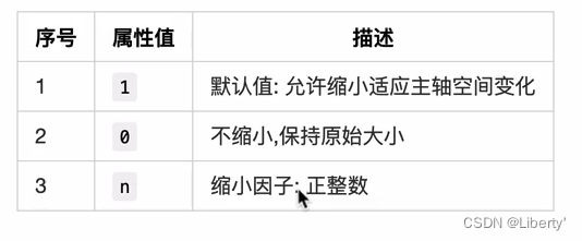
flex-shrink- 定义弹性项的缩小比例。默认为
1,表示如果空间不足,该项目将缩小。如果有空间不足的情况,则根据所有弹性项的flex-shrink值来缩小项目。
- 定义弹性项的缩小比例。默认为
flex-basis- 定义弹性项在主轴上的初始大小。默认为
auto,表示项目的大小由其内容决定。
- 定义弹性项在主轴上的初始大小。默认为
flex- 是
flex-grow、flex-shrink和flex-basis的简写属性,用于同时设置这三个值。例如,flex: 1 0 200px;就等同于flex-grow: 1; flex-shrink: 0; flex-basis: 200px;。
- 是
order- 定义弹性项的排列顺序(整数,默认为0)。数值越小,排列越靠前。
align-self- 允许单个弹性项覆盖由
align-items设置的交叉轴对齐方式。可选值与align-items相同。
- 允许单个弹性项覆盖由
创建flex容器与项目
1.属性
display:flex 创建flex块级容器
display:inline-flex 创建flex行内容器
主轴方向与多行容器
 <style>
        .container {
            width: 300px;
            height: 150px;
            background-color: pink;

            /* 可选值:
            row(默认值,水平方向从左到右)、
            row-reverse(水平方向从右到左)、
            column(垂直方向从上到下)、
            column-reverse(垂直方向从下到上)。 */

            display: flex;
            /* 设置主轴方向:水平方向 */
            /* flex-direction: row; */
            /* flex-direction: row-reverse; */

            /* 设置主轴方向:垂直方向 */
            flex-direction: column;
            /* flex-direction: column-reverse;  */


            /* 设置多行容器 */
            /* 可选值:nowrap(默认值,不换行)、
            wrap(换行,第一行在上方)、
            wrap-reverse(换行,第一行在下方)。 */

            /* 默认单行容器,不允许换行显示,项目自动收缩适应容器大小 */
            /* flex-wrap: nowrap; */
            flex-wrap: wrap;


        }


        .item {
            width: 100px;
            height: 50px;
            background-color: lightcyan;

        }
    </style>
</head>

<body>
    <div class="container">
        <div class="item">1</div>
        <div class="item">2</div>
        <div class="item">3</div>
        <div class="item">4</div>
    </div>
</body>
主轴项目对齐方式
 <style>
        .container {
            width: 300px;
            height: 150px;
            background-color: pink;
            display: flex;

            /* 默认从主轴的起始线排列 */
            justify-content: flex-start;

            /* 对齐到终止线 */
            justify-content: flex-end;

            /* 对齐到主轴的中间线,居中对齐 */
            justify-content: center;

            /* 两端对齐  剩余空间在头尾项目之外的项目间平均分配 */
            justify-content: space-between;

            /* 分散对齐  剩余空间在每个项目之间平均分配*/
            justify-content: space-around;

            /* 平均对齐 */
            justify-content: space-evenly;
        }


        .item {
            width: 50px;
            height: 50px;
            background-color: lightcyan;

        }
    </style>
    </head>

    <body>
        <div class="container">
            <div class="item">1</div>
            <div class="item">2</div>
            <div class="item">3</div>
            <div class="item">4</div>
        </div>
    </body>
交叉轴项目对齐方式
<style>
        /* 可选值:
        stretch(默认值,如果弹性项未设置高度或设为auto,将占满整个容器的高度)、
        flex-start、flex-end、center、baseline(以第一行文字的基线对齐)。 */
        .container {
            width: 300px;
            height: 150px;
            background-color: pink;
            display: flex;

            /* 主轴为水平方向 */
            flex-flow: row nowrap;

            /* 默认:从交叉轴的起始线开始排列,对齐到起始线 */
            align-items: flex-start;

            /* 对齐到终止线 */
            align-items: flex-end;

            /* 居中对齐 */
            align-items: center;


        }


        .item {
            width: 50px;
            height: 50px;
            background-color: lightcyan;

        }
    </style>
    </head>

    <body>
        <div class="container">
            <div class="item">1</div>
            <div class="item">2</div>
            <div class="item">3</div>
            <div class="item">4</div>
        </div>
    </body>
多行容器项对齐方式

<style>
    .container {
        width: 300px;
        height: 400px;
        background-color: pink;
        display: flex;

        /* 主轴为水平方向 */
        flex-flow: row wrap;

        /* 默认 */
        align-content: stretch;

        /* 与起始线对齐 */
        align-content: flex-start;

        /* 与终止线对齐 */
        align-content: flex-end;

        /* 居中对齐 */
        align-content: center;

        /* 两端对齐 */
        align-content: space-between;

        /* 分散对齐 */
        align-content: space-around;

        /* 平均对齐 */
        align-content: space-evenly;

    }


    .item {
        width: 100px;
        height: 50px;
        background-color: lightcyan;

    }
</style>
</head>

<body>
    <div class="container">
        <div class="item">1</div>
        <div class="item">2</div>
        <div class="item">3</div>
        <div class="item">4</div>
        <div class="item">5</div>
        <div class="item">6</div>
        <div class="item">7</div>

    </div>
</body>
设置单个项目在交叉轴上的对齐方式

<style>
    .container {
        width: 300px;
        height: 200px;
        background-color: pink;
        display: flex;


    }


    .item {
        width: 100px;
        height: 50px;
        background-color: lightcyan;

    }


    .item:first-child {
        align-self: flex-start;
        /* auto 是默认值,继承的是容器中的align-items */
        align-self: auto;
    }

    .item:nth-child(2) {
        /* 第二个项目与中间线对齐 */
        align-self: center;
    }

    .item:nth-child(3) {
        /* 第三个项目拉伸 */
        align-self: stretch;
    }

    .item:last-child {
        /* 和基线对齐 */
        /* 所有项目基线对齐才会有效果 */
        align-self: baseline;
    }
</style>


</head>

<body>
    <div class="container">
        <div class="item">1</div>
        <div class="item">2</div>
        <div class="item">3</div>
        <div class="item">4</div>


    </div>
</body>
设置单个项目的排列顺序
<style>
        .container {
            width: 300px;
            height: 200px;
            background-color: pink;
            display: flex;


        }


        .item {
            width: 100px;
            height: 50px;
            background-color: lightcyan;

        }


        /* order数值越小顺序越靠前 ,默认为0,按照书写顺序*/
        .item:first-child {
            order: 2;
        }

        .item:nth-child(2) {
            order: -1;
        }


        .item:last-child {
            order: 0;
        }
    </style>


</head>

<body>
    <div class="container">
        <div class="item">1</div>
        <div class="item">2</div>
        <div class="item">3</div>


    </div>
</body>
单个项目的放大因子
<style>
        .container {
            width: 300px;
            height: 200px;
            background-color: pink;
            display: flex;


        }


        .item {
            width: 50px;
            height: 50px;
            background-color: lightcyan;

        }


        /* 默认值为0 */
        放大比列计算方法

        /* 1.计算出需要分配的主轴上剩余空间:300 - (50*3) */
        /* 2.计算放大因子:(0 + 1 + 2) = 3 */
        /* 将剩余空间150px分成三等分 150 / 3 */
        /* 第一个:50  + (0 * 50) = 50
        第二个:50 + (1 * 50) = 100
        第三个:50 + (2 * 50) = 150 */
        .item:first-child {
            flex-grow: 0;
        }

        .item:nth-child(2) {
            flex-grow: 1;
        }


        .item:last-child {
            flex-grow: 2;
        }
    </style>


</head>

<body>
    <div class="container">
        <div class="item">1</div>
        <div class="item">2</div>
        <div class="item">3</div>


    </div>
</body>
单个项目的收缩因子
<style>
        .container {
            width: 300px;
            height: 200px;
            background-color: pink;
            display: flex;

            /* flex-wrap: wrap; */

        }


        .item {
            width: 150px;
            height: 50px;
            background-color: lightcyan;

        }


        .item:first-child {
            flex-shrink: 0;
        }

        .item:nth-child(2) {
            flex-shrink: 1;
        }


        .item:last-child {
            flex-shrink: 2;
        }
    </style>


</head>

<body>
    <div class="container">
        <div class="item">1</div>
        <div class="item">2</div>
        <div class="item">3</div>


    </div>
</body><style>
        .container {
            width: 300px;
            height: 200px;
            background-color: pink;
            display: flex;

            /* flex-wrap: wrap; */

        }


        .item {
            width: 150px;
            height: 50px;
            background-color: lightcyan;

        }


        .item:first-child {
            flex-shrink: 0;
        }

        .item:nth-child(2) {
            flex-shrink: 1;
        }


        .item:last-child {
            flex-shrink: 2;
        }
    </style>


</head>

<body>
    <div class="container">
        <div class="item">1</div>
        <div class="item">2</div>
        <div class="item">3</div>


    </div>
</body>
设置项目在主轴上的计算基准尺寸

<style>
        .container {
            width: 300px;
            height: 200px;
            background-color: pink;
            display: flex;
            flex-wrap: wrap;

        }


        .item {
            width: 50px;
            height: 50px;
            background-color: lightcyan;

            /* 默认 */
            /* flex-basis: auto; */

            /* flex-basis设置的值会覆盖掉原始项目的值 */
            flex-basis: 80px;

            /* min-width的值会覆盖掉flex-basis的值 */
            min-width: 90px;


        }
    </style>


</head>

<body>
    <div class="container">
        <div class="item">1</div>
        <div class="item">2</div>
        <div class="item">3</div>


    </div>
</body>


 2774
2774


 被折叠的 条评论
为什么被折叠?
被折叠的 条评论
为什么被折叠?
 到【灌水乐园】发言


