


Toolbar
本文由 Luzhuo 编写,请尊重个人劳动成果,转发请保留该信息.
原文: http://blog.csdn.net/Rozol/article/details/50189449
微博: http://weibo.com/u/2524456400
- ToolBar是android5.0当中用于代替ActionBar使用,从而实现Material Design风格.
- 本文只讲ToolBar向下兼容部分,也就是低版本api可用使用的部分.
- 库导入: v7包(
compile 'com.android.support:appcompat-v7:24.2.1')
基本使用
XML布局:
<android.support.v7.widget.Toolbar
    android:id="@+id/toolbar"
    android:layout_width="match_parent"
    android:layout_height="60dp"
    android:background="#03A9F4" />
Activity代码:
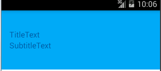
public class ToolBarDemo extends AppCompatActivity {
    private Toolbar toolbar;
    private ImageView back;

    @Override
    protected void onCreate(Bundle savedInstanceState) {
        super.onCreate(savedInstanceState);
        setContentView(R.layout.activity_toolbar);
        initView();
        initData();
    }

    private void initView() {
        toolbar = (Toolbar) findViewById(R.id.toolbar);
    }

    private void initData() {
        setSupportActionBar(toolbar);
    }
}
主题
<style name="AppTheme" parent="Theme.AppCompat.Light.NoActionBar">
    <item name="colorPrimary">@color/colorPrimary</item>
    <item name="colorPrimaryDark">@color/colorPrimaryDark</item>
    <item name="colorAccent">@color/colorAccent</item>
    <item name="android:windowIsTranslucent">true</item>
</style>
效果:
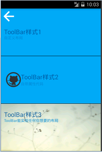
源码研究
XML属性研究:
<declare-styleable name="Toolbar">
    <attr name="titleTextAppearance" format="reference" />      // 标题文字样式
    <attr name="subtitleTextAppearance" format="reference" />   // 副标题文字样式
    <attr name="title" />                                       // 设置标题文字
    <attr name="subtitle" />                                    // 设置副标题文字
    <attr name="android:gravity" />
    <attr name="titleMargins" format="dimension" />             // 标题:四周边距+垂直居中(超出范围不显示)
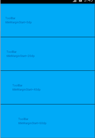
<attr name="titleMarginStart" format="dimension" /> // 标题:左边距
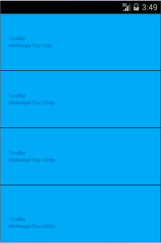
    <attr name="titleMarginEnd" format="dimension" />
    <attr name="titleMarginTop" format="dimension" />           // 标题:上边距
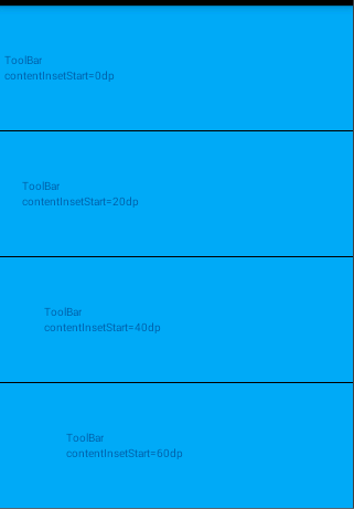
    <attr name="titleMarginBottom" format="dimension" />
    <attr name="contentInsetStart" />                           // 内容:左边距[0无边距]
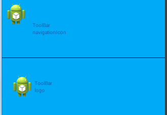
    <attr name="contentInsetEnd" />
    <attr name="contentInsetLeft" />                            // 内容:XXX未知XXX
    <attr name="contentInsetRight" />
    <attr name="maxButtonHeight" format="dimension" />          // XXX未知XXX

    <attr name="collapseIcon" format="reference" />             // XXX未知XXX
    <attr name="collapseContentDescription" format="string" />
    <attr name="popupTheme" />
    <attr name="navigationIcon" format="reference" />           // 图标
    <attr name="navigationContentDescription" format="string" />// 图标描述(不会显示)
    <attr name="android:minHeight" />

    <attr name="logo" />                                        // Logo
    <attr name="logoDescription" format="string" />             // Logo描述
    <attr name="titleTextColor" format="color" />               // 标题文字颜色
    <attr name="subtitleTextColor" format="color" />            // 副标题文字颜色
</declare-styleable>


 7456
7456


 被折叠的 条评论
为什么被折叠?
被折叠的 条评论
为什么被折叠?
 到【灌水乐园】发言


