


弹性盒布局
标准盒模型:box-size:content-box

怪异盒模型:box-size:border-box

1.主轴横向对齐(设置在父类容器上)justify-content
1.1 justify-content:space-around 分开左右边距对齐
//css样式
.box{
	display:-webkit-flex;
	display:flex;
	width:400px;height:100px;margin:0;padding:0;border-radius:5px;list-style:none;background:#eee;}
	.box li{margin:5px;width:50px;padding:10px;border-radius:5px;background:#aaa;text-align:center;}
	#box1{
		-webkit-justify-content:space-around;
		justify-content:space-around;
	}
//body中
	<h2>justify-content:space-around</h2>
	<ul id="box1" class="box">
		<li>a</li>
		<li>b</li>
		<li>c</li>
	</ul>
显示如下:

1.2 justify-content:space-between 分开对齐
//css样式
.box{
	display:-webkit-flex;
	display:flex;
	width:400px;height:100px;margin:0;padding:0;border-radius:5px;list-style:none;background:#eee;}
	.box li{margin:5px;width:50px;padding:10px;border-radius:5px;background:#aaa;text-align:center;}
	#box2{
		-webkit-justify-content:space-between;
		justify-content:space-between;
	}
//body中
	<h2>justify-content:space-between</h2>
	<ul id="box2" class="box">
		<li>a</li>
		<li>b</li>
		<li>c</li>
	</ul>
显示如下:

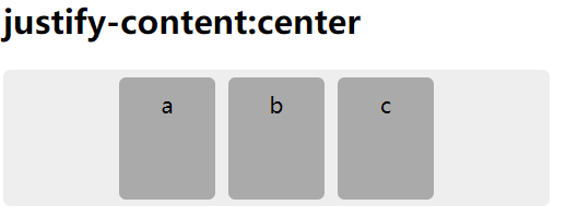
1.3 justify-content:center 居中对齐
//css样式
.box{
	display:-webkit-flex;
	display:flex;
	width:400px;height:100px;margin:0;padding:0;border-radius:5px;list-style:none;background:#eee;}
	.box li{margin:5px;width:50px;padding:10px;border-radius:5px;background:#aaa;text-align:center;}
	#box3{
		-webkit-justify-content:center;
		justify-content:content:center;
	}
//body中
	<h2>justify-content:center</h2>
	<ul id="box3" class="box">
		<li>a</li>
		<li>b</li>
		<li>c</li>
	</ul>
显示如下:
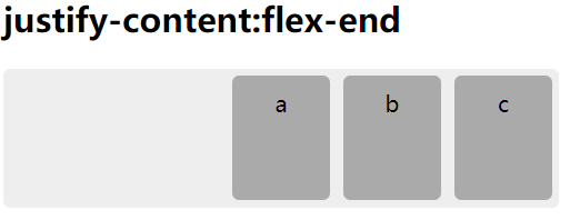
1.4 justify-content:flex-end 结束对齐
//css样式
.box{
	display:-webkit-flex;
	display:flex;
	width:400px;height:100px;margin:0;padding:0;border-radius:5px;list-style:none;background:#eee;}
	.box li{margin:5px;width:50px;padding:10px;border-radius:5px;background:#aaa;text-align:center;}
	#box4{
		-webkit-justify-content:flex-end;
		justify-content:content:flex-end;
	}
//body中
	<h2>justify-content:flex-end</h2>
	<ul id="box4" class="box">
		<li>a</li>
		<li>b</li>
		<li>c</li>
	</ul>
显示如下:
1.5 justify-content:flex-start 起始对齐
//css样式
.box{
	display:-webkit-flex;
	display:flex;
	width:400px;height:100px;margin:0;padding:0;border-radius:5px;list-style:none;background:#eee;}
	.box li{margin:5px;width:50px;padding:10px;border-radius:5px;background:#aaa;text-align:center;}
	#box5{
		-webkit-justify-content:flex-start;
		justify-content:content:flex-start;
	}
//body中
	<h2>justify-content:flex-start</h2>
	<ul id="box5" class="box">
		<li>a</li>
		<li>b</li>
		<li>c</li>
	</ul>
显示如下:

2.主轴纵向对齐(设置在父类容器上)align-content
2.1 align-content:space-around 分开左右边距对齐
//css
	.box{
		display:-webkit-flex;
		display:flex;
		-webkit-flex-wrap:wrap;
		flex-wrap:wrap;
		width:200px;height:200px;margin:0;padding:0;border-radius:5px;list-style:none;background-color:#eee;}
	.box li{margin:5px;padding:10px;border-radius:5px;background:#aaa;text-align:center;}
	#box1{
		-webkit-align-content:space-around;
		align-content:space-around;
	}
//body中
	<h2>align-content:space-around</h2>
	<ul id="box5" class="box">
		<li>a</li>
		<li>b</li>
		<li>c</li>
		<li>d</li>
		<li>e</li>
		<li>f</li>
	</ul>
显示如下:

2.2 align-content:space-between 分开对齐
//css
	.box{
		display:-webkit-flex;
		display:flex;
		-webkit-flex-wrap:wrap;
		flex-wrap:wrap;
		width:200px;height:200px;margin:0;padding:0;border-radius:5px;list-style:none;background-color:#eee;}
	.box li{margin:5px;padding:10px;border-radius:5px;background:#aaa;text-align:center;}
	#box2{
		-webkit-align-content:space-between;
		align-content:space-between;
	}
//body中
	<h2>align-content:space-between</h2>
	<ul id="box2" class="box">
		<li>a</li>
		<li>b</li>
		<li>c</li>
		<li>d</li>
		<li>e</li>
		<li>f</li>
	</ul>
显示如下:

2.3 align-content:center 居中对齐
注:要配合flex-wrap:wrap一起使用
//css
	.box{
		display:-webkit-flex;
		display:flex;
		-webkit-flex-wrap:wrap;
		flex-wrap:wrap;
		width:200px;height:200px;margin:0;padding:0;border-radius:5px;list-style:none;background-color:#eee;}
	.box li{margin:5px;padding:10px;border-radius:5px;background:#aaa;text-align:center;}
	#box3{
		-webkit-align-content:center;
		align-content:center;
	}
//body中
	<h2>align-content:center</h2>
	<ul id="box3" class="box">
		<li>a</li>
		<li>b</li>
		<li>c</li>
		<li>d</li>
		<li>e</li>
		<li>f</li>
	</ul>
显示如下:

2.4 align-content:strecth 上下拉伸对齐
//css
	.box{
		display:-webkit-flex;
		display:flex;
		-webkit-flex-wrap:wrap;
		flex-wrap:wrap;
		width:200px;height:200px;margin:0;padding:0;border-radius:5px;list-style:none;background-color:#eee;}
	.box li{margin:5px;padding:10px;border-radius:5px;background:#aaa;text-align:center;}
	#box4{
		-webkit-align-content:strecth;
		align-content:strecth;
	}
//body中
	<h2>align-content:strecth</h2>
	<ul id="box4" class="box">
		<li>a</li>
		<li>b</li>
		<li>c</li>
		<li>d</li>
		<li>e</li>
		<li>f</li>
	</ul>
显示如下:

2.5 align-content:flex-end 结束对齐
//css
	.box{
		display:-webkit-flex;
		display:flex;
		-webkit-flex-wrap:wrap;
		flex-wrap:wrap;
		width:200px;height:200px;margin:0;padding:0;border-radius:5px;list-style:none;background-color:#eee;}
	.box li{margin:5px;padding:10px;border-radius:5px;background:#aaa;text-align:center;}
	#box5{
		-webkit-align-content:flex-end;
		align-content:flex-end;
	}
//body中
	<h2>align-content:flex-end</h2>
	<ul id="box5" class="box">
		<li>a</li>
		<li>b</li>
		<li>c</li>
		<li>d</li>
		<li>e</li>
		<li>f</li>
	</ul>
显示如下:

2.6 align-content:flex-start 起始对齐
//css
	.box{
		display:-webkit-flex;
		display:flex;
		-webkit-flex-wrap:wrap;
		flex-wrap:wrap;
		width:200px;height:200px;margin:0;padding:0;border-radius:5px;list-style:none;background-color:#eee;}
	.box li{margin:5px;padding:10px;border-radius:5px;background:#aaa;text-align:center;}
	#box6{
		-webkit-align-content:flex-start;
		align-content:flex-start;
	}
//body中
	<h2>align-content:flex-start</h2>
	<ul id="box6" class="box">
		<li>a</li>
		<li>b</li>
		<li>c</li>
		<li>d</li>
		<li>e</li>
		<li>f</li>
	</ul>
显示如下:

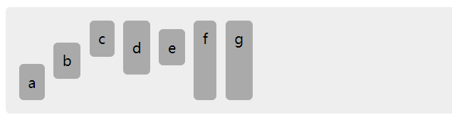
3 案例(拓展)侧轴对齐:align-items(设置在父) align-self(设置在子)
3.1flex-start 起始对齐
3.2flex-end 结束对齐
3.3center 居中对齐
3.4baseline 基线对齐
3.5strech 上下拉升对齐
注:align-items基本与align-content差不多就2个参数没有
<!doctype html>
<html>
	<head>
		<meta charset="utf-8">
		<title>align-self 弹性盒子-侧轴对齐</title>
		<style>
		.box{
			display:-webkit-flex;
			display:flex;

			height:100px;margin:0;padding:10px;border-radius:5px;list-style:none;background-color:#eee;}
		.box li{margin:5px;padding:10px;border-radius:5px;background:#aaa;text-align:center;}
		.box li:nth-child(1){
			-webkit-align-self: flex-end;
			align-self: flex-end;
		}
		.box li:nth-child(2){
			-webkit-align-self: center;
			align-self: center;
		}
		.box li:nth-child(3){
			-webkit-align-self: flex-start;
			align-self: flex-start;
		}
		.box li:nth-child(4){
			-webkit-align-self: baseline;
			align-self: baseline;
			padding:20px 10px;
		}
		.box li:nth-child(5){
			-webkit-align-self: baseline;
			align-self: baseline;
		}
		.box li:nth-child(6){
			-webkit-align-self: stretch;
			align-self: stretch;
		}
		.box li:nth-child(7){
			-webkit-align-self: auto;
			align-self: auto;
		}
		</style>
	</head>
	<body>
		<ul id="box" class="box">
			<li>a</li>
			<li>b</li>
			<li>c</li>
			<li>d</li>
			<li>e</li>
			<li>f</li>
			<li>g</li>
		</ul>
	</body>
</html>
结果显示为:
4.弹性盒流向(设置在父元素上)flex-direction
4.1 flex-direction:row 分横向从左到右(左对齐)
//css
	.box{
		display:-webkit-flex;
		display:flex;
		margin:0;padding:10px;list-style:none;background:#eee;}
	.box li{width:100px;height:100px;border:1px solid #aaa;text-align:center;}
	#box1{
		-webkit-flex-direction:row;
		flex-direction:row;
	}
//body中
	<h2>flex-direction:row</h2>
	<ul id="box1" class="box">
		<li>a</li>
		<li>b</li>
		<li>c</li>
	</ul>
显示如下:

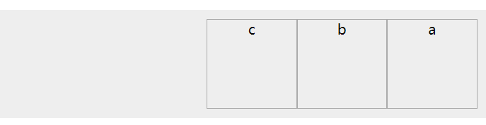
4.2 flex-direction:row-reverse 反转横向排列(右对齐)
//css
	.box{
		display:-webkit-flex;
		display:flex;
		margin:0;padding:10px;list-style:none;background:#eee;}
	.box li{width:100px;height:100px;border:1px solid #aaa;text-align:center;}
	#box2{
		-webkit-flex-direction:row-reverse;
		flex-direction:row-reverse;
	}
//body中
	<h2>flex-direction:row-reverse</h2>
	<ul id="box2" class="box">
		<li>a</li>
		<li>b</li>
		<li>c</li>
	</ul>
显示如下:
4.3 flex-direction:column 纵向排列
//css
	.box{
		display:-webkit-flex;
		display:flex;
		margin:0;padding:10px;list-style:none;background:#eee;}
	.box li{width:100px;height:100px;border:1px solid #aaa;text-align:center;}
	#box3{
		height:500px;
		-webkit-flex-direction:column;
		flex-direction:column;
	}
//body中
	<h2>flex-direction:column</h2>
	<ul id="box3" class="box">
		<li>a</li>
		<li>b</li>
		<li>c</li>
	</ul>
显示如下:

4.4 flex-direction:column-reverse 反转纵向排列
//css
	.box{
		display:-webkit-flex;
		display:flex;
		margin:0;padding:10px;list-style:none;background:#eee;}
	.box li{width:100px;height:100px;border:1px solid #aaa;text-align:center;}
	#box4{
		height:500px;
		-webkit-flex-direction:column-reverse;
		flex-direction:column-reverse;
	}
//body中
	<h2>flex-direction:column-reverse</h2>
	<ul id="box4" class="box">
		<li>a</li>
		<li>b</li>
		<li>c</li>
	</ul>
显示如下:

5.伸缩换行(适用于父类容器上)flex-wrap
5.1 flex-wrap:nowrap 当子元素溢出父容器时不换行
//css
	.box{
		display:-webkit-flex;
		display:flex;
		width:220px;margin:0;padding:10px;list-style:none;background-color:#eee;}
	.box li{width:100px;height:100px;border:1px solid #aaa;text-align:center;}
	#box1{
		-webkit-flex-wrap:nowrap ;
		flex-wrap:nowrap ;
	}
//body中
	<h2>flex-wrap:nowrap</h2>
	<ul id="box1" class="box">
		<li>a</li>
		<li>b</li>
		<li>c</li>
	</ul>
显示如下:

5.2 flex-wrap:wrap 当子元素溢出父容器时自动换行
//css
	.box{
		display:-webkit-flex;
		display:flex;
		width:220px;margin:0;padding:10px;list-style:none;background-color:#eee;}
	.box li{width:100px;height:100px;border:1px solid #aaa;text-align:center;}
	#box2{
		-webkit-flex-wrap:wrap ;
		flex-wrap:wrap ;
	}
//body中
	<h2>flex-wrap:wrap</h2>
	<ul id="box2" class="box">
		<li>a</li>
		<li>b</li>
		<li>c</li>
	</ul>
显示如下:

5.3 flex-wrap:wrap-reverse 反转wrap排列
//css
	.box{
		display:-webkit-flex;
		display:flex;
		width:220px;margin:0;padding:10px;list-style:none;background-color:#eee;}
	.box li{width:100px;height:100px;border:1px solid #aaa;text-align:center;}
	#box3{
		-webkit-flex-wrap:wrap-reverse ;
		flex-wrap:wrap-reverse ;
	}
//body中
	<h2>flex-wrap:wrap-reverse</h2>
	<ul id="box3" class="box">
		<li>a</li>
		<li>b</li>
		<li>c</li>
	</ul>
显示如下:


 93
93


 被折叠的 条评论
为什么被折叠?
被折叠的 条评论
为什么被折叠?
 到【灌水乐园】发言


