


 博客主要围绕前端特效展开,介绍了如何通过HTML部分和CSS部分来实现特定效果,聚焦于前端开发中利用这两种技术达成特效的内容。
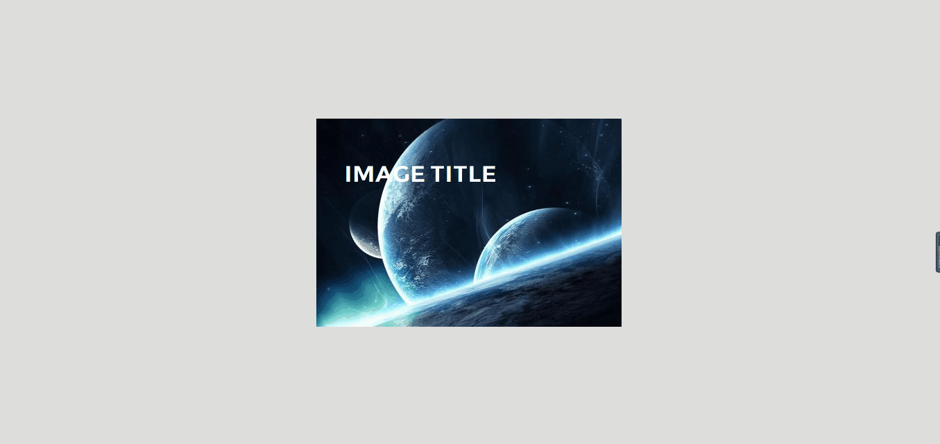
实现的效果
html部分
<!DOCTYPE html>
<html lang="en">
<head>
    <meta charset="UTF-8">
    <meta name="viewport" content="width=device-width, initial-scale=1.0">
    <meta http-equiv="X-UA-Compatible" content="ie=edge">
    <title>图片悬浮效果</title>
    <link rel="stylesheet" href="https://use.fontawesome.com/releases/v5.8.1/css/all.css" integrity="sha384-50oBUHEmvpQ+1lW4y57PTFmhCaXp0ML5d60M1M7uH2+nqUivzIebhndOJK28anvf" crossorigin="anonymous">
    <link rel="stylesheet" href="./css/index.css">
</head>
<body>
   <div class="image middle">
       <img src="http://img2.imgtn.bdimg.com/it/u=1688631197,3554659657&fm=26&gp=0.jpg" alt="">
       <div class="image-content">
           <h1>Image Title</h1>
           <div class="icons">
               <a href="javascript:;" class="icon fas fa-heart"></a>
               <a href="javascript:;" class="icon fas fa-comment"></a>
               <a href="javascript:;" class="icon fas fa-share"></a>
           </div>
       </div>
   </div>
</body>
</html>
css部分
* {
    padding: 0;
    margin: 0;
    font-family: "montserrat";
}

body {
    background: #ddd;
}

.middle {
    position: absolute;
    left: 50%;
    top: 50%;
    transform: translate(-50%,-50%);
}

.image {
    width: 440px;
    height: 300px;
    overflow: hidden;
    cursor: pointer;
}

.image-content {
    position: absolute;
    top: 0;
    left: 0;
    width: 100%;
    height: 100%;
    padding: 40px;
    box-sizing: border-box;
}


.image-content h1 {
    color: #fff;
    text-transform: uppercase;
    transform: translateY(20px);
    transition: 0.4s;
}

.image:hover .image-content h1 {
    transform: translateY(0px);
}

.icons {
    position: absolute;
    right: 40px;
    bottom: 40px;
}

.icon {
    text-decoration: none;
    color: #333;
    font-size: 22px;
    margin: 0 8px;
    transform: translateY(80px);
}

.image:hover .icon {
    transform: translateY(0px);
}

.icon:nth-of-type(1){
    transition: transform 0.4s 0.05s,color 0.4s
}

.icon:nth-of-type(2){
    transition: transform 0.4s 0.1s,color 0.4s
}

.icon:nth-of-type(3){
    transition: transform 0.4s 0.15s,color 0.4s
}

.icon:hover {
    color: #0984e3;
}

.image-content::before {
    content:"";
    position: absolute;
    left: 0;
    bottom: 0;
    background: rgba(255,255,255,.7);
    width: 100%;
    height: 0px;
    clip-path: polygon(0 100%,100% 0,100% 100%);
    transition: 0.5s
}


.image-content:hover::before {
    height: 140px;
}


 扫一扫
扫一扫


 2097
2097

 被折叠的 条评论
为什么被折叠?
被折叠的 条评论
为什么被折叠?
 到【灌水乐园】发言


