


1.什么是BFC?
W3C的链接:https://www.w3.org/TR/CSS2/visuren.html#block-formatting
9.4.1 Block formatting contexts
Floats, absolutely positioned elements, block containers (such as inline-blocks, table-cells, and table-captions) that are not block boxes, and block boxes with ‘overflow’ other than ‘visible’ (except when that value has been propagated to the viewport) establish new block formatting contexts for their contents.
In a block formatting context, boxes are laid out one after the other, vertically, beginning at the top of a containing block. The vertical distance between two sibling boxes is determined by the ‘margin’ properties. Vertical margins between adjacent block-level boxes in a block formatting context collapse.
In a block formatting context, each box’s left outer edge touches the left edge of the containing block (for right-to-left formatting, right edges touch). This is true even in the presence of floats (although a box’s line boxes may shrink due to the floats), unless the box establishes a new block formatting context (in which case the box itself may become narrower due to the floats).
For information about page breaks in paged media, please consult the section on allowed page breaks.9.4.1 Block formatting contexts
Floats, absolutely positioned elements, block containers (such as inline-blocks, table-cells, and table-captions) that are not block boxes, and block boxes with ‘overflow’ other than ‘visible’ (except when that value has been propagated to the viewport) establish new block formatting contexts for their contents.
In a block formatting context, boxes are laid out one after the other, vertically, beginning at the top of a containing block. The vertical distance between two sibling boxes is determined by the ‘margin’ properties. Vertical margins between adjacent block-level boxes in a block formatting context collapse.
In a block formatting context, each box’s left outer edge touches the left edge of the containing block (for right-to-left formatting, right edges touch). This is true even in the presence of floats (although a box’s line boxes may shrink due to the floats), unless the box establishes a new block formatting context (in which case the box itself may become narrower due to the floats).
For information about page breaks in paged media, please consult the section on allowed page breaks.
渣翻
Floats,绝对定位的元素,块容器(inline-blocks,table-cell,和table-captions)和块盒子(overflow不为visible)为它们的内容创建新的block formatting contexts(BFC).
在一个BFC里,盒子从包含块的顶端开始垂直地一个接一个地排列,两个盒子之间的垂直的间隙是由他们的margin 值所决定的。两个相邻的块级盒子的垂直外边距会发生叠加。
在块级格式化上下文中,每一个盒子的(margin-left)会触碰到容器的(border-left)(对于从右到左的格式来说,则触碰到margin-right),即使存在浮动也是如此,除非这个盒子创建一个新BFC(如果那样这个盒子可能变得更窄由于float)。
总结就是:
1.BFC的内部定位体系属于常规文档流。
2.一个BFC是一个HTML盒子并且至少满足下列条件中的任何一个:
a.float的值不为none
b.position的值不为static或者relative
c.display的值为 table-cell, table-caption, inline-block, flex, 或者 inline-flex中的其中一个
d.overflow的值不为visible
2.BFC如何应用?
BFC有一下特性:
1.内部的Box会在垂直方向,从顶部开始一个接一个地放置。
2.Box垂直方向的距离由margin决定。属于同一个BFC的两个相邻Box的margin会发生叠加
3.每个元素的margin box的左边, 与包含块border box的左边相接触(对于从左往右的格式化,否则相反)。即使存在浮动也是如此。
4.BFC的区域不会与float box叠加。
5.BFC就是页面上的一个隔离的独立容器,容器里面的子元素不会影响到外面的元素,反之亦然。
计算BFC的高度时,浮动元素也参与计算。
应用一:解决margin叠加问题
//css
p{width: 100px;height: 50px;margin: 20px;background: red;}
//html
<p>html</p>
<p>html</p>
<p>html</p>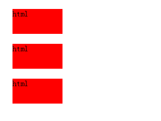
每个p标签只隔了20px;说明margin值发生了叠加
//css
p{width: 100px;height: 50px;margin: 20px;background: red;}
.parent{overflow: hidden;}
//html
<p>html</p>
<div class="parent">
    <p style="">html</p>
</div>
<p>html</p>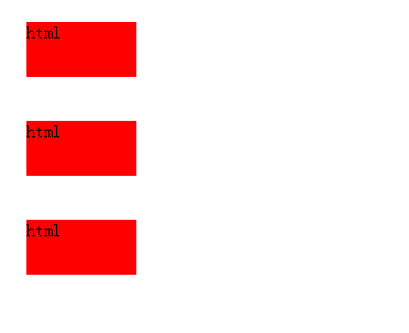
将中间的p放到另一个BFC中即可,不叠加后,p标签相隔:40px
应用二:左右分栏布局,右边自适应
//css
.left{width: 200px;height: 300px; background: red;float: left;}
.right{height: 500px;background: #6FC83C;}
//html
<div class="left">
    left
</div>
<div class="right">
    right
</div>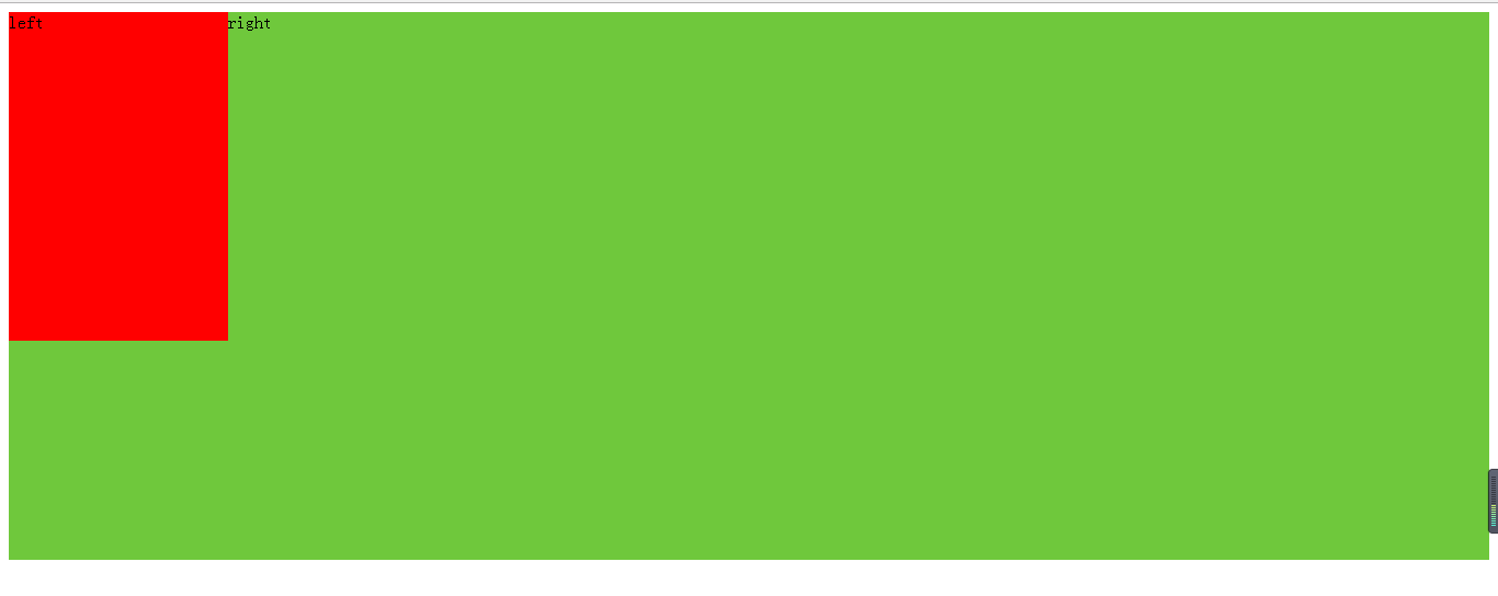
因为.left用了浮动所以,.left在.right上.
//css
.left{width: 200px;height: 300px; background: red;float: left;}
.right{height: 500px;background: #6FC83C;overflow: hidden;}
//html
<div class="left">
    left
</div>
<div class="right">
    right
</div>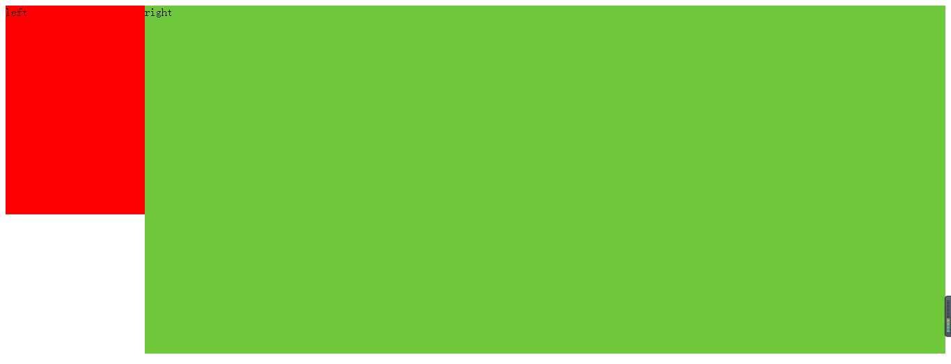
为.right设置overflow:hidden即可使得在不知右边宽度的情况下使得右边自适应布局
应用三:清除浮动
//css
.parent{border: 5px solid black;}
.left,.right{width: 200px;height: 200px; background: red;float: left;margin: 10px;}
//html
<div class="parent">
    <div class="left">
        left
    </div>
    <div class="right">
        right
    </div>
</div>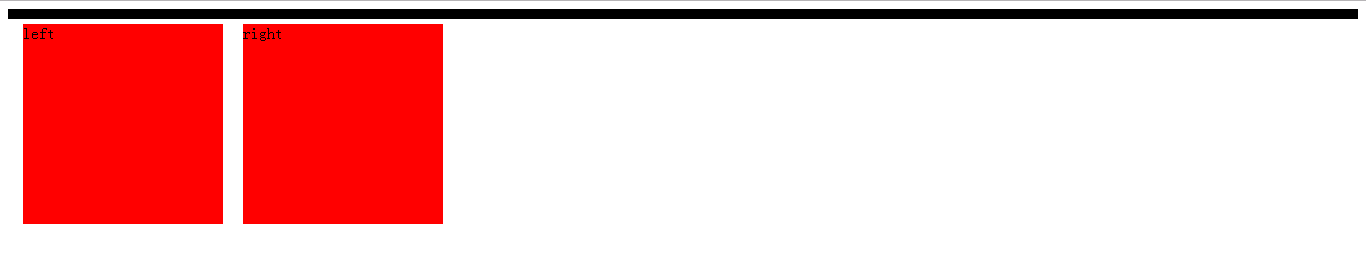
因为用了浮动,.right,.left脱离了文本流,使得父级高度为0
//css
.parent{border: 5px solid black;overflow: hidden;}
.left,.right{width: 200px;height: 200px; background: red;float: left;margin: 10px;}
//html
<div class="parent">
    <div class="left">
        left
    </div>
    <div class="right">
        right
    </div>
</div>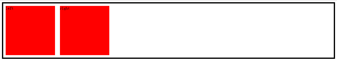
为父级加上overflow: hidden;即可使得子元素“塌陷”。
参考文章:http://www.html-js.com/article/1866
http://www.w3cplus.com/css/understanding-bfc-and-margin-collapse.html
http://www.w3cplus.com/css/understanding-block-formatting-contexts-in-css.html


 517
517

 被折叠的 条评论
为什么被折叠?
被折叠的 条评论
为什么被折叠?
 到【灌水乐园】发言


