


本文直接进入可视化,输入讲解输入列表生成图片,关于pandas操作看这篇pandas
可视化菜单
matplotlib导包
导包后使用
import matplotlib.pyplot as plt
import matplotlib
matplotlib.rcParams['font.family'] = 'SimHei' # 显示中文
matplotlib.pyplot.rcParams['axes.unicode_minus'] = False  #负号乱码
迅速可视化
objectname=[]
floatname = []
for i in data.columns:
    if (data[i].dtype)=='object':
        objectname.append(i)
    else:
        floatname.append(i)
import matplotlib
import matplotlib.pyplot as plt
matplotlib.rcParams['font.family'] = 'SimHei' # 显示中文
matplotlib.pyplot.rcParams['axes.unicode_minus'] = False  #负号乱码
def simp_show_pie(name,shownum='%3.1f%%',p=20):
    nv = data[i].value_counts(1)[:p]
    plt.title(f'{name} pie data show')
    plt.pie(nv.values, labels=nv.index,autopct=shownum)
    plt.show()
for i in objectname:
    if data[i].value_counts(i).size<=50:
        simp_show_pie(i,shownum='%3.1f%%')
import seaborn as sns
for i in floatname:
        sns.histplot(data[i])
        plt.show()
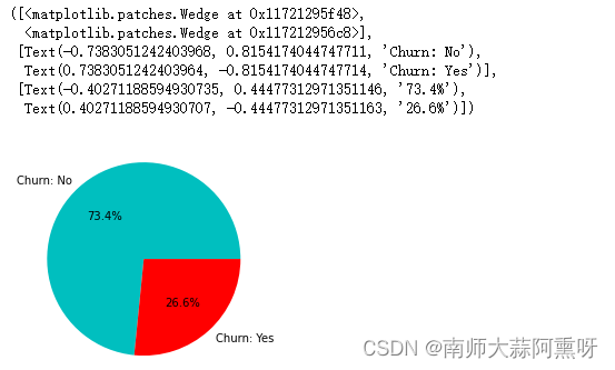
饼图
import matplotlib.pyplot as plt
def plt_pieshow(dff,name):
    """
    ddf:Dataframe['column name']
    name: title name
    """
    data = dff.value_counts(1)
    plt.pie(data, labels=data.index, autopct='%3.1f%%')
    plt.title(name)
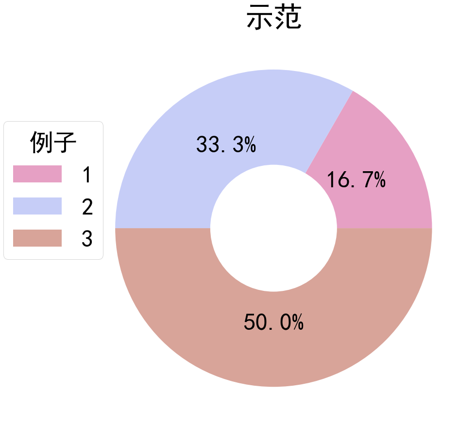
使用 plt.figure 函数设置图片的大小为 15x15
使用 plt.pie 函数绘制饼图,并设置相关的参数:
values:饼图中各个扇形所代表的数值。
radius:饼图的半径。
labels:是否在扇形上显示数据标签。设置为 None 表示不显示。
autopct:扇形上显示数据百分比的格式。
textprops:设置字体大小。
colors:饼图中各个扇形的颜色。
使用 plt.pie 再次绘制一个空心圆环图,以遮盖饼图中心的部分,使饼图看起来更美观。
使用 plt.title 函数为图片添加标题,并设置字体大小。
使用 plt.legend 函数为饼图添加图例。参数解释如下:
title:图例的标题。
bbox_to_anchor:调整图例在图片中的位置。第一个数字表示图例距离左边的距离,第二个数字表示图例距离下面的距离。
labels:图例中各个元素所代名字
def draw_pie_chart_with_legend(name, values):
	matplotlib.rcParams['font.family'] = 'SimHei' # 显示中文
	plt.rcParams['axes.unicode_minus'] = False  #负号乱码
    # 绘制饼图
    plt.figure(figsize=(15,15))
    #颜色组成设置,也可以用默认的,把pie的colors删了就可以了
    colors = ['#E6A0C4', '#C6CDF7', '#D8A499', '#7294D4', '#C6C6BC', '#869E82']
    #显示饼图的数据labels=None,不显示label,数据量过大不易展示,textprops字体大小,autopct保留几位小数
    plt.pie(values,radius=1, labels=None,autopct='%1.1f%%',textprops={'fontsize': 50},colors=colors)
    plt.pie([1,0,0,0],radius=0.4,colors='w')
    plt.title('示范',fontsize=60)
   # 绘制空心圆环图
    # 为饼图添加图例
    plt.rcParams.update({'font.size': 50})#图例大小
    ##bbox_to_anchor调节位置第一个代表距离左边距离,第二个代表距离下面距离
    plt.legend(title='例子', bbox_to_anchor=(0.1, 0.8),labels=name)
    plt.show()

#示范
draw_pie_chart_with_legend([1,2,3],[1,2,3])
显示结果
柱状图以及颜色设置
def draw_bar(name, values):
    # 设置图片的尺寸
    plt.figure(figsize=(40,30))
    colors = ['#E6A0C4', '#C6CDF7', '#D8A499', '#7294D4', '#C6C6BC', '#869E82']
    # 绘制柱状图
    bars= plt.bar(name,values,color=colors)
    # 设置坐标轴的刻度标签斜着显示
    plt.xticks(rotation=45)
    plt.title('示范')
    for bar in bars:
        height = bar.get_height()
        plt.text(bar.get_x() + bar.get_width() / 2, height / 2, f'{height}', ha='center',fontsize=50)

    plt.show()
draw_bar([1,2,3],[1,2,3])
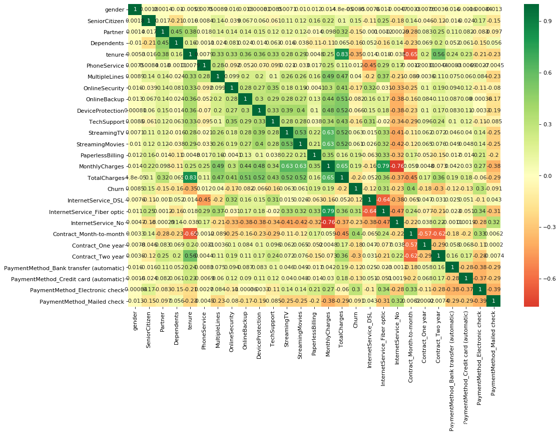
热力相关图图
corrmat=churn.corr()
f,ax=plt.subplots(figsize=(20,20))

# cmap='RdBu' 设置颜色
# 设置center数据时,如果有数据溢出,则手动设置的vmax、vmin会自动改变 vmax=1
sns.heatmap(corrmat,cmap='RdBu',square=True)

# 设置坐标轴标签字体大小
ax.tick_params(labelsize=18)
plt.title('Important Variables correlation map',fontsize=18)

#包装一下
#全表相关性分析
import seaborn as sns
def heatmap(data, method='pearson', camp='RdYlGn', figsize=(10 ,8)):
    """
    data: 整份数据
    method:默认为 pearson 系数
    camp:默认为:RdYlGn-红黄蓝;YlGnBu-黄绿蓝;Blues/Greens 也是不错的选择
    figsize: 默认为 10,8
    """
    plt.figure(figsize=figsize, dpi= 80)
    sns.heatmap(data.corr(method=method), \
                xticklabels=data.corr(method=method).columns, \
                yticklabels=data.corr(method=method).columns, cmap=camp, \
                center=0, annot=True)
    # 要想实现只是留下对角线一半的效果,括号内的参数可以加上 mask=mask

heatmap(data=dfM, figsize=(15,10))
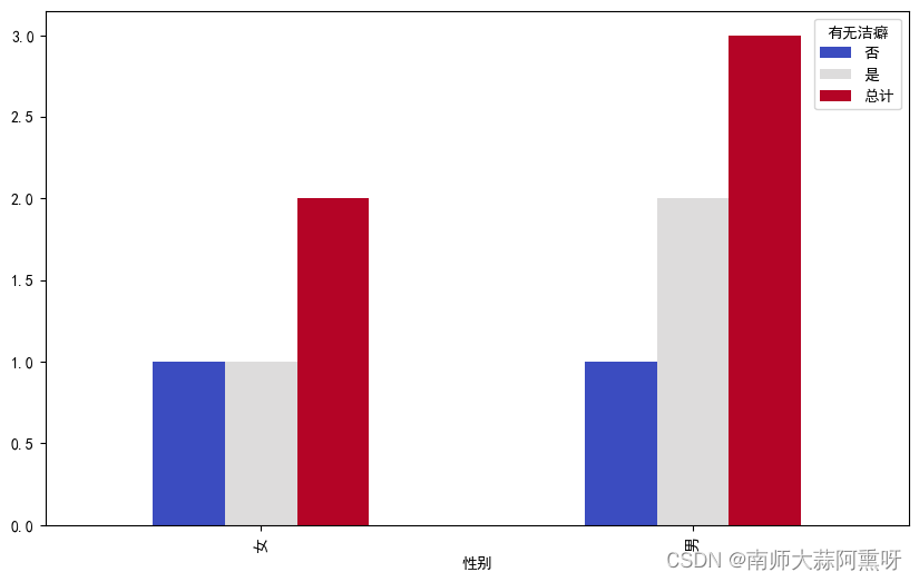
柱状图对比
# 假设您的数据框为 df
# 创建DataFrame
data = {
    '性别': ['男', '男', '女', '女', '男'],
    '有无洁癖': ['是', '否', '是', '否', '是']
}

df = pd.DataFrame(data)

# 使用pivot_table()函数来统计男性和女性犯罪的数量
crime_counts = df.pivot_table(index='性别', columns='有无洁癖', aggfunc='size', fill_value=0)

# 如果您需要将结果放在一起,您可以添加一个总计列
crime_counts['总计'] = crime_counts.sum(axis=1)

fig, ax = plt.subplots(figsize=(10, 6))
crime_counts.plot(kind='bar', stacked=False, colormap='coolwarm', ax=ax)
plt.show()
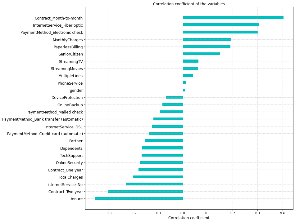
import numpy as np
# 计算每一个特征和目标(流失)的相关系数,排序画图,试图从特征相关性这个维度找到重要特征
churn_corr = df.corr()[['Exited']].sort_values(by='Exited').drop(['Exited']).reset_index()

fig,ax=plt.subplots(figsize=(12,12))
ind = np.arange(churn_corr.shape[0])
rects=ax.barh(ind,churn_corr['Exited'].values,color='c', height=0.4)
ax.set_yticks(ind)  # y 轴刻度
ax.set_yticklabels(churn_corr['index'],rotation='horizontal',fontsize=12)  # y 轴的标签
ax.set_xlabel('Correlation coefficient',fontsize=12)
ax.set_title('Correlation coefficient of the variables',fontsize=12)
plt.grid(linestyle='--', alpha=0.5)
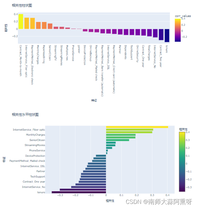
# 计算每一个特征和目标(流失)的相关系数,排序画图,试图从特征相关性这个维度找到重要特征
churn_corr = churn.corr()[['Churn']].sort_values(by='Churn').drop(['Churn']).reset_index()
churn_corr= churn_corr.rename(columns={'index':'col_labels','Churn':'corr_values'})

fig = px.bar(churn_corr, x=churn_corr.col_labels, y=churn_corr['corr_values'], color=churn_corr.corr_values, color_discrete_sequence=px.colors.qualitative.Plotly)
# 更新布局并倒置 x 和 y 轴
fig.update_layout(title_text='相关性柱状图', xaxis_title='相关性', yaxis_title='特征')
fig.update_xaxes(title_text='特征', autorange='reversed')  # 倒置 x 轴
fig.update_yaxes(title_text='相关性')  # 设置 y 轴标题
fig.show()

# 使用 Plotly 创建水平柱状图
fig = go.Figure(data=[go.Bar(
    y=churn_corr['col_labels'],  # y 轴使用特征标签
    x=churn_corr['corr_values'],  # x 轴使用相关性值
    orientation='h',  # 设置为水平方向
    marker=dict(color=churn_corr['corr_values'], colorscale='Viridis', colorbar=dict(title='相关性')),  # 设置颜色
)])

# 更新布局和轴标题
fig.update_layout(title='相关性水平柱状图', xaxis_title='相关性', yaxis_title='特征')

# 显示图表
fig.show()
import plotly.express as px
import pandas as pd
import plotly.graph_objects as go
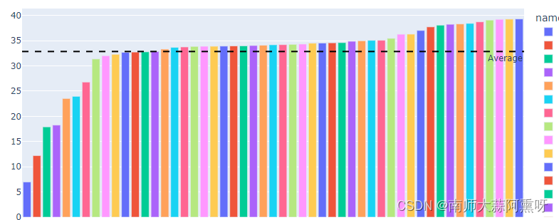
grdf = df.groupby('name')['salinity'].mean().sort_values()
grdf = pd.DataFrame(grdf)
fig = px.bar(grdf, x=grdf.index, y='salinity', color=grdf.index, color_discrete_sequence=px.colors.qualitative.Plotly)
fig.update_layout(title_text='Salinity in different sea areas', xaxis_title='Name', yaxis_title='Salinity')
fig.add_hline(y=grdf['salinity'].mean(), line_dash="dash", line_color="black", annotation_text="Average", annotation_position="bottom right")
fig.show()
import plotly.express as px
import pandas as pd
from plotly.subplots import make_subplots
import plotly.graph_objects as go
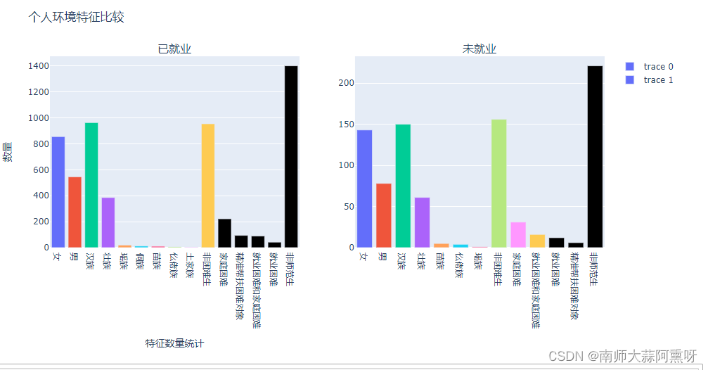
# Assuming listbar, values, listbar1, and values1 are defined elsewhere in your code
grdf = pd.concat([pd.DataFrame(listbar), pd.DataFrame(values)], axis=1)
grdf.columns = ['特征', '数量']
grdf1 = pd.concat([pd.DataFrame(listbar1), pd.DataFrame(values1)], axis=1)
grdf1.columns = ['特征', '数量']
# Create subplots
fig = make_subplots(rows=1, cols=2, subplot_titles=('Graph 1', 'Graph 2'))
# Add the first bar chart to the first subplot
fig.add_trace(
go.Bar(x=grdf['特征'], y=grdf['数量'], marker_color=px.colors.qualitative.Plotly),
row=1, col=1
)
# Add the second bar chart to the second subplot
fig.add_trace(
go.Bar(x=grdf1['特征'], y=grdf1['数量'], marker_color=px.colors.qualitative.Plotly),
row=1, col=2
)
# Update layout
fig.update_layout(title_text='Salinity in different sea areas', xaxis_title='特征数量统计', yaxis_title='数量')
# Show the figure
fig.show()
import numpy as np
# 计算每一个特征和目标(流失)的相关系数,排序画图,试图从特征相关性这个维度找到重要特征

tname = 'from_station_name'
churn_corr = total_df[tname].value_counts()[:50]

fig,ax=plt.subplots(figsize=(12,12))
ind = np.arange(churn_corr.shape[0])
rects=ax.barh(ind,churn_corr.values,color='c', height=0.4)

ax.set_yticks(ind)  # y 轴刻度
ax.set_yticklabels(churn_corr.index,rotation='horizontal',fontsize=12)  # y 轴的标签
ax.set_xlabel('count',fontsize=12)
ax.set_title(f'{tname}  count top10',fontsize=12)
plt.grid(linestyle='--', alpha=0.5)
折线图
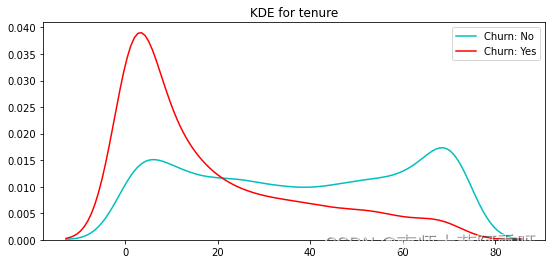
核密度估计(概率密度)
"""核密度估计"""
# 在没有已测得的样本分布的情况下,估计在取值点处的概率密度函数

def kdeplot(feature):
    plt.figure(figsize=(9, 4))
    plt.title("KDE for {}".format(feature))
    ax0 = sns.kdeplot(churn[churn['Churn'] == 0][feature].dropna(), color= 'c', label= 'Churn: No')
    ax1 = sns.kdeplot(churn[churn['Churn'] == 1][feature].dropna(), color= 'r', label= 'Churn: Yes')
kdeplot("tenure")
import seaborn as sns
import matplotlib.pyplot as plt

def kdeplot(feature, df, ax, title):
    try:
        ax.set_title("KDE for {}".format(title))
        ax0 = sns.kdeplot(df[df['corals'] == 0][feature].dropna(), color='c', label='exist: No', ax=ax)
        ax1 = sns.kdeplot(df[df['corals'] == 1][feature].dropna(), color='r', label='exist: Yes', ax=ax)

        # Filling the areas under the KDE curves with different colors and opacity
        ax0.fill_between(ax0.get_lines()[0].get_data()[0], ax0.get_lines()[0].get_data()[1], color='c', alpha=0.5)
        ax1.fill_between(ax1.get_lines()[1].get_data()[0], ax1.get_lines()[1].get_data()[1], color='r', alpha=0.5)
        ax.legend()  # Show the legend
    except:
        pass

# Create a 2x4 grid of subplots
fig, axes = plt.subplots(2, 4, figsize=(16, 8))
plt.subplots_adjust(wspace=0.5, hspace=0.5)  # Adjust the spacing

# List of features
features = ['salinity', 'January_temp', 'June_temp', 'area', 'latitude', 'longitude', 'type of sea', 'silt/sulfide']
titles = ['Salinity', 'January Temperature', 'June Temperature', 'Area', 'Latitude', 'Longitude', 'Type of Sea', 'Silt/Sulfide']

# Loop through the features and corresponding axes
for feature, title, ax in zip(features, titles, axes.flatten()):
    kdeplot(feature, df, ax, title)

plt.show()
def plot_line(x, y, title='资金对应日期变化', xlabel='日期', ylabel='总额'):
    import matplotlib
    import matplotlib.pyplot as plt
    plt.figure(figsize=(15,15))
    matplotlib.rcParams['font.family'] = 'SimHei' # 显示中文
    plt.plot(x, y)
    plt.title(title)
    # 设置显示的日期刻度
    plt.xticks(x[::50], x[::50], rotation=45)
    plt.xlabel(xlabel)
    plt.ylabel(ylabel)
    plt.show()
plot_line(day, c)
小提琴图
sns.catplot(x="SeniorCitizen", y="MonthlyCharges", hue="Churn",
            kind="violin", split=True, data=churn)

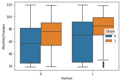
箱图
sns.boxplot(x="Partner", y="MonthlyCharges",
            hue="Churn", data=churn)  # palette=["m", "g"],  色调
# sns.despine(offset=10, trim=True)  # 边框设置
plt.show()
简单柱状图
X =df.groupby('用电主分类')['电度电价'].mean().index
Y = df.groupby('用电主分类')['电度电价'].mean().values
plt.bar(X, Y)
for a,b in zip(X,Y):
    plt.text(a,b,round(b,2))
plt.ylabel('values')  # 纵坐标轴标题
plt.xticks(rotation=45)
plt.show()
折线图
plt.figure()
y =[1,2,3]
x = [1,2,3]
plt.plot(y,x, label="values", color="#FF3B1D", marker='*', linestyle="-")
plt.legend()
plt.ylabel("价格")
plt.xlabel("日期")
plt.show()
sns快速
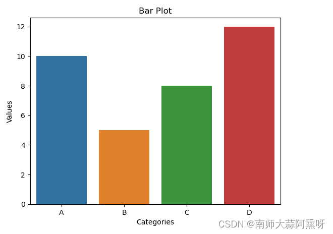
##柱状图
import seaborn as sns
import matplotlib.pyplot as plt

# Create sample data
x = ['A', 'B', 'C', 'D']
y = [10, 5, 8, 12]

# Create a bar plot using Seaborn
sns.barplot(x=x, y=y)

# Set labels for x and y axes
plt.xlabel('Categories')
plt.ylabel('Values')

# Set title for the plot
plt.title('Bar Plot')

# Display the plot
plt.show()
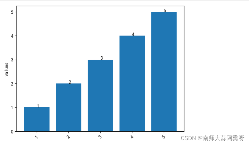
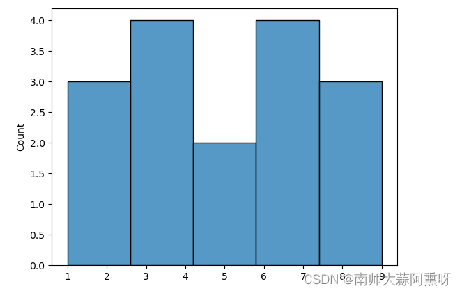
直方图
import seaborn as sns
import matplotlib.pyplot as plt
# Create a sample dataset
data = [1, 1, 2, 3, 3, 3, 4, 5, 5, 6, 6, 6, 7, 8, 8, 9]

# Create a histogram using Seaborn
sns.histplot(data)

# Display the plot
plt.show()
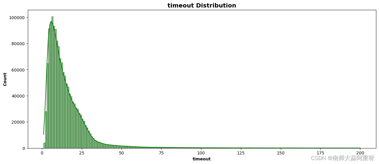
import seaborn as sns
# 设置画布的大小
plt.figure(figsize=(15, 6))

disc_hist = sns.histplot(data=total_df, x='timeout', bins=200, kde=True, color='green')
#标题坐标名称设置
disc_hist.set_xlabel('timeout', fontweight='bold')
disc_hist.set_ylabel('Count', fontweight='bold')
disc_hist.set_title('timeout Distribution', fontweight='heavy', size='x-large')
plt.show()
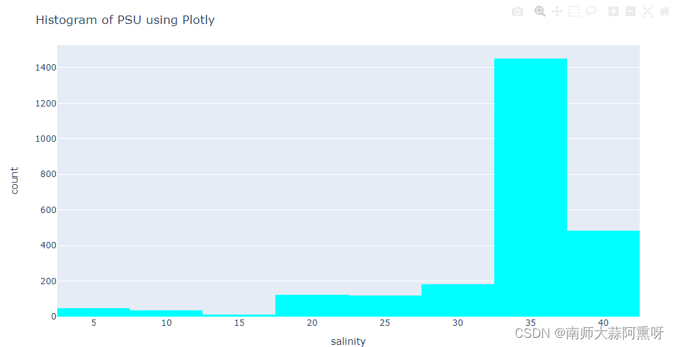
import matplotlib.pyplot as plt
import seaborn as sns
import plotly.express as px
import plotly.graph_objects as go
import plotly.figure_factory as ff
from plotly.subplots import make_subplots


# 使用Plotly绘制直方图
fig = px.histogram(df, x='salinity', nbins=10, color_discrete_sequence=['cyan'])
fig.update_layout(title_text='Histogram of PSU using Plotly')
fig.show()
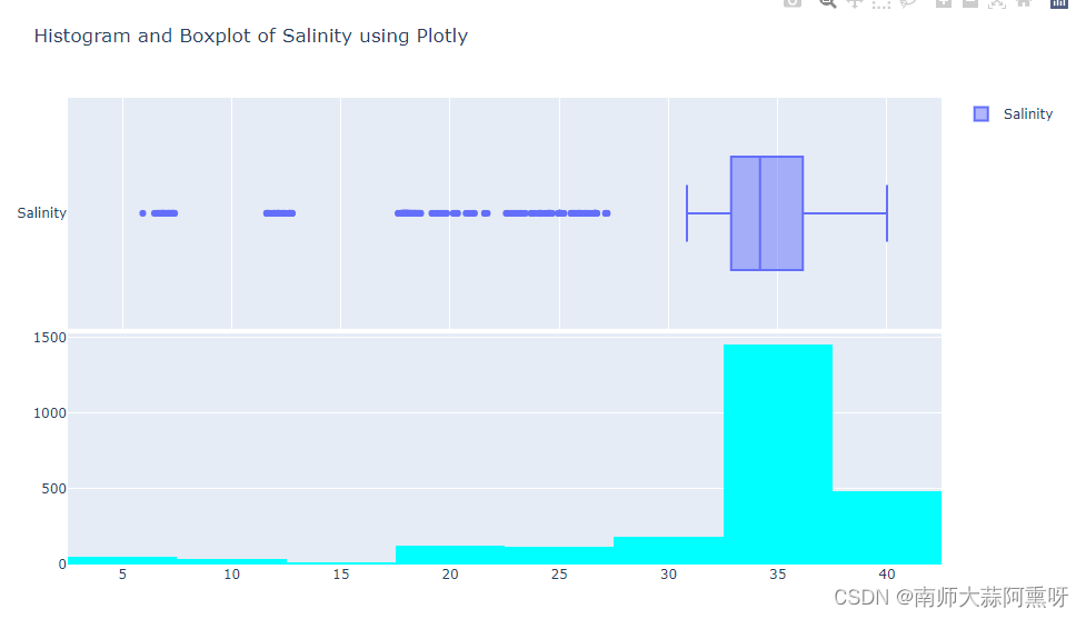
from plotly.subplots import make_subplots

# 创建子图
fig = make_subplots(rows=2, cols=1, shared_xaxes=True, vertical_spacing=0.01)

# 添加箱线图到第一行
fig.add_trace(go.Box(x=df['salinity'], name='Salinity' ,orientation='h'), row=1, col=1)

# 添加直方图到第二行
fig.add_trace(px.histogram(df, x='salinity', nbins=10, color_discrete_sequence=['cyan']).data[0], row=2, col=1)


# 调整布局
fig.update_layout(height=600, title_text="Histogram and Boxplot of Salinity using Plotly")

# 显示图形
fig.show()
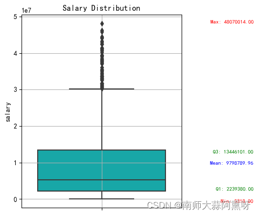
def sns_boxplot(df_copy,name="salary",masg=True,x=None,hue=None):
    # 设置画布的大小
    plt.figure(figsize=(6, 4.5))
    # 创建箱线图
    ax = sns.boxplot(y=name, x=None,hue=None ,data=df_copy, color='c')
    # 添加标题
    plt.title("Salary Distribution")
    if masg == True:
        # 获取统计信息
        q1 = df_copy['salary'].quantile(0.25)
        q3 = df_copy['salary'].quantile(0.75)
        mean_val = df_copy['salary'].mean()
        max_val = df_copy['salary'].max()
        min_val = df_copy['salary'].min()
        # 标记 Q1、Q3、均值、最大值和最小值
        ax.text(0.95, q1, f'Q1: {q1:.2f}', verticalalignment='bottom', horizontalalignment='right', color='green', fontsize=8)
        ax.text(0.95, q3, f'Q3: {q3:.2f}', verticalalignment='top', horizontalalignment='right', color='green', fontsize=8)
        ax.text(0.95, mean_val, f'Mean: {mean_val:.2f}', verticalalignment='center', horizontalalignment='right', color='blue', fontsize=8)
        ax.text(0.95, max_val, f'Max: {max_val:.2f}', verticalalignment='bottom', horizontalalignment='right', color='red', fontsize=8)
        ax.text(0.95, min_val, f'Min: {min_val:.2f}', verticalalignment='top', horizontalalignment='right', color='red', fontsize=8)


    plt.ylabel(name)
    # 设置坐标轴刻度标签的字体大小
    plt.xticks(fontsize=10)
    plt.yticks(fontsize=10)
    # 显示网格线
    plt.grid(True)
    # 调整图形布局
    plt.tight_layout()
    # 显示图形
    plt.show()
sns_boxplot(df_copy,name="salary",masg=True)
折线图
import seaborn as sns
import matplotlib.pyplot as plt
# Create a sample dataset
data = [1, 1, 2, 3, 3, 3, 4, 5, 5, 6, 6, 6, 7, 8, 8, 9]

# Create a histogram using Seaborn
sns.histplot(data)

# Display the plot
plt.show()
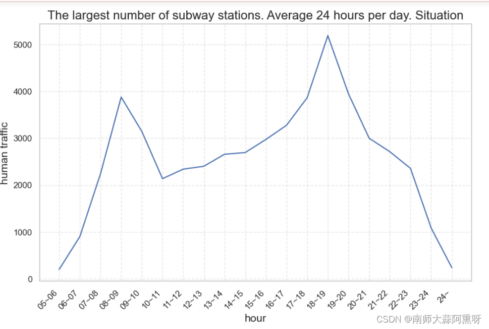
import seaborn as sns

data = df.loc[df['subway_station_name'] =='잠실(송파구청)'].iloc[:, 4:-1].mean(axis=0)
# 创建折线图
sns.set(style="whitegrid")  # 设置样式为白色网格

# 绘制折线图
plt.figure(figsize=(10, 6))  # 设置图形尺寸
# Create a histogram using Seaborn
ax =  sns.lineplot(x = data.index ,y =data.values)
# 添加标题和标签
plt.title('The largest number of subway stations. Average 24 hours per day. Situation', fontsize=16)  # 添加标题
# 倾斜 x 轴标签
ax.set_xticklabels(ax.get_xticklabels(), rotation=45, ha="right")

plt.xlabel('hour', fontsize=14)  # 添加 X 轴标签
plt.ylabel('human traffic', fontsize=14)  # 添加 Y 轴标签
plt.grid(linestyle='--', alpha=0.5)
plt.show()
地图
folium显示地图(可移动细分)
# import folium
# import pandas as pd

# # 创建一个地图
# m = folium.Map(location=[0, 0], zoom_start=2)

# # 读取数据
# data = df.copy()
# # 在地图上标记位置
# for index, row in data.iterrows():
#     folium.Marker([row['latitude'], row['longitude']], popup=row['name']).add_to(m)

# # 显示地图
# m
geopandas 显示地图
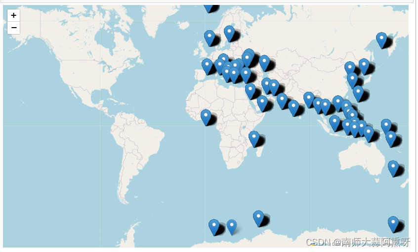
import geopandas as gpd
from shapely.geometry import Point
import matplotlib.pyplot as plt

# 假设您已经有了'df' DataFrame

# 创建一个GeoDataFrame
geometry = [Point(xy) for xy in zip(df['longitude'], df['latitude'])]
gdf = gpd.GeoDataFrame(df, geometry=geometry)

# 绘制地图
world = gpd.read_file(gpd.datasets.get_path('naturalearth_lowres'))
ax = world.plot(figsize=(10, 6))
gdf.plot(ax=ax, color='red')

plt.show()
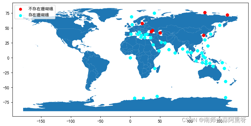
import geopandas as gpd
from shapely.geometry import Point
import matplotlib.pyplot as plt

df1 = df.loc[df['corals']==0]
df2 = df.loc[df['corals']==1]

# 创建第一个GeoDataFrame
geometry1 = [Point(xy) for xy in zip(df1['longitude'], df1['latitude'])]
gdf1 = gpd.GeoDataFrame(df1, geometry=geometry1)

# 创建第二个GeoDataFrame
geometry2 = [Point(xy) for xy in zip(df2['longitude'], df2['latitude'])]
gdf2 = gpd.GeoDataFrame(df2, geometry=geometry2)

# 绘制地图
world = gpd.read_file(gpd.datasets.get_path('naturalearth_lowres'))
ax = world.plot(figsize=(10, 6))

# 在地图上标记位置并添加图例
gdf1.plot(ax=ax, color='red', label='不存在珊瑚礁')  # 添加第一个数据集的标记
gdf2.plot(ax=ax, color='cyan', label='存在珊瑚礁')  # 添加第二个数据集的标记
plt.legend()  # 显示图例

plt.show()


 2065
2065


 被折叠的 条评论
为什么被折叠?
被折叠的 条评论
为什么被折叠?
 到【灌水乐园】发言


