


Element-UI中关于table表格的样式操作
自定义列的内容:
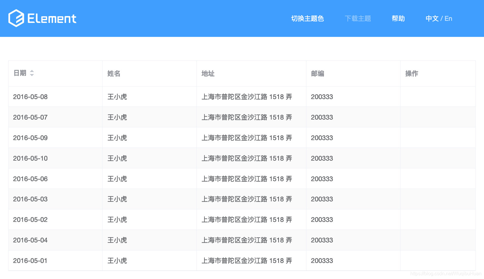
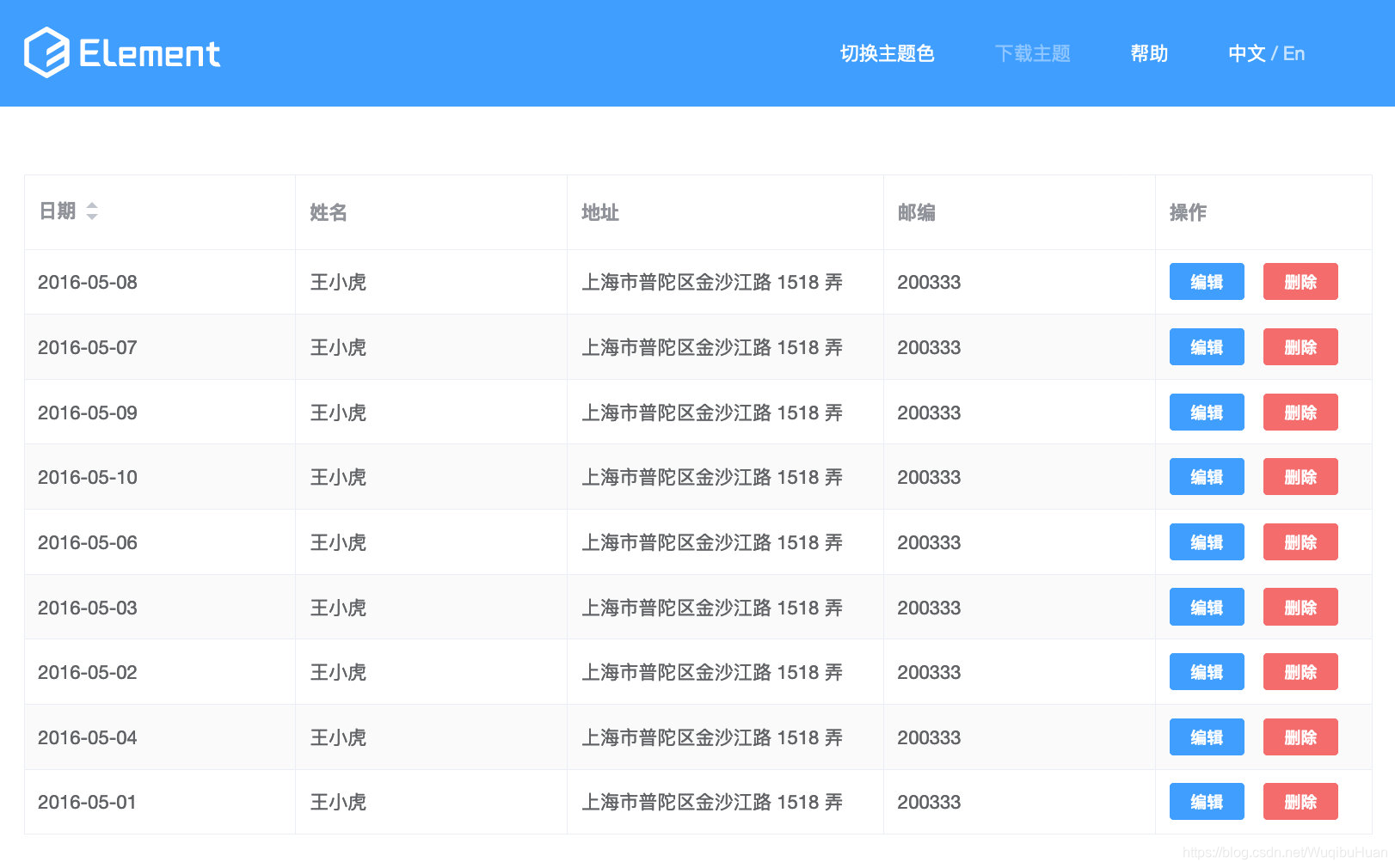
- 需求:在表格最后一栏添加操作按钮
通过slot-scope="scope"添加操作按钮,这是专门为我们提供的插槽,方便自定义添加不同的内容。
<el-table-column>
        <template slot-scope="scope">
          <el-button size="mini" type="primary">编辑</el-button>
          <el-button size="mini" type="danger">删除</el-button>
        </template>
</el-table-column>
scope.$index 获取当前行下标
<el-table-column label="操作" width="160">
            <template slot-scope="scope">
              <el-button size="mini" type="primary" plain @click ="showIndex(scope.$index)">点击显示当前行下标</el-button>
            </template>
</el-table-column>
**根据下标可以对指定某一行进行操作

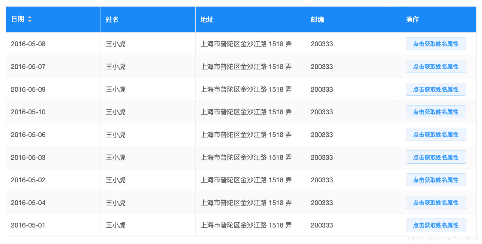
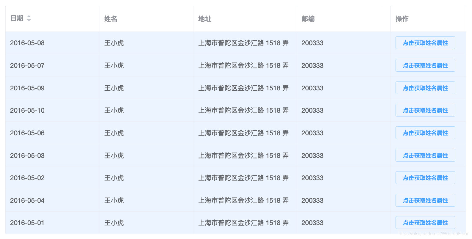
通过scope.row.属性名可以获取当前行对应的属性值
<el-table-column label="操作" width="160">
            <template slot-scope="scope">
              <el-button size="mini" type="primary" plain @click = "showName(scope.row.name)">点击获取姓名属性</el-button>
            </template>
 </el-table-column>

可以通过scope.row.属性名和三目运算符给特殊的属性值设定样式
<el-table-column prop="name" :label="langConfig.table.name[lang]" width="200">
            <template slot-scope="scope">
              <div :class="scope.row.name === '王大虎' ? 'specialColor':''">{{scope.row.name}}</div>
            </template>
</el-table-column>
编写specialColor样式,将字体颜色设置为红色
.specialColor{
    color:red;
  }
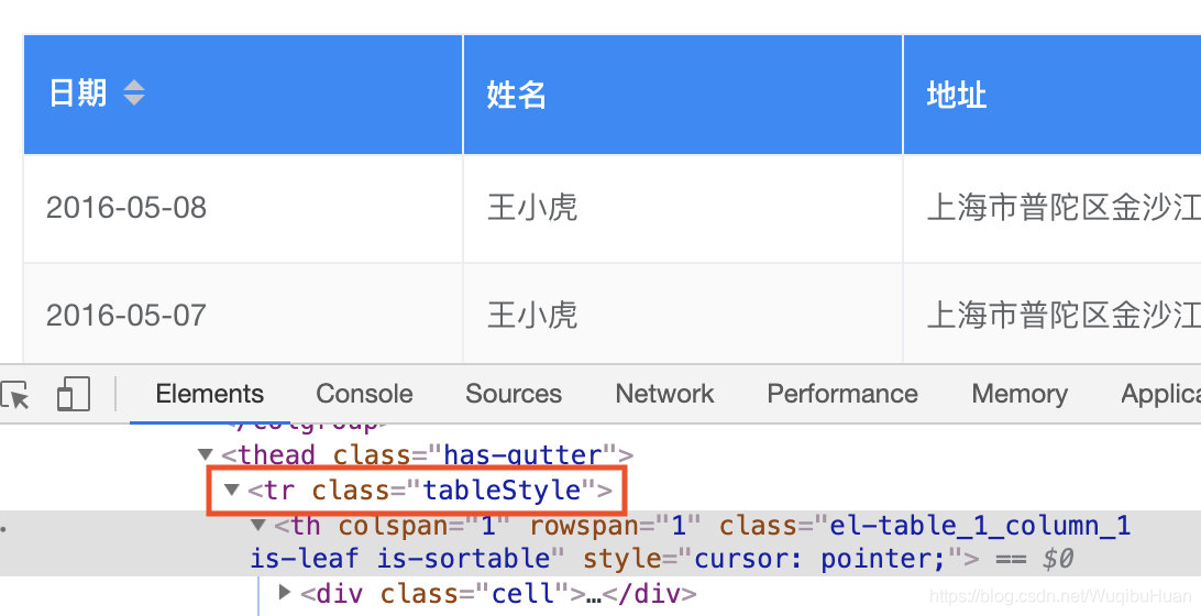
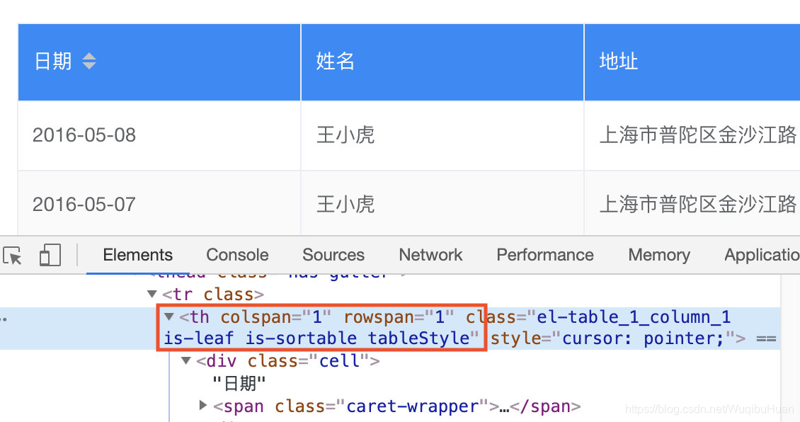
设置表头样式
- 需求:将表头样式改为背景色蓝色,字体颜色白色,字重400
header-cell-class-name - 说明:表头单元格的 className 的回调方法,也可以使用字符串为所有表头单元格设置一个固定的 className。
- 类型:Function({row, column, rowIndex, columnIndex})/String
- 函数形式:将headerStyle方法传递给header-cell-class-name
<el-table
     :data="tableData[lang]"
      class="table"
      stripe
      border
      :header-cell-class-name="headerStyle"
 >
编写headerStyle,返回class名称tableStyle
headerStyle ({row, column, rowIndex, columnIndex}) {
        return 'tableStyle'
      }
在style中编写tableStyle样式
<style lang = "scss">
  .tableStyle{
    background-color: #1989fa!important;
    color:#fff;
    font-weight:400;
  }
</style>
字符串形式:直接将tableStyle名称赋值给header-cell-class-name
<el-table
          :data="tableData[lang]"
          class="table"
          stripe
          border
          header-cell-class-name="tableStyle"
        >
header-cell-style
- 说明:表头单元格的 style 的回调方法,也可以使用一个固定的 Object 为所有表头单元格设置一样的 Style。
- 类型:Function({row, column, rowIndex, columnIndex})/Object
- 函数形式:将tableHeaderStyle方法传递给header-cell-style
<el-table
          :data="tableData[lang]"
          class="table"
          stripe
          border
          :header-cell-style='tableHeaderStyle'
        >
编写tableHeaderStyle方法,返回样式
tableHeaderStyle ({row, column, rowIndex, columnIndex}) {
        return 'background-color:#1989fa;color:#fff;font-weight:400;'
      }
对象形式:直接在对象中编写样式
<el-table
          :data="tableData[lang]"
          class="table"
          stripe
          border
          :header-cell-style="{
            'background-color': '#1989fa',
            'color': '#fff',
            'font-weight': '400'
        }">
header-row-class-name
- 说明:表头行的className 的回调方法,也可以使用字符串为所有表头行设置一个固定的 className。
- 类型:Function({row, rowIndex})/String
- 使用方式与header-cell-class-name类似
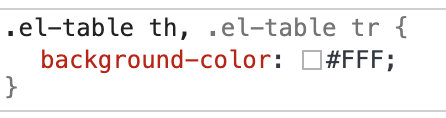
注意:header-row-class-name与header-cell-class-name的区别:
header-row-class-name是添加在tr上面的,header-cell-class-name是添加在th上面的。
header-row-class-name:
所以想让添加在tr上的样式显示,需要关闭element-ui中原本的th的样式,否则会被覆盖!(例如背景色)
header-cell-class-name:
header-row-style
- 说明:表头行的 style 的回调方法,也可以使用一个固定的 Object 为所有表头行设置一样的 Style。
- 类型:Function({row, rowIndex})/Object
- 使用方式与header-cell-style类似
设置行样式
需求:将表格中行的背景色设置为浅蓝色
row-class-name
- 说明:行的 className 的回调方法,也可以使用字符串为所有行设置一个固定的 className。
- 类型:Function({row, rowIndex})/String
- 使用方式与header-cell-class-name类似
row-style
- 说明:行的 style 的回调方法,也可以使用一个固定的 Object 为所有行设置一样的 Style。
- 类型:Function({row, rowIndex})/Object
- 使用方式与header-cell-style类似
函数形式:将tableRowStyle方法传给row-style
<el-table
          :data="tableData[lang]"
          class="table"
          border
          :row-style="tableRowStyle"
        >
编写tableRowStyle方法,返回样式
// 修改table tr行的背景色
tableRowStyle ({ row, rowIndex }) {
     return 'background-color:#ecf5ff'
   }
点击按钮操作当前行
需求:点击操作栏的按钮,切换按钮状态,并且将当前行置灰

①通过slot-scope添加按钮
<el-table-column label="操作" width="160">
            <template slot-scope="scope">
              <el-button size="mini" type="danger" plain v-if = "scope.row.buttonVisible" @click = "changeTable(scope.row.buttonVisible,scope.$index)">禁用该行</el-button>
              <el-button size="mini" type="primary" plain v-else @click = "changeTable(scope.row.buttonVisible,scope.$index)">启用该行</el-button>
            </template>
 </el-table-column>
②在每一个data中添加buttonVisible字段,使用v-if/v-else指令实现按钮的显示与隐藏
{
          date: '2016-05-10',
          name: '王大虎',
          address: '上海市普陀区金沙江路 1518 弄',
          zip: 200333,
          buttonVisible: true
 }
③编写changeTable方法,点击按钮的时候更改buttonVisible的值
changeTable (buttonVisible, index) {
        this.tableData[index].buttonVisible = !buttonVisible
      }
④给el-table添加row-style,并且将tableRowStyle方法传递给row-style
<el-table
          :data="tableData"
          class="table"
          border
          :row-style="tableRowStyle"
        >
⑤编写tableRowStyle方法,根据每一行buttonVisible的值设置背景色
// 修改table tr行的背景色
      tableRowStyle ({ row, rowIndex }) {
        if (this.tableData[rowIndex].buttonVisible === false) {
          return 'background-color: rgba(243,243,243,1)'
        }
      }


 扫一扫
扫一扫


 4205
4205

 被折叠的 条评论
为什么被折叠?
被折叠的 条评论
为什么被折叠?
 到【灌水乐园】发言


