


CSS元素主要分行内元素与块元素
块元素
- 块元素会在页面中独占一行(自上向下垂直排列)
- 默认宽度是父元素的全部(会把父元素撑满)
- 默认高度是被内容(子元素)撑开
- 常用的元素:
- div
- h1~h6
- p
- table
- ul
- ol
- menu
- hr
- address
-
行内元素 - 行内元素不会独占页面的一行,只占自身的大小
- 行内元素在页面中从左向右水平排列
- 行内元素的默认宽度和高度都是被内容撑开
- 行内元素只能容纳文本或其他行内元素
- 常见的行内元素:
- span
- em
- b
- label
- q
- s
- strong
- sub
- sup
行内块元素与行内元素的区别:是否可以设置宽高,margin-top/buttom 是否有效
常见的行内块元素:
- img
- buttom
- select
- input
- textarea
当给行内元素设置margin时,只有左右生效,上下无影响!
对于行内元素实现居中:
.box{
    text-align: center;
    /*
	    规定元素中文本(行内元素/行内块)的对齐方式
	    -left
	    -right
	    -center
	    -justify:两端对齐,ps:可能失效
	    -inherit:从父元素继承
    */
}
span{
    line-height: 400px;
    /*实现垂直居中*/
}
确定宽度的块元素实现居中:
块元素默认宽度为父元素的宽度,而高度则被内容撑开,这时候结合水平公式:
left+margin-left+border-left+padding-left+width+border-right+margin-right+padding-right+right=包含块的内容区宽度
可以通过设置width和margin:auto实现水平居中
.box1{
width:200px;
height:200px;
}
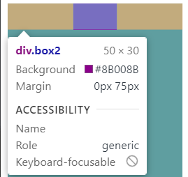
.box2{
width: 50px;
height:30px ;
background-color: darkmagenta;
margin: auto;
}
<div class="box1">
<div class="box2"></div>
</div>
为什么不能实现垂直居中?
块元素的性质是独占一行,高度由内容撑开。此时对于box2而言,包含块的宽度为父元素宽度200px,包含块的高度为子元素高度30px;在水平方向上,可以通过margin:auto自动调整margin-left/right实现居中。但,在垂直方向上,剩余空间已经为0,无法调整实现垂直居中。
如果想实现垂直居中,则可以结合position:absolute
现在来回顾一下position:absolute的特性
绝对定位(absolute)
- 特点
- 1、开启绝对定位后,如不设置偏移量,元素位置不会发生变化
- 2、开启绝对定位后,元素会从文档流中脱离
- 3、绝对定位会改变元素的性质,行内变成块,块的宽高被内容撑开
- 4、绝对定位会使元素提升一个层级
- 5、绝对定位是相对于其包含块进行定位的
包含块(containing block)
- 正常情况下:包含块就是离当前元素最近的祖先块元素
- 绝对定位的包含块:
- 包含块就是离它最近的开启了定位的祖先包含元素
- 如果所有祖先元素都没有开启定位,则根元素就是包含块 -html(根元素、初始包含块)
当给子元素开启绝对定位,给父元素开启相对定位时,子元素的包含块宽高则为父元素的宽高。此事垂直方向上的水平表达式也成立了。
.box1{
   width: 200px;
   height: 200px;
   background-color: cadetblue;
   position: relative;
}
.box2{
   width: 50px;
   height:30px ;
   background-color: darkmagenta;
   position: absolute;
   top:0;
   bottom: 0;
   left: 0;
   right: 0;
   margin: auto;
}
通过top/left 向下向右移动一半父元素的高度/宽度,再向上向左移动子元素的一半也可以实现居中的效果
  .box1{
    width: 200px;
    height: 200px;
    background-color: cadetblue;
    position: relative;
}
.box2{
    /* display: table-cell;
    vertical-align: middle;
    text-align: center; */
    width: 50px;
    height:30px ;
    background-color: darkmagenta;
    position: absolute;
    left: 50%;
    top:50%;
    margin-left: -25px;/*width一半*/
    margin-top: -15px;/*height一半*/
}

未知宽度的块元素居中:
1.使用table+margin:auto实现水平居中
.box2{
    display: table;
    background-color: darkmagenta;
    margin:auto;
}

此时可以实现水平居中却无法实现垂直居中,对元素设置margin时候,上下失效,我猜想此时的box2为行内元素属性,但是当给定义line-height实现垂直居中时候。发现和纯行内元素有不同的地方。的确能实现垂直居中和水平居中,但是却有点小问题。同时text-align: center;对display:table失效。目前display:table不是很清楚,后续看看能不能补充。

.box1{
    width: 200px;
    height: 200px;
    background-color: cadetblue;
}
.box2{
    display: table;
    background-color: darkmagenta;
    margin:auto;
    line-height: 200px;
}
.box3{
    background-color: crimson;
    text-align: center;
    width: 200px;
    height: 200px;
}
span{
    background-color:cyan;
    line-height: 200px;
}
2.display:inline-block/inline +text-align实现水平居中
.box1{
  width: 200px;
  height: 200px;
  background-color: cadetblue;
  text-align: center;
}
.box2{
  display: inline-block;
  background-color: darkmagenta;
}
3.transform实现居中
实现原理同left/top,margin-left/margin-top
.box1{
    width: 200px;
    height: 200px;
    background-color: cadetblue;
    position: relative;
}
.box2{
    background-color: darkmagenta;
    position: absolute;
    left: 50%;
    top: 50%;
    transform: translate(-50%,-50%);
}


 2750
2750


 被折叠的 条评论
为什么被折叠?
被折叠的 条评论
为什么被折叠?
 到【灌水乐园】发言


