


详情请参考博客: Top 50 matplotlib Visualizations
因编译更新问题,本文将稍作更改,以便能够顺利运行。
1 Ordered Bar Chart
有序条形图有效地传达项目的排名顺序。但是,将图表上方的指标值相加,用户将从图表本身获得准确的信息。这是一种基于计数或任何给定指标可视化项目的经典方法。查看此免费视频教程,了解如何实现和解释有序条形图。
# Import Setup
from Setup import pd
from Setup import plt

# Prepare Data
df_raw = pd.read_csv("https://github.com/selva86/datasets/raw/master/mpg_ggplot2.csv")
df = df_raw[['cty', 'manufacturer']].groupby('manufacturer').apply(lambda x: x.mean())
df.sort_values('cty', inplace=True)
df.reset_index(inplace=True)

# Draw plot
import matplotlib.patches as patches

fig, ax = plt.subplots(figsize=(16,10), facecolor='white', dpi= 80)
ax.vlines(x=df.index, ymin=0, ymax=df.cty, color='firebrick', alpha=0.7, linewidth=20)

# Annotate Text
for i, cty in enumerate(df.cty):
    ax.text(i, cty+0.5, round(cty, 1), horizontalalignment='center')


# Title, Label, Ticks and Ylim
ax.set_title('Bar Chart for Highway Mileage', fontdict={'size':22})
ax.set(ylabel='Miles Per Gallon', ylim=(0, 30))
plt.xticks(df.index, df.manufacturer.str.upper(), rotation=60, horizontalalignment='right', fontsize=12)

# Add patches to color the X axis labels
p1 = patches.Rectangle((.57, -0.005), width=.33, height=.13, alpha=.1, facecolor='green', transform=fig.transFigure)
p2 = patches.Rectangle((.124, -0.005), width=.446, height=.13, alpha=.1, facecolor='red', transform=fig.transFigure)
fig.add_artist(p1)
fig.add_artist(p2)
plt.show()
运行结果为:

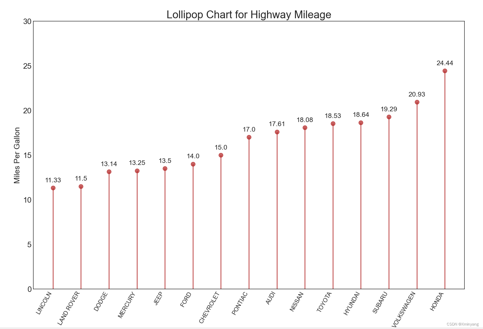
2 Lollipop Chart
该图表的作用与有序条形图类似,具有视觉上令人愉悦的方式。
# Import Setup
from Setup import pd
from Setup import plt

# Prepare Data
df_raw = pd.read_csv("https://github.com/selva86/datasets/raw/master/mpg_ggplot2.csv")
df = df_raw[['cty', 'manufacturer']].groupby('manufacturer').apply(lambda x: x.mean())
df.sort_values('cty', inplace=True)
df.reset_index(inplace=True)

# Draw plot
fig, ax = plt.subplots(figsize=(16,10), dpi= 80)
ax.vlines(x=df.index, ymin=0, ymax=df.cty, color='firebrick', alpha=0.7, linewidth=2)
ax.scatter(x=df.index, y=df.cty, s=75, color='firebrick', alpha=0.7)

# Title, Label, Ticks and Ylim
ax.set_title('Lollipop Chart for Highway Mileage', fontdict={'size':22})
ax.set_ylabel('Miles Per Gallon')
ax.set_xticks(df.index)
ax.set_xticklabels(df.manufacturer.str.upper(), rotation=60, fontdict={'horizontalalignment': 'right', 'size':12})
ax.set_ylim(0, 30)

# Annotate
for row in df.itertuples():
    ax.text(row.Index, row.cty+.5, s=round(row.cty, 2), horizontalalignment= 'center', verticalalignment='bottom', fontsize=14)

plt.show()
运行结果为:
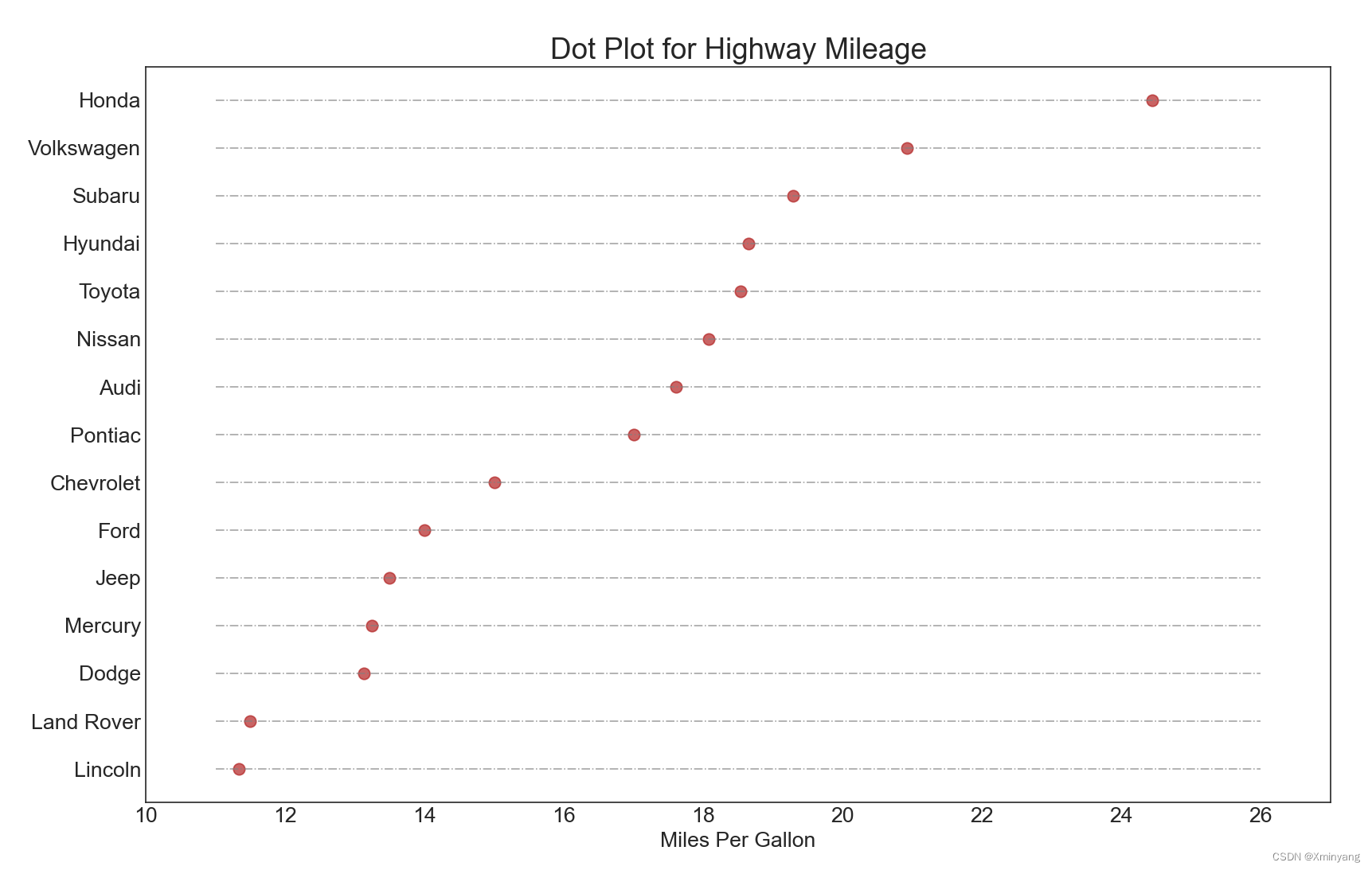
3 Dot Plot
点图表示项目的排名顺序。由于它沿水平轴对齐,因此您可以更轻松地可视化点之间的距离。
# Import Setup
from Setup import pd
from Setup import plt

# Prepare Data
df_raw = pd.read_csv("https://github.com/selva86/datasets/raw/master/mpg_ggplot2.csv")
df = df_raw[['cty', 'manufacturer']].groupby('manufacturer').apply(lambda x: x.mean())
df.sort_values('cty', inplace=True)
df.reset_index(inplace=True)

# Draw plot
fig, ax = plt.subplots(figsize=(16,10), dpi= 80)
ax.hlines(y=df.index, xmin=11, xmax=26, color='gray', alpha=0.7, linewidth=1, linestyles='dashdot')
ax.scatter(y=df.index, x=df.cty, s=75, color='firebrick', alpha=0.7)

# Title, Label, Ticks and Ylim
ax.set_title('Dot Plot for Highway Mileage', fontdict={'size':22})
ax.set_xlabel('Miles Per Gallon')
ax.set_yticks(df.index)
ax.set_yticklabels(df.manufacturer.str.title(), fontdict={'horizontalalignment': 'right'})
ax.set_xlim(10, 27)
plt.show()
运行结果为:
4 Slope Chart
斜率图最适合比较给定人员/项目的“之前”和“之后”位置。
# Import Setup
from Setup import pd
from Setup import plt
from Setup import np

import matplotlib.lines as mlines
# Import Data
df = pd.read_csv("https://raw.githubusercontent.com/selva86/datasets/master/gdppercap.csv")

left_label = [str(c) + ', '+ str(round(y)) for c, y in zip(df.continent, df['1952'])]
right_label = [str(c) + ', '+ str(round(y)) for c, y in zip(df.continent, df['1957'])]
klass = ['red' if (y1-y2) < 0 else 'green' for y1, y2 in zip(df['1952'], df['1957'])]

# draw line
# https://stackoverflow.com/questions/36470343/how-to-draw-a-line-with-matplotlib/36479941
def newline(p1, p2, color='black'):
    ax = plt.gca()
    l = mlines.Line2D([p1[0],p2[0]], [p1[1],p2[1]], color='red' if p1[1]-p2[1] > 0 else 'green', marker='o', markersize=6)
    ax.add_line(l)
    return l

fig, ax = plt.subplots(1,1,figsize=(14,14), dpi= 80)

# Vertical Lines
ax.vlines(x=1, ymin=500, ymax=13000, color='black', alpha=0.7, linewidth=1, linestyles='dotted')
ax.vlines(x=3, ymin=500, ymax=13000, color='black', alpha=0.7, linewidth=1, linestyles='dotted')

# Points
ax.scatter(y=df['1952'], x=np.repeat(1, df.shape[0]), s=10, color='black', alpha=0.7)
ax.scatter(y=df['1957'], x=np.repeat(3, df.shape[0]), s=10, color='black', alpha=0.7)

# Line Segmentsand Annotation
for p1, p2, c in zip(df['1952'], df['1957'], df['continent']):
    newline([1,p1], [3,p2])
    ax.text(1-0.05, p1, c + ', ' + str(round(p1)), horizontalalignment='right', verticalalignment='center', fontdict={'size':14})
    ax.text(3+0.05, p2, c + ', ' + str(round(p2)), horizontalalignment='left', verticalalignment='center', fontdict={'size':14})

# 'Before' and 'After' Annotations
ax.text(1-0.05, 13000, 'BEFORE', horizontalalignment='right', verticalalignment='center', fontdict={'size':18, 'weight':700})
ax.text(3+0.05, 13000, 'AFTER', horizontalalignment='left', verticalalignment='center', fontdict={'size':18, 'weight':700})

# Decoration
ax.set_title("Slopechart: Comparing GDP Per Capita between 1952 vs 1957", fontdict={'size':22})
ax.set(xlim=(0,4), ylim=(0,14000), ylabel='Mean GDP Per Capita')
ax.set_xticks([1,3])
ax.set_xticklabels(["1952", "1957"])
plt.yticks(np.arange(500, 13000, 2000), fontsize=12)

# Lighten borders
plt.gca().spines["top"].set_alpha(.0)
plt.gca().spines["bottom"].set_alpha(.0)
plt.gca().spines["right"].set_alpha(.0)
plt.gca().spines["left"].set_alpha(.0)
plt.show()
运行结果为:

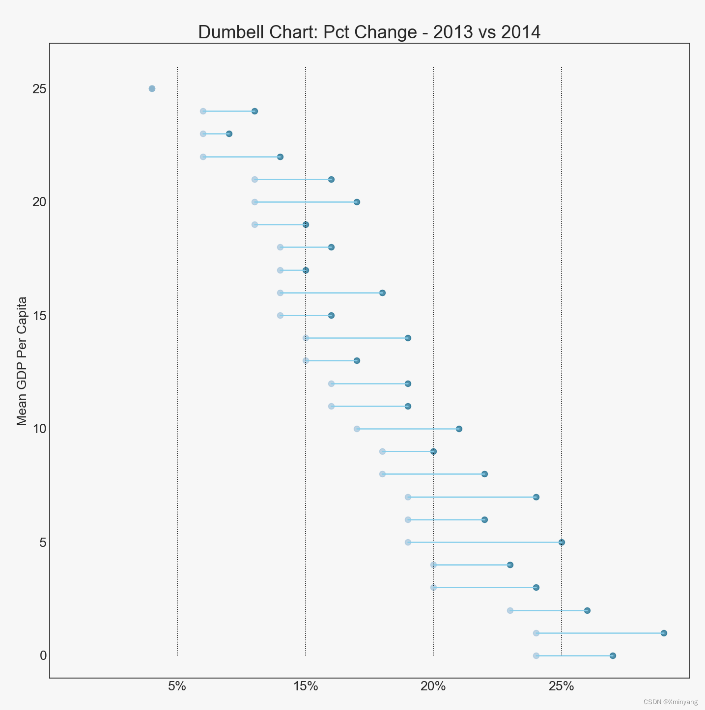
5 Dumbbell Plot
哑铃图传达了各种物品的“之前”和“之后”位置以及物品的等级顺序。如果您想可视化特定项目/计划对不同对象的影响,它非常有用。
# Import Setup
from Setup import pd
from Setup import plt

import matplotlib.lines as mlines

# Import Data
df = pd.read_csv("https://raw.githubusercontent.com/selva86/datasets/master/health.csv")
df.sort_values('pct_2014', inplace=True)
df.reset_index(inplace=True)

# Func to draw line segment
def newline(p1, p2, color='black'):
    ax = plt.gca()
    l = mlines.Line2D([p1[0],p2[0]], [p1[1],p2[1]], color='skyblue')
    ax.add_line(l)
    return l

# Figure and Axes
fig, ax = plt.subplots(1,1,figsize=(14,14), facecolor='#f7f7f7', dpi= 80)

# Vertical Lines
ax.vlines(x=.05, ymin=0, ymax=26, color='black', alpha=1, linewidth=1, linestyles='dotted')
ax.vlines(x=.10, ymin=0, ymax=26, color='black', alpha=1, linewidth=1, linestyles='dotted')
ax.vlines(x=.15, ymin=0, ymax=26, color='black', alpha=1, linewidth=1, linestyles='dotted')
ax.vlines(x=.20, ymin=0, ymax=26, color='black', alpha=1, linewidth=1, linestyles='dotted')

# Points
ax.scatter(y=df['index'], x=df['pct_2013'], s=50, color='#0e668b', alpha=0.7)
ax.scatter(y=df['index'], x=df['pct_2014'], s=50, color='#a3c4dc', alpha=0.7)

# Line Segments
for i, p1, p2 in zip(df['index'], df['pct_2013'], df['pct_2014']):
    newline([p1, i], [p2, i])

# Decoration
ax.set_facecolor('#f7f7f7')
ax.set_title("Dumbell Chart: Pct Change - 2013 vs 2014", fontdict={'size':22})
ax.set(xlim=(0,.25), ylim=(-1, 27), ylabel='Mean GDP Per Capita')
ax.set_xticks([.05, .1, .15, .20])
ax.set_xticklabels(['5%', '15%', '20%', '25%'])
ax.set_xticklabels(['5%', '15%', '20%', '25%'])
plt.show()
运行结果为:


 385
385


 被折叠的 条评论
为什么被折叠?
被折叠的 条评论
为什么被折叠?
 到【灌水乐园】发言


