


Setup
Run this once before the plot’s code. The individual charts, however, may redefine its own aesthetics.
# !pip install brewer2mpl
import numpy as np
import pandas as pd
import matplotlib as mpl
import matplotlib.pyplot as plt
import seaborn as sns
import warnings; warnings.filterwarnings(action='once')

large = 22; med = 16; small = 12
params = {'axes.titlesize': large,
          'legend.fontsize': med,
          'figure.figsize': (16, 10),
          'axes.labelsize': med,
          'axes.titlesize': med,
          'xtick.labelsize': med,
          'ytick.labelsize': med,
          'figure.titlesize': large}
plt.rcParams.update(params)
plt.style.use('seaborn-whitegrid')
sns.set_style("white")
%matplotlib inline

# Version
print(mpl.__version__)  #> 3.0.0
print(sns.__version__)  #> 0.9.0
Correlation
The plots under correlation is used to visualize the relationship between 2 or more variables. That is, how does one variable change with respect to another.
1. Scatter plot
Scatteplot is a classic and fundamental plot used to study the relationship between two variables. If you have multiple groups in your data you may want to visualise each group in a different color. In matplotlib, you can conveniently do this using plt.scatterplot().
Show Code

2. Bubble plot with Encircling
Sometimes you want to show a group of points within a boundary to emphasize their importance. In this example, you get the records from the dataframe that should be encircled and pass it to the encircle() described in the code below.
Show Code
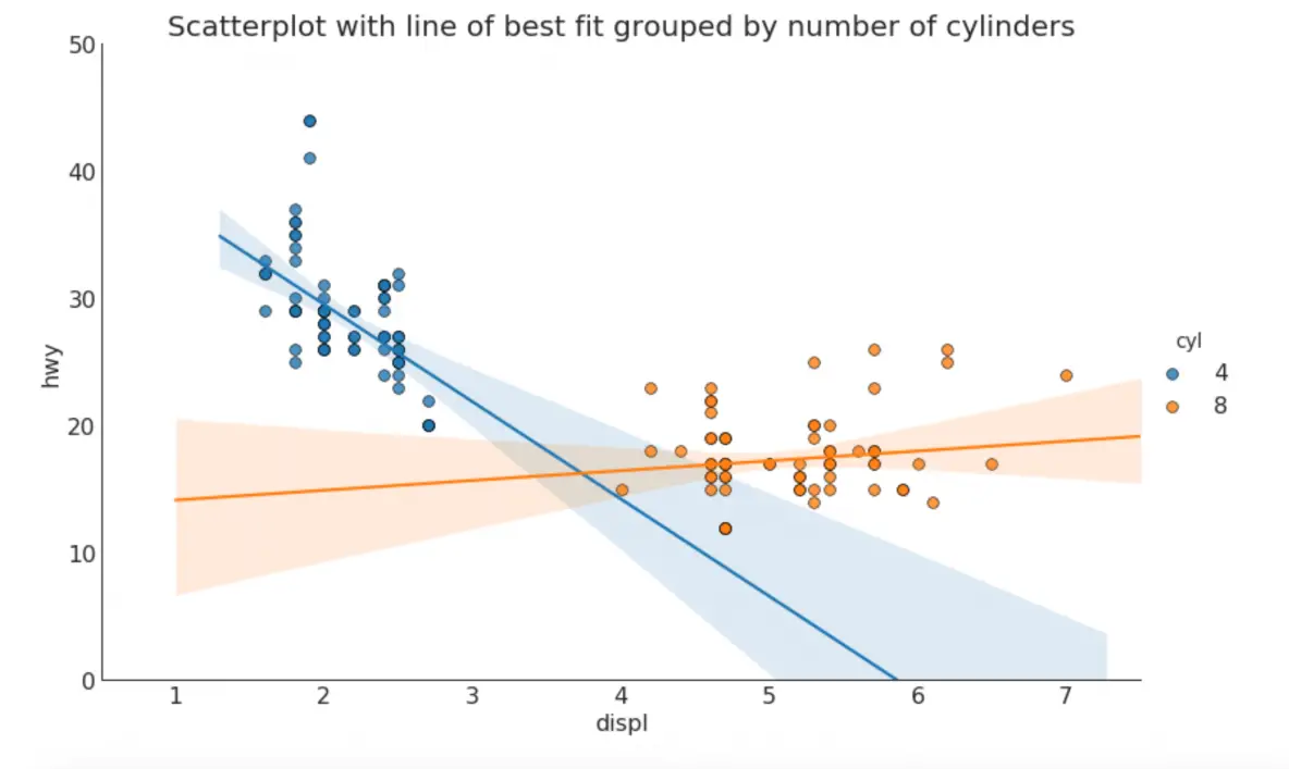
3. Scatter plot with linear regression line of best fit
If you want to understand how two variables change with respect to each other, the line of best fit is the way to go. The below plot shows how the line of best fit differs amongst various groups in the data. To disable the groupings and to just draw one line-of-best-fit for the entire dataset, remove the hue='cyl' parameter from the sns.lmplot() call below.
Show Code
Each regression line in its own column
Alternately, you can show the best fit line for each group in its own column. You cando this by setting the col=groupingcolumn parameter inside the sns.lmplot().
Show Code
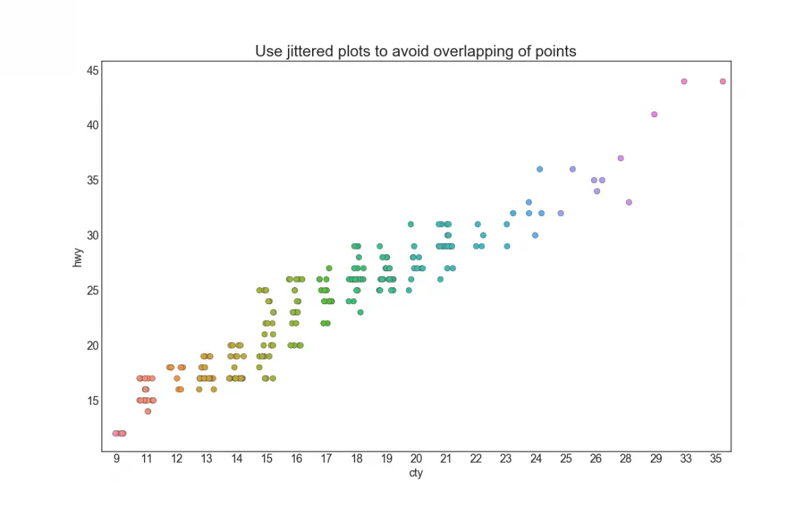
4. Jittering with stripplot
Often multiple datapoints have exactly the same X and Y values. As a result, multiple points get plotted over each other and hide. To avoid this, jitter the points slightly so you can visually see them. This is convenient to do using seaborn’s stripplot().
Show Code
5. Counts Plot
Another option to avoid the problem of points overlap is the increase the size of the dot depending on how many points lie in that spot. So, larger the size of the point more is the concentration of points around that.
# Import Data
df = pd.read_csv("https://raw.githubusercontent.com/selva86/datasets/master/mpg_ggplot2.csv")
df_counts = df.groupby(['hwy', 'cty']).size().reset_index(name='counts')

# Draw Stripplot
fig, ax = plt.subplots(figsize=(16,10), dpi= 80)
sns.stripplot(df_counts.cty, df_counts.hwy, size=df_counts.counts*2, ax=ax)

# Decorations
plt.title('Counts Plot - Size of circle is bigger as more points overlap', fontsize=22)
plt.show()
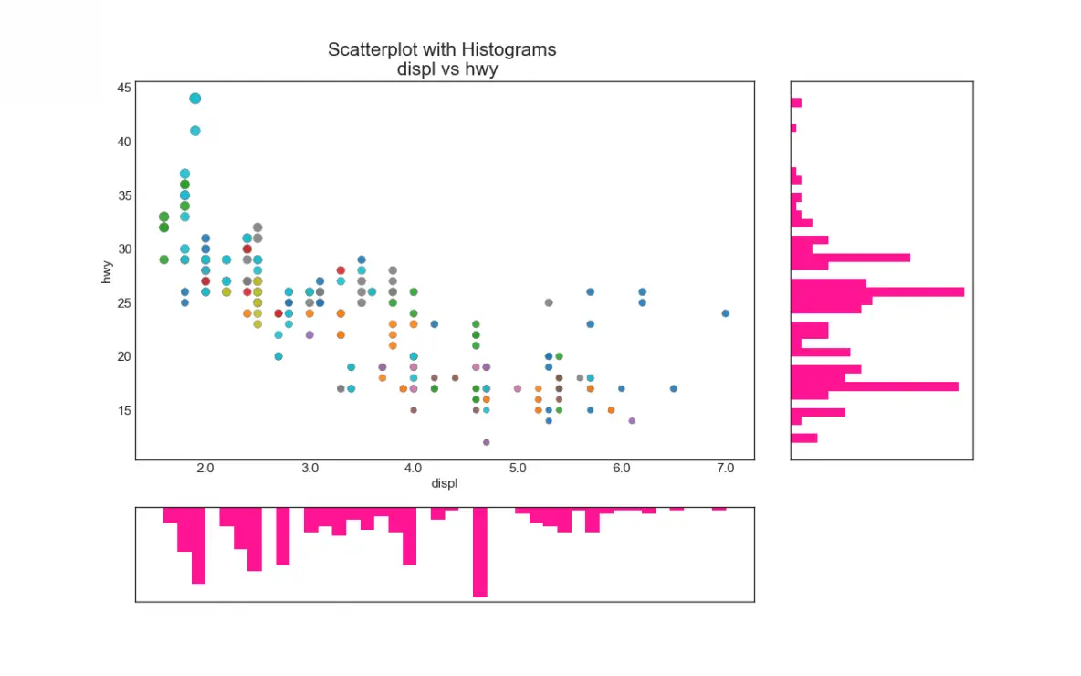
6. Marginal Histogram
Marginal histograms have a histogram along the X and Y axis variables. This is used to visualize the relationship between the X and Y along with the univariate distribution of the X and the Y individually. This plot if often used in exploratory data analysis (EDA).
Show Code
7. Marginal Boxplot
Marginal boxplot serves a similar purpose as marginal histogram. However, the boxplot helps to pinpoint the median, 25th and 75th percentiles of the X and the Y.
Show Code
8. Correllogram
Correlogram is used to visually see the correlation metric between all possible pairs of numeric variables in a given dataframe (or 2D array).
# Import Dataset
df = pd.read_csv("https://github.com/selva86/datasets/raw/master/mtcars.csv")

# Plot
plt.figure(figsize=(12,10), dpi= 80)
sns.heatmap(df.corr(), xticklabels=df.corr().columns, yticklabels=df.corr().columns, cmap='RdYlGn', center=0, annot=True)

# Decorations
plt.title('Correlogram of mtcars', fontsize=22)
plt.xticks(fontsize=12)
plt.yticks(fontsize=12)
plt.show()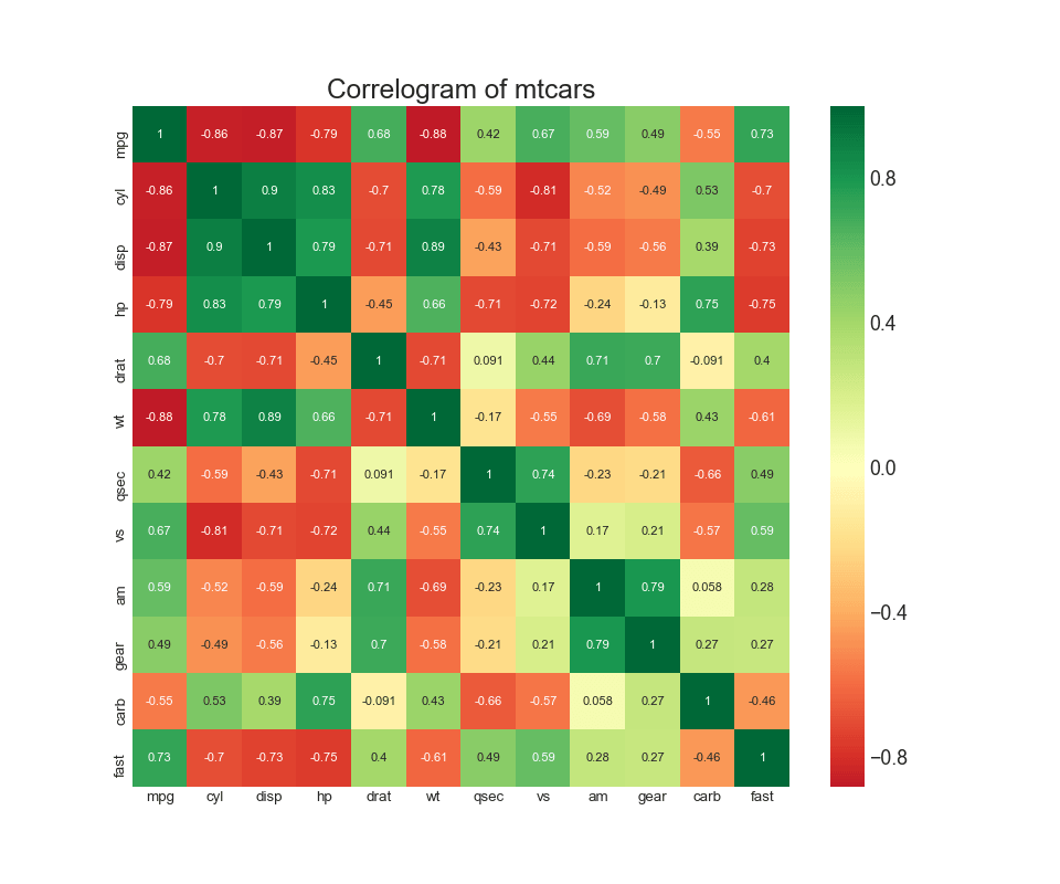
9. Pairwise Plot
Pairwise plot is a favorite in exploratory analysis to understand the relationship between all possible pairs of numeric variables. It is a must have tool for bivariate analysis.
# Load Dataset
df = sns.load_dataset('iris')

# Plot
plt.figure(figsize=(10,8), dpi= 80)
sns.pairplot(df, kind="scatter", hue="species", plot_kws=dict(s=80, edgecolor="white", linewidth=2.5))
plt.show()
# Load Dataset
df = sns.load_dataset('iris')

# Plot
plt.figure(figsize=(10,8), dpi= 80)
sns.pairplot(df, kind="reg", hue="species")
plt.show()
Deviation
10. Diverging Bars
If you want to see how the items are varying based on a single metric and visualize the order and amount of this variance, the diverging bars is a great tool. It helps to quickly differentiate the performance of groups in your data and is quite intuitive and instantly conveys the point.
# Prepare Data
df = pd.read_csv("https://github.com/selva86/datasets/raw/master/mtcars.csv")
x = df.loc[:, ['mpg']]
df['mpg_z'] = (x - x.mean())/x.std()
df['colors'] = ['red' if x < 0 else 'green' for x in df['mpg_z']]
df.sort_values('mpg_z', inplace=True)
df.reset_index(inplace=True)

# Draw plot
plt.figure(figsize=(14,10), dpi= 80)
plt.hlines(y=df.index, xmin=0, xmax=df.mpg_z, color=df.colors, alpha=0.4, linewidth=5)

# Decorations
plt.gca().set(ylabel='$Model$', xlabel='$Mileage$')
plt.yticks(df.index, df.cars, fontsize=12)
plt.title('Diverging Bars of Car Mileage', fontdict={'size':20})
plt.grid(linestyle='--', alpha=0.5)
plt.show()
11. Diverging Texts
Diverging texts is similar to diverging bars and it preferred if you want to show the value of each items within the chart in a nice and presentable way.
# Prepare Data
df = pd.read_csv("https://github.com/selva86/datasets/raw/master/mtcars.csv")
x = df.loc[:, ['mpg']]
df['mpg_z'] = (x - x.mean())/x.std()
df['colors'] = ['red' if x < 0 else 'green' for x in df['mpg_z']]
df.sort_values('mpg_z', inplace=True)
df.reset_index(inplace=True)

# Draw plot
plt.figure(figsize=(14,14), dpi= 80)
plt.hlines(y=df.index, xmin=0, xmax=df.mpg_z)
for x, y, tex in zip(df.mpg_z, df.index, df.mpg_z):
    t = plt.text(x, y, round(tex, 2), horizontalalignment='right' if x < 0 else 'left',
                 verticalalignment='center', fontdict={'color':'red' if x < 0 else 'green', 'size':14})

# Decorations
plt.yticks(df.index, df.cars, fontsize=12)
plt.title('Diverging Text Bars of Car Mileage', fontdict={'size':20})
plt.grid(linestyle='--', alpha=0.5)
plt.xlim(-2.5, 2.5)
plt.show()
12. Diverging Dot Plot
Divering dot plot is also similar to the diverging bars. However compared to diverging bars, the absence of bars reduces the amount of contrast and disparity between the groups.
Show Code
13. Diverging Lollipop Chart with Markers
Lollipop with markers provides a flexible way of visualizing the divergence by laying emphasis on any significant datapoints you want to bring attention to and give reasoning within the chart appropriately.
Show Code
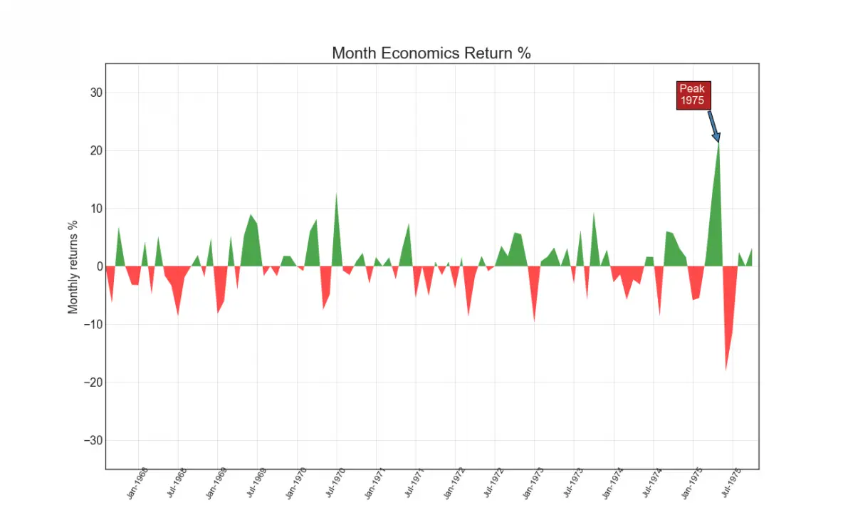
14. Area Chart
By coloring the area between the axis and the lines, the area chart throws more emphasis not just on the peaks and troughs but also the duration of the highs and lows. The longer the duration of the highs, the larger is the area under the line.
Show Code
Ranking
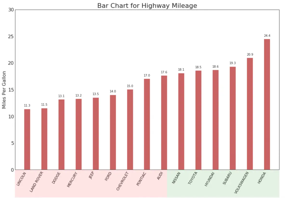
15. Ordered Bar Chart
Ordered bar chart conveys the rank order of the items effectively. But adding the value of the metric above the chart, the user gets the precise information from the chart itself.
Show Code
16. Lollipop Chart
Lollipop chart serves a similar purpose as a ordered bar chart in a visually pleasing way.
Show Code
17. Dot Plot
The dot plot conveys the rank order of the items. And since it is aligned along the horizontal axis, you can visualize how far the points are from each other more easily.
# Prepare Data
df_raw = pd.read_csv("https://github.com/selva86/datasets/raw/master/mpg_ggplot2.csv")
df = df_raw[['cty', 'manufacturer']].groupby('manufacturer').apply(lambda x: x.mean())
df.sort_values('cty', inplace=True)
df.reset_index(inplace=True)

# Draw plot
fig, ax = plt.subplots(figsize=(16,10), dpi= 80)
ax.hlines(y=df.index, xmin=11, xmax=26, color='gray', alpha=0.7, linewidth=1, linestyles='dashdot')
ax.scatter(y=df.index, x=df.cty, s=75, color='firebrick', alpha=0.7)

# Title, Label, Ticks and Ylim
ax.set_title('Dot Plot for Highway Mileage', fontdict={'size':22})
ax.set_xlabel('Miles Per Gallon')
ax.set_yticks(df.index)
ax.set_yticklabels(df.manufacturer.str.title(), fontdict={'horizontalalignment': 'right'})
ax.set_xlim(10, 27)
plt.show()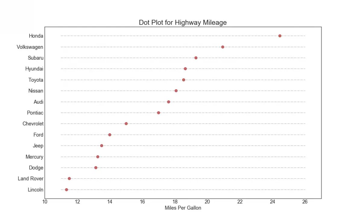
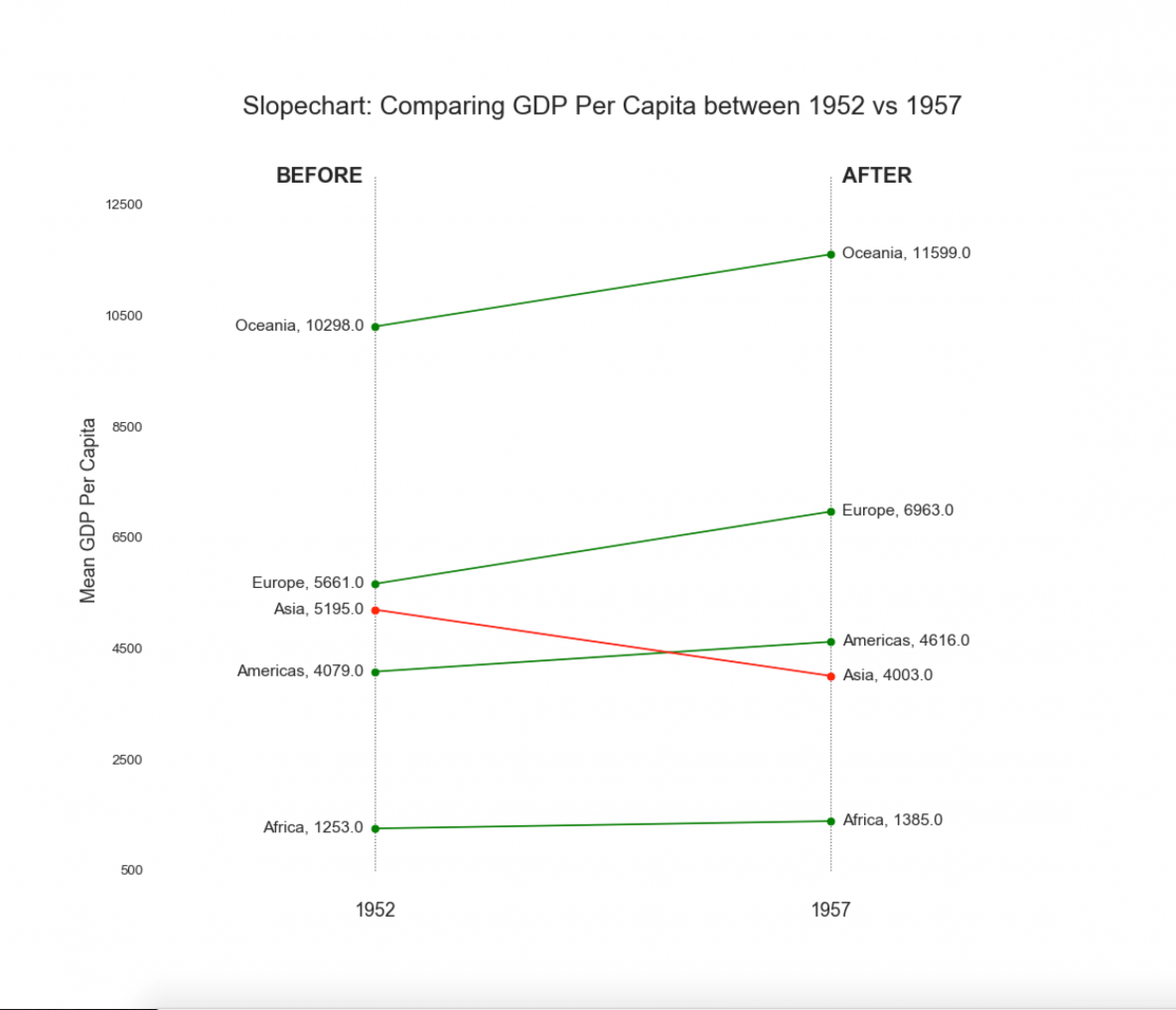
18. Slope Chart
Slope chart is most suitable for comparing the ‘Before’ and ‘After’ positions of a given person/item.
Show Code
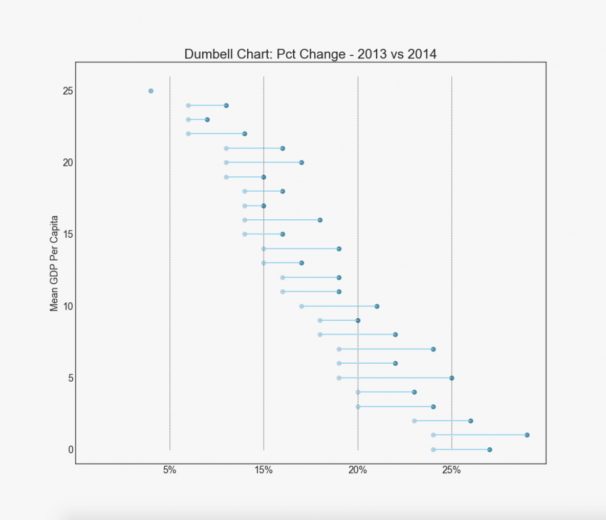
19. Dumbbell Plot
Dumbbell plot conveys the ‘before’ and ‘after’ positions of various items along with the rank ordering of the items. Its very useful if you want to visualize the effect of a particular project / initiative on different objects.
Show Code
Distribution
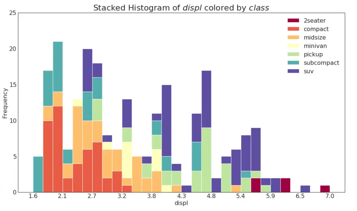
20. Histogram for Continuous Variable
Histogram shows the frequency distribution of a given variable. The below representation groups the frequency bars based on a categorical variable giving a greater insight about the continuous variable and the categorical variable in tandem.
Show Code
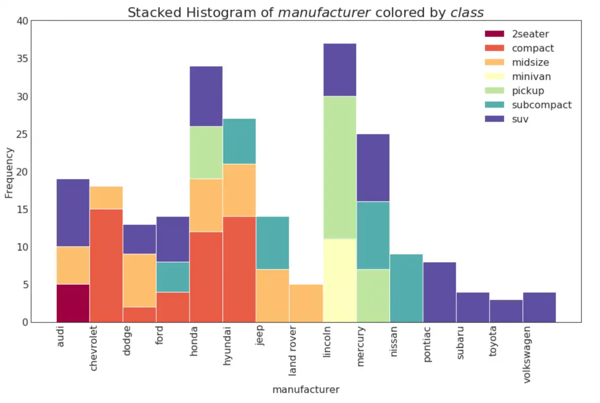
21. Histogram for Categorical Variable
The histogram of a categorical variable shows the frequency distribution of a that variable. By coloring the bars, you can visualize the distribution in connection with another categorical variable representing the colors.
Show Code
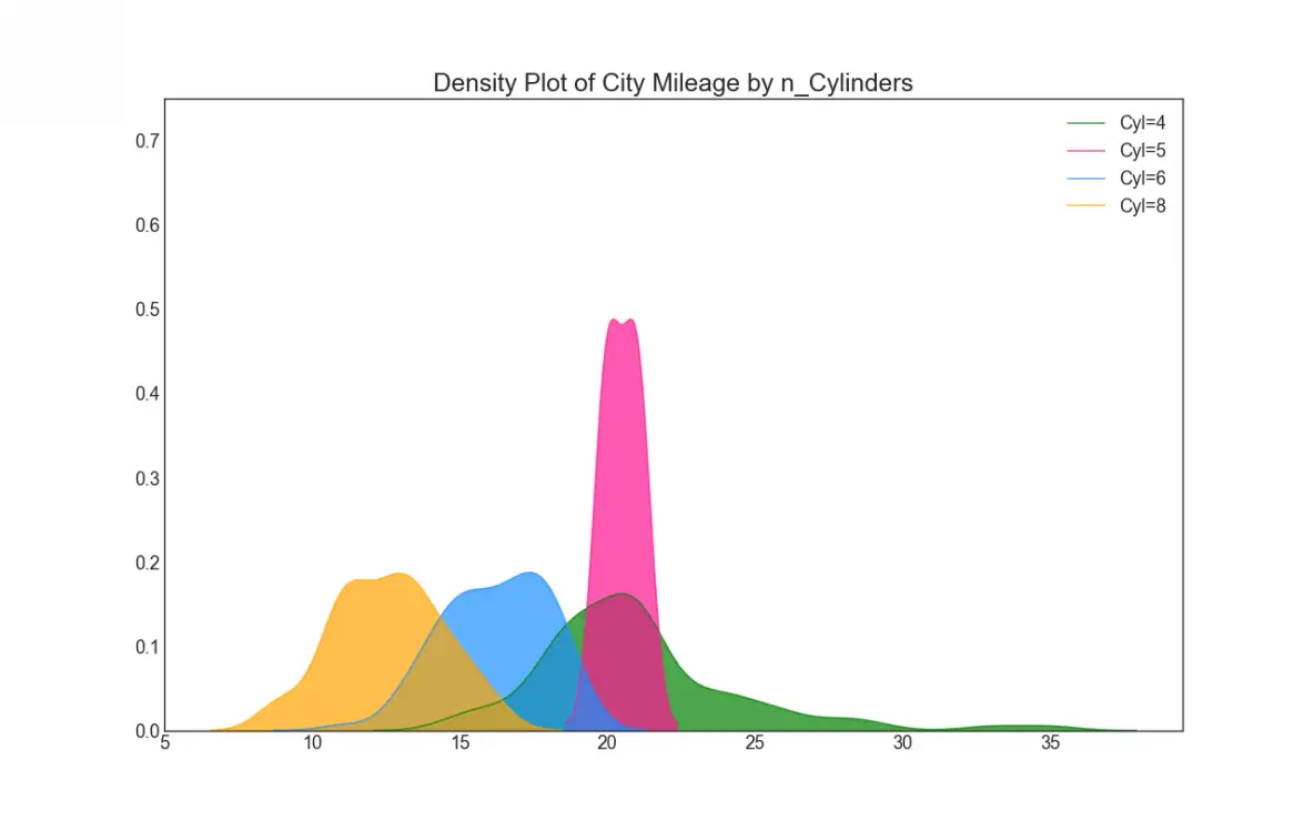
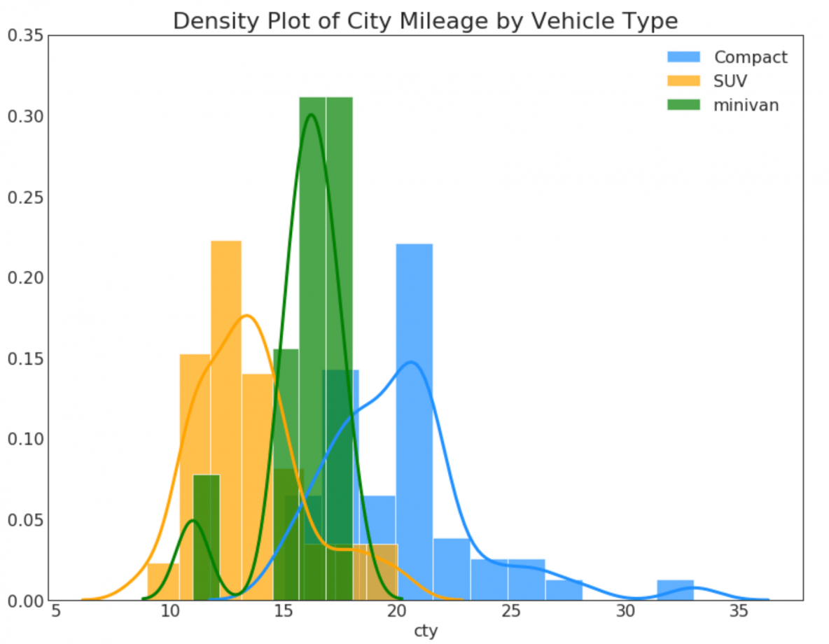
22. Density Plot
Density plots are a commonly used tool visualise the distribution of a continuous variable. By grouping them by the ‘response’ variable, you can inspect the relationship between the X and the Y. The below case if for representational purpose to describe how the distribution of city mileage varies with respect the number of cylinders.
Show Codes
23. Density Curves with Histogram
Density curve with histogram brings together the collective information conveyed by the two plots so you can have them both in a single figure instead of two.
Show Code
24. Joy Plot
Joy Plot allows the density curves of different groups to overlap, it is a great way to visualize the distribution of a larger number of groups in relation to each other. It looks pleasing to the eye and conveys just the right information clearly. It can be easily built using the joypy package which is based on matplotlib.
# !pip install joypy
# Import Data
mpg = pd.read_csv("https://github.com/selva86/datasets/raw/master/mpg_ggplot2.csv")

# Draw Plot
plt.figure(figsize=(16,10), dpi= 80)
fig, axes = joypy.joyplot(mpg, column=['hwy', 'cty'], by="class", ylim='own', figsize=(14,10))

# Decoration
plt.title('Joy Plot of City and Highway Mileage by Class', fontsize=22)
plt.show()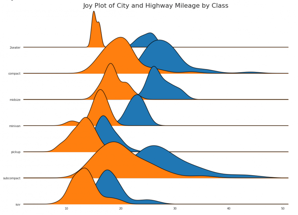
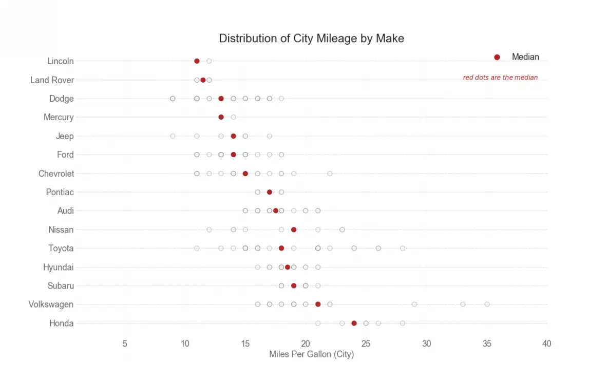
25. Distributed Dot Plot
Distributed dot plot shows the univariate distribution of points segmented by groups. The darker the points, more is the concentration of data points in that region. By coloring the median differently, the real positioning of the groups becomes apparent instantly.
Show Code
26. Box Plot
Box plots are a great way to visualize the distribution, keeping the median, 25th 75th quartiles and the outliers in mind. However, you need to be careful about interpreting the size the boxes which can potentially distort the number of points contained within that group. So, manually providing the number of observations in each box can help overcome this drawback.
For example, the first two boxes on the left have boxes of the same size even though they have 5 and 47 obs respectively. So writing the number of observations in that group becomes necessary.
# Import Data
df = pd.read_csv("https://github.com/selva86/datasets/raw/master/mpg_ggplot2.csv")

# Draw Plot
plt.figure(figsize=(13,10), dpi= 80)
sns.boxplot(x='class', y='hwy', data=df, notch=False)

# Add N Obs inside boxplot (optional)
def add_n_obs(df,group_col,y):
    medians_dict = {grp[0]:grp[1][y].median() for grp in df.groupby(group_col)}
    xticklabels = [x.get_text() for x in plt.gca().get_xticklabels()]
    n_obs = df.groupby(group_col)[y].size().values
    for (x, xticklabel), n_ob in zip(enumerate(xticklabels), n_obs):
        plt.text(x, medians_dict[xticklabel]*1.01, "#obs : "+str(n_ob), horizontalalignment='center', fontdict={'size':14}, color='white')

add_n_obs(df,group_col='class',y='hwy')

# Decoration
plt.title('Box Plot of Highway Mileage by Vehicle Class', fontsize=22)
plt.ylim(10, 40)
plt.show()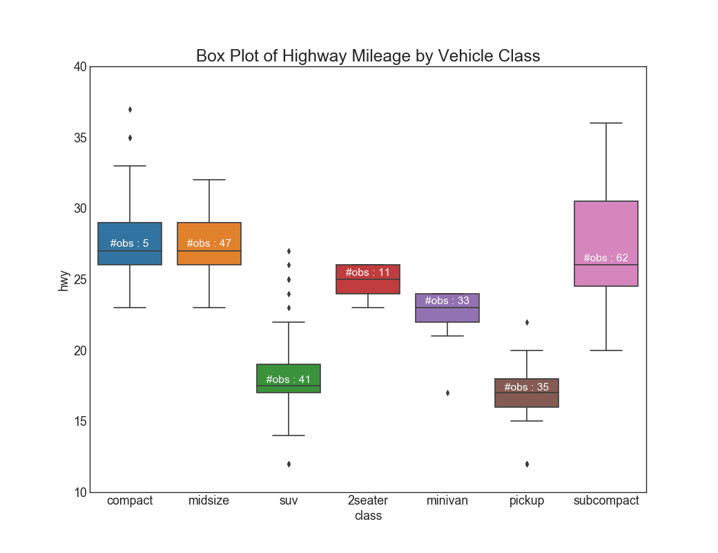
27. Dot + Box Plot
Dot + Box plot Conveys similar information as a boxplot split in groups. The dots, in addition, gives a sense of how many data points lie within each group.
# Import Data
df = pd.read_csv("https://github.com/selva86/datasets/raw/master/mpg_ggplot2.csv")

# Draw Plot
plt.figure(figsize=(13,10), dpi= 80)
sns.boxplot(x='class', y='hwy', data=df, hue='cyl')
sns.stripplot(x='class', y='hwy', data=df, color='black', size=3, jitter=1)

for i in range(len(df['class'].unique())-1):
    plt.vlines(i+.5, 10, 45, linestyles='solid', colors='gray', alpha=0.2)

# Decoration
plt.title('Box Plot of Highway Mileage by Vehicle Class', fontsize=22)
plt.legend(title='Cylinders')
plt.show()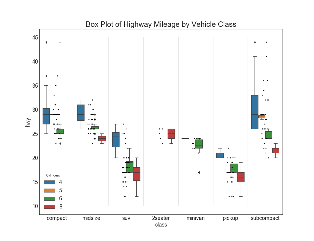
28. Violin Plot
Violin plot is a visually pleasing alternative to box plots. The shape or area of the violin depends on the number of observations it holds. However, the violin plots can be harder to read and it not commonly used in professional settings.
# Import Data
df = pd.read_csv("https://github.com/selva86/datasets/raw/master/mpg_ggplot2.csv")

# Draw Plot
plt.figure(figsize=(13,10), dpi= 80)
sns.violinplot(x='class', y='hwy', data=df, scale='width', inner='quartile')

# Decoration
plt.title('Violin Plot of Highway Mileage by Vehicle Class', fontsize=22)
plt.show()
29. Population Pyramid
Population pyramid can be used to show either the distribution of the groups ordered by the volumne. Or it can also be used to show the stage-by-stage filtering of the population as it is used below to show how many people pass through each stage of a marketing funnel.
# Read data
df = pd.read_csv("https://raw.githubusercontent.com/selva86/datasets/master/email_campaign_funnel.csv")

# Draw Plot
plt.figure(figsize=(13,10), dpi= 80)
group_col = 'Gender'
order_of_bars = df.Stage.unique()[::-1]
colors = [plt.cm.Spectral(i/float(len(df[group_col].unique())-1)) for i in range(len(df[group_col].unique()))]

for c, group in zip(colors, df[group_col].unique()):
    sns.barplot(x='Users', y='Stage', data=df.loc[df[group_col]==group, :], order=order_of_bars, color=c, label=group)

# Decorations
plt.xlabel("$Users$")
plt.ylabel("Stage of Purchase")
plt.yticks(fontsize=12)
plt.title("Population Pyramid of the Marketing Funnel", fontsize=22)
plt.legend()
plt.show()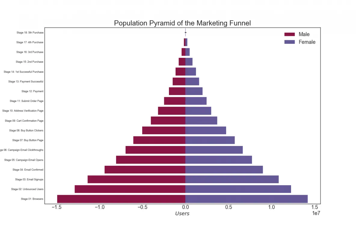
30. Categorical Plots
Categorical plots provided by the seaborn library can be used to visualize the counts distribution of 2 ore more categorical variables in relation to each other.
# Load Dataset
titanic = sns.load_dataset("titanic")

# Plot
g = sns.catplot("alive", col="deck", col_wrap=4,
                data=titanic[titanic.deck.notnull()],
                kind="count", height=3.5, aspect=.8,
                palette='tab20')

fig.suptitle('sf')
plt.show()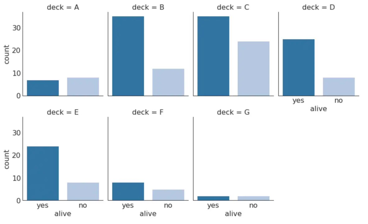
# Load Dataset
titanic = sns.load_dataset("titanic")

# Plot
sns.catplot(x="age", y="embark_town",
            hue="sex", col="class",
            data=titanic[titanic.embark_town.notnull()],
            orient="h", height=5, aspect=1, palette="tab10",
            kind="violin", dodge=True, cut=0, bw=.2)
Composition
31. Waffle Chart
The waffle chart can be created using the pywaffle package and is used to show the compositions of groups in a larger population.
Show Code
Show Code
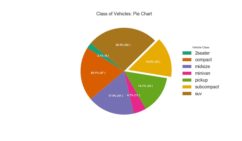
32. Pie Chart
Pie chart is a classic way to show the composition of groups. However, its not generally advisable to use nowadays because the area of the pie portions can sometimes become misleading. So, if you are to use pie chart, its highly recommended to explicitly write down the percentage or numbers for each portion of the pie.
# Import
df_raw = pd.read_csv("https://github.com/selva86/datasets/raw/master/mpg_ggplot2.csv")

# Prepare Data
df = df_raw.groupby('class').size()

# Make the plot with pandas
df.plot(kind='pie', subplots=True, figsize=(8, 8), dpi= 80)
plt.title("Pie Chart of Vehicle Class - Bad")
plt.ylabel("")
plt.show()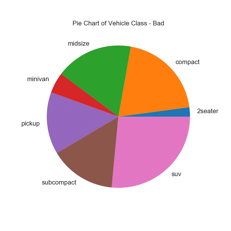
Show Code
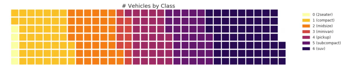
33. Treemap
Tree map is similar to a pie chart and it does a better work without misleading the contributions by each group.
# pip install squarify
import squarify

# Import Data
df_raw = pd.read_csv("https://github.com/selva86/datasets/raw/master/mpg_ggplot2.csv")

# Prepare Data
df = df_raw.groupby('class').size().reset_index(name='counts')
labels = df.apply(lambda x: str(x[0]) + "\n (" + str(x[1]) + ")", axis=1)
sizes = df['counts'].values.tolist()
colors = [plt.cm.Spectral(i/float(len(labels))) for i in range(len(labels))]

# Draw Plot
plt.figure(figsize=(12,8), dpi= 80)
squarify.plot(sizes=sizes, label=labels, color=colors, alpha=.8)

# Decorate
plt.title('Treemap of Vechile Class')
plt.axis('off')
plt.show()
34. Bar Chart
Bar chart is a classic way of visualizing items based on counts or any given metric. In below chart, I have used a different color for each item, but you might typically want to pick one color for all items unless you to color them by groups. The color names get stored inside all_colors in the code below. You can change the color of the bars by setting the color parameter in plt.plot().
Show Code
Change
35. Time Series Plot
Time series plot is used to visualise how a given metric changes over time. Here you can see how the Air Passenger traffic changed between 1949 and 1969.
Show Code

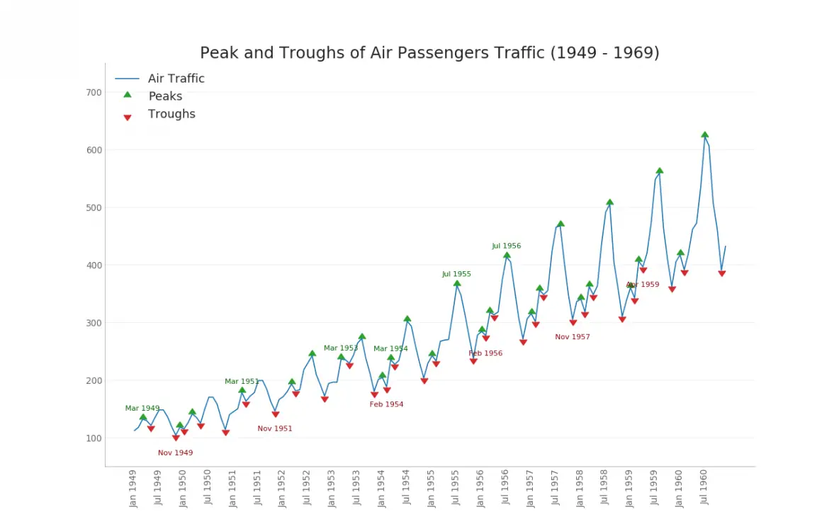
36. Time Series with Peaks and Troughs Annotated
The below time series plots all the the peaks and troughs and annotates the occurence of selected special events.
Show Code
37. Autocorrelation (ACF) and Partial Autocorrelation (PACF) Plot
The ACF plot shows the correlation of the time series with its own lags. Each vertical line (on the autocorrelation plot) represents the correlation between the series and its lag starting from lag 0. The blue shaded region in the plot is the significance level. Those lags that lie above the blue line are the significant lags.
So how to interpret this?
For AirPassengers, we see upto 14 lags have crossed the blue line and so are significant. This means, the Air Passengers traffic seen upto 14 years back has an influence on the traffic seen today.
PACF on the other had shows the autocorrelation of any given lag (of time series) against the current series, but with the contributions of the lags-inbetween removed.
from statsmodels.graphics.tsaplots import plot_acf, plot_pacf

# Import Data
df = pd.read_csv('https://github.com/selva86/datasets/raw/master/AirPassengers.csv')

# Draw Plot
fig, (ax1, ax2) = plt.subplots(1, 2,figsize=(16,6), dpi= 80)
plot_acf(df.traffic.tolist(), ax=ax1, lags=50)
plot_pacf(df.traffic.tolist(), ax=ax2, lags=20)

# Decorate
# lighten the borders
ax1.spines["top"].set_alpha(.3); ax2.spines["top"].set_alpha(.3)
ax1.spines["bottom"].set_alpha(.3); ax2.spines["bottom"].set_alpha(.3)
ax1.spines["right"].set_alpha(.3); ax2.spines["right"].set_alpha(.3)
ax1.spines["left"].set_alpha(.3); ax2.spines["left"].set_alpha(.3)

# font size of tick labels
ax1.tick_params(axis='both', labelsize=12)
ax2.tick_params(axis='both', labelsize=12)
plt.show()
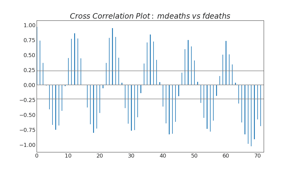
38. Cross Correlation plot
Cross correlation plot shows the lags of two time series with each other.
Show Code
39. Time Series Decomposition Plot
Time series decomposition plot shows the break down of the time series into trend, seasonal and residual components.
from statsmodels.tsa.seasonal import seasonal_decompose
from dateutil.parser import parse

# Import Data
df = pd.read_csv('https://github.com/selva86/datasets/raw/master/AirPassengers.csv')
dates = pd.DatetimeIndex([parse(d).strftime('%Y-%m-01') for d in df['date']])
df.set_index(dates, inplace=True)

# Decompose
result = seasonal_decompose(df['traffic'], model='multiplicative')

# Plot
plt.rcParams.update({'figure.figsize': (10,10)})
result.plot().suptitle('Time Series Decomposition of Air Passengers')
plt.show()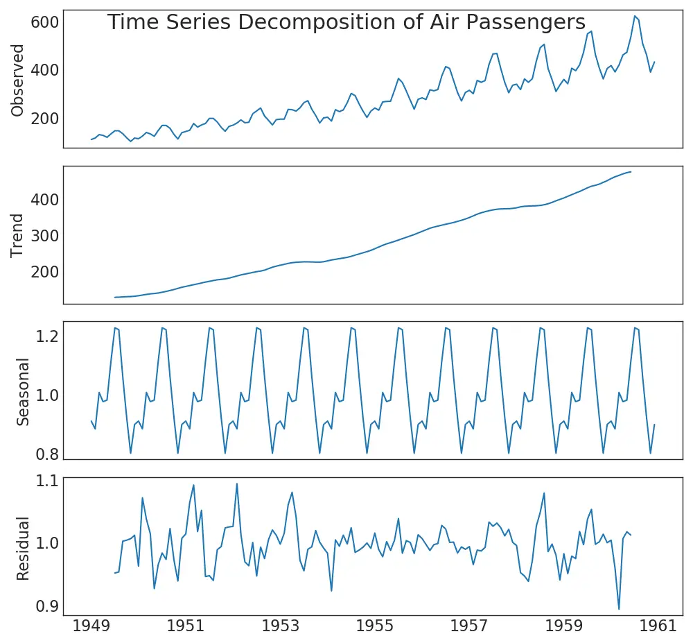
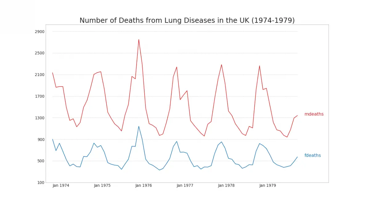
40. Multiple Time Series
You can plot multiple time series that measures the same value on the same chart as shown below.
Show Code
41. Plotting with different scales using secondary Y axis
If you want to show two time series that measures two different quantities at the same point in time, you can plot the second series againt the secondary Y axis on the right.
Show Code
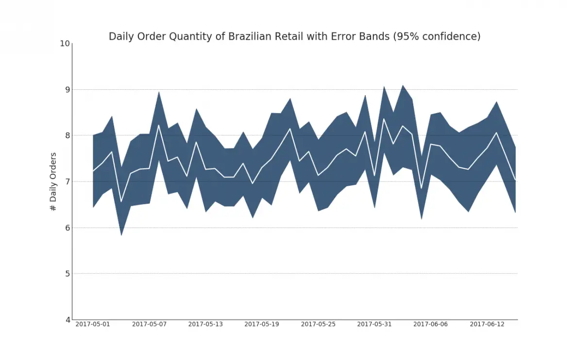
42. Time Series with Error Bands
Time series with error bands can be constructed if you have a time series dataset with multiple observations for each time point (date / timestamp). Below you can see a couple of examples based on the orders coming in at various times of the day. And another example on the number of orders arriving over a duration of 45 days.
In this approach, the mean of the number of orders is denoted by the white line. And a 95% confidence bands are computed and drawn around the mean.
Show Code
Show Code
43. Stacked Area Chart
Stacked area chart gives an visual representation of the extent of contribution from multiple time series so that it is easy to compare against each other.
Show Code
44. Area Chart UnStacked
An unstacked area chart is used to visualize the progress (ups and downs) of two or more series with respect to each other. In the chart below, you can clearly see how the personal savings rate comes down as the median duration of unemployment increases. The unstacked area chart brings out this phenomenon nicely.
Show Code
45. Calendar Heat Map
Calendar map is an alternate and a less preferred option to visualise time based data compared to a time series. Though can be visually appealing, the numeric values are not quite evident. It is however effective in picturising the extreme values and holiday effects nicely.
import matplotlib as mpl
import calmap

# Import Data
df = pd.read_csv("https://raw.githubusercontent.com/selva86/datasets/master/yahoo.csv", parse_dates=['date'])
df.set_index('date', inplace=True)

# Plot
plt.figure(figsize=(16,10), dpi= 80)
calmap.calendarplot(df['2014']['VIX.Close'], fig_kws={'figsize': (16,10)}, yearlabel_kws={'color':'black', 'fontsize':14}, subplot_kws={'title':'Yahoo Stock Prices'})
plt.show()
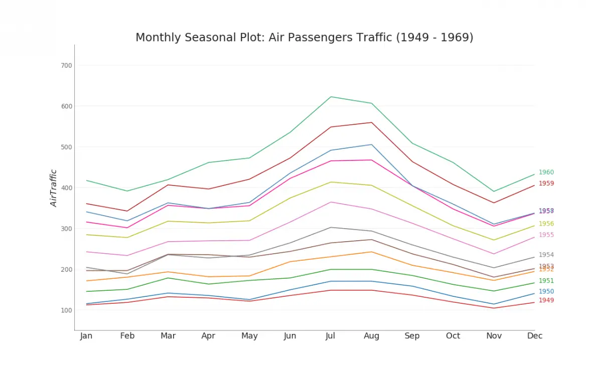
46. Seasonal Plot
The seasonal plot can be used to compare how the time series performed at same day in the previous season (year / month / week etc).
Show Code
Groups
47. Dendrogram
A Dendrogram groups similar points together based on a given distance metric and organizes them in tree like links based on the point’s similarity.
import scipy.cluster.hierarchy as shc

# Import Data
df = pd.read_csv('https://raw.githubusercontent.com/selva86/datasets/master/USArrests.csv')

# Plot
plt.figure(figsize=(16, 10), dpi= 80)
plt.title("USArrests Dendograms", fontsize=22)
dend = shc.dendrogram(shc.linkage(df[['Murder', 'Assault', 'UrbanPop', 'Rape']], method='ward'), labels=df.State.values, color_threshold=100)
plt.xticks(fontsize=12)
plt.show()
48. Cluster Plot
Cluster Plot canbe used to demarcate points that belong to the same cluster. Below is a representational example to group the US states into 5 groups based on the USArrests dataset. This cluster plot uses the ‘murder’ and ‘assault’ columns as X and Y axis. Alternately you can use the first to principal components as rthe X and Y axis.
Show Code
49. Andrews Curve
Andrews Curve helps visualize if there are inherent groupings of the numerical features based on a given grouping. If the features (columns in the dataset) doesn’t help discriminate the group (cyl), then the lines will not be well segregated as you see below.
from pandas.plotting import andrews_curves

# Import
df = pd.read_csv("https://github.com/selva86/datasets/raw/master/mtcars.csv")
df.drop(['cars', 'carname'], axis=1, inplace=True)

# Plot
plt.figure(figsize=(12,9), dpi= 80)
andrews_curves(df, 'cyl', colormap='Set1')

# Lighten borders
plt.gca().spines["top"].set_alpha(0)
plt.gca().spines["bottom"].set_alpha(.3)
plt.gca().spines["right"].set_alpha(0)
plt.gca().spines["left"].set_alpha(.3)

plt.title('Andrews Curves of mtcars', fontsize=22)
plt.xlim(-3,3)
plt.grid(alpha=0.3)
plt.xticks(fontsize=12)
plt.yticks(fontsize=12)
plt.show()
50. Parallel Coordinates
Parallel coordinates helps to visualize if a feature helps to segregate the groups effectively. If a segregation is effected, that feature is likely going to be very useful in predicting that group.
from pandas.plotting import parallel_coordinates

# Import Data
df_final = pd.read_csv("https://raw.githubusercontent.com/selva86/datasets/master/diamonds_filter.csv")

# Plot
plt.figure(figsize=(12,9), dpi= 80)
parallel_coordinates(df_final, 'cut', colormap='Dark2')

# Lighten borders
plt.gca().spines["top"].set_alpha(0)
plt.gca().spines["bottom"].set_alpha(.3)
plt.gca().spines["right"].set_alpha(0)
plt.gca().spines["left"].set_alpha(.3)

plt.title('Parallel Coordinated of Diamonds', fontsize=22)
plt.grid(alpha=0.3)
plt.xticks(fontsize=12)
plt.yticks(fontsize=12)
plt.show()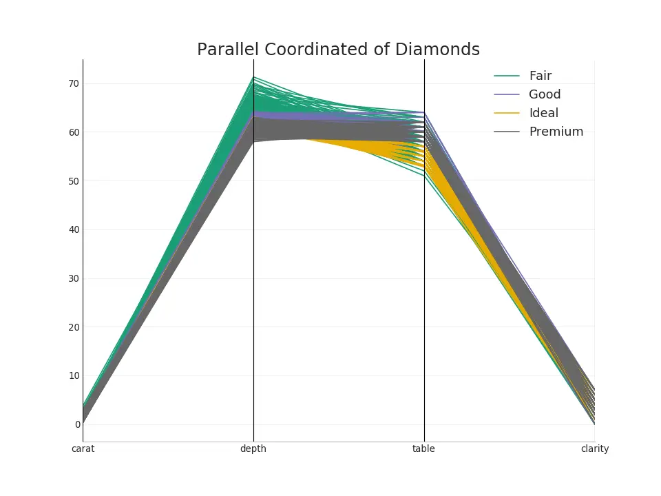
That’s all for now! If you encounter some error or bug please notify here.


 1268
1268

 被折叠的 条评论
为什么被折叠?
被折叠的 条评论
为什么被折叠?
 到【灌水乐园】发言


