


CSS实现带三角的对话框即对话气泡框
作者:爱编程的小金毛球球
日期:2020年3月22日
话不多说,上图展示:
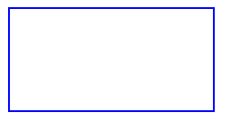
首先,肯定是要先添加一个框了
HTML
<div class = "div"></div>
CSS
.div{
  border: 2px blue solid;
  width: 200px;
  height: 100px;
}
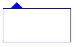
这样就会得到一个框,如图所示:
接着就是要实现上边的三角形部分。首先,让我们看看三角形是怎么来的。
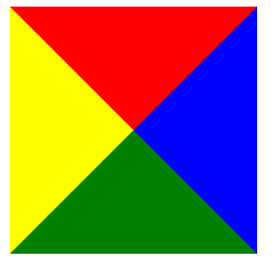
我们先做个实验,做个边长为100的正方形div。
<div class = "div"></div>
.div{
  width: 100px;
  height: 100px;
  border: 100px solid;
  border-color: red blue green yellow;
}

接下来,把长和宽都设置为0px,这样就会出先四个三角形。
现在将上、左、右border-color都设置为继承父类颜色。
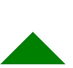
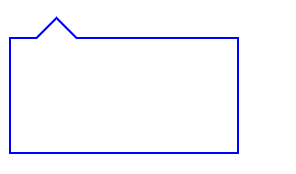
这样就只剩下一个三角形了,这就是上方三角形的由来,现在将这两个组合起来。用CSS在div之前插入此样式,用::before 就可以啦, 对其绝对定位!为了和之前的边框同颜色,把下边框三角形颜色设为:blue,左右边框为透明色,上边框为透明色。
.div::before{
  content: '';
  width: 0;
  height: 0;
  border: 20px solid;
  position: absolute;
  top: -40px;
  left: 20px;
  border-color:  transparent transparent blue;
}
就会得到这样的图:
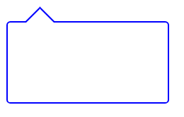
但是现在和想要的目标还差一点点,原来的三角形处应该是空心的,现在来实现它,只需要在三角形处的上方设置同样大小的三角形向下移动边框的宽度个距离,将颜色设置为和最底层相同即可了。
.div::after{
  content: '';
  width: 0;
  height: 0;
  border: 20px solid;
  position: absolute;
  top: -38px;
  left: 20px;
  border-color:  transparent transparent white;
}
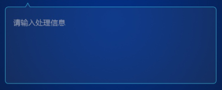
这样就大功告成了,如果想过于边框圆润一些,只要设置border-radius就可以了,将border-radius设置为5px。
在里边加入文本区域标签textarea就可以啦
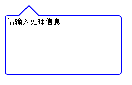
全部代码:
HTML
 <div class="div">
      <textarea>请输入处理信息</textarea>
    </div>
CSS
.div{
  border: 2px blue solid;
  width: 200px;
  height: 100px;
  position: relative;
  border-radius: 5px;
}
.div::before{
  content: '';
  width: 0;
  height: 0;
  border: 20px solid;
  position: absolute;
  top: -40px;
  left: 20px;
  border-color:  transparent transparent blue;
}
.div::after{
  content: '';
  width: 0;
  height: 0;
  border: 20px solid;
  position: absolute;
  top: -38px;
  left: 20px;
  border-color:  transparent transparent white;
}
  textarea{
    border: 0px;
    height: 90px;
    width: 190px;
  }


 911
911


 被折叠的 条评论
为什么被折叠?
被折叠的 条评论
为什么被折叠?
 到【灌水乐园】发言


