


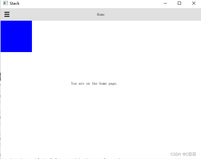
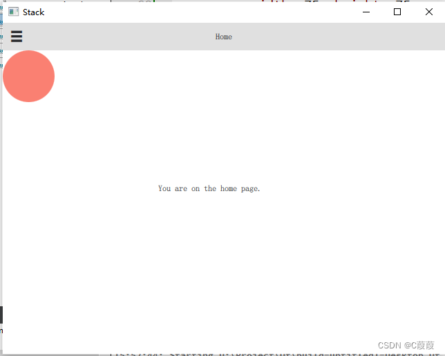
    Rectangle {
        id: root
        width: 100; height: 100
        state: "blue_color"
        states: [
            State {
                name: "red_color"
                PropertyChanges { target: root; color: "red" }
            },
            State {
                name: "blue_color"
                PropertyChanges { target: root; color: "blue" }
            }
        ]

        MouseArea {
            anchors.fill: parent
            onPressed: {
                root.state = "red_color"
            }
            onReleased: {
                root.state = "blue_color"
            }
        }
    }
展现效果:默认蓝色,鼠标点击显示红色,释放显示蓝色
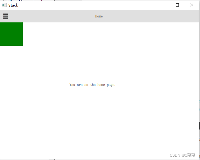
    Rectangle {
        id: flashingblob
        width: 75;
        height: 75
        color: "blue"
        opacity: 1.0

        MouseArea {
            anchors.fill: parent
            onClicked: {
                animateColor.start()
                animateOpacity.start()
            }
        }

        PropertyAnimation {
            id: animateColor;
            target: flashingblob;
            properties: "color";
            to: "green";
            duration: 1000
        }

        NumberAnimation {
            id: animateOpacity
            target: flashingblob
            properties: "opacity"
            from: 0.1
            to: 1.0
            duration: 2000
            //loops: Animation.Infinite
            //easing {type: Easing.OutBack; overshoot: 500}
       }
    }
展示效果:由蓝变绿,时间1s,透明度由0.1 到 1
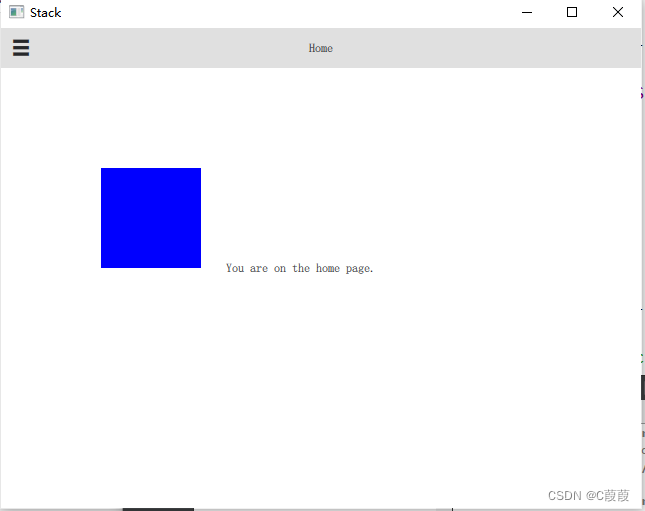
    Rectangle {
        id: rect
        width: 100;
        height: 100
        color: "red"

        PropertyAnimation on x {
            to: 100
        }
        PropertyAnimation on y {
            to: 100
        }//移动位置
        SequentialAnimation on color {
            ColorAnimation {
                to: "red"
                duration: 1000
            }
            ColorAnimation {
                to: "blue"
                duration: 1000
            }
        }//执行队列
    }
展现效果:从0位置移动到 100,100 的位置,再持续一秒红色,变成蓝色
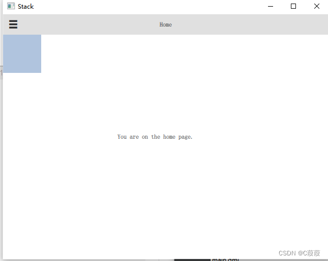
Rectangle {
      width: 75; height: 75
      id: button
      state: "RELEASED"

      MouseArea {
          anchors.fill: parent
          onPressed: button.state = "PRESSED"
          onReleased: button.state = "RELEASED"
      }

      states: [
          State {
              name: "PRESSED"
              PropertyChanges { target: button; color: "lightblue"}
          },
          State {
              name: "RELEASED"
              PropertyChanges { target: button; color: "lightsteelblue"}
          }
      ]

      transitions: [
          Transition {
              from: "PRESSED"
              to: "RELEASED"
              ColorAnimation { target: button; duration: 100}
          },
          Transition {
              from: "RELEASED"
              to: "PRESSED"
              ColorAnimation { target: button; duration: 100}
          }
      ]
  }
展现效果:达到渐变的效果,点击释放,释放点击的过程
Rectangle {
      width: 75; height: 75; radius: width
      id: ball
      color: "salmon"

	  MouseArea{
			anchors.fill: parent
			onClicked:{
				ball.x += 50
				ball.x += 40
		}
	  }
      Behavior on x {
          NumberAnimation {
              id: bouncebehavior
              easing {
                  type: Easing.OutElastic
                  amplitude: 1.0
                  period: 0.5
              }
          }
      }
      Behavior on y {
          animation: bouncebehavior
      }
      Behavior {
          ColorAnimation { target: ball; duration: 100 }
      }
  }
展现效果:x或y值变化的一个行为动作
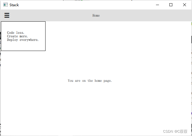
    Rectangle {
        id: banner
        width: 150; height: 100; border.color: "black"

        Column {
            anchors.centerIn: parent
            Text {
                id: code
                text: "Code less."
                opacity: 0.01
            }
            Text {
                id: create
                text: "Create more."
                opacity: 0.01
            }
            Text {
                id: deploy
                text: "Deploy everywhere."
                opacity: 0.01
            }
        }

        MouseArea {
            anchors.fill: parent
            onPressed: playbanner.start()
        }

        SequentialAnimation {
            id: playbanner
            running: false
            NumberAnimation { target: code; property: "opacity"; to: 1.0; duration: 1000}
            NumberAnimation { target: create; property: "opacity"; to: 1.0; duration: 1000}
            NumberAnimation { target: deploy; property: "opacity"; to: 1.0; duration: 1000}
        }
    }
展现效果:延时一秒,展示一行文本


 1364
1364


 被折叠的 条评论
为什么被折叠?
被折叠的 条评论
为什么被折叠?
 到【灌水乐园】发言


