


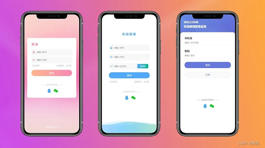
😀先看效果:
🙂话不多说看源码:
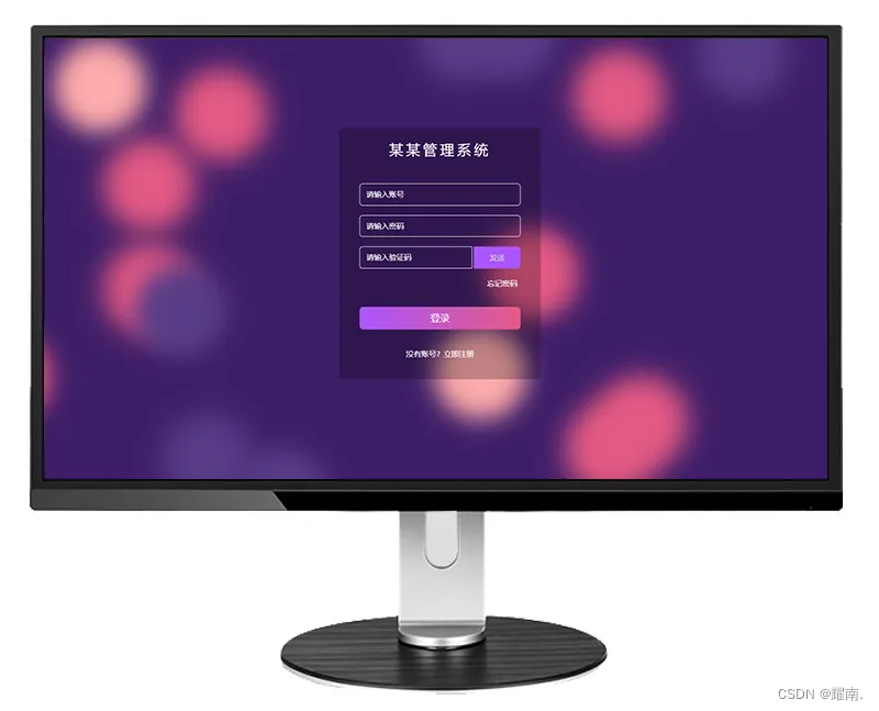
紫色登录界面(图一):
<!DOCTYPE html>
<html>
<head>
<meta charset="utf-8">
<title>登录1</title>
<style>
* {
margin: 0;
padding: 0;
box-sizing: border-box;
}
/* 动态背景 */
@keyframes move {
100% {
transform: translate3d(0, 0, 1px) rotate(360deg);
}
}
.background {
position: fixed;
width: 100vw;
height: 100vh;
top: 0;
left: 0;
background: #3E1E68;
overflow: hidden;
}
.background span {
width: 20vmin;
height: 20vmin;
border-radius: 20vmin;
backface-visibility: hidden;
position: absolute;
animation: move;
animation-duration: 45;
animation-timing-function: linear;
animation-iteration-count: infinite;
}
.background span:nth-child(0) {
color: #FFACAC;
top: 90%;
left: 47%;
animation-duration: 8s;
animation-delay: -17s;
transform-origin: 2vw 17vh;
box-shadow: -40vmin 0 5.494502440636581vmin currentColor;
}
.background span:nth-child(1) {
color: #FFACAC;
top: 31%;
left: 5%;
animation-duration: 40s;
animation-delay: -14s;
transform-origin: -5vw -14vh;
box-shadow: -40vmin 0 5.192195104974926vmin currentColor;
}
.background span:nth-child(2) {
color: #FFACAC;
top: 18%;
left: 62%;
animation-duration: 20s;
animation-delay: -5s;
transform-origin: -18vw -12vh;
box-shadow: 40vmin 0 5.72205756381233vmin currentColor;
}
.background span:nth-child(3) {
color: #FFACAC;
top: 71%;
left: 45%;
animation-duration: 30s;
animation-delay: -2s;
transform-origin: -4vw -20vh;
box-shadow: -40vmin 0 5.303503038071778vmin currentColor;
}
.background span:nth-child(4) {
color: #E45A84;
top: 90%;
left: 38%;
animation-duration: 15s;
animation-delay: -48s;
transform-origin: 7vw -9vh;
box-shadow: -40vmin 0 5.882238754040052vmin currentColor;
}
.background span:nth-child(5) {
color: #583C87;
top: 34%;
left: 32%;
animation-duration: 30s;
animation-delay: -36s;
transform-origin: -6vw -15vh;
box-shadow: 40vmin 0 5.183333217256063vmin currentColor;
}
.background span:nth-child(6) {
color: #583C87;
top: 25%;
left: 41%;
animation-duration: 21s;
animation-delay: -47s;
transform-origin: -10vw -5vh;
box-shadow: 40vmin 0 5.345257098222438vmin currentColor;
}
.background span:nth-child(7) {
color: #E45A84;
top: 16%;
left: 39%;
animation-duration: 30s;
animation-delay: -33s;
transform-origin: -15vw 3vh;
box-shadow: -40vmin 0 5.693872337330205vmin currentColor;
}
.background span:nth-child(8) {
color: #583C87;
top: 42%;
left: 55%;
animation-duration: 46s;
animation-delay: -50s;
transform-origin: -6vw 25vh;
box-shadow: 40vmin 0 5.588315610213253vmin currentColor;
}
.background span:nth-child(9) {
color: #E45A84;
top: 78%;
left: 25%;
animation-duration: 44s;
animation-delay: -21s;
transform-origin: -4vw -12vh;
box-shadow: -40vmin 0 5.82170170819547vmin currentColor;
}
.background span:nth-child(10) {
color: #E45A84;
top: 73%;
left: 77%;
animation-duration: 41s;
animation-delay: -40s;
transform-origin: 21vw -11vh;
box-shadow: -40vmin 0 5.838449416658446vmin currentColor;
}
.background span:nth-child(11) {
color: #E45A84;
top: 48%;
left: 81%;
animation-duration: 33s;
animation-delay: -42s;
transform-origin: 6vw 19vh;
box-shadow: 40vmin 0 5.848850560573668vmin currentColor;
}
.background span:nth-child(12) {
color: #E45A84;
top: 77%;
left: 7%;
animation-duration: 25s;
animation-delay: -1s;
transform-origin: 15vw 24vh;
box-shadow: -40vmin 0 5.800039290361969vmin currentColor;
}
.background span:nth-child(13) {
color: #E45A84;
top: 77%;
left: 38%;
animation-duration: 51s;
animation-delay: -40s;
transform-origin: -1vw -13vh;
box-shadow: -40vmin 0 5.876822672246133vmin currentColor;
}
.background span:nth-child(14) {
color: #583C87;
top: 58%;
left: 98%;
animation-duration: 7s;
animation-delay: -1s;
transform-origin: -19vw -20vh;
box-shadow: -40vmin 0 5.622075629639948vmin currentColor;
}
.background span:nth-child(15) {
color: #583C87;
top: 79%;
left: 31%;
animation-duration: 39s;
animation-delay: -46s;
transform-origin: 14vw 21vh;
box-shadow: 40vmin 0 5.022352355698978vmin currentColor;
}
.background span:nth-child(16) {
color: #E45A84;
top: 41%;
left: 74%;
animation-duration: 37s;
animation-delay: -4s;
transform-origin: -19vw 3vh;
box-shadow: 40vmin 0 5.049960684696969vmin currentColor;
}
.background span:nth-child(17) {
color: #583C87;
top: 56%;
left: 34%;
animation-duration: 26s;
animation-delay: -35s;
transform-origin: -16vw -7vh;
box-shadow: -40vmin 0 5.11253385954465vmin currentColor;
}
.background span:nth-child(18) {
color: #583C87;
top: 84%;
left: 2%;
animation-duration: 14s;
animation-delay: -39s;
transform-origin: -10vw -6vh;
box-shadow: 40vmin 0 5.903761483531039vmin currentColor;
}
.background span:nth-child(19) {
color: #E45A84;
top: 61%;
left: 39%;
animation-duration: 21s;
animation-delay: -36s;
transform-origin: 14vw 9vh;
box-shadow: 40vmin 0 5.448311817969409vmin currentColor;
}
.background span:nth-child(20) {
color: #E45A84;
top: 33%;
left: 5%;
animation-duration: 8s;
animation-delay: -7s;
transform-origin: 4vw 2vh;
box-shadow: 40vmin 0 5.013421190075091vmin currentColor;
}
/* 动态背景 */
body {
height: 100vh;
background-color: aquamarine;
}
.Box {
position: fixed;
top: 50%;
left: 50%;
transform: translate(-50%, -50%);
width: 320px;
background-color: rgba(0, 0, 0, 0.24);
border-radius: 6px;
padding: 20px 32px;
}
h3 {
font-size: 22px;
color: #fff;
text-align: center;
margin-bottom: 40px;
font-weight: 500;
letter-spacing: 5px;
}
input {
width: 100%;
height: 35px;
border: 1px solid #fff;
background-color: transparent;
padding-left: 10px;
font-size: 12px;
color: #fff;
margin-bottom: 20px;
outline: none;
border-radius: 5px;
}
input::placeholder {
color: #fff;
}
.yzmBox {
display: flex;
justify-content: flex-start;
}
.yzmBox input {
width: 70%;
border-top-right-radius: 0;
border-bottom-right-radius: 0;
}
.yzmBox .btn {
cursor: pointer;
width: 29%;
background-color: #aa55ff;
color: #d8d8d8;
height: 35px;
outline: none;
border: 1px solid #aa55ff;
font-size: 12px;
border-radius: 6px;
margin-left: 1%;
border-top-left-radius: 0;
border-bottom-left-radius: 0;
}
.forgetPwd {
text-align: end;
font-size: 12px;
color: #ffffff;
padding-right: 5px;
}
.loginBtn {
width: 100%;
line-height: 36px;
text-align: center;
font-size: 15px;
color: #fff;
border-radius: 6px;
background: linear-gradient(to right, #aa55ff, #E45A84);
outline: none;
border: none;
margin-top: 30px;
}
.no {
margin-top: 30px;
text-align: center;
font-size: 12px;
color: #ffffff;
}
</style>
</head>
<body>
<!-- 背景 -->
<div class="background">
<span></span>
<span></span>
<span></span>
<span></span>
<span></span>
<span></span>
<span></span>
<span></span>
<span></span>
<span></span>
<span></span>
<span></span>
<span></span>
<span></span>
<span></span>
<span></span>
<span></span>
<span></span>
<span></span>
<span></span>
<span></span>
</div>
<div class="Box">
<h3>某某管理系统</h3>
<form action="">
<input type="text" placeholder="请输入账号" required>
<input type="password" placeholder="请输入密码" required>
<div class="yzmBox">
<input type="text" placeholder="请输入验证码">
<button class="btn">发送</button>
</div>
<p class="forgetPwd">忘记密码</p>
<input type="submit" class="loginBtn" value="登录"></button>
<p class="no">没有账号?立即注册</p>
</form>
</div>
</body>
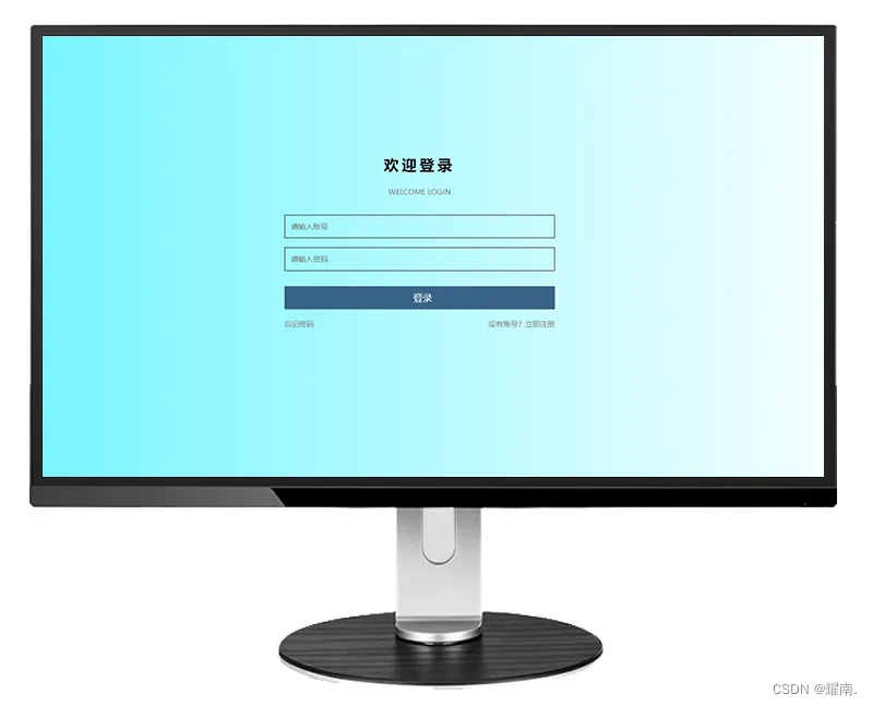
</html>蓝色登录界面(图二):
<!DOCTYPE html>
<html>
<head>
<meta charset="utf-8">
<title>登录2</title>
<style>
* {
margin: 0;
padding: 0;
box-sizing: border-box;
}
body {
height: 100vh;
background: linear-gradient(to right, #6af4ff, #ffffff);
}
.Box {
position: fixed;
top: 50%;
left: 50%;
transform: translate(-50%, -50%);
width: 550px;
height: 330px;
display: flex;
}
form {
position: absolute;
top: 50%;
left: 50%;
transform: translate(-50%, -60%);
width: 80%;
text-align: center;
}
h3 {
font-size: 24px;
margin-bottom: 20px;
letter-spacing: 5px;
}
input {
width: 100%;
height: 38px;
border: 1px solid #000000;
background-color: transparent;
padding-left: 10px;
font-size: 12px;
color: #000000;
margin-bottom: 15px;
outline: none;
}
.desc {
margin: 0px 20px 30px;
text-align: center;
font-size: 12px;
color: #828282;
}
.loginBtn {
width: 100%;
line-height: 36px;
text-align: center;
font-size: 15px;
color: #fff;
background: rgb(57, 99, 134);
outline: none;
border: none;
margin-top: 10px;
}
.no {
display: flex;
justify-content: space-between;
cursor: pointer;
text-align: center;
font-size: 12px;
color: #828282;
}
</style>
</head>
<body>
<div class="Box">
<form action="">
<h3>欢迎登录</h3>
<p class="desc">WELCOME LOGIN</p>
<input type="text" placeholder="请输入账号" required>
<input type="password" placeholder="请输入密码" required>
<input type="submit" class="loginBtn" value="登录"></button>
<p class="no">
<span>忘记密码</span>
<span>没有账号?立即注册</span>
</p>
</form>
</div>
</body>
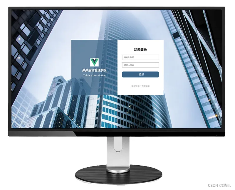
</html>青色登录界面(图三):
<!DOCTYPE html>
<html>
  <head>
    <meta charset="utf-8">
    <title>登录3</title>
    <style>
      * {
        margin: 0;
        padding: 0;
        box-sizing: border-box;
      }

      body {
        height: 100vh;
        background-color: aquamarine;
        background: url("https://images.pexels.com/photos/936722/pexels-photo-936722.jpeg?auto=compress&cs=tinysrgb&w=1260&h=750&dpr=1") no-repeat;
        background-size: cover;
      }

      .Box {
        position: fixed;
        top: 50%;
        left: 50%;
        transform: translate(-50%, -50%);
        width: 550px;
        height: 330px;
        display: flex;
      }

      .left {
        position: relative;
        width: 50%;
        height: 100%;
        background-color: rgba(57, 99, 134, 0.75);
      }

      .right {
        position: relative;
        width: 50%;
        height: 100%;
        background-color: rgba(255, 255, 255, 1);
      }

      .centerBox {
        position: absolute;
        top: 50%;
        left: 50%;
        transform: translate(-50%, -50%);
        width: 80%;
        text-align: center;
      }

      .left img {
        width: 50px;
        height: 50px;
        margin-bottom: 5px;
      }

      .left p {
        font-size: 14px;
        color: #fff;
      }

      .left h4 {
        font-size: 18px;
        color: #fff;
        margin-bottom: 10px;
      }

      .right form {
        position: absolute;
        top: 50%;
        left: 50%;
        transform: translate(-50%, -50%);
        width: 80%;
        text-align: center;
      }

      h3 {
        margin-bottom: 20px;
      }

      input {
        width: 100%;
        height: 30px;
        border: 1px solid #767676;
        background-color: transparent;
        padding-left: 10px;
        font-size: 12px;
        color: #000000;
        margin-bottom: 15px;
        outline: none;
      }

      .loginBtn {
        width: 100%;
        height: 35px;
        line-height: 32px;
        text-align: center;
        font-size: 15px;
        color: #fff;
        border-radius: 6px;
        background: rgb(57, 99, 134);
        outline: none;
        border: none;
        margin-top: 10px;
      }

      .no {
        cursor: pointer;
        margin-top: 30px;
        text-align: center;
        font-size: 12px;
        color: #828282;
      }
    </style>
  </head>
  <body>
    <div class="Box">
      <div class="left">
        <div class="centerBox">
          <img src="https://img0.baidu.com/it/u=2804005887,994501744&fm=253&fmt=auto&app=138&f=JPEG?w=200&h=200"
            alt="">
          <h4>某某后台管理系统</h4>
          <p>This is a description</p>
        </div>
      </div>
      <div class="right">
        <form action="">
          <h3>欢迎登录</h3>
          <input type="text" placeholder="请输入账号" required>
          <input type="password" placeholder="请输入密码" required>
          <input type="submit" class="loginBtn" value="登录"></button>
          <p class="no">没有账号?立即注册</p>
        </form>

      </div>
    </div>
  </body>
</html>🙇结束啦:
更多干货🎁
如果我的博客对你有帮助、如果你喜欢我的博客内容,请 “👍点赞” “✍️评论” “💙收藏” 一键三连哦!
【👇🏻👇🏻👇🏻关注我| 获取更多源码 | 优质文章】 带您学习各种前端插件、3D炫酷效果、图片展示、文字效果、以及整站模板 、大学生毕业HTML模板 、期末大作业模板 、等!
以上内容技术相关问题😈欢迎一起交流学习🔥嘉vx+18634371151
—— 往期推荐 ——
高颜值登录界面(一键复制)
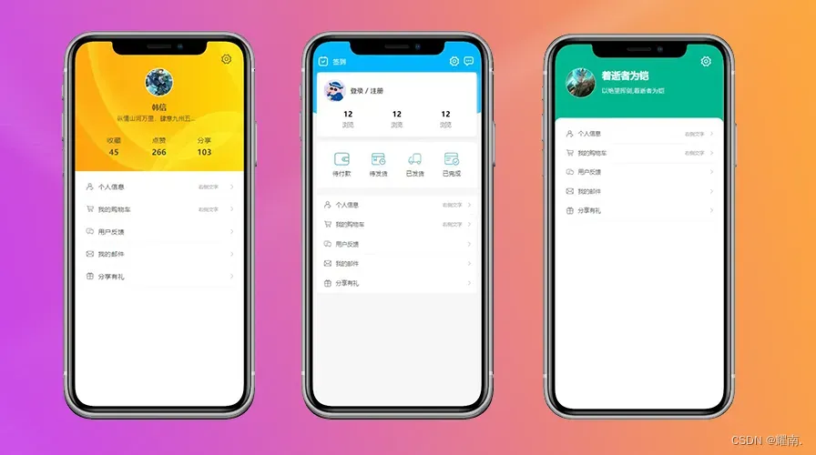
个人中心页面(一键复制)
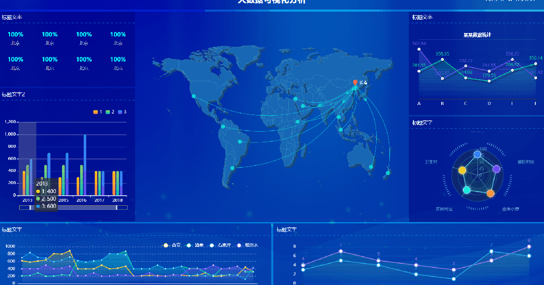
Echarts大屏(一键复制)
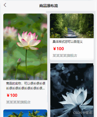
uniapp瀑布流实现(一键复制)
更多内容请前往我的首页侧边栏有专栏哦~!
......
....
..


 3万+
3万+


 被折叠的 条评论
为什么被折叠?
被折叠的 条评论
为什么被折叠?
 到【灌水乐园】发言


