


R语言ggplot2绘图入门笔记
今天分享的内容是在R语言中利用ggplot2进行可视化的入门笔记,适用于初学者了解ggplot2绘图系统。干货满满,建议收藏!
首先安装以下R包:
install.packages(c("tidyverse", "colorspace", "corrr",  "cowplot",
                   "ggdark", "ggforce", "ggrepel", "ggridges", "ggsci",
                   "ggtext", "ggthemes", "grid", "gridExtra", "patchwork",
                   "rcartocolor", "scico", "showtext", "shiny",
                   "plotly", "highcharter", "echarts4r","devtools","readxl"))
devtools::install_github("JohnCoene/charter")
数据导入环节
使用readxl包中read_excel()函数将数据导入到R中(该数据为网络下载),也可以使用其他的数据读取函数,或者使用R语言自带的系统示例数据都可以,主要是获得一份数据表格,用于可视化绘图。
chlr <- read_excel("~/ggplot2-绘图数据表.xlsx")
tibble::glimpse(chlr)
head(chlr, 5)

# # A tibble: 5 × 10
#    city date  death                temp dewpoint  pm10 o3      time season ...10
#   <dbl> <chr> <dttm>              <dbl>    <dbl> <dbl> <chr>  <dbl>  <dbl> <chr>
# 1    89 chic  1987-03-29 00:00:00   101     39.5  30.1 30.79…  20.2     88 wint…
# 2    90 chic  1987-03-30 00:00:00   125     29    12.9 20.79…  29.6     89 wint…
# 3    91 chic  1987-03-31 00:00:00   106     30    19   36.79…  23.9     90 wint…
# 4    92 chic  1987-04-01 00:00:00   119     41.5  22.9 29.79…  21.3     91 spri…
# 5    93 chic  1987-04-02 00:00:00    91     29.5  14.6 37.79…  22.1     92 spri…
ggplot语法规则
-
数据(data):要求是整洁的数据框
-
映射(mapping):指明变量与图形所见元素之间的联系
-
几何对象(geometric):数据的几何形状
-
标度(scale):标度函数控制几何对象中的标度映射
-
统计变换(stats):构建新的统计量进行绘图
-
坐标系(coord):数据的转换
-
位置调整(position adjustments):调用位置调整函数来调整某些图形元素的实际位置
-
分面(facet):对数据分组再分别绘图
-
主题(theme):图形的整体视觉默认值
-
输出(output):用ggsave()函数将图形保存为想要格式的文件
绘图函数使用方法
函数的第一个参数默认为数据源,因此需要将绘图数据框填写在此处,将数据变量(date和temp)添加到aes()内部,表示x轴对应时间,y轴对应温度。
g <- ggplot(chlr, aes(x = date, y = temp))
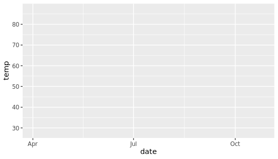
为什么运行后出来一个灰色的空图片?因为还没有设置画什么类型的图,通过添加geom_point()来创建散点图,类似于geom开头的这些函数可以用于不同的可视化方式。
g + geom_point()
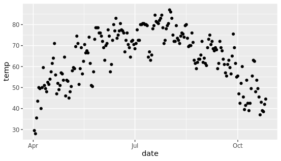
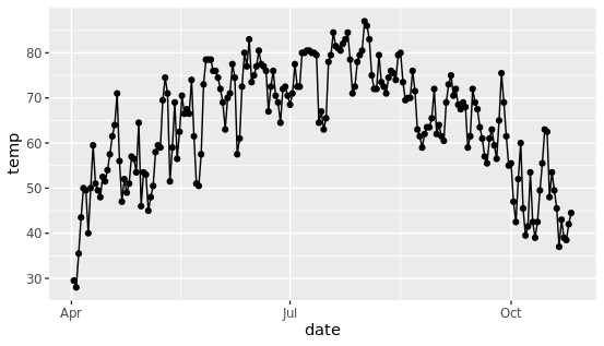
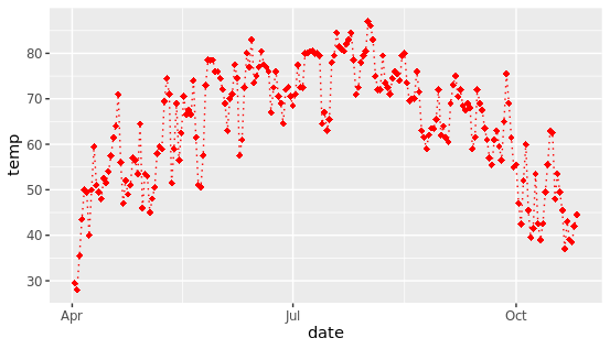
再次运行就能看到散点图的效果,这就是gemo图层实现的效果,除此之外,可以组合几个图层,形成更复杂的图片。(比如下图是在散点图基础上添加折线图)
调整几何图形的属性
将所有的点转换成蓝色钻石,更改图形中子元素的形状和颜色,这个需求在实际分析中经常碰到,其实也很简单。
g + geom_point(color = "blue", shape = "diamond", size = 3)
只需要将color和shape等参数添加具体的值即可,需要注意的是这些参数不能放在aes中,因为aes控制映射关系,也就是数据和图的映射,而我们想更改颜色和形状是人为参数指定的具体值,而不是数据映射而得。 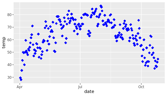
可以使用预设颜色或十六进制颜色代码,也可以使用不同的色盘。
g + geom_point(color = "red", shape = "diamond", size = 2) +
  geom_line(color = "red", linetype = "dotted", size = .5)
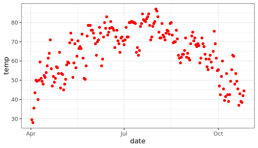
设置一个内置主题,通过theme图层可以控制图片的主题,个人认为bw主题比较美观、简洁大方。
theme_set(theme_bw())
g + geom_point(color = "red")
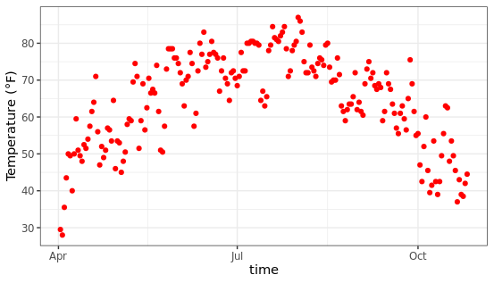
调整坐标轴相关信息
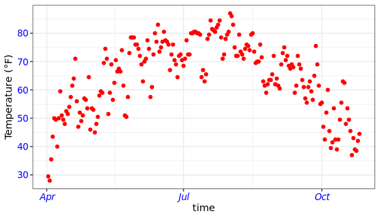
控制横纵坐标轴的信息可以通过xlab、ylab来实现,比如下面将修改坐标轴的标签,效果如下:
ggplot(chlr, aes(x = date, y = temp)) +
  geom_point(color = "red") +
  xlab("time") +
  ylab("Temperature (°F)")
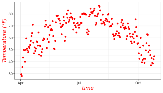
改变轴标题格式
通过labs图层可以同时修改横纵坐标轴标签等属性,另外还可以在theme属性中设置标签字体的颜色和大小。
ggplot(chlr, aes(x = date, y = temp)) +
  geom_point(color = "red") +
  labs(x = "time", y = "Temperature (°F)") +
  theme(axis.title = element_text(size = 13, color = "red", face = "italic"))
使用axis更改坐标轴文本的外观,快速自由定制好看的图片。
ggplot(chlr, aes(x = date, y = temp)) +
  geom_point(color = "red") +
  labs(x = "time", y = "Temperature (°F)") +
  theme(axis.text = element_text(color = "blue", size = 10),
        axis.text.x = element_text(face = "italic"))
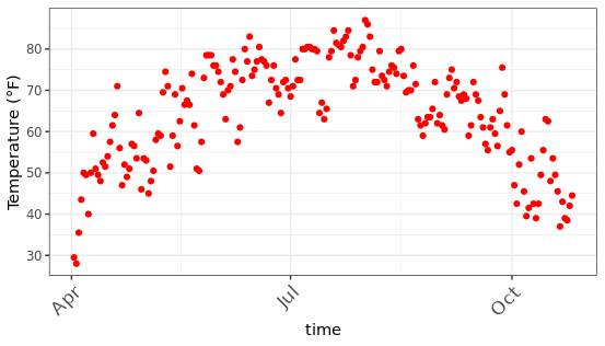
旋转坐标轴文本: 使用hjust和vjust可以在水平(0 =左,1 =右)和垂直(0 =上,1 =下)调整文本的位置,angle参数可以设置旋转的角度。(该功能也非常有用,尤其是在你的标签长度很长时,轻轻地旋转就能容纳更多信息)
ggplot(chlr, aes(x = date, y = temp)) +
  geom_point(color = "red") +
  labs(x = "time", y = "Temperature (°F)") +
  theme(axis.text.x = element_text(angle = 45, vjust = 1, hjust = 1, size = 13))
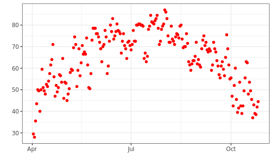
删除坐标轴标题:使用NULL删除
ggplot(chlr, aes(x = date, y = temp)) +
  geom_point(color = "red") +
  labs(x = NULL, y = "")
限制坐标轴范围:使用limits属性控制
ggplot(chlr, aes(x = date, y = temp)) +
  geom_point(color = "red") +
  labs(x = "time", y = "Temperature (°F)") +
  scale_y_continuous(limits = c(0,70))+
  coord_cartesian(ylim = c(0,70))
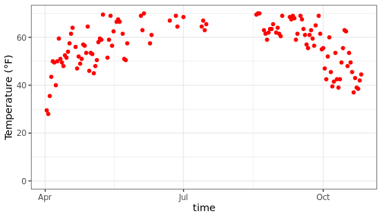
scale_y_continuous去除范围外的所有数据点,coord_cartesian调整可见区域。
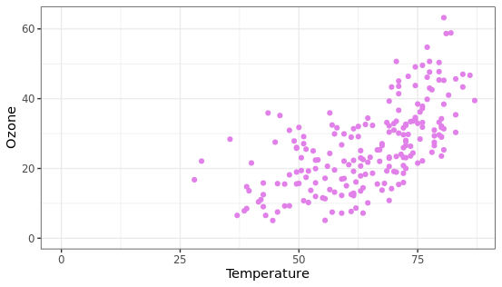
图表坐标原点设置
通过expand_limits参数可以控制图片中坐标轴的起始位置,规定图片的布局。
chlr_middle <- dplyr::filter(chlr, temp>25, o3>5)
ggplot(chlr_middle, aes(x = temp, y = o3)) +
  geom_point(color = "#E080E8") +
  labs(x = "Temperature",
       y = "Ozone") +
  expand_limits(x = 0, y = 0)
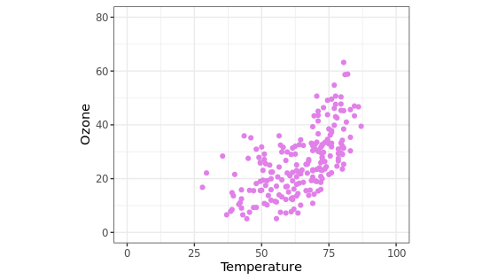
设置相同比例的坐标轴
coord_fixed(ratio = 1)参数能够将横纵坐标轴的比例设置为1:1,该功能在绘制某些相关性图时可能有用,另外还可以在ggsave图片保存时指定长和宽。
ggplot(chlr_middle, aes(x = temp, y = o3)) +
  geom_point(color = "#E080E8") +
  labs(x = "Temperature",
       y = "Ozone") +
  xlim(c(0, 100)) + ylim(c(0, 80)) +
  coord_fixed(ratio = 1)
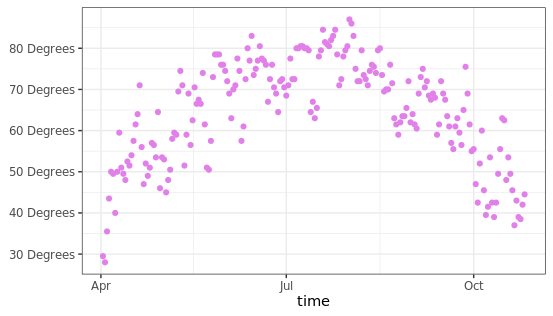
使用函数调整标签
可以在label参数中传入函数,用于生成一系列的刻度标签,这个功能也挺使用,比如你想展示某些带单位的信息,可以通过这个函数添加统一单位。
ggplot(chlr, aes(x = date, y = temp)) +
  geom_point(color = "#E080E8") +
  labs(x = "time", y = NULL) +
  scale_y_continuous(label = function(x) {return(paste(x, "Degrees"))})
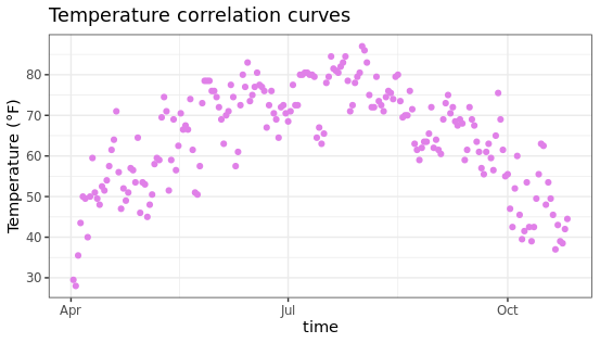
添加标题:使用ggtitle添加左上角标题
ggplot(chlr, aes(x = date, y = temp)) +
  geom_point(color = "#E080E8") +
  labs(x = "time", y = "Temperature (°F)") +
  ggtitle("Temperature correlation curves")
可以使用labs()函数添加元素,支持多种标注类型,比如主标题、副标题等。
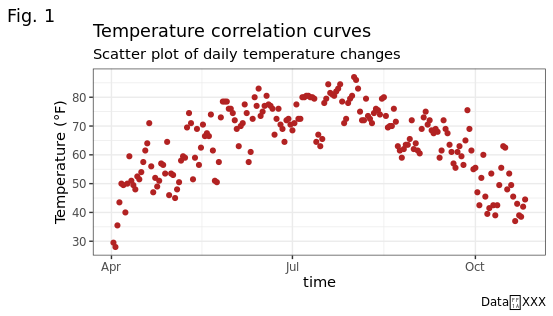
ggplot(chlr, aes(x = date, y = temp)) +
  geom_point(color = "firebrick") +
  labs(x = "time", y = "Temperature (°F)",
       title = "Temperature correlation curves",
       subtitle = "Scatter plot of daily temperature changes",
       caption = "Data:XXX",
       tag = "Fig. 1")
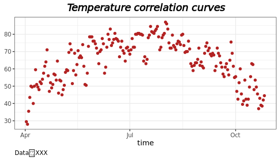
加粗标题:可以在theme主题中设置标题的显示格式,比如字体大小、颜色、粗细、形状等等。
ggplot(chlr, aes(x = date, y = temp)) +
  geom_point(color = "firebrick") +
  labs(x = "time", y = "Temperature (°F)",
       title = "Temperature correlation curves") +
  theme(plot.title = element_text(face = "bold",
                                  margin = margin(10, 5, 10, 5),
                                  size = 13))
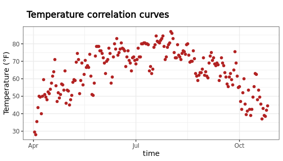
调整标题位置:通过hjust和face等参数可以自主调整标题,使用
ggplot(chlr, aes(x = date, y = temp)) +
  geom_point(color = "firebrick") +
  labs(x = "time", y = NULL,
       title = "Temperature correlation curves",
       caption = "Data:XXX") +
  theme(plot.title = element_text(hjust = 0.5, size = 15, face = "bold.italic"),
  plot.caption = element_text(hjust = 0))
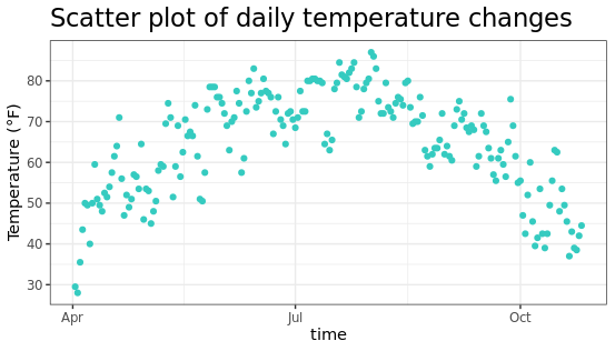
更改多行文本的间距
ggplot(chlr, aes(x = date, y = temp)) +
  geom_point(color = "#35CBC0") +
  labs(x = "time", y = "Temperature (°F)") +
  ggtitle("Scatter plot of daily temperature changes") +
  theme(plot.title = element_text(lineheight = .4, size = 17))
图例设置
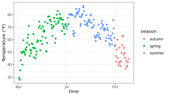
当把color参数放在aes映射中时,R语言会自动根据数据的分组进行不同颜色的绘制,并生成图例(下图右侧所示)
ggplot(chlr,aes(x = date, y = temp, color = season)) +
  geom_point() +
  labs(x = "time", y = "Temperature (°F)")
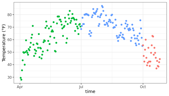
移除图例:使用position参数控制
ggplot(chlr,aes(x = date, y = temp, color = season)) +
  geom_point() +
  labs(x = "time", y = "Temperature (°F)") +
  theme(legend.position = "none")
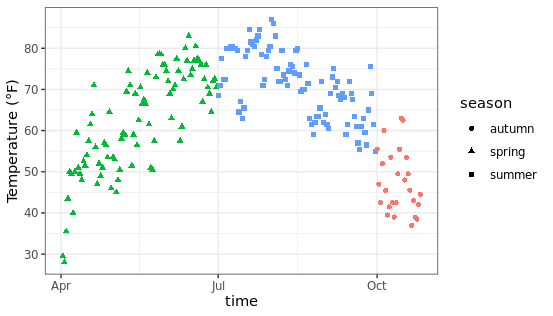
保留形状的图例,放弃颜色的图例,使用guides图层进行控制,可以指定图例的展示方式。
ggplot(chlr,aes(x = date, y = temp,
           color = season, shape = season)) +
  geom_point() +
  labs(x = "time", y = "Temperature (°F)") +
  guides(color = "none")
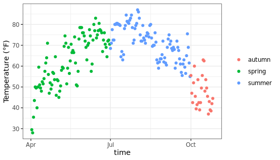
移除图例标题:
默认状态下图例的顶部会添加标题,也就是数据框中对应的变量名称,可以通过下面的方法进行删除。
ggplot(chlr, aes(x = date, y = temp, color = season)) +
  geom_point() +
  labs(x = "time", y = "Temperature (°F)") +
  theme(legend.title = element_blank())
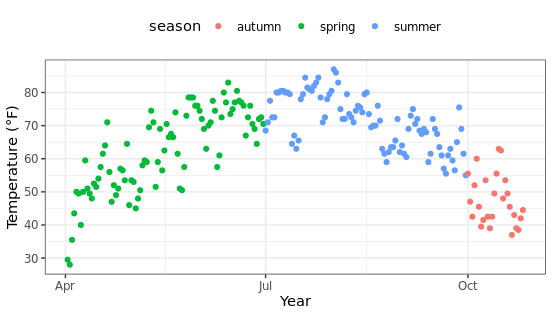
改变图例的位置:
使用主题图层的legend.position参数可以控制图例的摆放位置,支持上下左右或者是自定义的位置,方便后期调整。
ggplot(chlr, aes(x = date, y = temp, color = season)) +
  geom_point() +
  labs(x = "Year", y = "Temperature (°F)") +
  theme(legend.position = "top")
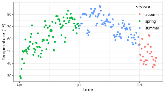
改变图例的方向: 默认情况下图例是横向排列,可以根据需要调整为纵向排列,看起来更加美观。
ggplot(chlr, aes(x = date, y = temp, color = season)) +
  geom_point() +
  labs(x = "time", y = "Temperature (°F)") +
  theme(legend.position = c(.9, .8),
        legend.background = element_rect(fill = "transparent")) +
  guides(color = guide_legend(direction = "vertical"))
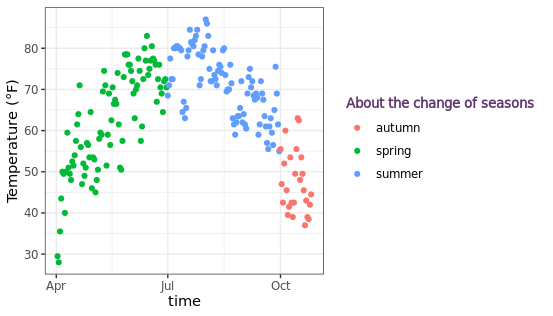
改变图例的标题:可以通过legend.title参数控制图例的标题,支持设置颜色、大小、字体等属性。
ggplot(chlr, aes(x = date, y = temp, color = season)) +
  geom_point() +
  labs(x = "time", y = "Temperature (°F)",
       color = "About the change of seasons") +
  theme(legend.title = element_text(color = "#61376D",
                                    size = 10, face = "bold"))
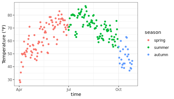
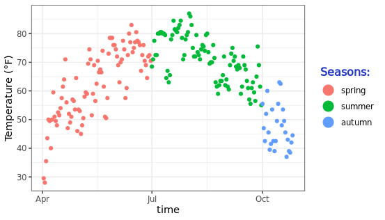
改变图例元素的顺序:在R语言中字符串类型的数据在映射时容易出现顺序错误,为了能够人为设置固定的顺序,可以将数据中字符串类型的变量转换为因子类型(factor),然后设置因子的水平,这样就可以在绘图时以指定顺序展示了。
chlr$season <-
  factor(chlr$season,
         levels = c("spring", "summer", "autumn"))
ggplot(chlr, aes(x = date, y = temp, color = season)) +
  geom_point() +
  labs(x = "time", y = "Temperature (°F)")
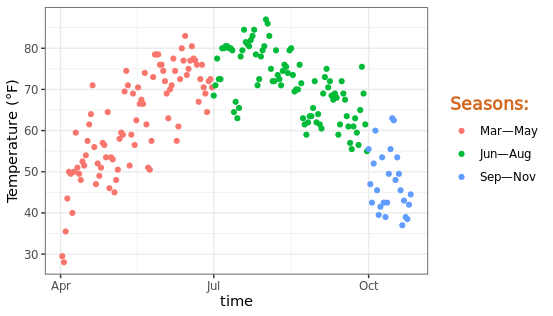
改变图例的标签:有时候默认的图例标签不符合我们的预期,这时候可以使用scale_color_discrete函数来控制图例的显示内容,自定义文字进行展示。
ggplot(chlr, aes(x = date, y = temp, color = season)) +
  geom_point() +
  labs(x = "time", y = "Temperature (°F)") +
  scale_color_discrete(
    name = "Seasons:",
    labels = c("Mar—May", "Jun—Aug", "Sep—Nov")
  ) +
  theme(legend.title = element_text(
   color = "chocolate", size = 13
  ))
改变图例符号的大小:假如想更改图例中元素的尺寸大小,可以通过函数 guide_legend(override.aes = list(size = 5))实现这个操作。
ggplot(chlr, aes(x = date, y = temp, color = season)) +
  geom_point() +
  labs(x = "time", y = "Temperature (°F)") +
  theme(legend.key = element_rect(fill = NA),
        legend.title = element_text(color = "#2135C8",
                                    size = 12, face = 2)) +
  scale_color_discrete("Seasons:") +
  guides(color = guide_legend(override.aes = list(size = 5)))
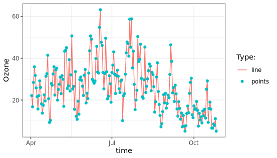
手动添加图例项:通过添加不同的图层可以将折线图、散点图组合到一起,此时图例将根据具体的情况进行调整。
ggplot(chlr, aes(x = date, y = o3)) +
  geom_line(aes(color = "line")) +
  geom_point(aes(color = "points")) +
  labs(x = "time", y = "Ozone") +
  scale_color_discrete("Type:")
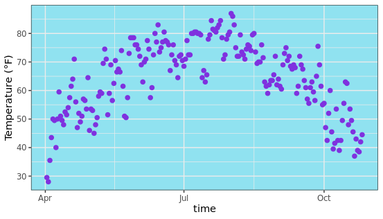
改变面板背景颜色:默认图片背景是灰色或者白色,可以通过panel.background参数进行针对性的设置,变成自己喜欢的颜色,修改特定主题。
ggplot(chlr, aes(x = date, y = temp)) +
  geom_point(color = "#7F31DF", size = 2) +
  labs(x = "time", y = "Temperature (°F)") +
  theme(panel.background = element_rect(
    fill = "#90E2F0", color = "#90E2F0", size = 2)
  )
更改图表背景颜色:图表的背景颜色是使用plot.background参数进行控制,也就是图片中横纵坐标轴区域。
ggplot(chlr, aes(x = date, y = temp)) +
  geom_point(color = "firebrick") +
  labs(x = "time", y = "Temperature (°F)") +
  theme(plot.background = element_rect(fill = "#DFD9D5",
                                       color = "#8C8987", size = 2))
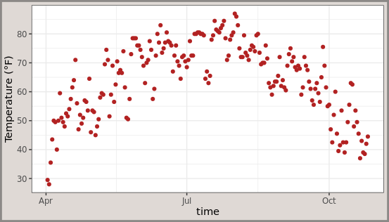
提示:panel图层表示图片中主题部分,例如散点折现等,而plot图层表示图片的控制部分,比如横纵坐标轴,这些元素都在图层中组合存在。
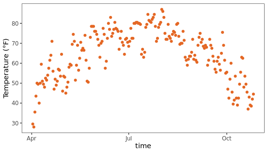
删除所有网格线:有时候需要一个纯净的背景,可以通过移除panel部分的网格线来实现,看起来干净了很多。
ggplot(chlr, aes(x = date, y = temp)) +
  geom_point(color = "#E46724") +
  labs(x = "time", y = "Temperature (°F)") +
  theme(panel.grid.major = element_blank(),  # 移除主要网格线
        panel.grid.minor = element_blank())  # 移除次要网格线
今天分享的R语言ggplot2绘图入门教程就到这里,感谢你的阅读,如果有所收获欢迎点赞转发,你的支持是作者更新的最大动力。
本文由 mdnice 多平台发布


 5万+
5万+


 被折叠的 条评论
为什么被折叠?
被折叠的 条评论
为什么被折叠?
 到【灌水乐园】发言


