


echarts
设置图表高度(这里设置的是只有图表的宽高和位置,cavans中其他的配置项 比如legned等都不参与其中)
div设置的是canvas整体的高 ``` grid: { //用于配置图标在canvas中的位置 height: "67%" 这里设置的是图标的高 top: 20, }, ``` ### 设置表格网络线格式 横向网格线在y轴配置,竖向网格线在x轴配置 ``` yAxis: [ { type: 'value', min: 0, max: 100, splitLine: { show: true, **lineStyle: { color: 'red', type:'dashed' },** }, } ] ``` ### echarts 一个legend控制多个图表 只需要将想要一起显示和隐藏的series中的name换成legend对应的name即可一起显示与隐藏 ### echarts type: category 想做连续的折现图,但是横坐标又固定。具体体现为天天基金网的走势图 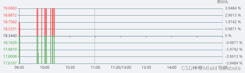 类型为类目时,splitNum和interval不生效。看了好久的文档之后,发现针对类目类型有一个独特的属性:axisLabel。可以在axisLabel中设置横坐标的显示,在data中遍历横坐标,挑出想设置的横坐标。 纵坐标也是类目类型,也是同样的原理,但是因为初始值,和最大值,最小值都不是固定的所以需要简单计算一下。横坐标倾斜
同样也是类目类型下的axisLabel属性。
axisLabel:  {
                    // 横坐标斜着放
                    interval: 0, // 设置为0意味着所有横坐标都显示出来
                    rotate: -45,
                    //倾斜度 -90 至 90 默认为0
                    margin: 2,
                },
ReactEchartsCore 绑定事件(zoom伸缩事件和legend点击事件)
主要代码:
1: const echarts_react = useRef(null);
2: let onEvents = {
        'datazoom': onChartLegendselectchanged,
         'legendselectchanged': onChartLegend // 点击legend事件
       }
3: <ReactEchartsCore
            echarts={ echarts }
            theme="light"
            option={ getOption() }
            style={ { height: '300px', marginTop: '5px'} }
            onEvents={onEvents}
            ref={echarts_react}
            />
横纵坐标轴字体颜色
xAxis: {
    data: data,
    axisLabel: {
       show: true,
        textStyle: {
          color: '#000',  //更改坐标轴文字颜色
          fontSize : 14      //更改坐标轴文字大小
        }
     },
     axisLine:{
         lineStyle:{
            color:'#000' //更改坐标轴颜色 和 坐标轴名字颜色
         }
   }
}
折线图与折现面积图的转换
因为echarts中的配置项非常多,而且给出的都是整段的代码,所以很难分辨出哪个属性是将折线图与折线面积图互相转换的。
很简单,就是series中的areaStyle属性,当它存在时图表为折线面积图,当他去掉时图表为折线图。
饼状图随着屏幕放大或缩小,颜色变黑
重点代码是:itemStyle:{normal:{color:titles[t].color}}}),设置颜色
for (let t in data_chart) {
            data_change_charts.push({value: data_chart[t], name: titles[t].name, itemStyle:{normal:{color:titles[t].color}}})
        }
y轴保留两位小数
重点代码:
 axisLabel:{
                formatter:function(value,index){
                    return value.toFixed(8)
                }
              },
yAxis: [{
            type: 'value',
            splitLine: {
                show: true,
                lineStyle: {
                    color: 'rgba(1, 60, 100, 0.7)',
                },
            },
            axisLine: {
                show: true,
                lineStyle: {
                  color: '#B2C1E1'
                }
              },
              axisLabel:{
                formatter:function(value,index){
                    return value.toFixed(8)
                }
              },
              min: intervalY1Min,
              // 不想数据=max,可手动更改interval*7 或 (interval*6)+ 20
              max: intervalY1, // 最大值
              splitNumber: 5, // 坐标轴的分割段数(预估值)
              interval: (intervalY1 - intervalY1Min) / 5, // 强制设置坐标轴分割间隔
            }],
表格tooltip过多时,让tooltip固定在表内

tooltip: {
              trigger: 'axis',
              confine: true,
          }
React Echarts 事件监听
<ReactEchartsCore
            echarts={ echarts }
            theme="light"
            option={ getOption() }
            style={{ height: '300px', marginTop: '5px'}}
            onEvents={onEvents}
            ref={echarts_react}
            />
const onChartLegendselectchanged = (params) => {
       let echarts_instance = echarts_react.current.getEchartsInstance();
       let xAxis=echarts_instance.getModel().option.xAxis[0];//获取axis
       const {rangeStart, rangeEnd, data} = xAxis; //里面存有代表滑动条的起始的数字
      }
      let onEvents = {
        'datazoom': onChartLegendselectchanged,  // 缩放条移动
         'legendselectchanged': onChartLegend // 点击legend事件
        }
样式
柱状图(正负值立体效果柱状图)

{
              name: '收益金额',
                z: 2,
                type: 'bar',
                yAxisIndex: 1,
                data: data_money.map((item) => {
                  // 循环
                  return {
                    value: item,
                    itemStyle: {
                      normal: {
                        label: {
                          show: true,
                          position: item > 0 ? 'top' : 'bottom',
                          textStyle: {
                            color: '#176BB6',
                            fontSize: 12
                          },
                          barBorderRadius: [30, 30, 30, 30],
                          shadowColor: "rgba(0,160,221,1)",
                          shadowBlur: 4,
                        }
                      }
                    }
                  };
                }),
                barWidth: "25px",
            },
             // 12176 柱折混合图优化
             {
              name: '收益金额',
              z: 3,
              type: 'pictorialBar',
              yAxisIndex: 1,
              data: data_money,
              symbol: 'rect',
              symbolOffset: ['-200%', '0'],
              symbolSize: [5, '100%'],
              itemStyle: {
                  normal: {
                      color: {
                        type: 'linear',
                        x: 0,
                        y: 0,
                        x2: 1,
                        y2: 0,
                        colorStops: [{
                            offset: 0, color: '#6697C4' // 0% 处的颜色
                        }, {
                          offset: 0.25, color: '#6697C4' // 0% 处的颜色
                      }, {
                        offset: 0.5, color: '#6697C4' // 0% 处的颜色
                    }, {
                            offset: 1, color: '#2774BA' // 100% 处的颜色
                        }],
                        global: false // 缺省为 false
                      },
                  },
              },
          },
          // 12176 柱折混合图优化
          {
            name: '收益金额',
            z: 3,
            type: 'pictorialBar',
            yAxisIndex: 1,
            data: data_money,
            symbol: 'rect',
            symbolOffset: ['175%', '0'],
            symbolSize: [5, '100%'],
            itemStyle: {
                normal: {
                    color: {
                      type: 'linear',
                      x: 1,
                      y: 0,
                      x2: 0,
                      y2: 0,
                      colorStops: [{
                          offset: 0, color: '#0D5392' // 0% 处的颜色
                      },{
                        offset: 0.25, color: '#0D5392' // 0% 处的颜色
                      }, {
                      offset: 0.5, color: '#0D5392' // 0% 处的颜色
                      }, {
                          offset: 1, color: '#2774BA' // 100% 处的颜色
                      }],
                      global: false // 缺省为 false
                    },
                },
            },
        },
堆叠面积图

百分比堆叠面积图,正负值。场景:所有正值相加为100%,但是负值也要显示出来。
如图

之前想要上下y轴的方式解决,但是达不到效果。于是重看了文档,发现堆叠图有一个属性【stackStrategy】,可以只堆正值不堆负值。就达到效果了。
这样其实的效果其实是所有正值累加,所有负值累加。就会完成非常变态的需求


 676
676

 被折叠的 条评论
为什么被折叠?
被折叠的 条评论
为什么被折叠?
 到【灌水乐园】发言


