


有一个需求需要在app上实现一个比较美观的手风琴效果,这里推荐react-native-collapsible这个开源的组件,GitHub地址:https://github.com/oblador/react-native-collapsible
一、组件demo
我实现的手风琴效果图如下:

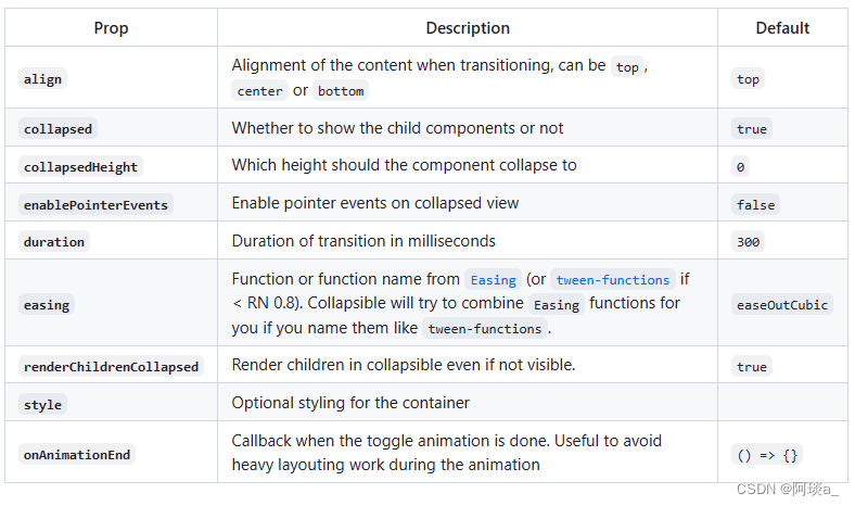
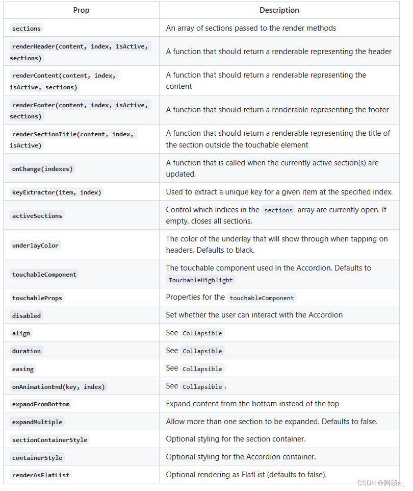
二、组件API
使用组件主要还是学习组件相关的api以及api对应的功能,react-native-collapsible组件的API如下:
三、demo详细代码
手风琴组件详细代码:
import React, {Component, useState} from 'react';
import Accordion from 'react-native-collapsible/Accordion';
import {View, Text, SafeAreaView} from "react-native";


export default function Test(){
    const [activeSections,setActiveSections] = useState([5]);
    const SECTIONS = [
        {
            title: 'Title1',
            content: 'Content1',
            bg:'#9085DE',
        },
        {
            title: 'Title2',
            content: 'Content2',
            bg:'#8698EE',
        },
        {
            title: 'Title3',
            content: 'Content3',
            bg:'#79B0FF',
        },
        {
            title: 'Title4',
            content: 'Content4',
            bg:'#52B6E6',
        },
        {
            title: 'Title5',
            content: 'Content5',
            bg:'#49CCA4',
        },
        {
            title: 'Title6',
            content: 'Content6',
            bg:'#28978B',
        },
    ];

    //手风琴的onChange方法
    const _updateSections = (activeSections) => {
        console.log(activeSections,'activeSections')
        if(activeSections.length==0){
            setActiveSections([5])
        }else{
            setActiveSections(activeSections)
        }

    };
    //渲染每个内容
    const  _renderContent = (section) => {
        return (
            <View style={{flexDirection:'row',justifyContent:'center'}}>
                <View style={{backgroundColor:section.bg,height:480,width:'100%',borderLeftWidth:2,borderRightWidth:2,borderColor:'#fff'}}>
                    <Text>{section.content}</Text>
                </View>
            </View>
        );
    };
    //渲染每个标题
    const  _renderHeader = (section) => {
        return (
            <View style={{flexDirection:'row',justifyContent:'center'}}>
                <View style={{height:60,backgroundColor:section.bg,width:"100%",borderTopRightRadius:20,borderTopLeftRadius:20,marginTop:-10,borderColor:'#fff',borderTopWidth:2,borderLeftWidth:2,borderRightWidth:2}}>
                    <Text style={{color:'#fff',fontSize:18,lineHeight:45,paddingLeft:10}}>{section.title}</Text>
                </View>
            </View>
        );
    };

    return(
        <View style={{height:'100%',backgroundColor:'#fff'}}>
            <SafeAreaView>
                <Accordion
                    duration={500}//手风琴关闭打开时间
                    align={'center'}//过渡时的对齐方式
                    underlayColor={'#00000000'}//点击标题的背景色
                    sections={SECTIONS}//展示的数据,是个数字
                    activeSections={activeSections}//手风琴打开的索引值
                    renderHeader={_renderHeader}//渲染标题
                    renderContent={_renderContent}//渲染内容
                    onChange={_updateSections}//改变方法,获取改变的索引值
                />
            </SafeAreaView>
        </View>
    )
}


 7826
7826


 被折叠的 条评论
为什么被折叠?
被折叠的 条评论
为什么被折叠?
 到【灌水乐园】发言


