


Input Elements
输入元素类型
We have already used the MouseArea as a mouse input element. Next, we’ll focus on keyboard input. We start off with the text editing elements: TextInput and TextEdit.
我们已经将MouseArea用作鼠标输入元素。接下来,我们将重点介绍键盘输入。我们从文本编辑元素开始:TextInput和TextEdit。
TextInput
文本输入框
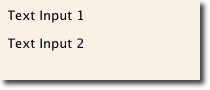
TextInput allows the user to enter a line of text. The element supports input constraints such as validator, inputMask, and echoMode.
TextInput允许用户输入一行文本。元素支持输入约束,例如验证程序(validator)、输入掩码(inputMask)和显示模式(echoMode)。
// textinput.qml

import QtQuick

Rectangle {
    width: 200
    height: 80
    color: "linen"

    TextInput {
        id: input1
        x: 8; y: 8
        width: 96; height: 20
        focus: true
        text: "Text Input 1"
    }

    TextInput {
        id: input2
        x: 8; y: 36
        width: 96; height: 20
        text: "Text Input 2"
    }
}
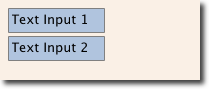
The user can click inside a TextInput to change the focus. To support switching the focus by keyboard, we can use the KeyNavigation attached property.
用户可以在文本输入中单击以更改焦点。为了支持通过键盘切换焦点,我们可以使用KeyNavigation 附加属性。
// textinput2.qml

import QtQuick

Rectangle {
    width: 200
    height: 80
    color: "linen"

    TextInput {
        id: input1
        x: 8; y: 8
        width: 96; height: 20
        focus: true
        text: "Text Input 1"
        KeyNavigation.tab: input2
    }

    TextInput {
        id: input2
        x: 8; y: 36
        width: 96; height: 20
        text: "Text Input 2"
        KeyNavigation.tab: input1
    }
}
The KeyNavigation attached property supports a preset of navigation keys where an element id is bound to switch focus on the given key press.
KeyNavigation 附加属性支持预设的导航键,其中元素id绑定为在给定按键上切换焦点。
A text input element comes with no visual presentation beside a blinking cursor and the entered text. For the user to be able to recognize the element as an input element it needs some visual decoration; for example, a simple rectangle. When placing the TextInput inside an element you need make sure you export the major properties you want others to be able to access.
文本输入元素在闪烁的光标和输入的文本旁边没有视觉显示。为了让用户能够识别作为输入元素的元素,它需要一些视觉装饰;例如,一个简单的矩形。将TextInput放置在元素中时,需要确保导出希望其他人能够访问的主要属性。
We move this piece of code into our own component called TLineEditV1 for reuse.
我们将这段代码移动到我们自己的命名为TLineEditV1的组件中,以便重用。
// TLineEditV1.qml

import QtQuick

Rectangle {
    width: 96; height: input.height + 8
    color: "lightsteelblue"
    border.color: "gray"

    property alias text: input.text
    property alias input: input

    TextInput {
        id: input
        anchors.fill: parent
        anchors.margins: 4
        focus: true
    }
}
TIP
注
If you want to export the TextInput completely, you can export the element by using property alias input: input. The first input is the property name, where the 2nd input is the element id.
如果要完全导出TextInput,可以使用property alias input: input导出元素。第一个输入是属性名,第二个输入是元素id。
We then rewrite our KeyNavigation example with the new TLineEditV1 component.
然后,我们用新的TLineEditV1组件重写我们的KeyNavigation示例。
Rectangle {
    ...
    TLineEditV1 {
        id: input1
        ...
    }
    TLineEditV1 {
        id: input2
        ...
    }
}
Try the tab key for navigation. You will experience the focus does not change to input2. The simple use of focus: true is not sufficient. The problem is that when the focus was transferred to the input2 element, the top-level item inside the TlineEditV1 (our Rectangle) received focus, and did not forward the focus to the TextInput. To prevent this, QML offers the FocusScope.
尝试使用tab键进行导航。您将发现焦点不会更改为input2。仅使用focus:true是不够的。问题在于,当焦点转移到input2元素时,TlineEditV1(我们的Rectangle)中的顶级项接收到焦点,而没有将焦点转发到TextInput。为了防止这种情况,QML提供了FocusScope。
FocusScope
聚焦镜元素类型
A focus scope declares that the last child element with focus: true receives the focus when the focus scope receives the focus. So it forwards the focus to the last focus-requesting child element. We will create a second version of our TLineEdit component called TLineEditV2, using a focus scope as the root element.
焦点范围声明当焦点范围接收焦点时,具有focus:true的最后一个子元素接收焦点。因此,它将焦点转发到请求子元素的最后一个焦点。我们将创建TLineEdit组件的第二个版本,称为TLineEditV2,使用焦点范围作为根元素。
// TLineEditV2.qml

import QtQuick

FocusScope {
    width: 96; height: input.height + 8
    Rectangle {
        anchors.fill: parent
        color: "lightsteelblue"
        border.color: "gray"

    }

    property alias text: input.text
    property alias input: input

    TextInput {
        id: input
        anchors.fill: parent
        anchors.margins: 4
        focus: true
    }
}
Our example now looks like this:
我们的示例如下所示:
Rectangle {
    ...
    TLineEditV2 {
        id: input1
        ...
    }
    TLineEditV2 {
        id: input2
        ...
    }
}
Pressing the tab key now successfully switches the focus between the 2 components and the correct child element inside the component is focused.
现在按tab键可以成功地在两个组件之间切换焦点,并且组件内正确的子元素被聚焦。
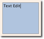
TextEdit
文本编辑元素类型
The TextEdit is very similar to TextInput, and supports a multi-line text edit field. It doesn’t have the text constraint properties, as this depends on querying the painted size of the text (paintedHeight, paintedWidth). We also create our own component called TTextEdit to provide an editing background and use the focus scope for better focus forwarding.
TextEdit与TextInput非常相似,支持多行文本编辑字段。它没有文本约束属性,因为这取决于查询文本的绘制大小(paintedHeight、paintedWidth)。我们还创建了自己的名为TTextEdit的组件,以提供编辑背景,并使用焦点范围来更好地转发焦点。
// TTextEdit.qml

import QtQuick

FocusScope {
    width: 96; height: 96
    Rectangle {
        anchors.fill: parent
        color: "lightsteelblue"
        border.color: "gray"

    }

    property alias text: input.text
    property alias input: input

    TextEdit {
        id: input
        anchors.fill: parent
        anchors.margins: 4
        focus: true
    }
}
You can use it like the TLineEdit component
您可以像使用TLineEdit组件一样使用它
// textedit.qml

import QtQuick

Rectangle {
    width: 136
    height: 120
    color: "linen"

    TTextEdit {
        id: input
        x: 8; y: 8
        width: 120; height: 104
        focus: true
        text: "Text Edit"
    }
}
Keys Element
按键元素类型
The attached property Keys allows executing code based on certain key presses. For example, to move and scale a square, we can hook into the up, down, left and right keys to translate the element, and the plus and minus keys to scale the element.
附加属性键允许基于某些按键执行代码。例如,要移动和缩放正方形,我们可以使用上、下、左、右键平移元素对象,使用加号和减号键缩放元素对象。
// keys.qml

import QtQuick

DarkSquare {
    width: 400; height: 200

    GreenSquare {
        id: square
        x: 8; y: 8
    }
    focus: true
    Keys.onLeftPressed: square.x -= 8
    Keys.onRightPressed: square.x += 8
    Keys.onUpPressed: square.y -= 8
    Keys.onDownPressed: square.y += 8
    Keys.onPressed: function (event) {
        switch(event.key) {
            case Qt.Key_Plus:
                square.scale += 0.2
                break;
            case Qt.Key_Minus:
                square.scale -= 0.2
                break;
        }
    }
}
示例源码下载


 690
690


 被折叠的 条评论
为什么被折叠?
被折叠的 条评论
为什么被折叠?
 到【灌水乐园】发言


