


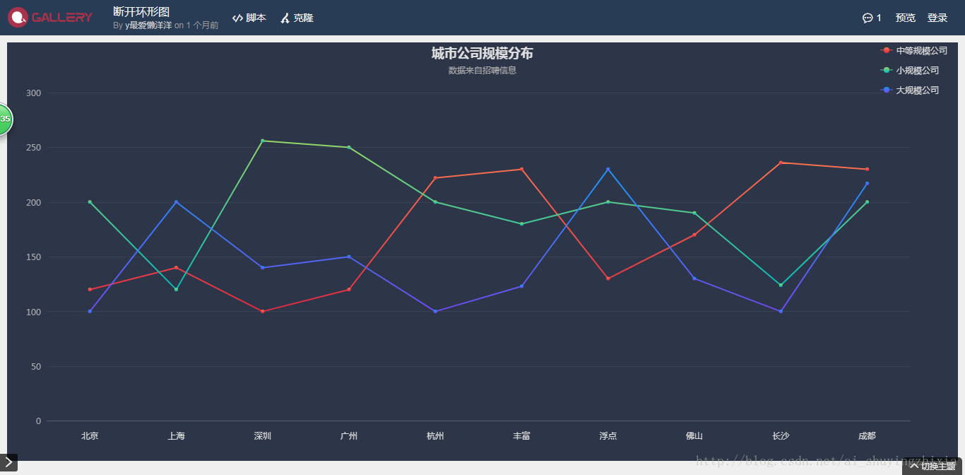
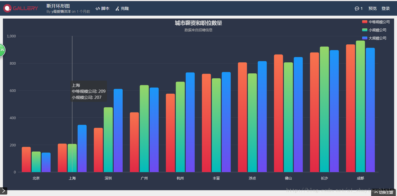
折线图和柱状图对比
通过点击Echart 图表右上角的 色块 可以控制对应图表的显隐。但在多条柱状图中,对应的图形复杂(可以调整柱状图之间的距离解决),不符合图表直观清晰的特征,所以通过改写成折线图的方式更有利。在只有两支柱状图时,使用柱状图较好。
2. 多图表展示
一般一个option 对应一张图表,但是也可以将多张图表通过一个option 展示
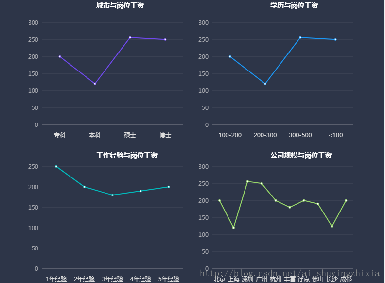
var edu = ['专科', '本科', '硕士', '博士'
];
var eduS = [200, 120, 256, 250];

var city = ['北京', '上海', '深圳', '广州', '杭州',
    '丰富', '浮点', '佛山', '长沙', '成都'
];
var cityS = [200, 120, 256, 250, 200, 180, 200, 190, 124, 200];

var comp = ['100-200', '200-300', '300-500', '<100'
];
var compS = [200, 120, 256, 250];

var exper = ['1年经验', '2年经验', '3年经验', '4年经验', '5年经验'
];
var experS = [250, 200, 180, 190, 200];
var colors = ['#96d668', '#01babc', '#1a98f8', '#7049f0'];

option = {
    backgroundColor: "#2d3548",
    title: [{
            text: "学历与岗位工资",
            left: "70%",
            textStyle: {
                color: "#fff",
                fontSize: "14"
            }
        }, {
            left: "25%",
            text: "城市与岗位工资",
            textStyle: {
                color: "#fff",
                fontSize: "14"
            }
        },
        {
            text: "公司规模与岗位工资",
            left: "70%",
            top: "52%",
            textStyle: {
                color: "#fff",
                fontSize: "14"
            }
        }, {
            left: "25%",
            top: "52%",
            text: "工作经验与岗位工资",
            textStyle: {
                color: "#fff",
                fontSize: "14"
            }
        }
    ],
    grid: [{
            x: '8%',
            y: '8%',
            width: '40%',
            height: "40%",
            containLabel: true
        },
        {
            x2: '8%',
            y: '8%',
            width: '40%',
            height: "40%",
            containLabel: true
        },
        {
            x: '8%',
            y2: '0',
            width: '40%',
            height: "40%",
            bottom: "2%",
            containLabel: true
        },
        {
            x2: '8%',
            y2: '0',
            width: '40%',
            height: "40%",
            bottom: "2%",
            containLabel: true
        },
    ],
    tooltip: {
        formatter: '{b}:<br/> {c}'
    },
    xAxis: [
        {
            gridIndex: 0,
            type: 'category',
            boundaryGap: true, //坐标轴两边留白
            data: edu,
            axisLabel: { //坐标轴刻度标签的相关设置。
                interval: 0, //设置为 1,表示『隔一个标签显示一个标签』
                margin: 15,
                textStyle: {
                    color: '#ddd',
                    fontStyle: 'normal',
                    fontFamily: '微软雅黑',
                    fontSize: 12,
                }
            },
            axisTick: {
                show: false,
            },
            axisLine: { //坐标轴轴线相关设置
                lineStyle: {
                    color: '#ddd',
                    opacity: 0.2
                }
            },
            splitLine: {
                show: false,
            }
        },
        {
            gridIndex: 1,
            type: 'category',
            boundaryGap: true, //坐标轴两边留白
            data: comp,
            axisLabel: { //坐标轴刻度标签的相关设置。
                interval: 0, //设置为 1,表示『隔一个标签显示一个标签』
                margin: 15,
                textStyle: {
                    color: '#ddd',
                    fontStyle: 'normal',
                    fontFamily: '微软雅黑',
                    fontSize: 12,
                }
            },
            axisTick: { //坐标轴刻度相关设置。
                show: false,
            },
            axisLine: { //坐标轴轴线相关设置
                lineStyle: {
                    color: '#ddd',
                    opacity: 0.2
                }
            },
            splitLine: { //坐标轴在 grid 区域中的分隔线。
                show: false,
            }
        },
        {
            gridIndex: 2,
            type: 'category',
            boundaryGap: true, //坐标轴两边留白
            data: exper,
            axisLabel: { //坐标轴刻度标签的相关设置。
                interval: 0, //设置为 1,表示『隔一个标签显示一个标签』
                margin: 15,
                textStyle: {
                    color: '#ddd',
                    fontStyle: 'normal',
                    fontFamily: '微软雅黑',
                    fontSize: 12,
                }
            },
            axisTick: { //坐标轴刻度相关设置。
                show: false,
            },
            axisLine: { //坐标轴轴线相关设置
                lineStyle: {
                    color: '#ddd',
                    opacity: 0.2
                }
            },
            splitLine: { //坐标轴在 grid 区域中的分隔线。
                show: false,
            }
        },
        {
            gridIndex: 3,
            type: 'category',
            boundaryGap: true, //坐标轴两边留白
            data: city,
            axisLabel: { //坐标轴刻度标签的相关设置。
                interval: 0, //设置为 1,表示『隔一个标签显示一个标签』
                margin: 15,
                textStyle: {
                    color: '#ddd',
                    fontStyle: 'normal',
                    fontFamily: '微软雅黑',
                    fontSize: 12,
                }
            },
            axisTick: { //坐标轴刻度相关设置。
                show: false,
            },
            axisLine: { //坐标轴轴线相关设置
                lineStyle: {
                    color: '#ddd',
                    opacity: 0.2
                }
            },
            splitLine: { //坐
最低0.47元/天 解锁文章


 1625
1625


 被折叠的 条评论
为什么被折叠?
被折叠的 条评论
为什么被折叠?
 到【灌水乐园】发言


