


ECharts官网地址
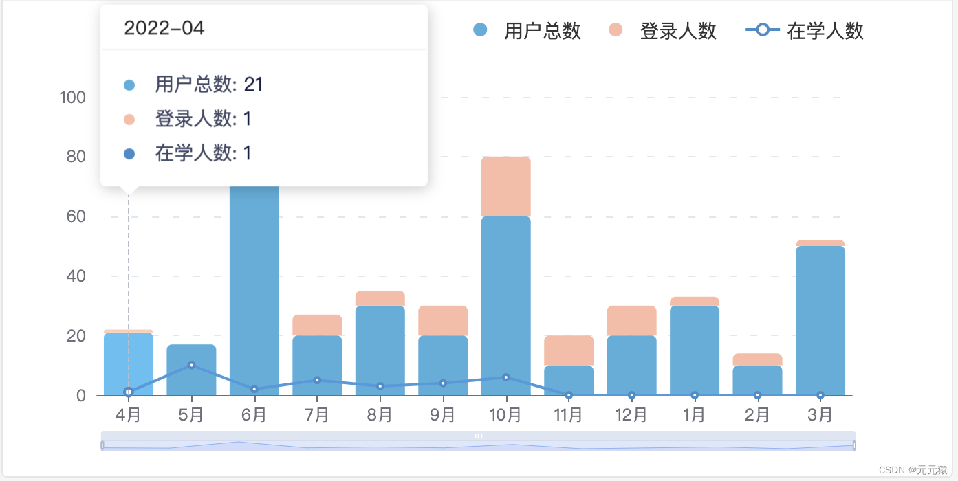
实现效果图
1、为echarts准备dom
一定要设置宽高,不然图表不显示。
<div style="width: 100%; height: 328px;" id="institutional-user"></div>2、设置/获取图表数据
设置或者获取图表所需要的相关数据以便后续设置图表配置项使用,当然也可以直接在设置图表配置项时设置图表数据,后续模拟接口返回图表数据进行操作。
// 图表数据
let institutionalUserData = {
  //直角坐标系 grid 中的 x 轴数据
  xAxis: {
    date: [
      "2022-04",
      "2022-05",
      "2022-06",
      "2022-07",
      "2022-08",
      "2022-09",
      "2022-10",
      "2022-11",
      "2022-12",
      "2023-01",
      "2023-02",
      "2023-03",
    ],
    data: [
      "4月",
      "5月",
      "6月",
      "7月",
      "8月",
      "9月",
      "10月",
      "11月",
      "12月",
      "1月",
      "2月",
      "3月",
    ],
  },
  //数据项数据
  series: {
    orgUser: {
      userCount: [21, 17, 90, 20, 30, 20, 60, 10, 20, 30, 10, 50],
      loginUserCount: [1, 0, 10, 7, 5, 10, 20, 10, 10, 3, 4, 2],
      learnUserCount: [1, 10, 2, 5, 3, 4, 6, 0, 0, 0, 0, 0],
    },
  },
};
3、初始化echarts实例
初始化echarts实例前需要为echarts准备dom。
// 初始化echarts实例
let institutionalUserEcharts = echarts.init(
  // 为echarts准备的dom,一定要设置宽高,不然图表不显示
  document.getElementById("institutional-user")
);
4、解决echarts图表相对某个元素自适应问题(可不设置)
// resize事件:监听窗口变化、监听DOM元素宽高的变化
// 解决echarts图表相对某个元素自适应问题
window.addEventListener("resize", function () {
  institutionalUserEcharts.resize();
});
5、图表配置项设置
// 图表配置项
let institutionalUserOption = {
  //提示框配置
  tooltip: {
    //坐标轴触发提示框
    trigger: "axis",
    //设置提示框浮层位置 point: 鼠标位置
    position: function (point) {
      return [point[0] - 18, point[1] - 140];
    },
    padding: 0,
    //提示框浮层内容格式器: 自定义提示框样式
    formatter: function (params) {
      let content = "";
      params.forEach((item) => {
        //提示框的内容样式及数据
        content += `<div style="height: 25px; line-height: 25px;">
            <span style="display: inline-block; margin-right: 10px; border-radius: 50%; width: 8px; height: 8px;background-color: ${item.color};"></span>
            <span style="color: #424864;">${item.seriesName}:</span>
            <span style="color: #172045;">${item.value}</span>
          </div>`;
      });
      //提示框外框样式及内容数据
      const htmlContent = `<div style="width: 236px; height: 130px;">
          <div style="color: #000000D9; border-bottom: 1px solid #F0F0F0; padding: 5px 16px;">${
            institutionalUserData.xAxis.date[params[0].dataIndex]
          }</div>
          <div style="padding: 12px 16px; position: relative;">
            ${content}
            <div style="position: absolute; bottom: -15px; left: 12px; width: 0; height: 0; overflow: hidden; border-width: 8px; border-color: #ffffff transparent transparent transparent; border-style: dashed dashed solid dashed;}"></div>
          </div>
        </div>`;
      return htmlContent;
    },
  },
  //图例配置
  legend: {
  	//图例组件离容器右侧距离8%
    right: "8%",
    //图例标记的图形高度设置为10
    itemHeight: 10,
    //图例每项之间的间隔设置为20
    itemGap: 20,
    //图例的公用文本样式
    textStyle: {
      fontSize: 14,
      //自定义富文本样式
      rich: {
        a: {
          //文字垂直对齐方式
          verticalAlign: "middle",
        },
      },
      padding: [0, 0, -2, 0],
    },
    data: [
      //数据项1
      {
        name: "用户总数",
        //数据项1的图例标记设置为圆
        icon: "circle",
      },
      //数据项2
      {
        name: "登录人数",
        //数据项2的图例标记设置为圆
        icon: "circle",
      },
      //数据项3: 数据项3的图例标记默认为折线标记
      {
        name: "在学人数",
      },
    ],
  },
  //x轴配置
  xAxis: {
    data: institutionalUserData.xAxis.data,
    boundaryGap: true,
    axisTick: {
      alignWithLabel: true,
    },
  },
  //y轴配置
  yAxis: {
    splitLine: {
      lineStyle: {
        type: [5, 10],
        dashOffset: 5,
      },
    },
  },
  //区域缩放配置
  dataZoom: [
    {
      type: "slider",
      show: true,
      height: 8,
      backgroundColor: "#F4F5FC",
      start: 0,
      end: 50,
    },
    {
      type: "inside",
      disabled: false,
    },
  ],
  series: [
    //数据项1
    {
    	//数据项1设置为柱状图
      type: "bar",
      //数据堆叠设置为x轴方向
      stack: "x",
      name: "用户总数",
      //数据项1的数据
      data: institutionalUserData.series.orgUser.userCount,
      //图形样式
      itemStyle: {
        color: "#50AEDD",
        borderRadius: [4, 4, 0, 0],
      },
      //柱条宽度设置
      barWidth: 36,
    },
    {
      type: "bar",
      stack: "x",
      name: "登录人数",
      data: institutionalUserData.series.orgUser.loginUserCount,
      itemStyle: {
        color: "#FDBCA5",
        borderRadius: [4, 4, 0, 0],
      },
    },
    //数据项3
    {
      //数据项3设置为折线图
      type: "line",
      name: "在学人数",
      //数据项3的数据
      data: institutionalUserData.series.orgUser.learnUserCount,
      //图形样式
      itemStyle: {
        color: "#428BCA",
      },
    },
  ],
};
6、将配置项设置给echarts实例对象
institutionalUserEcharts.setOption(institutionalUserOption);完整代码
html代码:
<div style="width: 100%; height: 328px;" id="institutional-user"></div>js代码:
// 图表数据
let institutionalUserData = {
  //直角坐标系 grid 中的 x 轴数据
  xAxis: {
    date: [
      "2022-04",
      "2022-05",
      "2022-06",
      "2022-07",
      "2022-08",
      "2022-09",
      "2022-10",
      "2022-11",
      "2022-12",
      "2023-01",
      "2023-02",
      "2023-03",
    ],
    data: [
      "4月",
      "5月",
      "6月",
      "7月",
      "8月",
      "9月",
      "10月",
      "11月",
      "12月",
      "1月",
      "2月",
      "3月",
    ],
  },
  //数据项数据
  series: {
    orgUser: {
      userCount: [21, 17, 90, 20, 30, 20, 60, 10, 20, 30, 10, 50],
      loginUserCount: [1, 0, 10, 7, 5, 10, 20, 10, 10, 3, 4, 2],
      learnUserCount: [1, 10, 2, 5, 3, 4, 6, 0, 0, 0, 0, 0],
    },
  },
};

// 初始化echarts实例
let institutionalUserEcharts = echarts.init(
  // 为echarts准备的dom,一定要设置宽高,不然图表不显示
  document.getElementById("institutional-user")
);

// resize事件:监听窗口变化、监听DOM元素宽高的变化
// 解决echarts图表相对某个元素自适应问题
window.addEventListener("resize", function () {
  institutionalUserEcharts.resize();
});

// 图表配置项
let institutionalUserOption = {
  //提示框配置
  tooltip: {
    //坐标轴触发提示框
    trigger: "axis",
    //设置提示框浮层位置 point: 鼠标位置
    position: function (point) {
      return [point[0] - 18, point[1] - 140];
    },
    padding: 0,
    //提示框浮层内容格式器: 自定义提示框样式
    formatter: function (params) {
      let content = "";
      params.forEach((item) => {
        //提示框的内容样式及数据
        content += `<div style="height: 25px; line-height: 25px;">
            <span style="display: inline-block; margin-right: 10px; border-radius: 50%; width: 8px; height: 8px;background-color: ${item.color};"></span>
            <span style="color: #424864;">${item.seriesName}:</span>
            <span style="color: #172045;">${item.value}</span>
          </div>`;
      });
      //提示框外框样式及内容数据
      const htmlContent = `<div style="width: 236px; height: 130px;">
          <div style="color: #000000D9; border-bottom: 1px solid #F0F0F0; padding: 5px 16px;">${
            institutionalUserData.xAxis.date[params[0].dataIndex]
          }</div>
          <div style="padding: 12px 16px; position: relative;">
            ${content}
            <div style="position: absolute; bottom: -15px; left: 12px; width: 0; height: 0; overflow: hidden; border-width: 8px; border-color: #ffffff transparent transparent transparent; border-style: dashed dashed solid dashed;}"></div>
          </div>
        </div>`;
      return htmlContent;
    },
  },
  //图例配置
  legend: {
  	//图例组件离容器右侧距离8%
    right: "8%",
    //图例标记的图形高度设置为10
    itemHeight: 10,
    //图例每项之间的间隔设置为20
    itemGap: 20,
    //图例的公用文本样式
    textStyle: {
      fontSize: 14,
      //自定义富文本样式
      rich: {
        a: {
          //文字垂直对齐方式
          verticalAlign: "middle",
        },
      },
      padding: [0, 0, -2, 0],
    },
    data: [
      //数据项1
      {
        name: "用户总数",
        //数据项1的图例标记设置为圆
        icon: "circle",
      },
      //数据项2
      {
        name: "登录人数",
        //数据项2的图例标记设置为圆
        icon: "circle",
      },
      //数据项3: 数据项3的图例标记默认为折线标记
      {
        name: "在学人数",
      },
    ],
  },
  //x轴配置
  xAxis: {
    data: institutionalUserData.xAxis.data,
    boundaryGap: true,
    axisTick: {
      alignWithLabel: true,
    },
  },
  //y轴配置
  yAxis: {
    splitLine: {
      lineStyle: {
        type: [5, 10],
        dashOffset: 5,
      },
    },
  },
  //区域缩放配置
  dataZoom: [
    {
      type: "slider",
      show: true,
      height: 8,
      backgroundColor: "#F4F5FC",
      start: 0,
      end: 50,
    },
    {
      type: "inside",
      disabled: false,
    },
  ],
  series: [
    //数据项1
    {
    	//数据项1设置为柱状图
      type: "bar",
      //数据堆叠设置为x轴方向
      stack: "x",
      name: "用户总数",
      //数据项1的数据
      data: institutionalUserData.series.orgUser.userCount,
      //图形样式
      itemStyle: {
        color: "#50AEDD",
        borderRadius: [4, 4, 0, 0],
      },
      //柱条宽度设置
      barWidth: 36,
    },
    {
      type: "bar",
      stack: "x",
      name: "登录人数",
      data: institutionalUserData.series.orgUser.loginUserCount,
      itemStyle: {
        color: "#FDBCA5",
        borderRadius: [4, 4, 0, 0],
      },
    },
    //数据项3
    {
      //数据项3设置为折线图
      type: "line",
      name: "在学人数",
      //数据项3的数据
      data: institutionalUserData.series.orgUser.learnUserCount,
      //图形样式
      itemStyle: {
        color: "#428BCA",
      },
    },
  ],
};

// 将配置项设置给echarts实例对象,用上述定义的配置项和数据显示图表
institutionalUserEcharts.setOption(institutionalUserOption);


 2万+
2万+


 被折叠的 条评论
为什么被折叠?
被折叠的 条评论
为什么被折叠?
 到【灌水乐园】发言


