


【附代码】python绘图集锦共7篇内容,本文为变化(Change)关系图。
时间序列图(Time Series Plot)
波峰和波谷添加注释的时间序列图(Time Series with Peaks and Troughs Annotated)
自相关和部分自相关图(Autocorrelation (ACF) and Partial Autocorrelation (PACF) Plot)
交叉相关图(Cross Correlation plot)
时间序列分解图(Time Series Decomposition Plot)
多重时间序列图(Multiple Time Series)
双坐标系时间序列图(Plotting with different scales using secondary Y axis)
带误差阴影的时间序列图(Time Series with Error Bands)
堆积面积图(Stacked Area Chart)
非堆积面积图(Area Chart UnStacked)
日历热力图(Calendar Heat Map)
季节图(Seasonal Plot)
1.时间序列图(Time Series Plot)
该图展示给定指标随时间的变化趋势。
# Import Data
df = pd.read_csv('./datasets/AirPassengers.csv')

# Draw Plot
plt.figure(figsize=(12, 8), dpi=80)
plt.plot(df['date'], df['value'], color='#dc2624')

# Decoration
plt.ylim(50, 750)
xtick_location = df.index.tolist()[::12]
xtick_labels = [x[-4:] for x in df.date.tolist()[::12]]
plt.xticks(ticks=xtick_location,
           labels=xtick_labels,
           rotation=0,
           fontsize=12,
           horizontalalignment='center',
           alpha=.7)
plt.yticks(fontsize=12, alpha=.7)
plt.title("Air Passengers Traffic (1949 - 1969)", fontsize=18)
plt.grid(axis='both', alpha=.3)

# Remove borders
plt.gca().spines["top"].set_alpha(0.0)
plt.gca().spines["bottom"].set_alpha(0.3)
plt.gca().spines["right"].set_alpha(0.0)
plt.gca().spines["left"].set_alpha(0.3)
plt.show()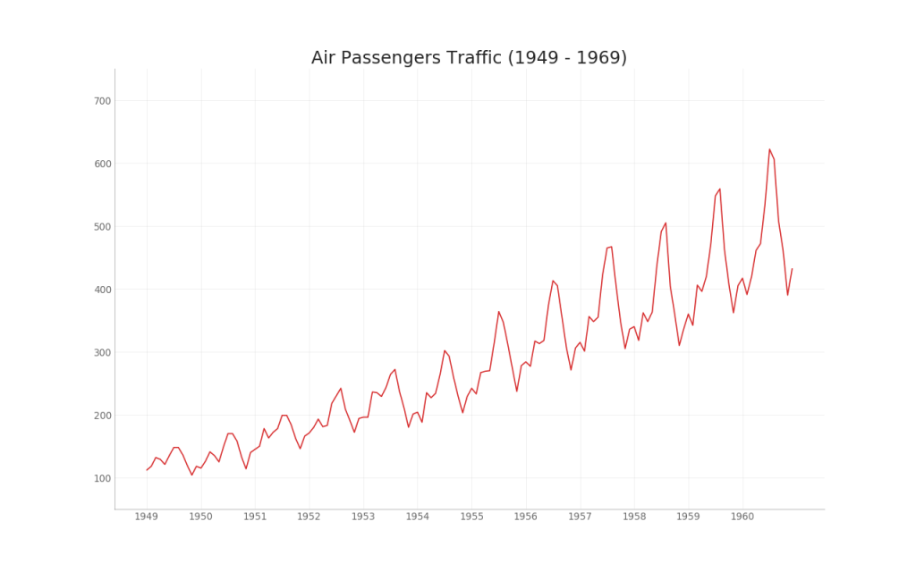
2.波峰和波谷添加注释的时间序列图(Time Series with Peaks and Troughs Annotated)
# Import Data
df = pd.read_csv('./datasets/AirPassengers.csv')

# Get the Peaks and Troughs
data = df['value'].values
doublediff = np.diff(np.sign(np.diff(data)))
peak_locations = np.where(doublediff == -2)[0] + 1

doublediff2 = np.diff(np.sign(np.diff(-1 * data)))
trough_locations = np.where(doublediff2 == -2)[0] + 1

# Draw Plot
plt.figure(figsize=(12, 8), dpi=80)
plt.plot('date', 'value', data=df, color='tab:blue', label='Air Traffic')
plt.scatter(df.date[peak_locations],
            df.value[peak_locations],
            marker=mpl.markers.CARETUPBASE,
            color='tab:green',
            s=100,
            label='Peaks')
plt.scatter(df.date[trough_locations],
            df.value[trough_locations],
            marker=mpl.markers.CARETDOWNBASE,
            color='tab:red',
            s=100,
            label='Troughs')

# Annotate
for t, p in zip(trough_locations[1::5], peak_locations[::3]):
    plt.text(df.date[p],
             df.value[p] + 15,
             df.date[p],
             horizontalalignment='center',
             color='darkgreen')
    plt.text(df.date[t],
             df.value[t] - 35,
             df.date[t],
             horizontalalignment='center',
             color='darkred')

# Decoration
plt.ylim(50, 750)
xtick_location = df.index.tolist()[::6]
xtick_labels = df.date.tolist()[::6]
plt.xticks(ticks=xtick_location,
           labels=xtick_labels,
           rotation=45,
           fontsize=12,
           alpha=.7)
plt.title("Peak and Troughs of Air Passengers Traffic (1949 - 1969)",
          fontsize=18)
plt.yticks(fontsize=12, alpha=.7)

# Lighten borders
plt.gca().spines["top"].set_alpha(.0)
plt.gca().spines["bottom"].set_alpha(.3)
plt.gca().spines["right"].set_alpha(.0)
plt.gca().spines["left"].set_alpha(.3)

plt.legend(loc='upper left')
plt.grid(axis='y', alpha=.3)
plt.show()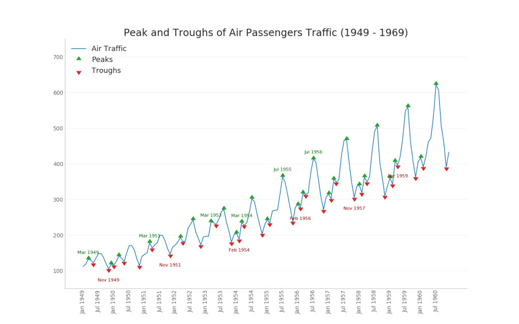
3.自相关和部分自相关图(Autocorrelation (ACF) and Partial Autocorrelation (PACF) Plot)
自相关,展示时间序列与其自身滞后的相关性。
部分自相关,展示任何给定滞后相对于当前序列的自相关。
from statsmodels.graphics.tsaplots import plot_acf, plot_pacf

# Import Data
df = pd.read_csv('./datasets/AirPassengers.csv')

# Draw Plot
fig, (ax1, ax2) = plt.subplots(1, 2, figsize=(12, 6), dpi=80)
plot_acf(df.value.tolist(), ax=ax1, lags=50)
plot_pacf(df.value.tolist(), ax=ax2, lags=20)

# Decorate
# lighten the borders
ax1.spines["top"].set_alpha(.3)
ax2.spines["top"].set_alpha(.3)
ax1.spines["bottom"].set_alpha(.3)
ax2.spines["bottom"].set_alpha(.3)
ax1.spines["right"].set_alpha(.3)
ax2.spines["right"].set_alpha(.3)
ax1.spines["left"].set_alpha(.3)
ax2.spines["left"].set_alpha(.3)

# font size of tick labels
ax1.tick_params(axis='both', labelsize=12)
ax2.tick_params(axis='both', labelsize=12)
plt.show()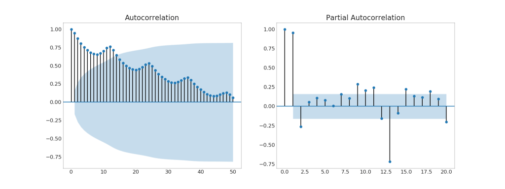
4.交叉相关图(Cross Correlation plot)
展示两个时间序列相互之间的滞后。
import statsmodels.tsa.stattools as stattools

# Import Data
df = pd.read_csv('./datasets/mortality.csv')
x = df['mdeaths']
y = df['fdeaths']

# Compute Cross Correlations
ccs = stattools.ccf(x, y)[:100]
nlags = len(ccs)

# Compute the Significance level
# ref: https://stats.stackexchange.com/questions/3115/cross-correlation-significance-in-r/3128#3128
conf_level = 2 / np.sqrt(nlags)

# Draw Plot
plt.figure(figsize=(12, 7), dpi=80)

plt.hlines(0, xmin=0, xmax=100, color='gray')  # 0 axis
plt.hlines(conf_level, xmin=0, xmax=100, color='gray')
plt.hlines(-conf_level, xmin=0, xmax=100, color='gray')

plt.bar(x=np.arange(len(ccs)), height=ccs, width=.3)

# Decoration
plt.title('$Cross\; Correlation\; Plot:\; mdeaths\; vs\; fdeaths,
          fontsize=18)
plt.xlim(0, len(ccs))
plt.show()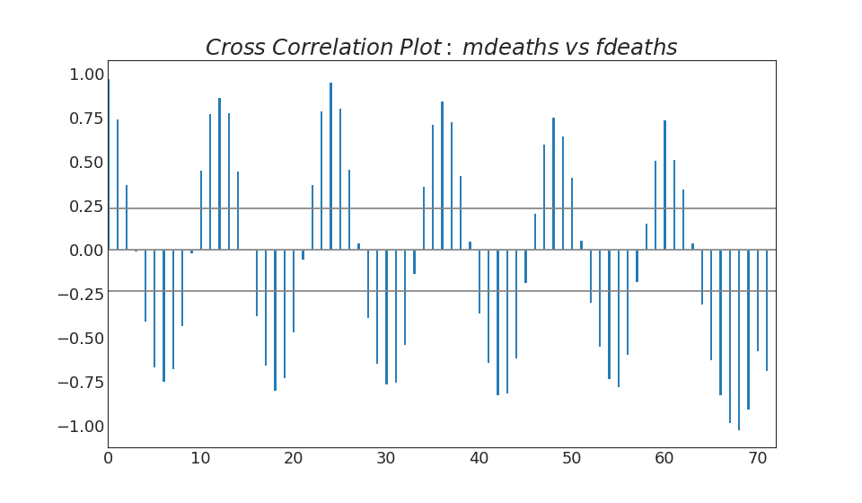
5.时间序列分解图(Time Series Decomposition Plot)
该图将时间序列分解为趋势、季节和残差分量(trend, seasonal and residual components.)。
from statsmodels.tsa.seasonal import seasonal_decompose
from dateutil.parser import parse

# Import Data
df = pd.read_csv('./datasets/AirPassengers.csv')
dates = pd.DatetimeIndex([parse(d).strftime('%Y-%m-01') for d in df['date']])
df.set_index(dates, inplace=True)

# Decompose
result = seasonal_decompose(df['value'], model='multiplicative')

# Plot
plt.figure(figsize=(12, 7), dpi=80)
#plt.rcParams.update({'figure.figsize': (10, 10)})
result.plot().suptitle('Time Series Decomposition of Air Passengers')
plt.show()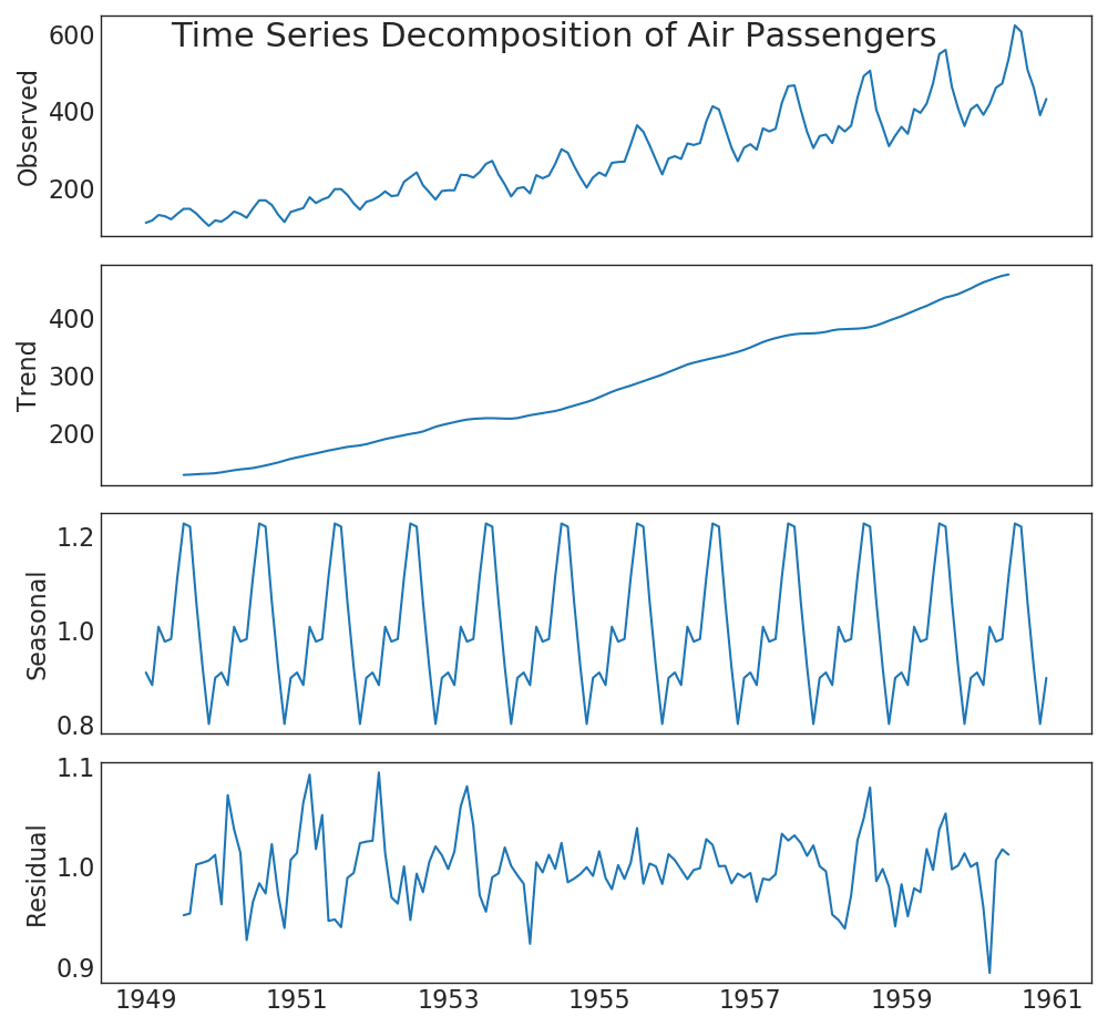
6.多重时间序列图(Multiple Time Series)
# Import Data
df = pd.read_csv('./datasets/mortality.csv')

# Define the upper limit, lower limit, interval of Y axis and colors
y_LL = 100
y_UL = int(df.iloc[:, 1:].max().max() * 1.1)
y_interval = 400
mycolors = ['tab:red', 'tab:blue', 'tab:green', 'tab:orange']

# Draw Plot and Annotate
fig, ax = plt.subplots(1, 1, figsize=(10, 6), dpi=80)

columns = df.columns[1:]
for i, column in enumerate(columns):
    plt.plot(df.date.values, df[column].values, lw=1.5, color=mycolors[i])
    plt.text(df.shape[0] + 1,
             df[column].values[-1],
             column,
             fontsize=14,
             color=mycolors[i])

# Draw Tick lines
for y in range(y_LL, y_UL, y_interval):
    plt.hlines(y,
               xmin=0,
               xmax=71,
               colors='black',
               alpha=0.3,
               linestyles="--",
               lw=0.5)

# Decorations
plt.tick_params(axis="both",
                which="both",
                bottom=False,
                top=False,
                labelbottom=True,
                left=False,
                right=False,
                labelleft=True)

# Lighten borders
plt.gca().spines["top"].set_alpha(.3)
plt.gca().spines["bottom"].set_alpha(.3)
plt.gca().spines["right"].set_alpha(.3)
plt.gca().spines["left"].set_alpha(.3)

plt.title('Number of Deaths from Lung Diseases in the UK (1974-1979)',
          fontsize=18)
plt.yticks(range(y_LL, y_UL, y_interval),
           [str(y) for y in range(y_LL, y_UL, y_interval)],
           fontsize=12)
plt.xticks(range(0, df.shape[0], 12),
           df.date.values[::12],
           horizontalalignment='left',
           rotation=45,
           fontsize=12)
plt.ylim(y_LL, y_UL)
plt.xlim(-2, 80)
plt.show()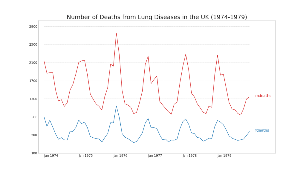
7.双坐标系时间序列图(Plotting with different scales using secondary Y axis)
# Import Data
df = pd.read_csv("./datasets/economics.csv")

x = df['date']
y1 = df['psavert']
y2 = df['unemploy']

# Plot Line1 (Left Y Axis)
fig, ax1 = plt.subplots(1, 1, figsize=(12, 6), dpi=100)
ax1.plot(x, y1, color='tab:red')

# Plot Line2 (Right Y Axis)
ax2 = ax1.twinx()  # instantiate a second axes that shares the same x-axis
ax2.plot(x, y2, color='tab:blue')

# Decorations
# ax1 (left Y axis)
ax1.set_xlabel('Year', fontsize=18)
ax1.tick_params(axis='x', rotation=70, labelsize=12)
ax1.set_ylabel('Personal Savings Rate', color='#dc2624', fontsize=16)
ax1.tick_params(axis='y', rotation=0, labelcolor='#dc2624')
ax1.grid(alpha=.4)

# ax2 (right Y axis)
ax2.set_ylabel("# Unemployed (1000's)", color='#01a2d9', fontsize=16)
ax2.tick_params(axis='y', labelcolor='#01a2d9')
ax2.set_xticks(np.arange(0, len(x), 60))
ax2.set_xticklabels(x[::60], rotation=90, fontdict={'fontsize': 10})
ax2.set_title(
    "Personal Savings Rate vs Unemployed: Plotting in Secondary Y Axis",
    fontsize=18)
fig.tight_layout()
plt.show()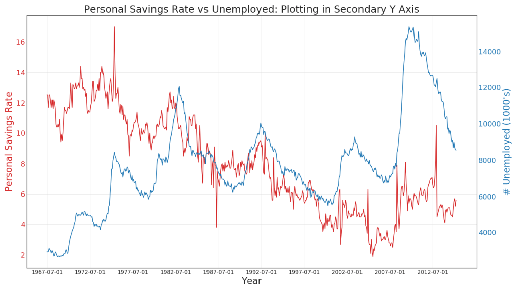
8.带误差阴影的时间序列图(Time Series with Error Bands)
from scipy.stats import sem

# Import Data
df = pd.read_csv("https://raw.githubusercontent.com/selva86/datasets/master/user_orders_hourofday.csv")
df_mean = df.groupby('order_hour_of_day').quantity.mean()
df_se = df.groupby('order_hour_of_day').quantity.apply(sem).mul(1.96)

# Plot
plt.figure(figsize=(16,10), dpi= 80)
plt.ylabel("# Orders", fontsize=16)
x = df_mean.index
plt.plot(x, df_mean, color="white", lw=2)
plt.fill_between(x, df_mean - df_se, df_mean + df_se, color="#3F5D7D")

# Decorations
# Lighten borders
plt.gca().spines["top"].set_alpha(0)
plt.gca().spines["bottom"].set_alpha(1)
plt.gca().spines["right"].set_alpha(0)
plt.gca().spines["left"].set_alpha(1)
plt.xticks(x[::2], [str(d) for d in x[::2]] , fontsize=12)
plt.title("User Orders by Hour of Day (95% confidence)", fontsize=22)
plt.xlabel("Hour of Day")

s, e = plt.gca().get_xlim()
plt.xlim(s, e)

# Draw Horizontal Tick lines
for y in range(8, 20, 2):
    plt.hlines(y, xmin=s, xmax=e, colors='black', alpha=0.5, linestyles="--", lw=0.5)

plt.show()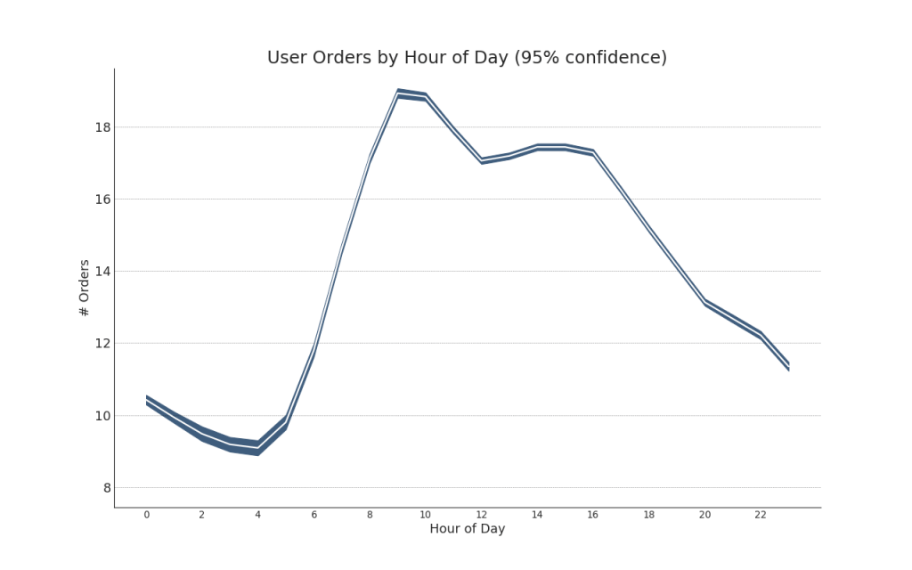
"Data Source: https://www.kaggle.com/olistbr/brazilian-ecommerce#olist_orders_dataset.csv"
from dateutil.parser import parse
from scipy.stats import sem

# Import Data
df_raw = pd.read_csv('https://raw.githubusercontent.com/selva86/datasets/master/orders_45d.csv',
                     parse_dates=['purchase_time', 'purchase_date'])

# Prepare Data: Daily Mean and SE Bands
df_mean = df_raw.groupby('purchase_date').quantity.mean()
df_se = df_raw.groupby('purchase_date').quantity.apply(sem).mul(1.96)

# Plot
plt.figure(figsize=(16,10), dpi= 80)
plt.ylabel("# Daily Orders", fontsize=16)
x = [d.date().strftime('%Y-%m-%d') for d in df_mean.index]
plt.plot(x, df_mean, color="white", lw=2)
plt.fill_between(x, df_mean - df_se, df_mean + df_se, color="#3F5D7D")

# Decorations
# Lighten borders
plt.gca().spines["top"].set_alpha(0)
plt.gca().spines["bottom"].set_alpha(1)
plt.gca().spines["right"].set_alpha(0)
plt.gca().spines["left"].set_alpha(1)
plt.xticks(x[::6], [str(d) for d in x[::6]] , fontsize=12)
plt.title("Daily Order Quantity of Brazilian Retail with Error Bands (95% confidence)", fontsize=20)

# Axis limits
s, e = plt.gca().get_xlim()
plt.xlim(s, e-2)
plt.ylim(4, 10)

# Draw Horizontal Tick lines
for y in range(5, 10, 1):
    plt.hlines(y, xmin=s, xmax=e, colors='black', alpha=0.5, linestyles="--", lw=0.5)

plt.show()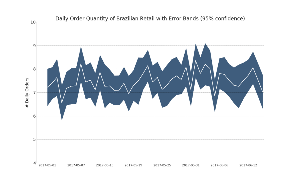
9.堆积面积图(Stacked Area Chart)
# Import Data
df = pd.read_csv('./datasets/nightvisitors.csv')

# Decide Colors
mycolors = ['#dc2624', '#2b4750', '#45a0a2', '#e87a59', '#7dcaa9', '#649E7D', '#dc8018', '#C89F91']

# Draw Plot and Annotate
fig, ax = plt.subplots(1,1,figsize=(12, 8), dpi= 80)
columns = df.columns[1:]
labs = columns.values.tolist()

# Prepare data
x  = df['yearmon'].values.tolist()
y0 = df[columns[0]].values.tolist()
y1 = df[columns[1]].values.tolist()
y2 = df[columns[2]].values.tolist()
y3 = df[columns[3]].values.tolist()
y4 = df[columns[4]].values.tolist()
y5 = df[columns[5]].values.tolist()
y6 = df[columns[6]].values.tolist()
y7 = df[columns[7]].values.tolist()
y = np.vstack([y0, y2, y4, y6, y7, y5, y1, y3])

# Plot for each column
labs = columns.values.tolist()
ax = plt.gca()
ax.stackplot(x, y, labels=labs, colors=mycolors, alpha=0.8)
ax.tick_params(axis='x', rotation=45, labelsize=12)
# Decorations
ax.set_title('Night Visitors in Australian Regions', fontsize=18)
ax.set(ylim=[0, 100000])
ax.legend(fontsize=10, ncol=4)
plt.xticks(x[::5], fontsize=10, horizontalalignment='center')
plt.yticks(np.arange(10000, 100000, 20000), fontsize=10)
plt.xlim(x[0], x[-1])

# Lighten borders
plt.gca().spines["top"].set_alpha(0)
plt.gca().spines["bottom"].set_alpha(.3)
plt.gca().spines["right"].set_alpha(0)
plt.gca().spines["left"].set_alpha(.3)

plt.show()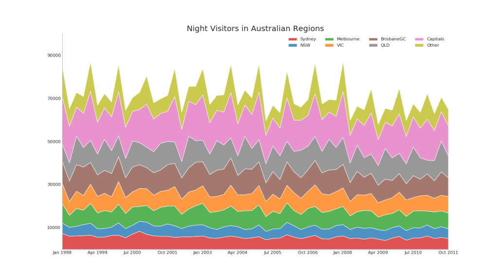
10.非堆积面积图(Area Chart UnStacked)
# Import Data
df = pd.read_csv("./datasets/economics.csv")

# Prepare Data
x = df['date'].values.tolist()
y1 = df['psavert'].values.tolist()
y2 = df['uempmed'].values.tolist()
columns = ['psavert', 'uempmed']

# Draw Plot
fig, ax = plt.subplots(1, 1, figsize=(12, 6), dpi=80)
ax.fill_between(x,
                y1=y1,
                y2=0,
                label=columns[1],
                alpha=0.5,
                color='#dc2624',
                linewidth=2)
ax.fill_between(x,
                y1=y2,
                y2=0,
                label=columns[0],
                alpha=0.5,
                color='#649E7D',
                linewidth=2)

# Decorations
ax.set_title('Personal Savings Rate vs Median Duration of Unemployment',
             fontsize=18)
ax.set(ylim=[0, 30])
ax.legend(loc='best', fontsize=12)
plt.xticks(x[::50], fontsize=10, horizontalalignment='center')
plt.yticks(np.arange(2.5, 30.0, 2.5), fontsize=10)
plt.xlim(-10, x[-1])
plt.tick_params(axis='x', rotation=45, labelsize=12)

# Draw Tick lines
for y in np.arange(2.5, 30.0, 2.5):
    plt.hlines(y,
               xmin=0,
               xmax=len(x),
               colors='black',
               alpha=0.3,
               linestyles="--",
               lw=0.5)

# Lighten borders
plt.gca().spines["top"].set_alpha(0)
plt.gca().spines["bottom"].set_alpha(.3)
plt.gca().spines["right"].set_alpha(0)
plt.gca().spines["left"].set_alpha(.3)
plt.show()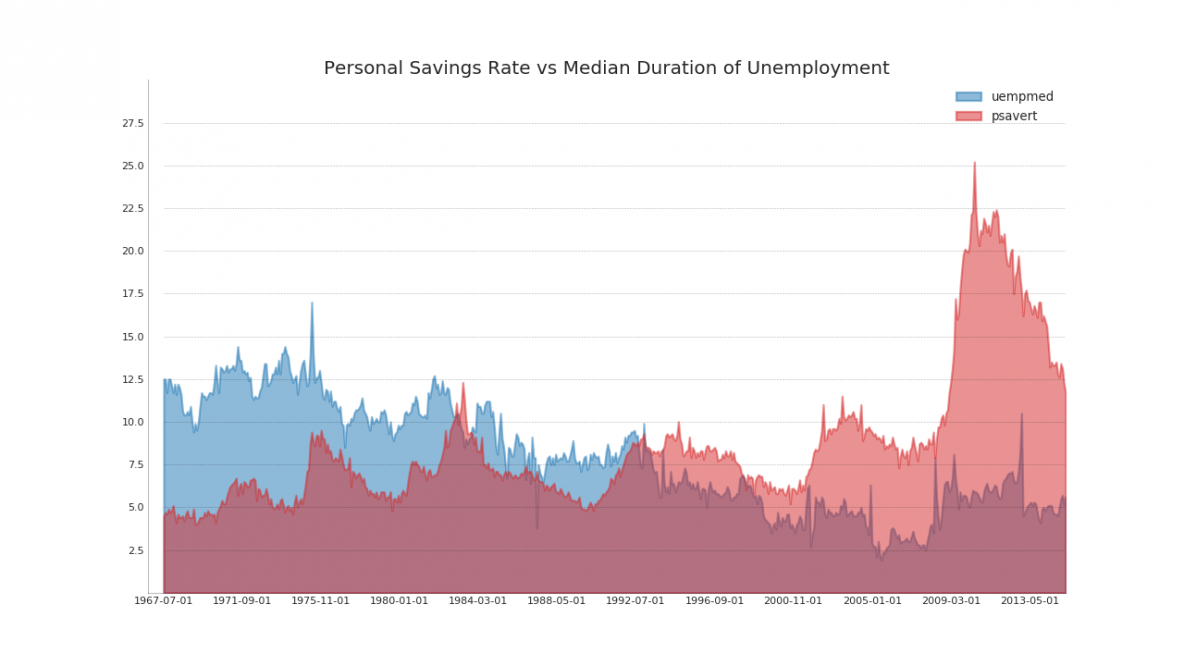
11.日历热力图(Calendar Heat Map)
!pip install calmap  -i https://pypi.tuna.tsinghua.edu.cn/simple#安装依赖包
import numpy as np
np.random.seed(sum(map(ord, 'calmap')))
import pandas as pd
import calmap
calmap.calendarplot(events,
                    monthticks=3,
                    daylabels='MTWTFSS',
                    dayticks=[0, 2, 4, 6],
                    cmap='YlGn',
                    fillcolor='grey',
                    linewidth=0,
                    fig_kws=dict(figsize=(8, 4)))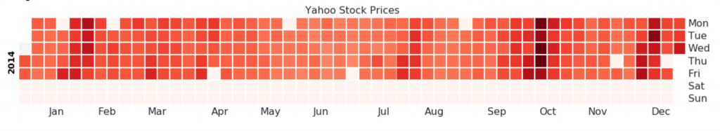
12.季节图(Seasonal Plot)
from dateutil.parser import parse

# Import Data
df = pd.read_csv('./datasets/AirPassengers.csv')

# Prepare data
df['year'] = [parse(d).year for d in df.date]
df['month'] = [parse(d).strftime('%b') for d in df.date]
years = df['year'].unique()

# Draw Plot

mycolors = [
    '#dc2624', '#2b4750', '#45a0a2', '#e87a59', '#7dcaa9', '#649E7D',
    '#dc8018', '#C89F91', '#6c6d6c', '#4f6268', '#c7cccf', 'firebrick'
]
plt.figure(figsize=(10, 6), dpi=80)

for i, y in enumerate(years):
    plt.plot('month',
             'value',
             data=df.loc[df.year == y, :],
             color=mycolors[i],
             label=y)
    plt.text(df.loc[df.year == y, :].shape[0] - .9,
             df.loc[df.year == y, 'value'][-1:].values[0],
             y,
             fontsize=12,
             color=mycolors[i])

# Decoration
plt.ylim(50, 750)
plt.xlim(-0.3, 11)
plt.ylabel('$Air Traffic)
plt.yticks(fontsize=11, alpha=.7)
plt.xticks(fontsize=11, alpha=.7)
plt.title("Monthly Seasonal Plot: Air Passengers Traffic (1949 - 1969)",
          fontsize=16)
plt.grid(axis='y', alpha=.3)

# Remove borders
plt.gca().spines["top"].set_alpha(0.0)
plt.gca().spines["bottom"].set_alpha(0.5)
plt.gca().spines["right"].set_alpha(0.0)
plt.gca().spines["left"].set_alpha(0.5)
# plt.legend(loc='upper right', ncol=2, fontsize=12)
plt.show()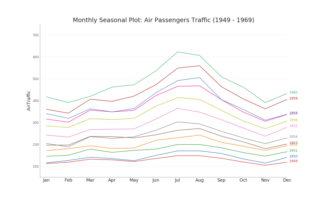
python绘图集锦系列共7篇文章,本文为变化(Change)关系图。
感兴趣或喜欢本文的小伙伴们记得点赞+收藏呀!您的支持是我坚持的动力~


 617
617


 被折叠的 条评论
为什么被折叠?
被折叠的 条评论
为什么被折叠?
 到【灌水乐园】发言


