


当多个界面都有很多相似部分时,可以考虑创建一个功能较全的模板。而在需要时,可以通过引用模板来实现自己想要实现的功能。比如适配器 Adapter,当很多的适配器都差不多时,就可以通过打造一个通用的适配器来实现。本例中主要是如何创建自定义的 ActionBar。
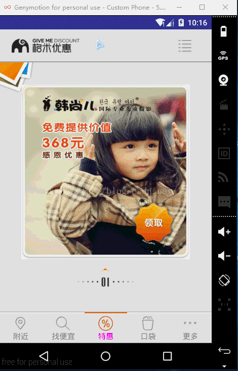
观察上图的,当切换界面时,每个界面的顶部最多只有两个图标,而且有4个界面具有类似特性。所以可以考虑通过自定义控件来创建UI模板。
由于是需要创建出具有重用功能的复合控件,所以通常需要继承 ViewGroup ,在给它添加指定功能的控制。给其指定一些可配置的属性,让其具有更强的扩展性。
本例可以简单的创建一个 TopBar 来继承 RelativeLayout,并在 values 文件下新建一个 attrs.xml 布局文件,该文件用于定义 ActionBar 的属性。
attrs.xml :
<?xml version="1.0" encoding="utf-8"?>
<resources>

    <declare-styleable name="TopBar" >
        <attr name="topbar_left_icon" format="reference" />
        <attr name="topbar_right_icon" format="reference" />
    </declare-styleable>
</resources>
其中:<declare-styleable name="TopBar" > 中的 name 值为继承自 RelativeLayout的类名,这样做的好处是在自定义属性较多时,能够很好的辨认出自定义的属性属于谁,属于哪个地方的自定义。当然也可以不用和继承自 RelativeLayout 的类名相同;由于 ActionBar 最多时只有 2 张图片,不需要其他属性(如果想在点击图标时改变图颜色等,还可以定义 format 的 color 值),所以给每张图片定义一个图片的引用即可,即:<attr name="topbar_left_icon" format="reference" /> 其中 format 指定的值为 reference,reference 表示图片的引用。
创建一个只有两张图片的布局文件,这样做的好处是在自定义控件的类中可以减少代码量,不必在该类中创建 ImageView ,也能更好的让 xml 完成 UI 界面设置,而 Java 程序则专门负责业务逻辑。
topbar_layout.xml :
<?xml version="1.0" encoding="utf-8"?>
<RelativeLayout xmlns:android="http://schemas.android.com/apk/res/android"
    android:layout_margin="6dp"
    android:layout_width="match_parent"
    android:layout_height="wrap_content">

    <ImageView
        android:id="@+id/topbar_left_img"
        android:layout_marginLeft="6dp"
        android:layout_width="wrap_content"
        android:layout_height="wrap_content" />

    <ImageView
        android:id="@+id/topbar_right_img"
        android:layout_marginRight="20dp"
        android:layout_alignParentRight="true"
        android:layout_width="wrap_content"
        android:layout_height="wrap_content" />

</RelativeLayout>
该布局只有两个横向的 ImageView 且都没有指定 src 属性。
创建一个 TopBar 类用于继承 RelativeLayout。
TopBar.java :
package com.crazy.gemi.ui.topbar;

import android.content.Context;
import android.content.res.TypedArray;
import android.graphics.drawable.Drawable;
import android.util.AttributeSet;
import android.util.Log;
import android.view.View;
import android.widget.ImageView;
import android.widget.RelativeLayout;

import com.crazy.gemi.R;

public class TopBar extends RelativeLayout {

    private Drawable draw_left;
    private Drawable draw_right;

    public TopBar(Context context) {
        this(context, null);
    }

    public TopBar(Context context, AttributeSet attrs) {
        this(context, attrs, 0);
    }

    public TopBar(Context context, AttributeSet attrs, int defStyleAttr) {
        super(context, attrs, defStyleAttr);

        init(attrs, defStyleAttr);
    }

    private void init(AttributeSet attrs, int defStyleAttr) {
        // 系统提供了 TypedArray 来获取自定义的属性集
        TypedArray typedArray = null;

        try {
            typedArray = getContext().obtainStyledAttributes(attrs, R.styleable.TopBar,defStyleAttr,-1);

            draw_left = typedArray.getDrawable(R.styleable.TopBar_topbar_left_icon);
            draw_right = typedArray.getDrawable(R.styleable.TopBar_topbar_right_icon);
        } finally {
            // 获取完所有的属性值后要回收资源
            typedArray.recycle();
        }

        View view = View.inflate(getContext(), R.layout.topbar_layout, this);

        ImageView imgLeft = (ImageView)view.findViewById(R.id.topbar_left_img);
        ImageView imgRight = (ImageView)view.findViewById(R.id.topbar_right_img);

        imgLeft.setImageDrawable(draw_left);
        imgRight.setImageDrawable(draw_right);
    }
}
其中需要注意的是:
1. 获取完属性值后,要记得回收资源。将其放入 finally 语句块中,就一定能够回收,不管前面是否出问题等。
2. 先加载该布局文件:View view = View.inflate(getContext(), R.layout.topbar_layout, this); 其中的 this 为该 TopBar 对象的引用,将其添加到 RelativeLayout 中;给图片赋值,如:imgLeft.setImageDrawable(draw_left);
由此可以看出避免了在该类中出现 ImageView imgLeft = new ImageView(content); 的创建 ImageView 对象的代码,也避免可为组件元素设置相应的布局元素的问题,如:
        // 为组件设置相应的布局元素(左边)
        LayoutParams leftParams = new LayoutParams(LayoutParams.WRAP_CONTENT, LayoutParams.WRAP_CONTENT);
        leftParams.addRule(RelativeLayout.ALIGN_PARENT_LEFT, TRUE);
        // 添加到 ViewGroup
        addView(imgLeft, leftParams);

        // 为组件设置相应的布局元素(右边)
        LayoutParams rightParams = new LayoutParams(LayoutParams.WRAP_CONTENT, LayoutParams.WRAP_CONTENT);
        leftParams.addRule(RelativeLayout.ALIGN_PARENT_LEFT, TRUE);
        // 添加到 ViewGroup
        addView(imgRight,rightParams);
当然该自定义的空间还不完善,可以在该类中添加接口,以方便点击图标时有相应的回调。这里也就没有去创建该接口了。
接下来就是在需要的引用该模板:
先创建自己的名字空间:xmlns:custom="http://schemas.android.com/apk/res-auto" 其中 custom 为自定义的名字,res-auto 也可以改为该应用的包名。下面简单创建一个布局,以此来演示对该 UI 模板的引用。
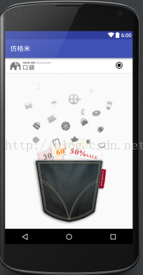
效果如下:
代码如下:
<RelativeLayout xmlns:android="http://schemas.android.com/apk/res/android"
    xmlns:tools="http://schemas.android.com/tools"
    xmlns:custom="http://schemas.android.com/apk/res-auto"
    android:layout_width="match_parent"
    android:layout_height="match_parent"
    tools:context="com.crazy.gemi.ui.pocket.PocketFragment">

    <com.crazy.gemi.ui.topbar.TopBar
        android:id="@+id/pocket_top_bar"
        android:background="@drawable/bg_cheaper_fg"
        android:layout_width="match_parent"
        android:layout_height="wrap_content"
        custom:topbar_left_icon="@drawable/pocket_logo"
        custom:topbar_right_icon="@drawable/abc_btn_radio_to_on_mtrl_015"/>

    <com.warmtel.expandtab.ExpandPopTabView
        android:id="@+id/fg_pocket_expandtab_view"
        android:layout_below="@id/pocket_top_bar"
        android:layout_width="match_parent"
        android:layout_height="wrap_content"
        custom:tab_toggle_btn_bg="@drawable/bg_expa_near"
        custom:tab_toggle_btn_font_color="@android:color/black"/>

    <ImageView
        android:id="@+id/fg_pocket_img"
        android:layout_below="@id/fg_pocket_expandtab_view"
        android:scaleType="centerCrop"
        android:src="@drawable/pocket_bg"
        android:layout_width="match_parent"
        android:layout_height="match_parent" />

</RelativeLayout>
其中用 custom:topbar_left_icon="" 来加载自己想要加载的图片(左边的图标)。这样就可以通过添加或者不添加 custom 属性来实现完对 UI 模板的引用。


 扫一扫
扫一扫
 815
815

 被折叠的 条评论
为什么被折叠?
被折叠的 条评论
为什么被折叠?
 到【灌水乐园】发言


