


 本文详细介绍了React中的styled-components库,包括其安装、使用方法、数据绑定、继承、主题切换和css片段定义,以及与Vue中CSSscoped特性的对比。
1、css in js
css in js有很多库,这里介绍styled-components
styled-components
下载【vscode可以安装vscode-styled-components 插件,有代码提示】
npm i styled-components1、然后为某个组件新建style.js文件,然后写一些样式。
import styled from 'styled-components'

export const Container = styled.div`
  color: green;
  .content {
    color: red;
  }
`
styled.div是一个函数,上面是用模板字符串的方式调用一个函数(示例代码如下),这个函数返回样式组件(这个样式组件最终渲染为带唯一类名的原生标签,上面用选择器写的样式都会唯一类名加上该选择器的后代选择器,效果见下面的图1)。
function myTag(strings, ...values) {
  console.log(strings); // ["Hello, ", "!"]
  console.log(values); // ["world"]
}

myTag`Hello, ${"world"}!`;
2、使用上面的样式组件
import { Container } from './style'

const Recommend = memo(() => {
  return (
    <Container>
      哈哈
      <RecomChild></RecomChild>
    </Container>
  )
})
最终的效果如下图:【那些能继承的css规则,子组件也会继承,比如color、font-family等,可以每个组件用一个样式组件来避免。】
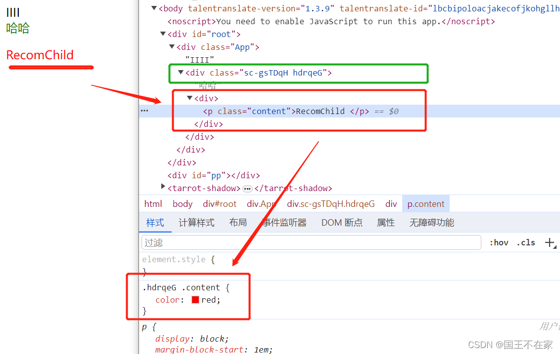
图1-最终渲染dom结构与样式
其他用法
1、使用js的数据
样式文件接收并使用传过来的props。
传入过程:往样式组件上存入props
import React, { useState } from 'react'
import { AppWrapper } from './style'
function App() {
  const [styleO] = useState({ size: 30, color: 'pink' })
  return (
    <div>
      <AppWrapper {...styleO}>
      </AppWrapper>
    </div>
  )
}

export default App
使用过程:在样式组件的定义文件中,使用函数接收props并使用
import styled from 'styled-components'
// AppWrapper会渲染为div标签,AppWrapper下的子元素使用类container有效。
export const AppWrapper = styled.div`
  .container {
    &:hover {
      color: ${(p) => p.color || 'red'};
      font-size: ${(p) => p.size + 'px'};
    }
}【为什么要要传入函数:在本文件作用域并没有props,所以设计成函数,由styled-components调用这个函数,并传入props 】
2、利用attrs设置标签属性
同样是传入回调,回调接收props,然后返回标签属性的描述对象,最后别忘了模板字符串的调用。
export const InputWrapper = styled.input.attrs((props) => ({
  type: props.$inputType || 'radio'
}))``
如果是原生的标签属性,能直接在使用的时候传递,不需要在定义处写明。自定义的属性需要以$作为前缀,这些自定义属性会被筛选掉,并不会添加到真实的dom上。
<Input defaultValue="@geelen" type="text" $inputColor="rebeccapurple" />如上,defaultValue和type这些自定义属性会直接添加到dom上,而$inputColor需要手动使用。
3、继承
styled中传入已经写好的样式组件,就能继承他的样式,可以做抽离。
const button = styled.button`
              padding: 8px 30px;
  `
const ButtonP = styled(button)`
  color: 'red';
`
4、主题切换
1、从styled-components中引入ThemeProvider组件,需要传入theme这个标签属性,属性值就是个对象,对象包含样式信息。
import React, { useState } from 'react'
import { ThemeProvider } from 'styled-components'
import { Button } from './style'
const theme1 = {
  colors: {
    primary: 'blue',
    secondary: 'green'
  }
}

const theme2 = {
  colors: {
    primary: 'red',
    secondary: 'yellow'
  }
}
function App() {
    //传入theme1,默认展示这个,后续改currentTheme的值
  const [currentTheme, setCurrentTheme] = useState(theme1)

  const handleThemeChange = () => {
    setCurrentTheme(currentTheme === theme1 ? theme2 : theme1)
  }

  return (
    <ThemeProvider theme={currentTheme}>
      {/* 这里的theme会挂载到每个样式组件(子组件)的props下,比如下卖弄的Button */}
      <Button onClick={handleThemeChange}>切换主题</Button>
    </ThemeProvider>
  )
}

export default App
ThemeProvider这个样式组件内部的样式组件上的props上就会有传入的theme。比如Button这个样式组件就能拿到,代码如下:
import styled from 'styled-components';

export const Button = styled.button`
  background-color: ${props => props.theme.colors.primary};
  color: white;
  padding: 10px 20px;
  border: none;
  border-radius: 4px;
`;
5、定义css片段
从styled-components中引入css这个函数,然后把一些样式传给它,返回css片段,就能直接在样式组件中使用这个变量了。【本质应该就是字符串,但是这样写有更好的提示】
import React from "react";
import styled, {css} from "styled-components";

const commonStyle = css`
  color: white;
  font-size: 20px;
`;

const Button = styled.button`
  ${commonStyle};
  background-color: red;
`;

const AnotherButton = styled.button`
  ${commonStyle};
  background-color: green;
`;
2、css module
使用步骤
1、新建一个[name].module.css文件,里面正常写css样式
.content{
  color: red;
}
2、引入上面的文件,然后在className处使用定义好的css类。【这样只会在这个组件中生效,对子组件无效】
import homeCss from './home.module.css'


<p className={homeCss.content}>Home</p>
原理
【将我们写的css类转为独一无二的类,比如将 .content 转为 .home_content__1bZH5
即:.模块_类名_哈希】
这需要打包工具的配合。以webpack为例,需要把css-loader的modules设为true。【当然,create-react-app已经设置好了,我们不用管。】
module.exports = {
  module: {
    rules: [
      {
        test: /\.css$/,
        use: [
          'style-loader',
          {
            loader: 'css-loader',
            options: {
              modules: true,
            },
          },
        ],
      },
    ],
  },
};
在构建过程中,会将 CSS 类名转换为唯一的类。
例如,.content可能会被转换 为.home_content__1bZH5
在运行时,JavaScript 会使用这些唯一的标识符来设置元素的类名。
<div class="home_content__1bZH5">Hello, world!</div>3、基本的css
主要就是内联样式和css文件的形式
内联样式
通过标签属性style进行设置,需要传递对象。
普通css文件
建一个css文件后通过import引入,然后className使用文件中定义的类。【因为没有作用域,这样使用是全局生效。】
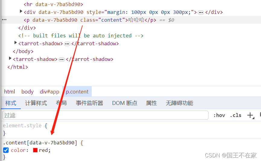
与vue的区别
css in js和css module都有生成唯一的类名来避免冲突,而vue中的scoped则是通过生成唯一的属性(data-v-哈希的形式),然后经过属性选择器来解决冲突。
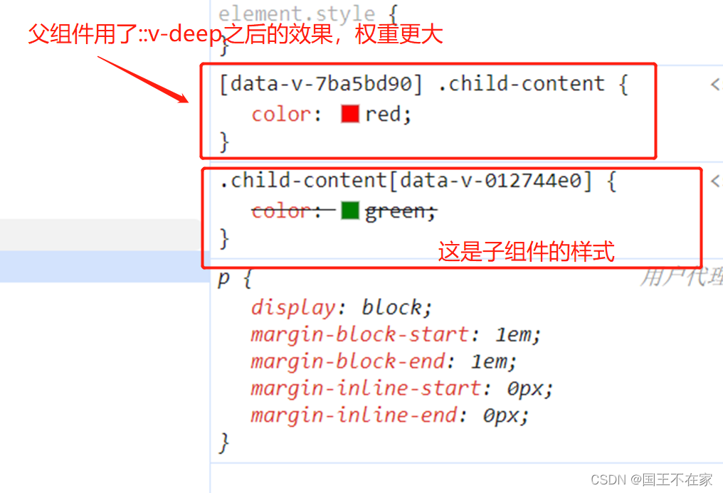
因为vue是通过属性选择器来定义样式,所以我们在该第三方库的组件(就是子组件)时是无法直接修改他的样式的,需要借助::v-deep这类深度修改器。原理就是增大选择器的权重。
父组件修改子组件样式的代码如下,最终的效果见下图,其中[data-v-7ba5bd90]这个属性选择器代表父组件,后面的.child-content就是子组件中的一个类,这样写的权重会比子组件的大,就会用父组件的这个效果。
::v-deep .child-content {
  color: red;
}
end
总结下react中的css使用,着重介绍了styled-components,还探究了下其与vue中css的区别。


 扫一扫
扫一扫


 3497
3497

 被折叠的 条评论
为什么被折叠?
被折叠的 条评论
为什么被折叠?
 到【灌水乐园】发言


