


echart 两个柱状图并列,共用一个y轴的label
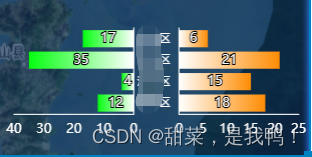
效果图如下:
代码如下:
let option = {
        tooltip: {
          trigger: 'axis',
          axisPointer: {            // 坐标轴指示器,坐标轴触发有效
            type: 'shadow'        // 默认为直线,可选为:'line' | 'shadow'
          }
        },
        axisPointer: {
          link: { xAxisIndex: 'all' }
        },
        grid: [{
          top: 20,
          bottoom: 60,
          left: 10,
          height: '65%',
          //right: '40%',
          width: '39%'
        }, {
          top: 20,
          bottoom: 60,
          //left: '60%',
          height: '65%',
          right: 10,
          width: '39%'
        }],
        xAxis: [
          {
            type: 'value',
            boundaryGap: false,
            inverse: true,
            position: 'right',
            axisLine: { onZero: true },
            axisTick: {
              show: false
            },
            splitLine: { show: false },
            axisLine: {
              lineStyle: {
                color: '#fff',
                width: 1, //这里是为了突出显示加上的
              }
            },
          },
          {
            type: 'value',
            gridIndex: 1,
            boundaryGap: false,
            axisLine: { onZero: true },
            axisTick: {
              show: false
            },
            splitLine: { show: false },
            axisLine: {
              lineStyle: {
                color: '#fff',
                width: 1, //这里是为了突出显示加上的
              }
            },
          }
        ],
        yAxis: [
          {
            type: 'category',
            position: 'right',
            axisTick: {
              show: false
            },
            axisLabel: {
              show: false,
              fontSize: 10
            },
            axisLine: {
              lineStyle: {
                color: '#fff',
                width: 1, //这里是为了突出显示加上的
              }
            },
            data: ['A区', 'B区', 'C区', 'D区',]
          },
          {
            type: 'category',
            gridIndex: 1,
            inverse: true,
            axisTick: {
              show: false
            },
            axisLabel: {
              fontSize: 16,
              fontSize: 10
            },
            axisLine: {
              lineStyle: {
                color: '#fff',
                width: 1, //这里是为了突出显示加上的
              }
            },
            data: ['A区', 'B区', 'C区', 'D区',]
          }
        ],
        series: [
          {
            name: '收入',
            type: 'bar',
            label: {
              show: true
            },
            hoverAnimation: false,
            itemStyle: {
              normal: {
                show: true,
                color: new echarts.graphic.LinearGradient(0, 0, 1, 0,
                  [
                    {
                      offset: 0,
                      color: "#05FF10"
                    },
                    {
                      offset: 1,
                      color: "#fff"
                    }
                  ],
                  false
                )
              }
            },
            data: [12, 4, 35, 17]
          },
          {
            name: '支出',
            type: 'bar',
            label: {
              show: true,
              //position: 'left'
            },
            xAxisIndex: 1,
            yAxisIndex: 1,
            hoverAnimation: false,
            itemStyle: {
              normal: {
                show: true,
                color: new echarts.graphic.LinearGradient(0, 0, 1, 0,
                  [
                    {
                      offset: 0,
                      color: "#fff"
                    },
                    {
                      offset: 1,
                      color: "#FF8C03"
                    }
                  ],
                  false
                )
              }
            },
            data: [6, 21, 15, 18]
          }
        ]
      }


 5880
5880


 被折叠的 条评论
为什么被折叠?
被折叠的 条评论
为什么被折叠?
 到【灌水乐园】发言


