


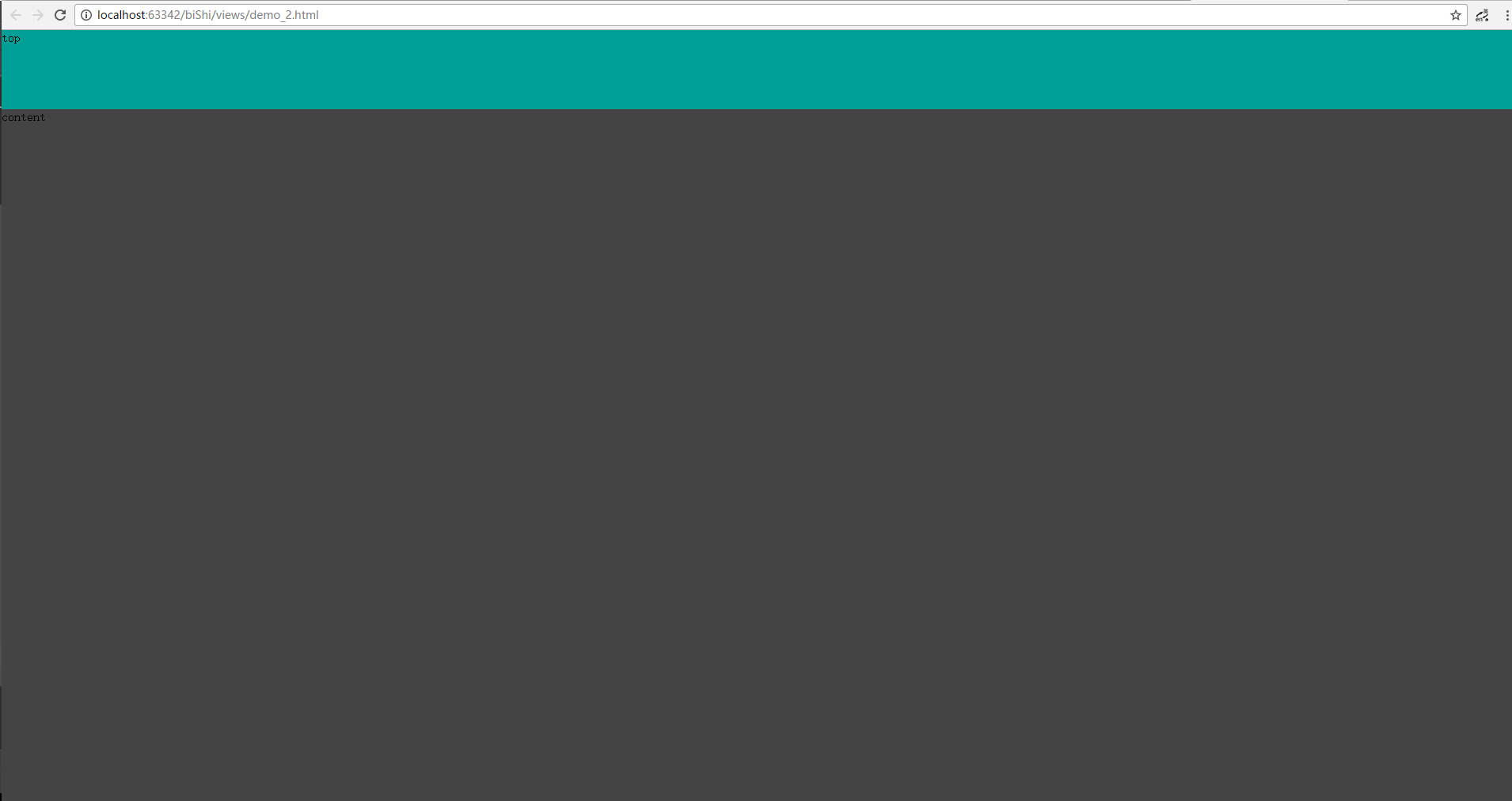
两行布局:头部高度固定,尾部高度为剩余高度
方法:尾部元素设置 position: absolute; top:顶部元素的高度,bottom:0;
<!DOCTYPE html>
<html lang="en">
<head>
<meta charset="UTF-8">
<title>Title</title>
<style>
html,body{
width: 100%;
height: 100%;
margin: 0;
padding: 0;
}
#top{
width: 100%;
height: 100px;
background: #009f95;
}
#content{
width: 100%;
position: absolute;
top: 100px;/*注意这里的写法*/
bottom: 0;/*注意这里的写法*/
background: #444444;
}
</style>
</head>
<body>
<div id="top">
top
</div>
<div id="content">
content
</div>
</body>
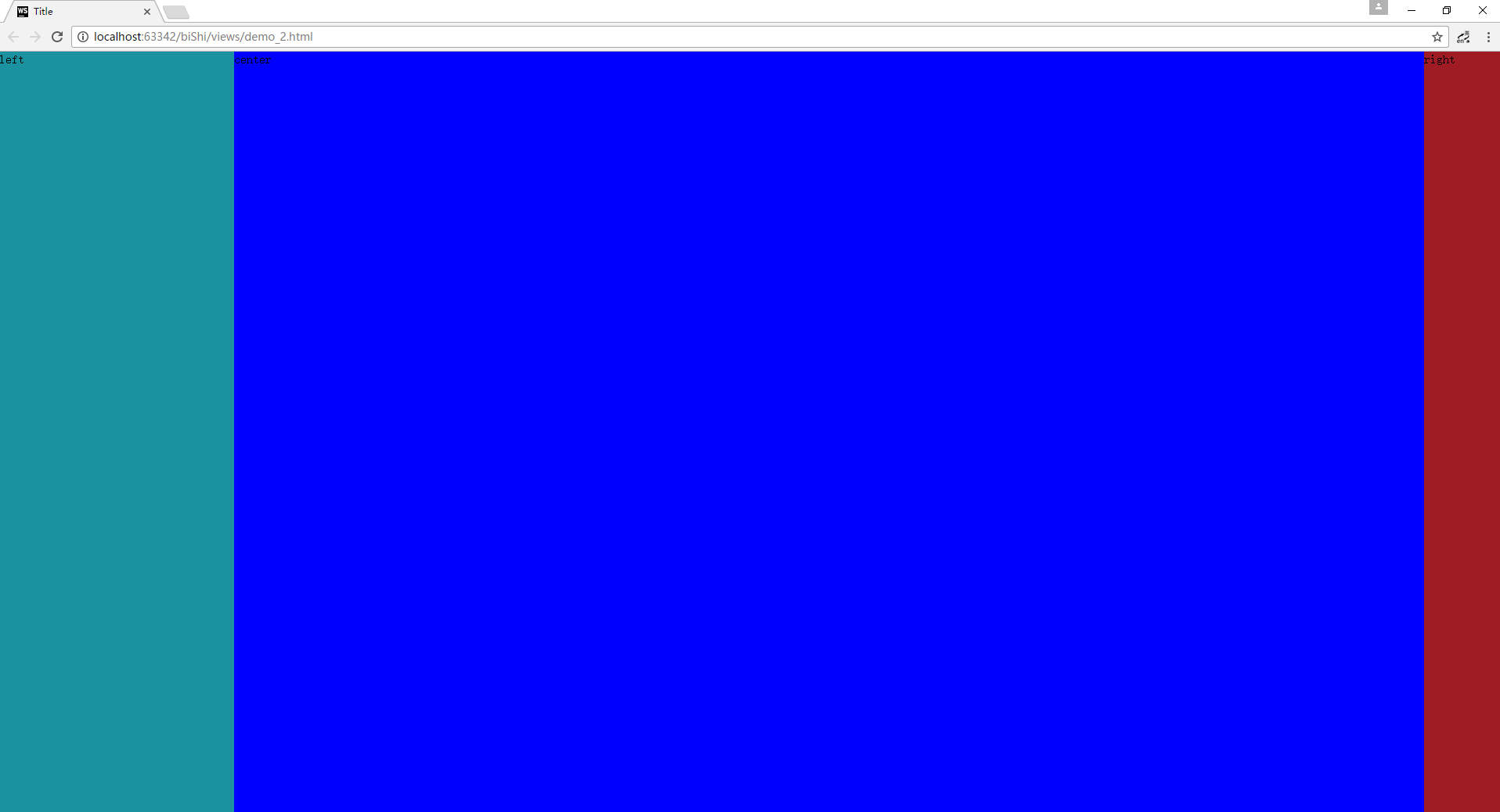
</html>双飞翼布局:左右宽度固定,中部自适应
代码如下:
方法一:利用中部元素左右margin+左右元素的绝对定位
<!DOCTYPE html>
<html lang="en">
<head>
    <meta charset="UTF-8">
    <title>Title</title>
    <style>
        html,body{
            width: 100%;
            height: 100%;
            margin: 0;
            padding: 0;
        }
        #left{
            width: 300px;
            height:100%;
            background: #1a929f;
            position: absolute;
            left: 0;
            top: 0;
        }
        #right{
            width: 100px;;
            height:100%;
            background: #9f1c24;
            position: absolute;
            right: 0;
            top: 0;
        }
        #content{
            height:100%;
            margin:0 100px 0 300px;
            background: #0000fe;
        }
    </style>
</head>
<body>
    <div id="content">
        center
    </div>
    <div id="left">
        left
    </div>
    <div id="right">
        right
    </div>
</body>
</html>
方法二:利用中部元素左右margin+左右元素的浮动;要注意三者的节点位置
<!DOCTYPE html>
<html lang="en">
<head>
<meta charset="UTF-8">
<title>Title</title>
<style>
html,body{
width: 100%;
height: 100%;
margin: 0;
padding: 0;
}
#left{
width: 300px;
height:100%;
background:#000;
float: left;
}
#right{
width: 100px;;
height:100%;
background: #9f1c24;
float: right;
}
#content{
height:100%;
margin:0 100px 0 300px;
background: #0000fe;
}
</style>
</head>
<body>
<!------注意三者的位置关系------>
<div id="left"></div>
<div id="right"></div>
<div id="content"></div>
</body>
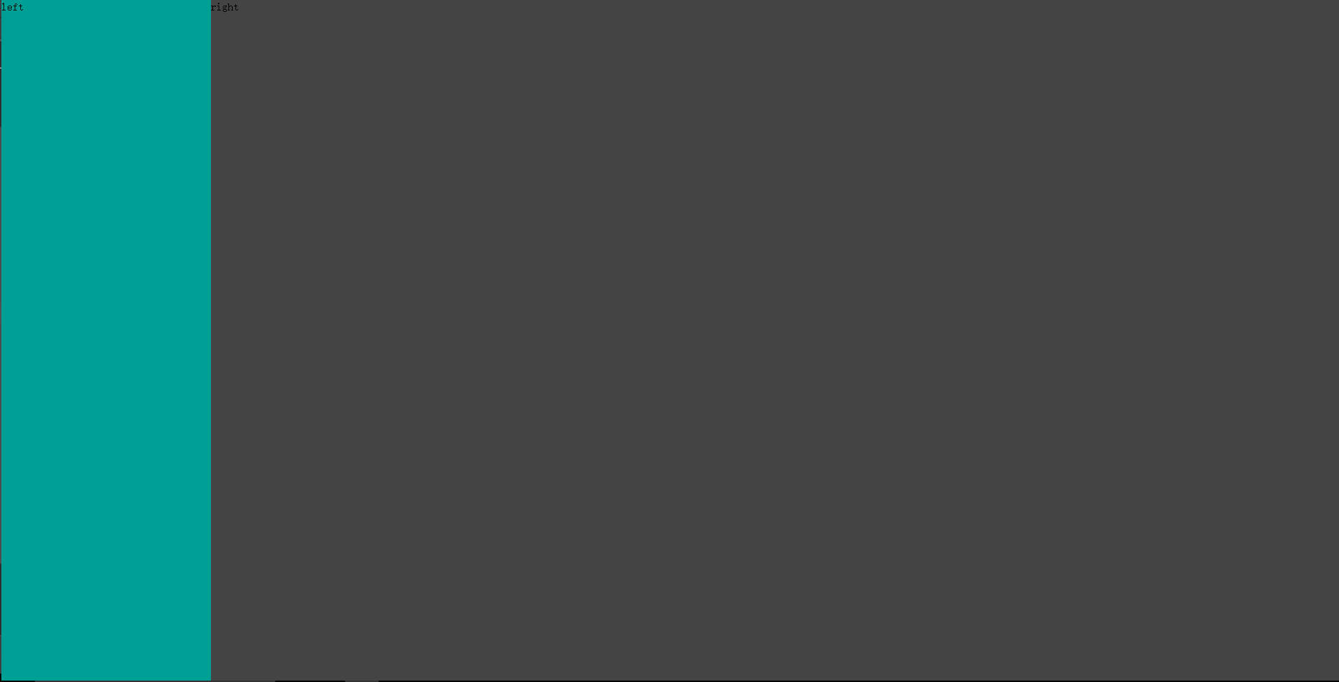
</html>左边固定宽度。右边自适应
方法:左元素左浮动+右元素元素设置margin-left为左边元素的宽度(同理可得右固定,左自适应)
<!DOCTYPE html>
<html lang="en">
<head>
<meta charset="UTF-8">
<title>Title</title>
<style>
html,body{
width: 100%;
height: 100%;
margin: 0;
padding: 0;
}
#left{
width:300px;
height: 100%;
background: #009f95;
float:left;
}
#right{
margin-left: 300px;
height: 100%;
background: #444444;
}
</style>
</head>
<body>
<div id="left">
left
</div>
<div id="right">
right
</div>
</body>
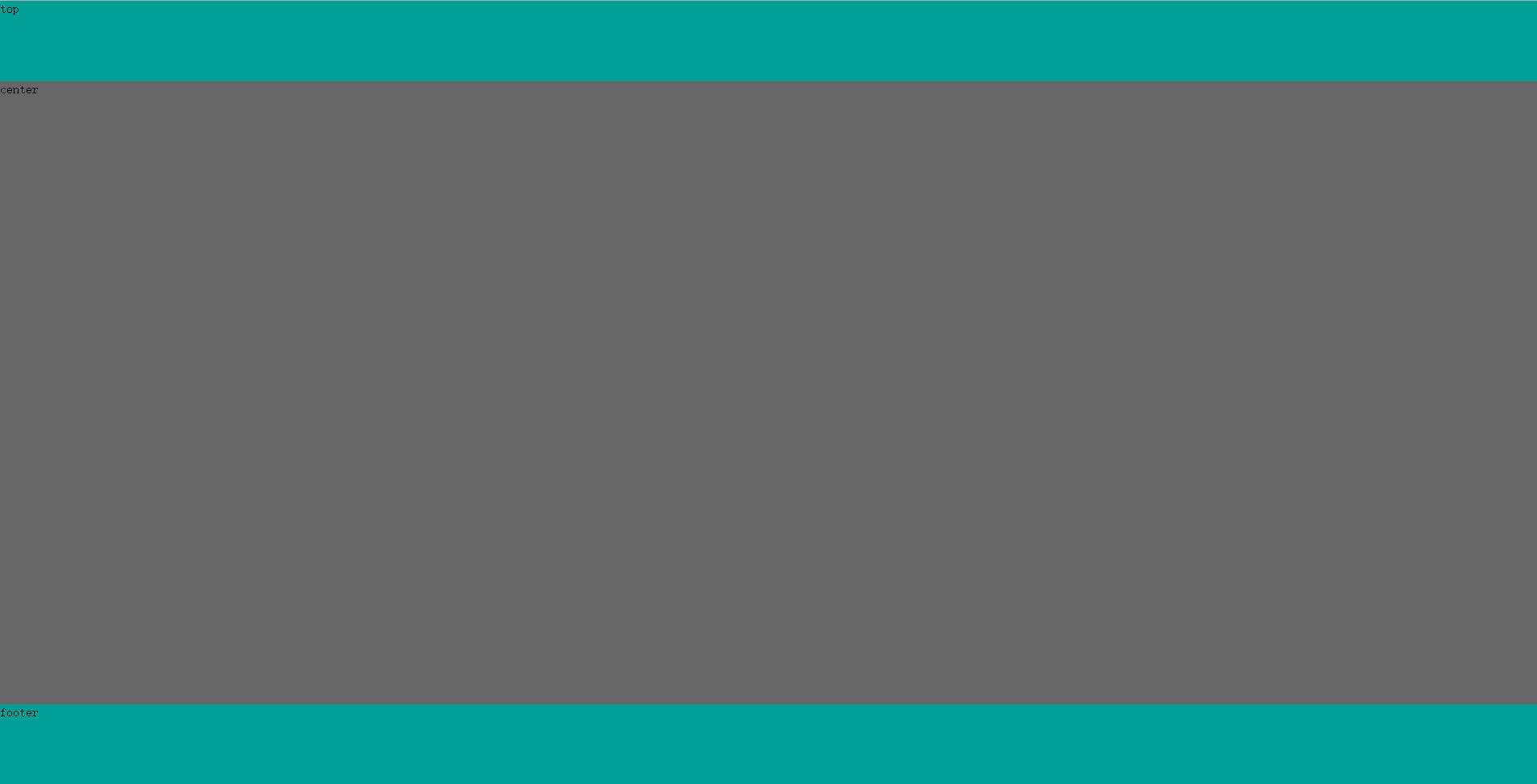
</html>头部,尾部高度固定,中间自适应布局
方法:中间元素设置 position: absolute;top: 头部的高度;bottom: 尾部的高度 + 尾部元素设置:position: absolute;bottom: 0;
<!DOCTYPE html>
<html lang="en">
<head>
<meta charset="UTF-8">
<title>Title</title>
<style>
html,body{
width: 100%;
height: 100%;
margin: 0;
padding: 0;
}
#top{
width: 100%;
height: 100px;
background: #009f95;
}
#footer{
width: 100%;
height: 100px;
position: absolute;
bottom: 0;
background: #009f95;
}
#center{
width: 100%;
position: absolute;
top: 100px;
bottom: 100px;
background: #666666;
}
</style>
</head>
<body>
<div id="top">top</div>
<div id="center">center</div>
<div id="footer">footer</div>
</body>
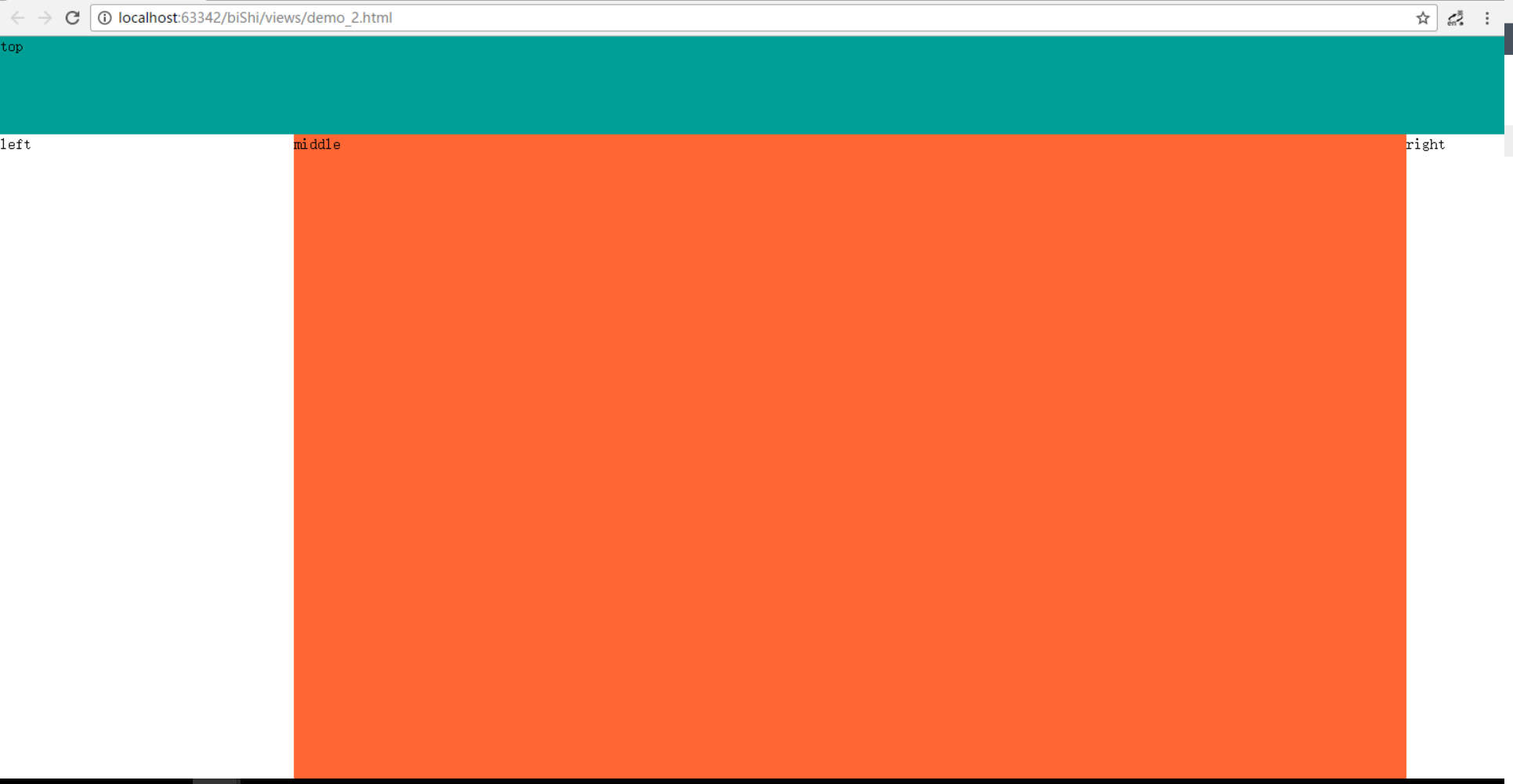
</html>最近遇到了一道考题;如图所示:
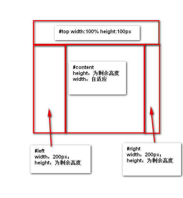
实现效果图:
<!DOCTYPE html>
<html lang="en">
<head>
    <meta charset="UTF-8">
    <title>Title</title>
    <style>
        html,body{
            width: 100%;
            height: 100%;
            margin: 0;
            padding: 0;
        }
       #top{
           width: 100%;
           height: 100px;
           background: #009f95;
       }
      #left{
        background: #fff;
        width: 300px;
        position: absolute;
        top: 100px;
        bottom: 0;
     }
    #right{
        background: #fff;
        width: 100px;
        position: absolute;
        top: 100px;
        right: 0;
        bottom: 0;
    }
    #middle{
        background:#ff6633;
        position: absolute;
        left:300px;
        right: 100px;
        top: 100px;
        bottom: 0;
    }
    </style>
</head>
<body>
    <div id="top">top</div>
    <div id="left">
        left
    </div>
    <div id="middle">
        middle
    </div>
    <div id="right">
        right
    </div>
</body>
</html>
利用是position一个小hack;通过top,right,left,bottom来强制渲染元素的大小。我没有测试兼容性,用的时候要小心


 4744
4744

 被折叠的 条评论
为什么被折叠?
被折叠的 条评论
为什么被折叠?
 到【灌水乐园】发言


