


需求概述
首先明确我们要做什么:一个包含4个关注点的配置,每个关注点包含名称、颜色、半径、启用状态四个可配置属性。所有配置需持久化到数据库,并能实时反馈到UI显示上。
-
核心功能点:
-
关注点属性动态配置
-
配置数据实时生效
-
所有数据持久化存储
-
优雅、用户友好的交互界面
-
需求分析
按上述需求,可以通过一个关注点类,将名称、颜色、半径、启用作为它的属性,同时由于名称是可变化的,最好再添加一个别名或ID的属性,以便在数据库中进行存储。
关注点类:名称与颜色的存储,可以使用字符串,半径使用浮点数,是否启用使用bool值。
所有关注点可以形成一个可观察对象的集合,以用于UI上的绑定。
需求实现
UI代码如下,以下为WINUI xaml代码,WPF亦可做参考(仅需极少改动即可):
<?xml version="1.0" encoding="utf-8" ?>
<Window
    x:Class="WINUIDemo.MainWindow"
    xmlns="http://schemas.microsoft.com/winfx/2006/xaml/presentation"
    xmlns:x="http://schemas.microsoft.com/winfx/2006/xaml"
    xmlns:converters="using:WINUIDemo.Converters"
    xmlns:d="http://schemas.microsoft.com/expression/blend/2008"
    xmlns:local="using:WINUIDemo"
    xmlns:mc="http://schemas.openxmlformats.org/markup-compatibility/2006"
    xmlns:viewmodels="using:WINUIDemo.ViewModel"
    mc:Ignorable="d">


    <StackPanel>
        <StackPanel.Resources>
            <Style x:Key="FocusPointItemStyle" TargetType="ListViewItem">
                <Setter Property="HorizontalContentAlignment" Value="Left" />
                <!--  内容左对齐  -->
                <Setter Property="Padding" Value="10" />
                <!--  内边距  -->
                <Setter Property="Margin" Value="0,0,10,0" />
                <!--  禁止水平拉伸  -->
                <Setter Property="HorizontalAlignment" Value="Left" />
                <Setter Property="Width" Value="Auto" />

                <!--  禁用悬停和选中时的背景变化  -->
                <Setter Property="Background" Value="Transparent" />
                <Setter Property="BorderBrush" Value="Transparent" />

                <!--  修改 VisualStateManager 行为  -->
                <Setter Property="Template">
                    <Setter.Value>
                        <ControlTemplate TargetType="ListViewItem">
                            <Grid
                                x:Name="ContentBorder"
                                Background="{TemplateBinding Background}"
                                BorderBrush="{TemplateBinding BorderBrush}"
                                BorderThickness="{TemplateBinding BorderThickness}">
                                <ContentPresenter
                                    x:Name="ContentPresenter"
                                    Margin="{TemplateBinding Padding}"
                                    HorizontalAlignment="{TemplateBinding HorizontalContentAlignment}"
                                    VerticalAlignment="{TemplateBinding VerticalContentAlignment}"
                                    Content="{TemplateBinding Content}"
                                    ContentTemplate="{TemplateBinding ContentTemplate}"
                                    ContentTransitions="{TemplateBinding ContentTransitions}" />
                            </Grid>
                        </ControlTemplate>
                    </Setter.Value>
                </Setter>
            </Style>
            <DataTemplate x:Key="FocusPointTemplate" x:DataType="viewmodels:FocusPoint">
                <Border
                    Padding="10"
                    Background="{ThemeResource CardBackgroundFillColorDefault}"
                    BorderBrush="AliceBlue"
                    BorderThickness="1"
                    CornerRadius="8">
                    <StackPanel Orientation="Horizontal" Spacing="10">
                        <!--  名称  -->
                        <TextBox
                            Width="100"
                            VerticalAlignment="Center"
                            Text="{x:Bind Name}"
                            TextAlignment="Center" >
                        </TextBox>


                        <!--  颜色选择按钮(默认显示图标)  -->
                        <Button
                            x:Name="ColorPickerButton"
                            Width="32"
                            Height="32"
                            Padding="0">
                            <Button.Content>
                                <!--  小图标:显示当前颜色的方块  -->
                                <Rectangle
                                    Width="20"
                                    Height="20"
                                    Fill="{x:Bind ToBrush(Color), Mode=OneWay}" />
                            </Button.Content>

                            <Button.Flyout>
                                <Flyout Placement="Bottom" ShowMode="TransientWithDismissOnPointerMoveAway">
                                    <!--  展开后的完整ColorPicker  -->
                                    <ColorPicker
                                        Width="320"
                                        Height="320"
                                        ColorSpectrumShape="Ring"
                                        IsAlphaEnabled="False"
                                        IsColorPreviewVisible="False"
                                        Color="{x:Bind Color, Mode=TwoWay}" />
                                </Flyout>
                            </Button.Flyout>
                        </Button>

                        <!--  半径和启用控件  -->
                        <StackPanel VerticalAlignment="Center" Orientation="Horizontal">
                            <TextBlock
                                Margin="0,0,10,0"
                                VerticalAlignment="Center"
                                Text="半径" />
                            <NumberBox
                                Width="50"
                                Header=""
                                Maximum="50"
                                Minimum="1"
                                Value="{x:Bind Radius, Mode=TwoWay}" />
                        </StackPanel>
                        <CheckBox
                            Width="Auto"
                            MinWidth="0"
                            Content="启用"
                            IsChecked="{x:Bind IsEnabled, Mode=TwoWay}" />
                    </StackPanel>
                </Border>
            </DataTemplate>
        </StackPanel.Resources>

        <ListView
            VerticalAlignment="Center"
            HorizontalContentAlignment="Center"
            ItemContainerStyle="{StaticResource FocusPointItemStyle}"
            ItemTemplate="{StaticResource FocusPointTemplate}"
            ItemsSource="{x:Bind viewModel.FocusPoints}"
            Loaded="ListView_Loaded">
            <ListView.ItemsPanel>
                <ItemsPanelTemplate>
                    <!--<ItemsStackPanel Orientation="Horizontal" />-->
                    <ItemsWrapGrid
                        HorizontalAlignment="Left"
                        VerticalAlignment="Center"
                        MaximumRowsOrColumns="2"
                        Orientation="Horizontal" />
                </ItemsPanelTemplate>
            </ListView.ItemsPanel>
        </ListView>
    </StackPanel>
</Window>
UI设计亮点:
-
集成式颜色选择:将
ColorPicker嵌入到Flyout中,节省空间,交互优雅。 -
数据绑定:所有控件属性均与ViewModel中的数据进行绑定,实现双向更新。
以下为FocusPoint,使用ObservableObject(MVVMToolkit)来实现属性变更通知。
using CommunityToolkit.Mvvm.ComponentModel;
using Microsoft.UI;
using System;
using Windows.UI;

namespace WINUIDemo.ViewModel
{
    // 关注点数据模型
    public partial class FocusPoint : ObservableObject
    {
        private string name;
        private string color;
        private double radius;
        private bool isEnabled;

        public string Name
        {
            get => name;
            set { SetProperty(ref name, value); }
        }

        public string Color
        {
            get => color;
            set { SetProperty(ref color, value); }
        }

        public double Radius
        {
            get => radius;
            set { SetProperty(ref radius, value); }
        }

        public bool IsEnabled
        {
            get => isEnabled;
            set { SetProperty(ref isEnabled, value); }
        }

        public Microsoft.UI.Xaml.Media.SolidColorBrush ToBrush(string color)
        {
            return new Microsoft.UI.Xaml.Media.SolidColorBrush(FromHex(color));
        }
        private static Color FromHex(string hex)
        {
            hex = hex.TrimStart('#');
            byte a = 255; // 默认不透明
            if (hex.Length == 8)
            {
                a = Convert.ToByte(hex.Substring(0, 2), 16);
                hex = hex.Substring(2); // 移除 Alpha 部分
            }
            byte r = Convert.ToByte(hex.Substring(0, 2), 16);
            byte g = Convert.ToByte(hex.Substring(2, 2), 16);
            byte b = Convert.ToByte(hex.Substring(4, 2), 16);
            return ColorHelper.FromArgb(a, r, g, b);
        }
        // 默认值构造函数
        public FocusPoint(string name, string color, double radius, bool isEnabled)
        {
            Name = name;
            Color = color;
            Radius = radius;
            IsEnabled = isEnabled;
        }

    }


}
设计要点:颜色采用Hex字符串存储,便于序列化和数据库存储,同时提供方法与XAML的Brush相互转换。
以下为VM
using CommunityToolkit.Mvvm.ComponentModel;
using Microsoft.UI;
using System.Collections.ObjectModel;
namespace WINUIDemo.ViewModel
{
public partial class MainViewModel : ObservableRecipient
{
[ObservableProperty]
public ObservableCollection<FocusPoint> focusPoints;
public MainViewModel()
{
FocusPoints = new ObservableCollection<FocusPoint>
{
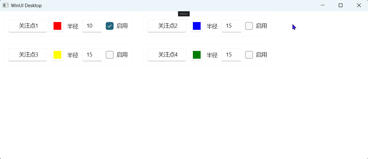
new ("关注点1", Colors.Red.ToString(), 10.0, true),
new ("关注点2", Colors.Blue.ToString(), 15.0, false),
new ("关注点3", Colors.Yellow.ToString(), 15.0, false),
new ("关注点4", Colors.Green.ToString(), 15.0, false),
};
}
}
}
仅实现测试效果需要的初始数据,未实现数据保存到数据库。
实现效果


 扫一扫
扫一扫


 691
691

 被折叠的 条评论
为什么被折叠?
被折叠的 条评论
为什么被折叠?
 到【灌水乐园】发言


