


首先是图例的设置
一个简单的小栗子,来更清晰地观察。
import numpy as np
import pandas as pd
# 导入notebook绘图模块
import warnings
warnings.filterwarnings('ignore')
# 首先创建figure,建立数据
from bokeh.plotting import figure,show
from bokeh.io import output_notebook # 这个是在jupyternotebook空间中生成图标
output_notebook() #生成图标
p = figure(plot_width = 600,plot_height = 400)
#图例设置
#定义X,y
x = np.linspace(0,4*np.pi,100)
y = np.sin(x)
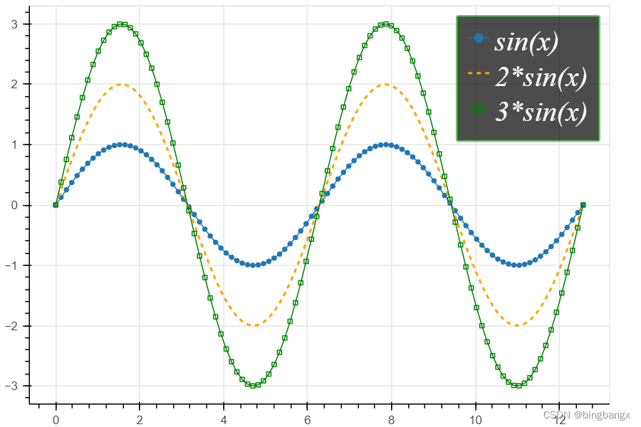
p.circle(x,y,legend = "sin(x)")
p.line(x,y,legend ="sin(x)")
# 绘制line2,设置图例名称
p.line(x,2*y,legend= "2*sin(x)" ,line_dash =[4,4],line_color = 'orange' , line_width = 2)
# 绘制line3,设置图例名称
p.square(x,3*y,legend= "3*sin(x)" ,fill_color = None,line_color = 'green') #p.square是指的构建方形的点
p.line(x,3*y,legend= "3*sin(x)" ,line_color = 'green')
# 设置图例位置
p.legend.location = 'top_right' # 位置:top_left,top_center,top_right,center_right,center,center_left,bottom_left,bottom_right,bottom_center
#设置图例排列方向
p.legend.orientation = 'vertical' #方向:vertical、horizontal
# 设置图例颜色、大小、字体、风格
p.legend.label_text_font ="times"
p.legend.label_text_font_style = "italic" #斜体
p.legend.label_text_color ='white'
p.legend.label_text_font_size = "20pt"
#设置图例边界线颜色、宽度、透明度
p.legend.border_line_width = 3
p.legend.border_line_color ="green"
p.legend.border_line_alpha = 0.5
#设置图例背景,颜色,透明度
p.legend.background_fill_color = 'black'
p.legend.background_fill_alpha = 0.7
show(p)效果显示:
其次是使用bokeh时,框线、绘图背景、边线,网格线,绘图背景地设置。
相关代码如下:
#图表的画法
p = figure(plot_width = 600,plot_height = 400)
p.circle(df.index,df['A'],color = 'green',size = 10,alpha = 0.5)
#### 框线
p.outline_line_width = 7 #边框线宽
p.outline_line_alpha = 0.3 #边框透明度
p.outline_line_color = 'navy' #边框线颜色
# 绘图背景
p.background_fill_color = 'yellow' # 绘图背景颜色
p.background_fill_alpha = 0.5 # 绘图背景透明度
#外边界设置
p.border_fill_color = "red" # 外边界背景
p.min_border_left = 80 # 外边界背景 -----左边宽度
p.min_border_right= 80 # 外边界背景 -----右边宽度
p.min_border_top = 10 # 外边界背景 -----上宽度
p.min_border_bottom = 10 # 外边界背景 -----下宽度
#轴线的设置
# 设置X轴线:标签,线宽,轴线颜色
p.xaxis.axis_label ='Temp'
p.xaxis.axis_label_text_font_style ="FangSong" #设置字体
p.xaxis.axis_label_standoff = 30 # 设置偏移距离
p.xaxis.axis_line_width = 3
p.xaxis.axis_line_color = "red"
# 设置y轴线:标签,字体颜色,字体角度
p.yaxis.axis_label ='PPPP'
p.yaxis.major_label_text_color = "red"
p.yaxis.major_label_orientation = "vertical"
p.axis.minor_tick_in = 5 # 刻度往绘图区域内延伸长度
p.axis.minor_tick_out = 3 # 刻度往绘图区域外延伸长度
p.xaxis.bounds =(2,4) #设置轴线范围
####格网设置
p.xgrid.grid_line_color =None # 颜色设置,None时则不显示
p.ygrid.grid_line_alpha = 0.8 # 设置透明度
p.ygrid.grid_line_dash = [6,4] # dash--->通过设置间隔来做虚线
#设置次轴线 minor_line
p.xgrid.minor_grid_line_color = 'navy'
p.xgrid.minor_grid_line_alpha = 0.5
####格网颜色填充
p.ygrid.band_fill_alpha = 0.1
p.ygrid.band_fill_color = 'navy'
shw(p)
总结如下:
Line Properties → 线设置
Fill Properties → 填充设置
Text Properties → 字体设置1、Line Properties → 线设置
(1)line_color,设置颜色
(2)line_width,设置宽度
(3)line_alpha,设置透明度
(4)line_join,设置连接点样式:'miter' miter_join,'round' round_join,'bevel' bevel_join
(5)line_cap,设置线端口样式,'butt' butt_cap,'round' round_cap,'square' square_cap
(6)line_dash,设置线条样式,'solid','dashed','dotted','dotdash','dashdot',或者整型数组方式(例如[6,4])2、Fill Properties → 填充设置
(1)fill_color,设置填充颜色
(2)fill_alpha,设置填充透明度3、Text Properties → 字体设置
(1)text_font,字体
(2)text_font_size,字体大小,单位为pt或者em( '12pt', '1.5em')
(3)text_font_style,字体风格,'normal' normal text,'italic' italic text,'bold' bold text
(4)text_color,字体颜色
(5)text_alpha,字体透明度
(6)text_align,字体水平方向位置,'left', 'right', 'center'
(7)text_baseline,字体垂直方向位置,'top','middle','bottom','alphabetic','hanging'4、可见性
p.xaxis.visible = False
p.xgrid.visible = False
基本参数中都含有.visible参数,设置是否可见


 2021
2021


 被折叠的 条评论
为什么被折叠?
被折叠的 条评论
为什么被折叠?
 到【灌水乐园】发言


