One of the most popular new features introduced in iOS 8 is the ability to create several types of extensions. In this tutorial, I will guide you through the process of creating a custom widget for the Today section of the notification center. But first, let’s briefly review some topics about extensions and understand the important concepts that underly widgets.
创建扩展是iOS8升级后的一个重要的特性,在本次介绍中,我将通过创建一个自定义的今日组件在通知中心来讲解。首先我们短暂的来了解一下有关扩展来明白组件这个重要的概念。
- What Is an Extension?
1.扩展是什么?
An extension is a special purpose binary. It’s not a complete app, it needs acontaining app to be distributed. This could be your existing app, which can include one or more extensions, or a newly created one. Although the extension is not distributed separately, it does have its own container.
扩展是一个特殊的程序。但是它并不属于一个完整的APP,它需要有一个容器APP(containing app)来进行发布。容器可以是一个已经存在的APP,也可以创建一个新的。一个容器可以有一个或一个以上的扩展。扩展不能独立的进行发布,它需要有一个容器。
An extension is launched and controlled via its host app. It could be Safari, for example, if you’re creating a share extension, or the Today system app that takes care of the notification center and other widgets. Each system area that supports being extended is called an extension point.
扩展被它所属的宿主程序(host app)所加载和控制。举个例子,它可以像Safari一样有分享扩张,或者像通知中心的今日摘要和其他组件一样。系统的每一个支持扩展的地方叫做扩展插入点。
To create an extension, you need to add a target to the project of the containing app. The templates provided by Xcode already include the appropriate frameworks for each extension point, allowing the app to interact with and following the correct policies of the host app.
为了创建扩展,你需要添加一个target到容器(cotaining app)的工程文件之中。Xcode提供的模板已经包括扩展接入点所需要的框架,
- Today Extension Point
2.今日扩展接入点
Extensions created for the today extension point, the so-called widgets, are meant to provide simple and quick access to information. Widgets link to the Notification Center framework. It’s important that you design your widget with a simple and focused user interface, because too much interaction can be a problem. Note also that you don’t have access to a keyboard.
扩展提供了今日扩展接入点,就是所谓的组件,可以提供简单快捷的访问信息。组件关联到通知中心。设计一个简单易用的的组件是非常重要的,因为太多的交互可能会导致用户的操作困难。要注意千万不要使用键盘。
Widgets are expected to perform well and keep their content updated. Performance is a big point to consider. Your widget needs to be ready quickly and use resources wisely. This will avoid slowing the whole experience down. The system terminates widgets that use too much memory, for example. Widgets need to be simple and focused on the content they are displaying.
我们都希望组件能够有好看的界面和及时更新,保证它稳定的工作尤为重要,你需要让你的组件又快又节省资源。避免影响这个用户体验,系统将终止组件的运行如果组件占用了太多内存。组件需要的是简单,专注于显示他们需要显示的内容。
That’s enough theory for now. Let’s start creating a custom today widget. The widget we’re about to create will show information about disk usage, including a progress bar to provide a quick visual reference for the user. Along the way, we’ll also cover other important concepts of iOS 8 extensions.
理论说够了,让我们来创建一个自己的今日组件,我们用它来显示磁盘的用量,通过一个进度条来提示用户。在这个过程中,我们也会涉及其他的扩展。
- Target Setup
3.实现步骤
Step 1: Project Setup
步骤1:创建项目
If you want to build this widget as an extension to an existing app, go ahead and open your Xcode project, and jump to the second step. If you’re starting from scratch just like me, then you first need to create a containing app.
如果你想要创建一个扩展作为一个已经存在的app,打开Xcode工程,然后到步骤2。如果你像我一样从零开始,你需要先创建一个容器程序(containing app)
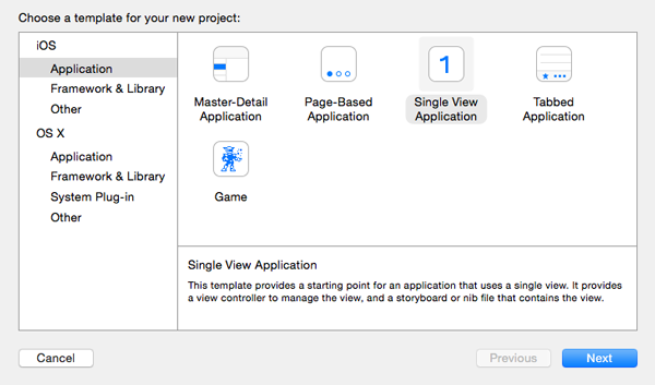
Open Xcode and in the File menu select New > Project…. We will be using Objective-C as the programming language and the the Single View Applicationtemplate to start with.
打开Xcode在File目录选择New > Project... 我们使用objective-C作为开发语言,选择 Single View Application 模板.
Step 2: Add New Target
步骤2:添加一个target
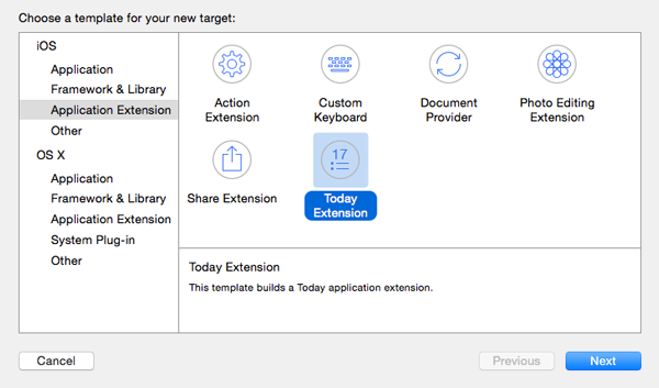
Open the File menu and choose New > Target…. In the Application Extension category, select the Today Extension template.
打开 File 目录,选择 New > Target.... 在 Application Extension 的类别中选择 Today Extension 模板.
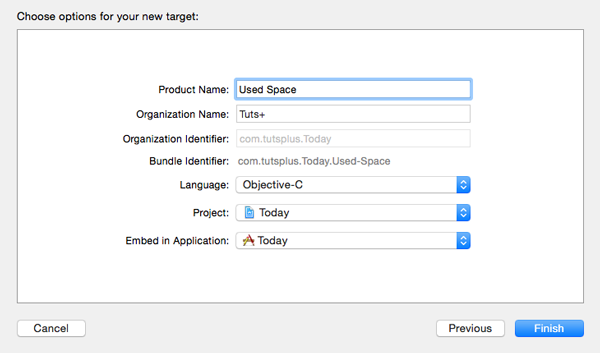
You’ll notice that the Project to which the target will be added is the project we’re currently working with and the extension will be embedded in the containing application. Also note that the extension has a distinct bundle identifier based on the one of the containing application, com.tutsplus.Today.Used-Space.
你会注意到target被添加到我们当前的工程,扩展将会被嵌入到容器程序。然后扩展会有一个标识符类似容器程序 com.tutsplus.Today.Used-Space.
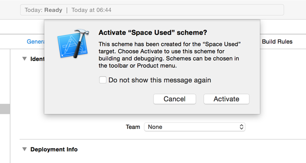
Click Next, give your widget a name, for example, Used Space, and click Finish to create the new target. Xcode has created a new scheme for you and it will ask you to activate it for you. Click Activate to continue.
点击 Next, 给组件取个名字,例如Used Space, 点击 Finish 创建一个target..,Xcode将为你创建一个新的scheme,然后询问你是否激活,点击Activate继续
Xcode has created a new group for the widget named Space Used and added a number of files to it, a UIViewController subclass and a storyboard. That’s right, a widget is nothing more than a view controller and a storyboard. If you open the view controller’s header in the code editor, you’ll notice that it is indeed subclassing UIViewController.
Xcode将为组件创建一个名叫Space Used的分组 然后在其中生成一些文件,一个UIViewController和一个storyboard,组件就只是一个UIViewController和一个storyboard,如果你打开视图控制器的头文件,你会发现它就是一个普通的UIViewController的子类。
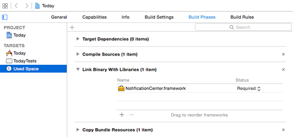
If you select the extension target from the list of targets, open the Build Phases tab, and expand the Link Binary With Libraries section, you’ll see that the new target is linked to the Notification Center framework.
If you select the extension target from the list of targets, open the Build Phases tab, and expand the Link Binary With Libraries section, you’ll see that the new target is linked to the Notification Center framework.
如果你选择扩展的target,打开 Build Phases并展开Link Binary With Libraries,你会发现它添加了 Notification Centre得框架
- User Interface
4.用户界面
We’ll now build a basic user interface for our widget. Determining the widget size is important and there are two ways of telling the system the amount of space we need. One is using Auto Layout and the other is using the preferredContentSize property of the view controller.
我们现在来创建一个基本的用户界面,首先需要确定组件的大小,有两种方式来告诉系统我们所需的大小。第一是是采用自动布局(Auto Layout),第二是使用viewcontroller的preferredContentSize属性。
The concept of adaptive layouts is also applicable to widgets. Not only do we now have iPhones with various widths (and iPads and future devices), but also remember that the widget might need to show its content in landscape orientation. If the user interface can be described with Auto Layout constraints, then that is a clear advantage for the developer. The height can be adjusted later with setPreferredContentSize
自动布局的概念在组件上依然是可用的,不仅需要注意iPhone的各种宽度(以及iPad和未来的设备)也需要注意它可能会在横屏模式下现实。如果界面是用的是自动布局来约束,对开发者来说是非常方便的。调节组件的高度可以通过setPreferredContentSize来实现。
Step 1: Adding Elements
步骤1:添加元素
Open MainInterface.storyboard in the Xcode editor. You’ll notice that a label displaying “Hello World” is already present in the view controller’s view. Select it and delete it from the view as we won’t be using it. Add a new label to the view and align it to the right margin as shown below.
在Xcode编辑器中打开 MainInterface.storyboard. 你会发现已经有一个HelloewWorld的label已经在视图中了,选中并删除它,因为我们不会用到,添加一个新的label并且让它靠右对齐像图中那样
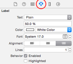
In the Attributes Inspector, set text color to white, text alignment to right, and the label’s text to 50.0%.
在 Attributes Inspector 中设置颜色为白色, 字体对齐方式为靠右对齐, 文本占 50.0%.
Select Size to Fit Content from Xcode’s Editor menu to resize the label properly if it’s too small to fit its contents.
在编辑器中选择 Size to Fit Content 来让label自动调节大小
Next, add a UIProgressView instance to the left of the label and position it as shown below.
接着添加一个UIProgressView对象在label的左边位置,如图所示。
With the progress view selected, change the Progress Tint attribute in theAttributes Inspector to white and the Track Tint color to dark grey. This will make it more visible. This is looking good so far. It’s time to apply some constraints.
选中进度条,在Attributes Inspector改变 Progress Tint为白色, 改变Track Tint 为深褐色.这将会使得进度条更加明显,接下来添加一些约束。
Step 2: Adding Constraints
步骤2:添加约束
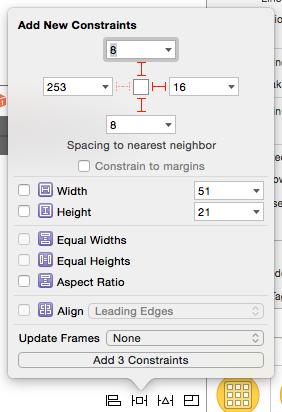
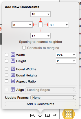
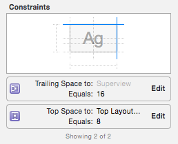
Select the percentage label and add a top, bottom, and trailing constraint as shown below. Be sure to uncheck the Constrain to margins checkbox.
选中label添加如图所示的上下约束。不要勾选Constrain to margins 的选项
Select the progress view and add a top, leading, and trailing constraint. Use this opportunity to change the leading space to 3 and don’t forget to uncheck Constrain to margins
选择进度条添加如图所示的上左右的约束,同时不要忘记反选Constrain to margins
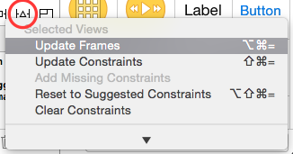
Because we changed the value of the leading constraint of the progress view, we have a small problem that we need to fix. The frame of the progress view doesn’t reflect the constraints of the progress view. With the progress view selected, click the Resolve Auto Layout Issues button at the bottom and choose Update Frames from the Selected Views section. This will update the frame of the progress view based on the constraints we set earlier.
因为我们改变了约束,所以我们会有一个小问题需要解决,现在的进度条大小并不能正确的反应约束后的进度条大小,选择进度条, 点击 Resolve Auto Layout Issues 按钮,选择 Update Frames 选择 Selected Views.这将会根据约束来更新进度条的大小。
Step 3: Build and Run
步骤3:构建与运行
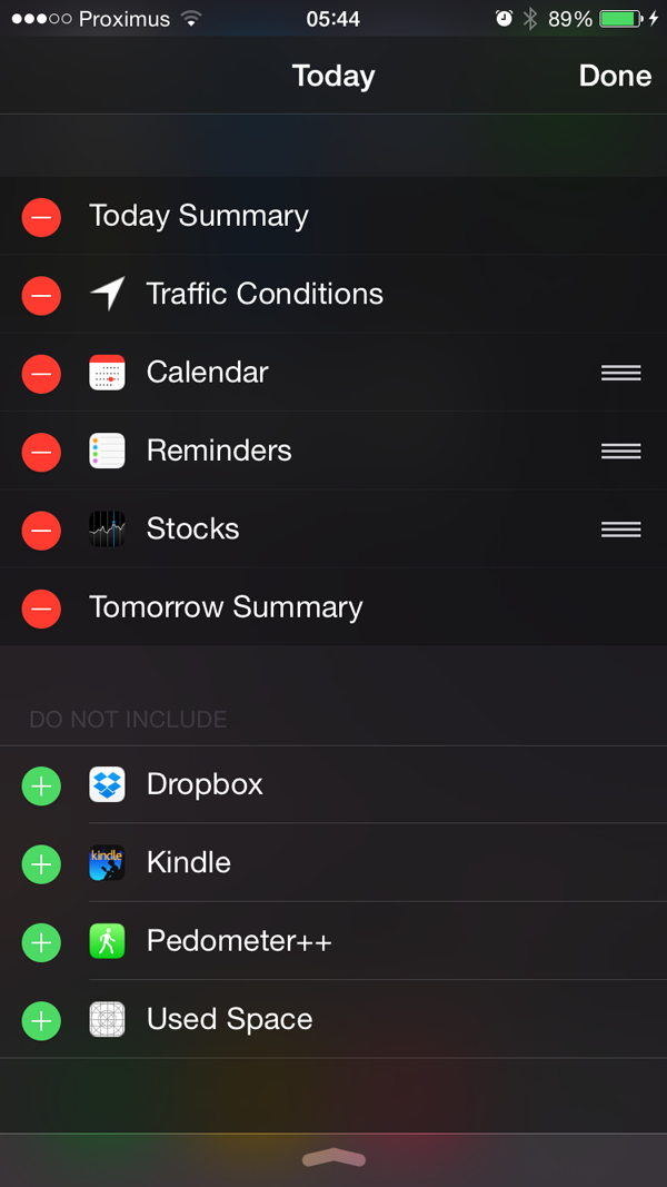
It’s time to see the widget in action. With the Used Space scheme selected, select Run from the Product menu or hit Command-R. Reveal the notification center by swiping from the top of the screen to the bottom and tap the Edit button at the bottom of the notification center. Your widget should be available to add to the Today section. Add it to the Today section by tapping the add button on its left.
是时候来看一下我们的组件了,选择Used Space scheme,选择Prodect目录中得Run或者直接按下 Command-R,下拉显示通知中心,然后点击下方的edit按钮,你的今日组件将会出现在可添加的地方,点击它左边的添加按钮。
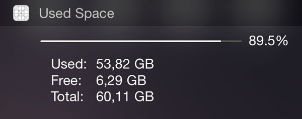
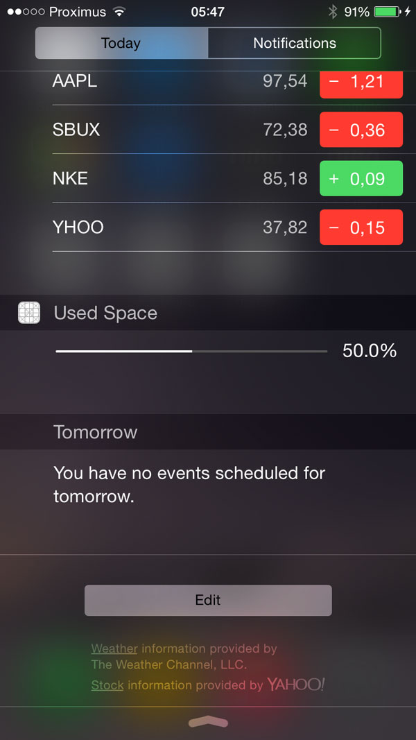
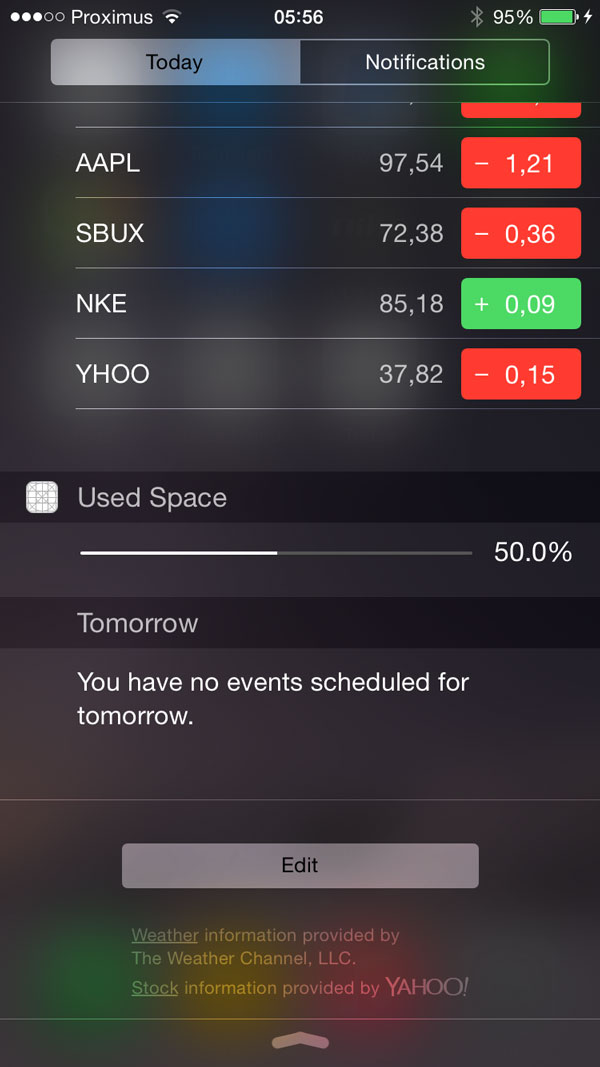
This is what our extension should look like.
这就是我们的扩展的样子。
That looks good, but why is there so much space below the progress view and label? Also, why didn’t the operating system respect the leading constraint of the progress view?
看起来不错,但是为什么在下面有那么多空隙呢?为什么操作系统没有遵循进度条的约束呢?
Both issues are standard margins set by the operating system. We will change this in the next step. Note, however, that the left margin is desirable since it aligns the progress view with the widget’s name.
这个问题都是操作系统的标准间距导致的,我们接下来将会改变它,请注意,无论如何,保证进度条的左边距与名字对齐的。
If you rotate your device or run the application on a different device, you’ll notice that the widget adjusts it size properly. That’s thanks to Auto Layout.
如果你选择你的设备或者在其它设备运行,你会发现组件会调整大小,这得益于我们使用了自动布局( Auto Layout)
Step 4: Fixing the Bottom Margin
步骤4:修正按钮边距
Open TodayViewController.m in Xcode’s editor. You’ll notice that the view controller conforms to the NCWidgetProviding protocol. This means we need to implement the
widgetMarginInsetsForProposedMarginInsets: method and return a custom margin by returning a UIEdgeInsets structure. Update the method’s implementation as shown below.
打开 TodayViewController.m. 可以看到控制器实现了NCWidgetProviding协议. 这意味着我们需要实现widgetMarginInsetsForProposedMarginInsets:方法来返回一个自定义的边距(UIEdgeInsets结构),修改方法如下
Run the application again to see the result. The widget should be smaller with less margin at the bottom. You can customize these margins to get the result you’re after.
再次运行程序查看结果,发现组件的下边距变小了,你可以定制这些边距达到任意你想要的效果
Step 5: Connecting Outlets
步骤5:连接Outlets
Before moving on, let’s finish the user interface by adding two outlets. With the storyboard file opened, switch to the assistant editor and make sure that it displays TodayViewController.m.
最后,我们来添加两个Outlets,打开storyboard,切换到双编辑器模式,确保现实TodayViewController.m.
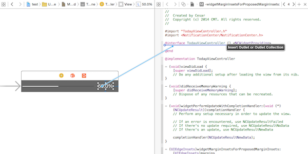
Hold Control and drag from the label to the view controller’s interface to create an outlet for the label. Name the outlet percentLabel . R epeat this step and create an outlet named b arView for the UI ProgressView instance.
按住Control并拖动label到viewcontroller的接口部分来创建label的接口,命名为percentLabel,重复这个过程为UIProgressView创建barView;
- Displaying Real Data
5.显示真实数据
We will use the NSFileManager class to calculate the device’s available space. But how do we update the widget with that data?
我们将使用 NSFileManageer类来计算设备的可用空间,那么我们改如何更新组件的数据呢?
This is where another method from the NCWidgetProviding protocol comes into play. The operating system invokes the widgetPerformUpdateWithCompletionHandler: method when the widget is loaded and it can also be called in the background. In the latter case, even if the widget is not visible, the system may launch it and ask for updates to save a snapshot. This snapshot will be displayed the next time the widget appears, usually for a short period of time until the widget is displayed.
这就就是NCWidgetProviding协议的另外一个方法。操作系统将调用widgetPerformUpdateWithCompletionHandler:方法当组件被载入的时候或者从后台进入的时候。即使组件不可见,系统还是有可能载入和更新它并保存快照,快照将在组件下次出现的时候显示,这是因为在组件显示之前会有一小段的时间。
The argument passed in this method is a completion handler that needs to be called when the content or data is updated. The block takes a parameter of type NCUpdateResult to describe if we have new content to show. If not, the operating system will know that there is no need to save a new snapshot.
通过处理完成句柄来判断是否需要调用新的内容或数据更新。block有一个参数NCUpdateResult来描述是否我们要更新内容。如果不是的话,操作系统会知道没有必要保存一个新的快照。
Step 1: Properties
步骤1:定义属性
We first need to create some properties to hold the free, used, and total sizes. We will also add a property to hold the used space on the device. This allows us greater flexibility later. Add these properties to the class extension inTodayViewController.m.
我们需要先定义一些属性来保存剩余、已使用和总得空间,把这些属性添加到TodayViewController.m.
Step 2: Implementing updateSizes
步骤2:实现updateSizes
Next, create and implement a helper method, updateSizes , to fetch the necessary data and calculate the device’s used space.
创建一个辅助方法updateSizes来拉取必要的数据和计算设备的空间使用率
- (void)updateSizes
{
    // Retrieve the attributes from NSFileManager
    NSDictionary *dict = [[NSFileManager defaultManager]
                attributesOfFileSystemForPath:NSHomeDirectory()
                                        error:nil];

    // Set the values
    self.fileSystemSize = [[dict valueForKey:NSFileSystemSize]
                              unsignedLongLongValue];
    self.freeSize       = [[dict valueForKey:NSFileSystemFreeSize]
                              unsignedLongLongValue];
    self.usedSize       = self.fileSystemSize - self.freeSize;
}
Step 3: Caching
步骤3:存储
We can take advantage of N SUserDefaults to save the calculated used space between launches. The lifecycle of a widget is short so if we cache this value, we can set up the user interface with an initial value and then calculate the actual value.
我们可以方便的使用NSUserDefaults来存储数据。组件的生命周期很短,所以我们需要缓存这个值,我们可以给界面设置一个初始的值,然后再计算真实的值。
This is also helpful to determine if we need to update the widget snapshot or not. Let’s create two convenience methods to access the user defaults database.
这对我们是否要更新组件的快照是非常有帮助的,让我们来创建一个快捷方法来访问NSUserdefaults
Note that we use a macro RATE_KEY so don’t forget to add this one at the top ofTodayViewController.m.
注意我们使用了一个宏定义RATE_KEY,别忘了把它加入TodayViewController.m.
Step 4: Updating the User Interface
步骤4:更新界面
Because our widget is a view controller, the viewDidLoad method is a good place to update the user interface. We make use of a helper
method, updateInterface to do so.
因为我们的组件是一个视图控制器,viewDidLoad方法很适合用来更新用户界面,我们创建一个帮助方法updateInterface来更新界面。
Step 5: Invoking the Completion Handler
步骤5:调用完成句柄
The number of free bytes tends to change quite frequently. To check if we really need to update the widget, we check the calculated used space and apply a threshold of 0.01% instead of the exact number of free bytes. Change the implementation widgetPerformUpdateWithCompletionHandler: as shown below.
可用空间的变化导致跟新的过于频繁,为了判断我们是否真的需要刷新界面,我们计算已使用量并且设置了一个更新的下限0.1%,而不是一改变就刷新界面。修改widgetPerformUpdateWithCompletionHandler:如下
- (void)widgetPerformUpdateWithCompletionHandler:(void (^)(NCUpdateResult))completionHandler
{

    [self updateSizes];

    double newRate = (double)self.usedSize / (double)self.fileSystemSize;

    if (newRate - self.usedRate < 0.0001) {
        completionHandler(NCUpdateResultNoData);
    } else {
        [self setUsedRate:newRate];
        [self updateInterface];
        completionHandler(NCUpdateResultNewData);
    }
}
We recalculate the used space and, if it’s significantly different from the previous value, save the value and update the interface. We then tell the operating system that something changed. If not, then there’s no need for a new snapshot. While we don’t use it in this example, there is also a NCUpdateResultFailed value to indicate that an error occurred.
在我们每次重新计算之后,如果与上次有明显的变化,则保存值并更新界面,告诉操作系统。如果没有明显的变化,我们就不需要新的快照。如果有错误发生将会在NCUpdateResultFailed来报告错误的发生,但是在这个例子中没有出现错误。
Step 6: Build & Run
步骤6:构建与运行
Run your application once more. It should now display the correct value of how much space is used by your device.
再一次运行你的程序,它将正确的显示您已经使用了多少空间。
- Recap
6 总结
Let’s review the lifecycle of your new widget. When you open the Today panel, the system may display a previous snapshot until it is ready. The view is loaded and your widget will retrieve a value cached in NSUserDefaults and use it to update the user interface.
我们来回顾一下组件的生命周期,当我们打开今日面板,系统可能会显示上次的快照知道准备完成。界面会被加载,组件将取出缓存在NSUserDefaults的来更新用户界面。
Next, widgetPerformUpdateWithCompletionHandler: is called and it will recalculate the actual value. If the cached and new value are not significantly different, then we don’t do anything. If the new value is substantially different, we cache it and update the user interface accordingly.
接着widgetPerformUpdateWithCompletionHandler:会被调用,重新计算真实的值,如果缓存的值和真实值相近,不会发生任何事情,如果存在不同,那么新的值会被缓存界面会被刷新。
While in the background, the widget may be launched by the operating system and the same process is repeated. If NCUpdateResultNewData is returned, a new snapshot is created to display for the next appearance.
在后台的时候,组件可能会被系统调用,如果返回NCUpdateResultNewData,新的快照就会被创建为了下次的出现。
- Adding More Information and Animation
7添加更多得信息和动画
Although we are already showing the used space, it would be interesting to have a precise number. To avoid cluttering the user interface, we will make our widget more interactive. If the user taps the percentage label, the widget expands, showing a new label with absolute numbers. This is also a great opportunity to learn how to use animation in widgets.
Step 1: Changing the User Interface
步骤1:改变用户界面
Open MainInterface.storyboard and select the percent label. In the Attributes Inspector, under the View section, find the User Interaction Enabled option and enable it.
打开MainInterface.storyboard选择label,在In the Attributes Inspector,在View选项下,找到User Interaction Enabled选项并启用它。
Next, we need to remove the bottom constraint of the label. The distance of the label to the bottom of the view will change programmatically, which means the constraint would become invalid.
接下来,我们需要去除label的底部约束。label视图的底部的距离会改变,这意味着约束将成为无效。
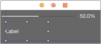
Select the label, open the Size area in the Size Inspector, select the bottom space constraint, and hit delete. You can also manually select the constraint guide in the view and delete it. The label now only has a top and trailing space constraint as shown below.
选择label,在Size Inspector展开’Size’,选择底部的空间约束,并点击删除。你也可以手动选择视图中的约束引导并删除它。label现在只有顶部的约束,如下图所示。
Select the view controller by clicking the first of the three icons at the top of the scene. In the Size area of the Size Inspector, set the height to 106.
通过点击画面上方的三个图标的第一个选择视图控制器。在Size Inspector的Size中,将高度设置为106。
Add a new label to the view and, as we did before, set its color to white in the Attributes Inspector. In addition, set the number of lines to 3, the height to 61, and the width 200. This should be enough to accommodate three lines of information. You also want it aligned to the bottom and left margins.
添加一个新的label,,在Attributes Inspector设置其颜色为白色。此外,设置行数3,高度61,宽度200。这应该足以容纳三条信息。让它保存靠左和靠下对齐。
The last step is to open the assistant editor and create an outlet for the label named detailsLabel.
最后一步是打开助理编辑和创建名为detailslabel的outlet。
Step 2: Setup
步骤2:安装
The widget will only be expanded for a brief moment. We could save a boolean in NSUserDefaults and load it remembering the previous state, but, to keep it simple, every time the widget is loaded it will be closed. When tapping the percentage label, the extra information appears.
控件将只会在一瞬间扩大。我们可以在NSUserDefaults保存一个布尔变量来记住上一次的状态,但是,为了简单,每次组件加载它时将关闭。当点击百分比label的时候,额外的信息将会出现。
Let’s first define two macros at the top of TodayViewController.m to help with the sizes.
In viewDidLoad, add two lines of code to set the initial height of the widget and to make the details label transparent. We will fade in the details label when the percentage label is tapped.
让我们首先定义两个宏在TodayViewController.m来帮助我们设置大小。
在viewDidLoad,添加两行代码来设置控件的初始高度,让label透明。我们将在百分比label被点击的时候使详细label出现。
Note that we set the width of the widget to 0.0, because the width will be set by the operating system.
请注意,我们设置控件的宽度为0,因为宽度将由操作系统决定。
Step 3: Updating the Details Label
更新详情标签
In the detail label, we show values for free, used, and total space available with the help of NSByteCountFormatter. Add the following implementation to the view controller.
Step 4: Capturing Touches
步骤4:检测点击事件
To detect touches, we override the touchesBegan:withEvent: method. The idea is simple, whenever a touch is detected, the widget is expanded and the details label is updated. Note that the size of the widget is updated by callingsetPreferredContentSize: on the view controller.
为了检测点击事件,我们在试图中重写了touchesBegan:withEvent:方法。想法很简单,当检测到触摸事件,展开详情标签并更新。请注意,插件的大小的是在callingsetPreferredContentSize更新的。
Step 5: Adding Animation
步骤5:添加动画
Even though the widget works fines, we can improve the user experience by fading the details label in while the widget expands. This is possible if we implement viewWillTransitionToSize:withTransitionCoordinator:. This method is called when the widget’s height changes. Because a transition coordinator object is passed in, we can include additional animations.
虽然这个组件运行的不错,我们还是可以通过在收展详情标签使用渐变效果来提升用户体验,这个可以通过实现viewWillTransitionToSize:withTransitionCoordinator:来完成。这个方法会在组件的高度变化的时候被调用。因为这是通过渐变协调对象来完成,所以我们可以添加一些额外的动画。
As you can see, we change the alpha value of the details label, but you can add any type of animate that you feel enhances the user experience.
你可以看到的,我们改变了标签的alpha值,但是你可以添加任何类型的动画来增强的用户体验。
Step 6: Build & Run
步骤6:构建与运行
We are ready to run the application one more time. Give it a try and tap the percentage label to reveal the new details.
我们再一次运行程序。通过点击百分比label来现实详情label。
Conclusion
结论
While all this logic might seem overly complex for such a simple task, you will now be familiar with the complete process to create a today extension. Keep these principles in mind when designing and building your widget. Remember to keep it simple and direct, and don’t forget performance.
这些逻辑似乎过于复杂对于这样一个简单的任务,但是你将熟悉创建今日扩展的的全过程。记住这些原则在设计和开发你的插件的时候。记得要保持它的简单和明了,同时也别忘了性能。
Caching here wouldn’t be needed at all with these fast operations, but it is especially important if you have expensive processing to do. Use your knowledge of view controllers and check that it works for various screen sizes. It’s also recommended that you avoid scroll views or complex touch recognition.
缓存在一些快速操作也许不需要,但你要做耗时的处理它就变得尤为重要。用你的视图控制器的知识来检查它是否能够在各种屏幕尺寸下工作。建议你避免滚动视图或复杂的触摸识别。
Although the extension will have a separate container, as we saw earlier, it is possible to enable data sharing between the extension and the containing app. You can also use NSExtensionContext ‘s openURL:completionHandler: with a custom URL scheme to launch your app from the widget. And if code is what you need to share with your extension, go ahead and create a framework to use in your app and extension.
虽然扩展将有一个单独的容器,正如我们前面看到的,它可以使应用程序和包含扩展之间的数据共享。你也可以使用NSExtensionContext的OpenURL:completionhandler:通过一个自定义的URL scheme来快速启动你的程序从组件。如果你需要分享你的延伸,创建一个框架来使用您的应用程序和扩展。
I hope the knowledge presented here comes in useful when building your next great today widget.
我希望这里介绍的知识是有用的,帮助创建你的下一个伟大的今天扩展。







 1万+
1万+

 被折叠的 条评论
为什么被折叠?


