ui组件——多选下拉input的实现(带有搜索功能)

本文介绍了如何实现一个带有搜索功能的多选下拉input UI组件。通过展示效果图、DOM结构、CSS样式设定以及关键的JavaScript代码,详细讲解了组件的工作原理。CSS中的border-sizing:border-box属性确保了宽度计算,而display:inline-block和z-index:9999用于布局和定位。JS部分主要关注事件监听和DOM操作,依赖于jQuery库。
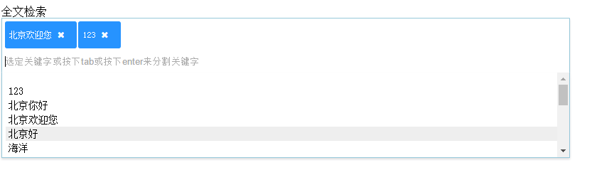
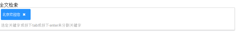
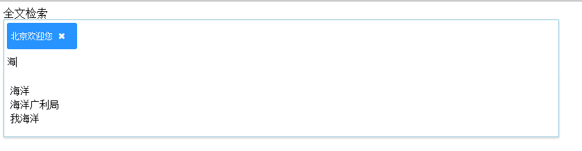
摘要由CSDN通过智能技术生成

先上效果图
这里写图片描述

这里写图片描述

这里写图片描述

废话不说 先看div层次结构

<!-- 最外层div 可以任意指定 主要用于定义子元素宽度 -->
        <div class="col-xs-10" style="width:800px">
          <!-- 表单label 添加文字提示 -->
          <label for="" class="label-control">全文检索</label>
          <!-- 多选承接div 以后会动态添加span -->
          <div class="hint-input-span-container">
            <!-- 表单元素 用来绑定监听事件以及接收用户输入 该层上方会动态添加span -->
            <input type="text" name="hint-search" value="" placeholder="选定关键字或按下tab或按下enter来分割关键字">
          </div>
          <!-- 包含下拉列表列 -->
          <div class="hint-block">
            <!-- 根据json数据包动态添加li -->
            <ul class="hint-ul">

            </ul>
          </div>
        </div>

dom结构注释已经能说得清楚了,下面来看css

* {
        box-sizing: border-box;
      }

      .hint-input-span-container {
        width:100%;
        background-color: #fff;
        border: 1px solid #ccc;
        box-shadow: inset 0 1px 1px rgba(0, 0, 0, 0.075);
        display: inline-block;
        padding: 2px 4px;
        color: #555;
        vertical-align: middle;
        border-radius: 1px;
        max-width: 100%;
        
  • 0
    点赞
  • 2
    收藏
    觉得还不错? 一键收藏
  • 0
    评论
Vue搜索下拉组件可以使用element-ui的Select组件结合el-select-search组件实现。具体流程如下: 1. 安装element-ui和el-select-search组件: ``` npm install element-ui el-select-search --save ``` 2. 在main.js中引入并使用element-ui: ```javascript import Vue from 'vue'; import ElementUI from 'element-ui'; import 'element-ui/lib/theme-chalk/index.css'; Vue.use(ElementUI); ``` 3. 在需要使用搜索下拉组件的地方引入el-select-search组件: ```javascript import ElSelectSearch from 'el-select-search'; ``` 4. 在template中使用el-select-search组件: ```vue <el-select v-model="selectedItem" placeholder="请选择" filterable> <el-option v-for="(item, index) in options" :key="index" :label="item.label" :value="item.value"> <template v-if="item.children"> <el-option-group v-for="(child, i) in item.children" :key="i" :label="child.label"> <el-option v-for="(c, j) in child.children" :key="j" :label="c.label" :value="c.value"></el-option> </el-option-group> </template> </el-option> </el-select> ``` 其中,options为一个数组,可以根据需要进行配置,包含label和value等属性。如果需要实现多级下拉,则可以在options中增加children属性。 层级多选组件可以使用vue-treeselect组件实现。具体流程如下: 1. 安装vue-treeselect组件: ``` npm install vue-treeselect --save ``` 2. 在需要使用组件的地方引入vue-treeselect组件: ```javascript import VueTreeselect from '@riophae/vue-treeselect'; ``` 3. 在template中使用vue-treeselect组件: ```vue <vue-treeselect v-model="selectedItems" :multiple="true" :options="options" :clearable="true" :close-on-select="false" :open-on-focus="true" :flatten-search-results="false" :limit="Infinity" :limit-text="count => `and ${count} more`" :searchable="true" :show-counts="true" :show-counts-before-parent="false" :show-counts-inside-parent="false" :show-counts-after-parent="false" :check-strictly="true" :default-expand-level="Infinity" :auto-expand-parent="false" :auto-collapse-disabled-nodes="false" :emit-value="true" :value-format="id => id" :label-format="label => label" :branch-nodes-first="false" :sort-value-by="default" :open-direction="auto" :open-on-mount="false" :open-on-click="false" :open-on-arrow="true" :highlight-matched-text="true" :disable-fuzzy-match="false" :match-path="false" :show-pointer="false" :backspace-remove-last="true" :tab-selects-match="true" :custom-label="null" :custom-no-data-text="null" :custom-search-icon="null" :debounce-search-ms="250" :show-dropdowns="true" :show-checkboxes="false" :show-branch-nodes="true" :show-branch-toggle="true" :show-node-icons="false" :show-tags="false" :show-loading="false" :loading-icon="null" :no-data-text="null" :no-results-text="null" :indent="16" :class-name="null" :input-class-name="null" :dropdown-class-name="null" :disabled="false" :readonly="false" :required="false" :tabindex="0" :name="null" :id="null" :size="null" :placeholder="null" :autofocus="false" :blur-on-select="false" :reset-on-select="false" :close-on-select="false" :close-on-blur="true" :close-on-select-with-parent="false" :open-on-clear="false" :cancelable="true" :filterable="false" :filter-placeholder="null" :filter-method="null" :copy-props="null" :multiple-limit="Infinity" :multiple-limit-text="count => `and ${count} more`" :flatten-nodes="false" :before-clear="null" :before-expand="null" :before-collapse="null" :before-select="null" :before-remove="null" :before-create="null" :before-sort="null" :before-search="null" :clear-on-select="false" :clear-on-close="false" :clear-on-blur="false" :clear-on-select-with-parent="false" :create-on-enter="false" :create-on-space="false" :create-on-blur="false" :create-on-paste="false" :clone=true :match-keys="['label', 'id']" :search-key="null" :multiple-separator=", " /> ``` 其中,options为一个树形结构的数组,可以根据需要进行配置。selectedItems为一个数组,用于存储已选中的多个值。其它属性可以根据需要进行配置。
评论
添加红包

请填写红包祝福语或标题

红包个数最小为10个

红包金额最低5元

当前余额3.43前往充值 >
需支付:10.00
成就一亿技术人!
领取后你会自动成为博主和红包主的粉丝 规则
hope_wisdom
发出的红包
实付
使用余额支付
点击重新获取
扫码支付
钱包余额 0

抵扣说明:

1.余额是钱包充值的虚拟货币,按照1:1的比例进行支付金额的抵扣。
2.余额无法直接购买下载,可以购买VIP、付费专栏及课程。

余额充值