


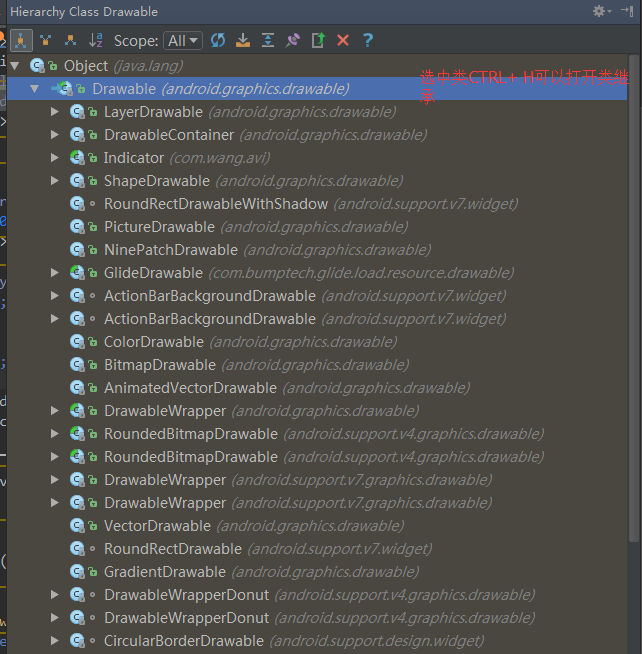
Drawbale使用简单,比自定义成本低,占用空间小
可以通过getIntriWindth/height来获取他们的内部宽高,作为颜色的drawable没有宽高。
1. BitmapDrawable
表示的就是一张图片,可用过xml描述
<?xml version="1.0" encoding="utf-8"?>
<bitmap xmlns:android="http://schemas.android.com/apk/res/android"
    android:src="@drawable/mui-icon-r-pos"
    android:antialias="true"
    android:dither="true"
    android:filter="true"
    android:gravity="center"
    android:mipMap="true"
    android:tintMode="screen">
</bitmap>android:src表示图片资源id
android:antialias抗锯齿
android:dither直译抖动,高像素图片在低配手机可以逼真点。
android:filter过滤同样更逼真
android:gravity当图片小于要纺织的容器时,可以设置位置,通过|可以组合使用
android:mipMap纹理映射不常用,默认是false。
android:tintMode平铺模式。
2.NinePatchDrawable
都是表示一张图片
<nine-patch xmlns:android="http://schemas.android.com/apk/res/android"
    android:src="@drawable/mui-icon-r-pos"
    android:dither="true"
    >

</nine-patch>
3.ShapeDrawable
这个很常见,我们用来制作圆角,或者其他形状图片等
<?xml version="1.0" encoding="utf-8"?>
<shape xmlns:android="http://schemas.android.com/apk/res/android"
    android:shape="oval">
    <corners
        android:bottomLeftRadius="@dimen/activity_horizontal_margin"
        android:bottomRightRadius="@dimen/activity_horizontal_margin"
        android:radius="@dimen/activity_horizontal_margin"
        android:topLeftRadius="@dimen/activity_horizontal_margin"
        android:topRightRadius="@dimen/activity_horizontal_margin"></corners>
    <gradient
        android:angle="14"
        android:centerColor="14"
        android:centerX="14"
        android:centerY="14"
        android:endColor="@color/colorAccent"
        android:gradientRadius="14dp"
        android:startColor="@color/colorAccent"
        android:type="sweep"
        android:useLevel="true"></gradient>
    <padding
        android:right="@dimen/activity_horizontal_margin"
        android:left="@dimen/activity_horizontal_margin"></padding>
    <size
        android:width="@dimen/activity_horizontal_margin"
        android:height="@dimen/activity_horizontal_margin"></size>
    <solid
        android:color="@color/colorPrimary"></solid>
    <stroke
        android:color="@color/colorPrimaryDark"
        android:dashGap="4dp"
        android:dashWidth="3dp"
        android:width="2dp"/>
</shape>android:shape形状,line和ring要加stroke标签,ring的属性多点
corners只合适矩形rectangle的shape。可设置四个角的角度
gradient与solid相排斥,表示渐变效果,angel必须是45的倍数,type有三种线性,径向,扫描。
padding距离你使用他的view距离,可不设置,直接在所用view设置
size作为背景时会拉伸或者缩小
stroke描边,dashwidth虚线宽度按,dashgap间隙
4.LayerDrawable
用item层叠每一个drawbale,一般作为集合使用
<?xml version="1.0" encoding="utf-8"?>
<layer-list xmlns:android="http://schemas.android.com/apk/res/android">
    <item>
      <bitmap android:src="@drawable/android_red"
        android:gravity="center" />
    </item>
    <item android:top="10dp" android:left="10dp">
      <bitmap android:src="@drawable/android_green"
        android:gravity="center" />
    </item>
    <item android:top="20dp" android:left="20dp">
      <bitmap android:src="@drawable/android_blue"
        android:gravity="center" />
    </item>
</layer-list>
5.StatelistDrawable
用selector作为集合使用
<?xml version="1.0" encoding="utf-8" ?>
<selector xmlns:Android="http://schemas.android.com/apk/res/android">
<!-- 默认时的背景图片-->
<item Android:drawable="@drawable/pic1" />
<!-- 没有焦点时的背景图片 -->
<item
   Android:state_window_focused="false"
   android:drawable="@drawable/pic_blue"
   />
<!-- 非触摸模式下获得焦点并单击时的背景图片 -->
<item
   Android:state_focused="true"
   android:state_pressed="true"
   android:drawable= "@drawable/pic_red"
   />
<!-- 触摸模式下单击时的背景图片-->
<item
   Android:state_focused="false"
   Android:state_pressed="true"
   Android:drawable="@drawable/pic_pink"
   />
<!--选中时的图片背景-->
<item
   Android:state_selected="true"
   android:drawable="@drawable/pic_orange"
   />
<!--获得焦点时的图片背景-->
<item
   Android:state_focused="true"
   Android:drawable="@drawable/pic_green"
   />
 <!--一般用于checkbox多-->
  <item
   Android:state_checked="true"
   Android:drawable="@drawable/pic_green"
   />
</selector>
6.LevelListDrawable
用一个图片集合
level-list xmlns:android="http://schemas.android.com/apk/res/android" >
    <item android:maxLevel="40" android:drawable="@drawable/b4" />
    <item android:maxLevel="10" android:drawable="@drawable/b1" />
    <item android:maxLevel="20" android:drawable="@drawable/b2" />
    <item android:maxLevel="30" android:drawable="@drawable/b3" />
</level-list>
那么无论提供什么样的Level值,都不会返回后面三个里的drawable(这里如果提供的Level值超过40,将返回一个空对象)。
可以通过Drawable对象的setLevel(int)方法来提供Level值。
比如当我们将一个LevelListDrawable作为一个View的background后,可以通过View的getBackground()方法获取这个Drawable对象,然后调用这个Drawable对象的setLevel()方法,提供不同的Level值,就可以改变View的背景。这个可以用来制作诸如进度条、音量调节等效果。
ImageView组件还提供了setImageLevel()方法来快捷设置android:src指定的LevelListDrawable的Level值(android:backgroudn指定的背景还是要通过View的形式来更改)。
7.TransitionDrawable
<transition xmlns:android="http://schemas.android.com/apk/res/android" >
    <item android:drawable="@drawable/image01"/>
    <item android:drawable="@drawable/image02"/>
</transition>
节点下的每个代表一个drawable资源。只能有两个。先前转换调用startTransition()。向后,调用 reverseTransition()。
8.InsetDrawable
InsetDrawable 表示一个drawable嵌入到另外一个drawable内部,并且在内部留一些间距,这一点很像drawable的padding属性,区别在于 padding表示drawable的内容与drawable本身的边距,insetDrawable表示两个drawable和容器之间的边距。当控件需要的背景比实际的边框小的时候比较适合使用InsetDrawable。
<?xml version="1.0" encoding="utf-8"?>
<inset
    xmlns:android="http://schemas.android.com/apk/res/android"
    android:drawable="@drawable/drawable_resource"
    android:insetTop="dimension"
    android:insetRight="dimension"
    android:insetBottom="dimension"
    android:insetLeft="dimension" />
8.ScaleDrawable
<?xml version="1.0" encoding="utf-8"?>
<scale
    xmlns:android="http://schemas.android.com/apk/res/android"
    android:drawable="@drawable/drawable_resource"
    android:scaleGravity=["top" | "bottom" | "left" | "right" | "center_vertical" |
                          "fill_vertical" | "center_horizontal" | "fill_horizontal" |
                          "center" | "fill" | "clip_vertical" | "clip_horizontal"]
    android:scaleHeight="percentage"
    android:scaleWidth="percentage" />
记得设置scaleDrawable.setLevel(1); 范围是1到10000
9、ClipDrawable
需要注意的是ClipDrawable是根据level的大小控制图片剪切操作的,官方文档的note中提到:The drawable is clipped completely and not visible when the level is 0 and fully revealed when the level is 10,000。也就是level的大小从0到10000,level为0时完全不显示,为10000时完全显示。是用Drawable提供的setLevel(int level)方法来设置剪切区域。
<?xml version="1.0" encoding="utf-8"?>
<clip
    xmlns:android="http://schemas.android.com/apk/res/android"
    android:drawable="@drawable/drawable_resource"
    android:clipOrientation=["horizontal" | "vertical"]
    android:gravity=["top" | "bottom" | "left" | "right" | "center_vertical" |
                     "fill_vertical" | "center_horizontal" | "fill_horizontal" |
                     "center" | "fill" | "clip_vertical" | "clip_horizontal"] />
top 将这个对象放在容器的顶部,不改变其大小。当clipOrientation 是”vertical”,裁剪发生在drawable的底部(bottom)
bottom 将这个对象放在容器的底部,不改变其大小。当clipOrientation 是 “vertical”,裁剪发生在drawable的顶部(top)
left 将这个对象放在容器的左部,不改变其大小。当clipOrientation 是 “horizontal”,裁剪发生在drawable的右边(right)。默认的是这种情况。
right 将这个对象放在容器的右部,不改变其大小。当clipOrientation 是 “horizontal”,裁剪发生在drawable的左边(left)。
center_vertical 将对象放在垂直中间,不改变其大小。裁剪的情况和”center“一样。
fill_vertical 垂直方向上不发生裁剪。(除非drawable的level是 0,才会不可见,表示全部裁剪完)
center_horizontal 将对象放在水平中间,不改变其大小。裁剪的情况和”center“一样。
fill_horizontal 水平方向上不发生裁剪。(除非drawable的level是 0,才会不可见,表示全部裁剪完)
center 将这个对象放在水平垂直坐标的中间,不改变其大小。当clipOrientation 是 “horizontal”裁剪发生在左右。当clipOrientation是”vertical”,裁剪发生在上下。
fill 填充整个容器,不会发生裁剪。(除非drawable的level是 0,才会不可见,表示全部裁剪完)。
clip_vertical
额外的选项,它能够把它的容器的上下边界,设置为子对象的上下边缘的裁剪边界。裁剪要基于对象垂直重力设置:如果重力设置为top,则裁剪下边,如果设置为bottom,则裁剪上边,否则则上下两边都要裁剪。
clip_horizontal
额外的选项,它能够把它的容器的左右边界,设置为子对象的左右边缘的裁剪边界。裁剪要基于对象垂直重力设置:如果重力设置为right,则裁剪左边,如果设置为left,则裁剪右边,否则则左右两边都要裁剪。
下面的代码或得到clipDrawable对象,并且增加裁剪区逐步显示图片:
ImageView imageview = (ImageView) findViewById(R.id.image);
ClipDrawable drawable = (ClipDrawable) imageview.getDrawable();
drawable.setLevel(drawable.getLevel() + 1000);


 扫一扫
扫一扫
 720
720

 被折叠的 条评论
为什么被折叠?
被折叠的 条评论
为什么被折叠?
 到【灌水乐园】发言


