


仅为学习记录,方便回顾复习,如有侵权请联系删除!
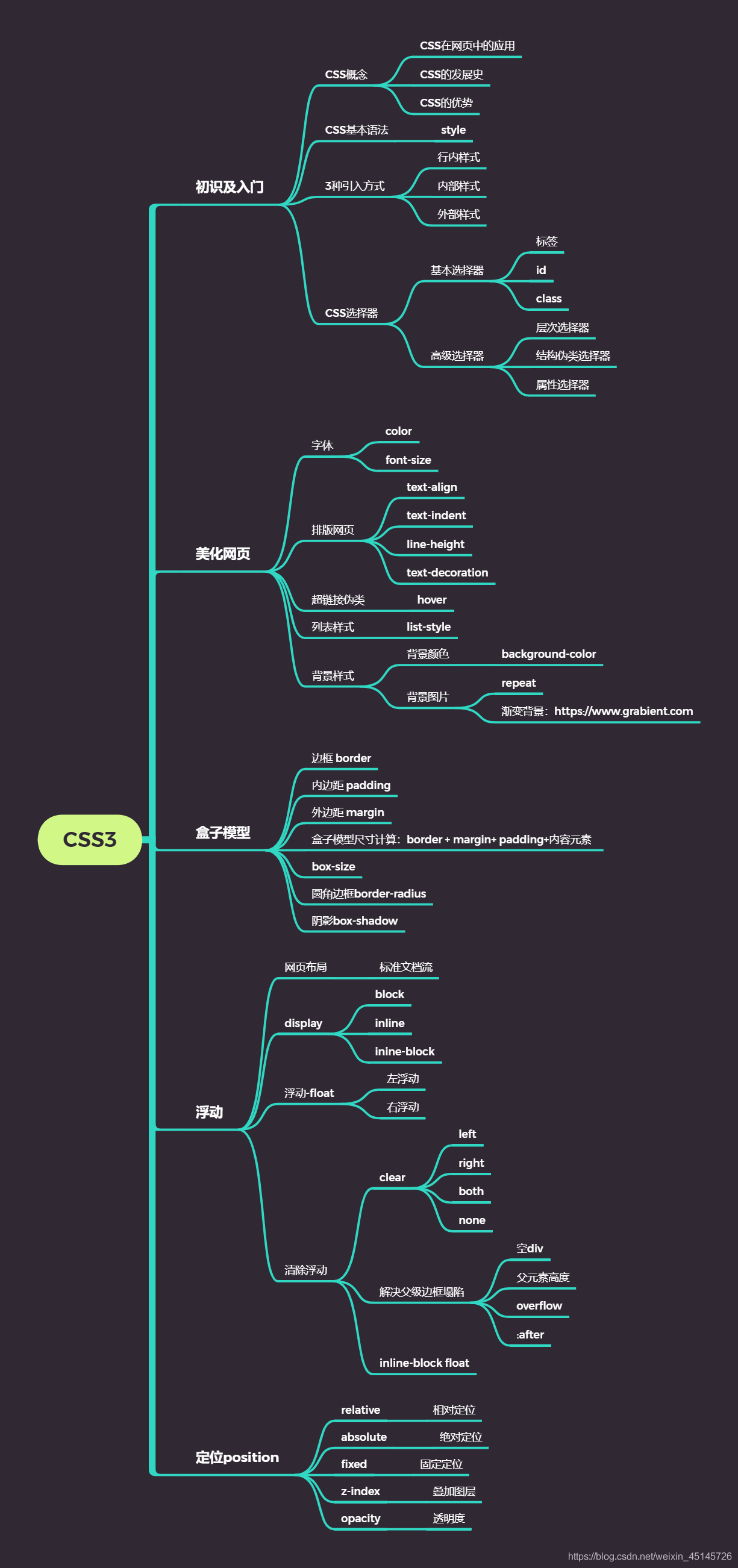
CSS3
目录
1、什么是CSS
1.1 CSS解释
Cascading Style Sheet 层叠样式表
CSS:表现(美化网页)
字体,颜色,边距,高度,宽度,背景图片,网页定位,网页浮动
1.2 发展史
CSS1.0
CSS2.0:DIV(块)+CSS,HTML与CSS结构分离的思想,网页变得简单,SEO
CSS2.1:浮动,定位
CSS3.0:圆角、阴影、动画…浏览器兼容性~
2、快速入门
2.1 CSS基本格式
2.1.1 练习格式
<!DOCTYPE html>
<html lang="en">
<head>
    <meta charset="UTF-8">
    <title>Title</title>
    <!--规范,<style>可以编写CSS的代码,每一个声明最好以";"结尾-->
    <!--语法:
        选择器{
                声明1;
                声明2;
                声明3;
        }
    -->
    <style>
        h1{
            color: crimson;
        }
    </style>

</head>
<body>

</body>
</html>
建议单独写一个css文件,用link标签引入css文件效果
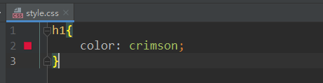
src/main/resources/css/style.css
h1{
    color: crimson;
}
src/main/resources/html/cssTest.html
<!DOCTYPE html>
<html lang="en">
<head>
    <meta charset="UTF-8">
    <title>Title</title>
    <!--规范,<style>可以编写CSS的代码,每一个声明最好以";"结尾-->
    <!--语法:
        选择器{
                声明1;
                声明2;
                声明3;
        }
    -->
    <link rel="stylesheet" href="../css/style.css"/>
</head>
<body>
</body>
</html>
2.1.2 CSS的优势
1、内容和表现分离
2、网页结构表现统一,可以实现复用
3、样式丰富
4、建议使用独立于html的css文件
5、利用SEO,容易被搜索引擎收录。Search Engine Optimization,汉译为搜索引擎优化
2.1.3 CSS的3种常用导入方式
内部样式、外部样式、行内样式。
优先级:就近原则,行内样式 > 内部样式 > 外部样式
<!DOCTYPE html>
<html lang="en">
<head>
    <meta charset="UTF-8">
    <title>Title</title>
    <!--内部样式-->
    <style>
        h1 {
            color: green;
        }
    </style>

    <!--外部样式-->
    <link rel="stylesheet" href="../css/style.css"/>
</head>
<body>
<!--行内样式:在标签元素中,编写一个style属性,编写样式即可-->
<h1 style="color: red">这是标签</h1>
</body>
</html>
拓展:外部样式两种方法
链接式
<!--外部样式-->
<link rel="stylesheet" href="../css/style.css"/>
导入式,@import是CSS2.1特有的。
<!--导入式-->
<style>
    @import url("css/style.css");
</style>
2.2 选择器
作用:选择页面上的某一个或者某一类元素
2.2.1 基本选择器
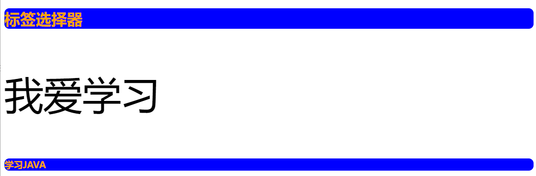
1、标签选择器
选择一类标签
格式:标签字{}
<!DOCTYPE html>
<html lang="en">
<head>
    <meta charset="UTF-8">
    <title>Title</title>
    <style>
        h1 {
            color: orange;
            background: blue;
            border-radius: 10px;	/*边框圆角:圆角半径*/
        }
        h3 {
            color: orange;
            background: blue;
            border-radius: 10px;
        }
        p {
            font-size: 80px;
        }
    </style>
</head>
<body>
<h1>标签选择器</h1>
<p>我爱学习</p>
<h3>学习JAVA</h3>
</body>
</html>
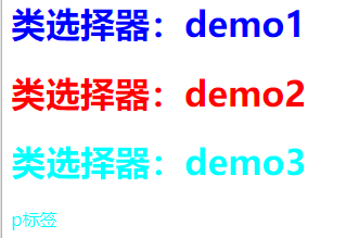
2、类选择器class
选择所有class一致的标签,跨标签
格式:.类名{}
<!DOCTYPE html>
<html lang="en">
<head>
    <meta charset="UTF-8">
    <title>Title</title>
    <style>
        /*
        类选择器的格式:.class的名称{}
                优点:可以多个标签归类,是同一个class,可以复用
        */
        .demo1{
            color: blue;
        }
        .demo2{
            color: red;
        }
        .demo3{
            color: aqua;
        }
    </style>
</head>
<body>
<h1 class="demo1">类选择器:demo1</h1>
<h1 class="demo2">类选择器:demo2</h1>
<h1 class="demo3">类选择器:demo3</h1>
<p class="demo3">p标签</p>
</body>
</html>
3、id选择器
全局唯一
格式:#id名{}
<!DOCTYPE html>
<html lang="en">
<head>
    <meta charset="UTF-8">
    <title>Title</title>
    <style>
        /*
        id选择器:id必须保证全局唯一
        #id名称{}
        不遵循就近原则,优先级固定
        id选择器 > class类选择器 > 标签选择器
        */
        #demo1 {
            color: red;
        }
        .demo2{
            color: green;
        }
        #demo2{
            color: orange;
        }
        h1 {
            color: blue;
        }
    </style>
</head>
<body>
<h1 id="demo1" class="demo1">id选择器:demo1</h1>
<h1 class="demo2" id="demo2">id选择器:demo2</h1>
<h1 class="demo2">id选择器:demo3</h1>
<h1>id选择器:demo4</h1>
</body>
</html>
[外链图片转存失败,源站可能有防盗链机制,建议将图片保存下来直接上传(img-3OeMHWzV-1660175330894)(C:\Users\Administrator\AppData\Roaming\Typora\typora-user-images\image-20220807201031096.png)]
4、各选择器优先级
id选择器 > class类选择器 > 标签选择器
2.2.2 高级选择器
1、层次选择器
-
后代选择器:
当标签发生嵌套时,内层标签就成为外层标签的后代。
所谓后代选择器,通俗的讲就是选择父元素里面包含的子元素,其写法就是把外层标签写在前面,内层标签写在后面,中间用空格分隔。
<!DOCTYPE html>
<html lang="en">
<head>
    <meta charset="UTF-8">
    <title>Title</title>
    <style>
        /*后代选择器*/
        /*将 li 标签下的所有 strong 标签里的内容改为红色,即大儿子、二儿子、孙子为红色*/
        li strong {
            color: red;
        }
    </style>
</head>
<body>
<li>
    <strong>大儿子</strong>
    <strong>二儿子</strong>
</li>
<li>
    <em>
        三儿子
        <strong>孙子</strong>
    </em>
</li>
</body>
</html>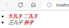
-
子选择器
子选择器只能选择作为某元素的最近一级子元素。通俗的讲就是把亲儿子元素选择出来,其他的孙子辈不要。
<!DOCTYPE html>
<html lang="en">
<head>
    <meta charset="UTF-8">
    <title>Title</title>
    <style>
        /*子代选择器*/
        /*只将li标签的下一级为 strong 标签里的内容改为绿色,即只将大儿子和二儿子改为绿色*/
        li > strong {
            color: greenyellow;
        }
    </style>
</head>
<body>
<li>
    <strong>大儿子</strong>
    <strong>二儿子</strong>
</li>
<li>
    <em>
        三儿子
        <strong>孙子</strong>
    </em>
</li>
</body>
</html>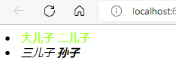
-
相邻的兄弟选择器:同辈
<!DOCTYPE html>
<html lang="en">
<head>
    <meta charset="UTF-8">
    <title>Title</title>
    <!--相邻的兄弟选择器,选下一个兄弟-->
    <style>
        .active+p{
            background: red;
        }
    </style>
</head>
<body>
<p>p0</p>
<p class="active">p1</p>
<p>p2</p>
</body>
</html>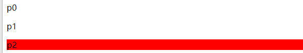
-
通用选择器
通用兄弟选择器,当前选中元素的向下的所有兄弟元素
<!DOCTYPE html>
<html lang="en">
<head>
    <meta charset="UTF-8">
    <title>Title</title>
    <!--通用兄弟选择器,当前选中元素的向下的所有兄弟元素-->
    <style>
        .active~p {
            background: red;
        }
    </style>
</head>
<body>
    <p>p0</p>
    <p class="active">p1</p>
    <p>p2</p>
    <h1>哈哈哈</h1>
    <p>p3
    <h2>嘿嘿h2</h2>
    </p>
    <p>哦哦哦</p>
</body>
</html>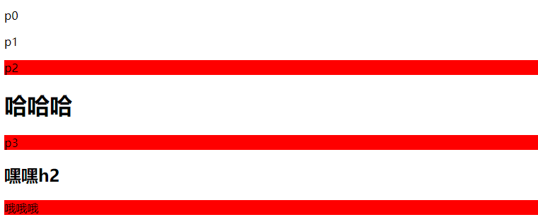
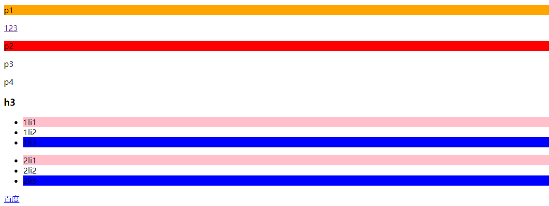
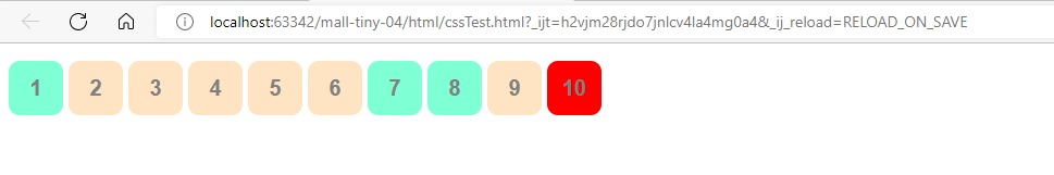
2、结构伪类选择器
:root	选择到根元素
:empty	选择到既不能有文本内容也没有后代元素的元素

:first-child			所有兄弟元素中的第一个
:last-child				所有兄弟元素中的最后一个
:nth-child(n)			所有兄弟元素中的第n个,n是个数字
:nth-last-child(n)		所有兄弟元素中的倒数第n个,n是个数字
:only-child				没有兄弟元素的元素

:first-of-type			所有兄弟元素中同类型的第一个
:last-of-type			所有兄弟元素中同类型的最后一个
:nth-of-type(n)			所有兄弟元素中同类型的第n个,n是个数字
:nth-last-of-type(n)	所有兄弟元素中同类型的倒数第n个,n是数字
:only-of-type			没有同类型兄弟元素
<!DOCTYPE html>
<html lang="en">
<head>
    <meta charset="UTF-8">
    <title>Title</title>

    <!--伪类选择器-->
    <style>
        li:first-child{/*ul的第一个子元素*/
            background: pink;
        }
        li:last-child{/*ul的最后一个子元素*/
            background: blue;
        }
        p:nth-child(1){/*选中p的父级元素,然后选中父级下的第一个子元素,该元素必须是p元素,才能生效*/
            background: orange;
        }
        p:nth-of-type(2){/*选中父元素下的第2个p元素*/
            background: red;
        }
        a:hover {/*鼠标悬浮到a标签,就会显示绿色*/
            color: green;
        }
    </style>
</head>
<body>
    <p>p1</p>
    <a href="">123</a>
    <p>p2</p>
    <p>p3</p>
    <p>p4</p>
    <h3>h3</h3>
    <ul>
        <li>1li1</li>
        <li>1li2</li>
        <li>1li3</li>
    </ul>
    <ul>
        <li>2li1</li>
        <li>2li2</li>
        <li>2li3</li>
    </ul>
    <a href="www.baidu.com">百度</a>
</body>
</html>
3、属性选择器(常用)
id+class结合
<!DOCTYPE html>
<html lang="en">
<head>
    <meta charset="UTF-8">
    <title>Title</title>
    <style>
        .demo a{/*本身或父级标注了class="demo"并且本身为a标签的元素才生效*/
            float: left;
            display: block;
            height: 50px;
            width: 50px;
            border-radius: 10px;
            background: red;
            text-align: center;
            color: grey;
            text-decoration: none;
            margin-right: 5px;
            /*line-height:50px*/
            font: bold 20px/50px Arial;
        }
        /*属性名,属性名=属性值(正则)
        = 表示绝对等于
        *= 表示包含
        ^= 表示以...开头
        $= 表示以...结尾
        存在id属性的元素
        a[]{}
        */
        a[id]{
            background-color: yellow;
        }
        a[id=first]{/*id=first的元素*/
            background-color: green;
        }
        a[class*="links"]{/*class中有links的元素*/
            background-color: bisque;
        }
        a[href^=http]{/*选中href中以http开头的元素*/
            background-color: aquamarine;
        }
        a[href$=pdf]{/*选中href中以pdf结尾的元素*/
            background-color: aquamarine;
        }
    </style>

</head>
<body>
    <p class="demo">
        <a href="http://www.baidu.com/" class="links item first" id="first">1</a>
        <a href="" class="links item active" target="_blank" title="test">2</a>
        <a href="images/123.html" class="links item">3</a>
        <a href="images/1.png" class="links item">4</a>
        <a href="images/1.jpg" class="links item">5</a>
        <a href="abc" class="links item">6</a>
        <a href="/a.pdf" class="links item">7</a>
        <a href="/abc.pdf" class="links item">8</a>
        <a href="abc.doc" class="links item">9</a>
        <a href="abcd.doc" class="item last">10</a><!--使用了.demo类的背景色红色-->
    </p>
</body>
</html>
3、美化网页元素
3.1 为什么要美化网页
- 有效的传递页面信息
- 美化网页,页面漂亮才能吸引客户
- 凸显页面的主题
- 提高用户的体验.
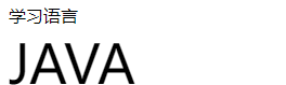
span标签:重点要突出的字,使用span标签套起来
<!DOCTYPE html>
<html lang="en">
<head>
    <meta charset="UTF-8">
    <title>Title</title>
    <style>
        #title1{
            font-size: 50px;
        }
    </style>
</head>
<body>
    学习语言<br/>
    <span id="title1">JAVA</span>
</body>
</html>
3.2 字体样式
- font-family:字体
- font-size:字体大小
- font-weight:字体粗细
- color:字体颜色
<!DOCTYPE html>
<html lang="en">
<head>
<meta charset="UTF-8">
<title>Title</title>
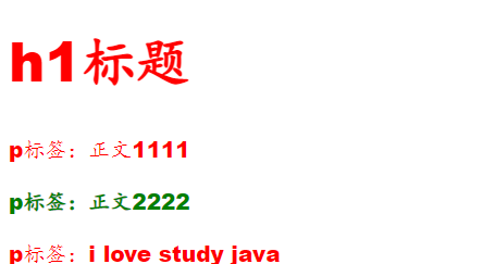
<style>
body{/*body标签*/
/*font-family指定一个元素的字体,可以把多个字体名称作为一个"回退"系统来保存。如果浏览器不支持第一个字体,则会尝试下一个。*/
font-family: "Arial Black", 楷体;
color: red;
font-size: 20px;
}
h1{
font-size: 50px;
}
.p1{
font-weight: 600;
color: green;
}
</style>
</head>
<body>
<h1>h1标题</h1>
<p>p标签:正文1111</p>
<p class="p1">p标签:正文2222</p>
<p>p标签:i love study java</p>
</body>
</html>
常用写法:
font-weight: bolder; /*也可以填px,但不能超过900,相当于bolder*/
/*常用写法*/
font: oblique bolder 12px "楷体"
3.3 文本样式
- 颜色–>color:agb / rgba()
- 文本对齐方式–>text-align:center
- 首行缩进–>text-indent:2em
- 行高–>line-height:300px;
- 下划线–>text-decoration
text-decoration: underline /*下划线*/
text-decoration: line-through /*中划线*/
text-decoration: overline /*上划线*/
text-decoration: none /*超链接去下划线*/
图片文字水平对齐
img,span{ vertical-align: middle; }
3.4 文本,阴影和超链接伪类
<style>
    a{/*超链接有默认的颜色*/
        text-decoration: none;
        color: #000000;
    }
    a:hover{/*鼠标悬浮状态*/
        color: orange;
    }
    a:active{/*鼠标保持按住不放的状态*/
        color: green;
    }
    a:visited{/*点击之后的状态*/
        color: red;
    }
    a:link{/*a:link 链接未点击上去时候的状态*/
        background-color: bisque;
    }
</style>
3.5 阴影
/*
第一个参数:表示水平偏移
第二个参数:表示垂直偏移
第三个参数:表示模糊半径
第四个参数:表示颜色
*/
text-shadow: 5px 5px 5px 颜色
3.6 列表
css代码
#nav{
    width: 300px;
    background-color: antiquewhite;
}
.title{
    font-size: 18px;
    font-weight: bold;
    text-indent: 1em;/*缩进*/
    line-height: 35px;
    background-color: red;
}
/*ul li*/
/*
list-style:
    none 去掉实心圆
    circle 空心圆
    square 正方形
*/
/*
ul{
    background: blue; 这样会覆盖nav里的背景色
}
*/
ul li{
    height: 30px;
    list-style: none;
    text-indent: 1em;
}
a{
    text-decoration: none;
    font-size: 14px;
    color: black;
}
a:hover{
    color: burlywood;
    text-decoration: underline;
}
html代码
<!DOCTYPE html>
<html lang="en">
<head>
    <meta charset="UTF-8">
    <title>Title</title>
    <link href="css/style.css" rel="stylesheet" type="text/css">
</head>
<body>
<div id="nav">
    <h2 class="title">全部商品分类</h2>
    <ul>
        <li>
            <a href="#">图书</a>
            <a href="#">音像</a>
            <a href="#">数字商品</a>
        </li>
        <li>
            <a href="#">家用电器</a>
            <a href="#">手机</a>
            <a href="#">数码</a>
        </li>
        <li>
            <a href="#">电脑</a>
            <a href="#">办公</a>
        </li>
        <li>
            <a href="#">家居</a>
            <a href="#">家装</a>
            <a href="#">厨具</a>
        </li>
        <li>
            <a href="#">服饰鞋帽</a>
            <a href="#">个性化妆</a>
        </li>
        <li>
            <a href="#">礼品箱包</a>
            <a href="#">钟表</a>
            <a href="#">珠宝</a>
        </li>
        <li>
            <a href="#">食品饮料</a>
            <a href="#">保健食品</a>
        </li>
        <li>
            <a href="#">彩票</a>
            <a href="#">旅行</a>
            <a href="#">充值</a>
            <a href="#">票务</a>
        </li>
    </ul>
</div>
</body>
</html>
3.7 背景
背景颜色:background
背景图片
background-image:url(""); /*默认是全部平铺的*/
background-repeat:repeat-x; /*水平平铺*/
background-repeat:repeat-y; /*垂直平铺*/
background-repeat:no-repeat; /*不平铺*/
3.8 渐变
渐变背景网址:https://www.grabient.com
径向渐变、圆形渐变
body{
    background-color: #4158D0;
    background-image: linear-gradient(43deg, #4158D0 0%, #C850C0 46%, #FFCC70 100%);
}
4、盒子模型
4.1 什么是盒子模型
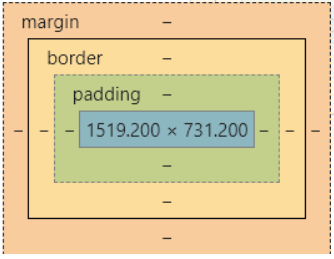
- margin:外边距
- padding:内边距
- border:边框
4.2 边框 border
border:粗细 样式 颜色
- 边框的粗细
- 边框的样式
- 边框的颜色
4.3 外边距 margin——居中妙用
margin-left/right/top/bottom–>表示四边,可分别设置,也可以同时设置如下
margin: 0 0 0 0 /*分别表示 上 右 下 左 (从上开始顺时针)*/
/* 例1 居中 */
margin: 0 auto /*auto表示左右自动*/
/* 例2 */
margin: 4px /*表示上、右、下、左都为4px*/
/* 例3 */
margin:10px 20px 30px /*表示上为10px,左右为20px,下为30px*/
盒子的计算方式:
margin+border+padding+内容的大小
总结:
body总有一个默认的外边距 margin:0
常见操作:初始化
4.4 圆角边框 border-radius
<style>
    div{
        width: 100px;
        height: 100px;
        border: 10px solid red;
        /* 一个border-radius只管一个圆的1/4 */
        border-radius: 50px 20px 20px 30px; /*左上 右上 右下 左下 ,顺时针方向*/
    }
</style>
4.5 盒子阴影
box-shadow: 10px 10px 1px black;
5、浮动
5.1 标准文档流
块级元素:独占一行 h1~h6 、p、div、 列表…
行内元素:不独占一行 span、a、img、strong
注: 行内元素可以包含在块级元素中,反之则不可以
5.2 display(重要)
- block:块元素
- inline:行内元素
- inline-block:是块元素,但是可以内联,在一行
这也是一种实现行内元素排列的方式,但是我们很多情况用float
<!DOCTYPE html>
<html lang="en">
<head>
<meta charset="UTF-8">
<title>Title</title>
<!--
block 块元素
inline 行内元素
inline-block 是块元素,但是可以内联 ,在一行
-->
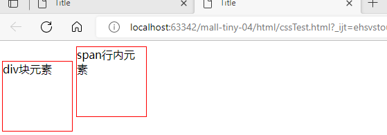
<style>
div{
width: 100px;
height: 100px;
border: 1px solid red;
display: inline-block; /*不再独占一行,变成可以内联的一块*/
}
span{
width: 100px;
height: 100px;
border: 1px solid red;
display: inline-block; /*变成可以内联的一块*/
}
</style>
</head>
<body>
<div>div块元素</div>
<span>span行内元素</span>
</body>
</html>
5.3 float: left/right 左右浮动
clear: both
5.4 overflow 及 父级边框塌陷问题
clear:
right:右侧不允许有浮动元素
left:左侧不允许有浮动元素
both:两侧不允许有浮动元素
none:
解决塌陷问题方案:
-
方案一:增加父级元素的高度;
-
方案二:增加一个空的div标签,清除浮动
<div class = "clear"></div> <style> .clear{ clear: both; margin: 0; padding: 0; } </style> -
方案三:在父级元素中增加一个overflow属性
overflow: hidden; /*隐藏超出部分*/ overflow: scoll /*滚动*/ -
方案四:父类添加一个伪类 : after
#father : after{
	content: '';
	display: block;
	clear: both;
}
小结:
- 浮动元素增加空div----> 简单、代码尽量避免空div
- 设置父元素的高度-----> 简单,但是元素假设有了固定的高度,可能就会超出范围
- overflow----> 简单,下拉的一些场景避免使用
- 父类添加一个伪类:after(推荐)----> 写法稍微复杂,但是没有副作用,推荐使用
5.5 display与float对比
- display:方向不可以控制
- float:浮动起来的话会脱离标准文档流,所以要解决父级边框塌陷的问题。
6、定位
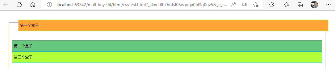
6.1 相对定位
相对定位:positon: relative;
相对于原来的位置,进行指定的偏移,相对定位的话,它仍然在标准文档流中!原来的位置会被保留
top: -20px;	/*向上偏移20px*/
left: 20px; /*向右偏移20px*/
bottom: 10px; /*向下偏移10px*/
right: 20px; /*向左偏移20px*/
html代码
<!DOCTYPE html>
<html lang="en">
<head>
    <meta charset="UTF-8">
    <title>Title</title>
    <!--
    相对定位:相对原来的位置进行偏移
    -->
    <style>
        body {
            padding: 20px; /*内边距*/
        }
        div{
            margin: 10px;
            padding: 5px;
            font-size: 12px;
            line-height: 25px;  /*行高*/
        }
        #father {
            border: #ffa538 1px solid;
            padding: 0;
        }
        #first{
            border: #b3ff38 1px solid;
            background-color: #ffa538;
            position: relative; /*相对定位:上下左右*/
            top: -20px; /*向上偏移20px*/
            left: 20px; /*向右偏移20px*/
        }
        #second{
            border: #427b11 1px solid;
            background-color: #66c77f;
        }
        #third{
            background-color: #b3ff38;
            border: #38d7ff 1px solid;
            position: relative;
            bottom: 10px;/*向上偏移10px*/
        }
    </style>
</head>
<body>
    <div id="father">
        <div id="first">第一个盒子</div>
        <div id="second">第二个盒子</div>
        <div id="third">第三个盒子</div>
    </div>
</body>
</html>
练习:
实现代码:
<style>
        #box{
            height: 300px;
            width: 300px;
            border: 2px red solid;
            padding: 10px;
        }
        a{
            height: 100px;
            width: 100px;
            background-color: #ee73b7;
            color: white;
            text-align: center;
            text-decoration: none;
            line-height: 100px;/*设置行距100px*/
            display: block;/*设置方块*/
        }
        a:hover{
            background: #4158D0;
        }
        .a2{
            position: relative;
            left: 200px;
            top: -100px;
        }
        .a4{
            position: relative;
            left: 200px;
            top: -100px;
        }
        .a5{
            position: relative;
            left: 100px;
            top: -300px;
        }
    </style>
</head>
<body>
<div id="box">
    <div class="a1"><a href="" >连接1</a></div>
    <div class="a2"><a href="" >连接2</a></div>
    <div class="a3"><a href="" >连接3</a></div>
    <div class="a4"><a href="" >连接4</a></div>
    <div class="a5"><a href="" >连接5</a></div>
</div>
</body>
6.2 绝对定位-absolute和固定定位-fixed
定位:基于xxx定位,上下左右~
1、没有父级元素定位的前提下,相对于浏览器定位
2、假设父级元素存在定位,我们通常会相对于父级元素进行偏移
3、在父级元素范围内移动
总结:相对于父级或浏览器的位置,进行指定的偏移,绝对定位的话,它不在标准文档流中,原来的位置不会被保留
position: absolute;  /*absolute 绝对定位,浏览器滚动条移动会使位置发生变化*/
position: fixed;  /*fixed 固定定位,浏览器滚动条移动也不会使位置发生变化*/
<!DOCTYPE html>
<html lang="en">
<head>
    <meta charset="UTF-8">
    <title>Title</title>
    <style>
        body{
            height: 1000px;
        }
        div:nth-of-type(1){
            width: 100px;
            height: 100px;
            background-color: red;
            position: absolute; /*absolute 绝对定位,浏览器滚动条移动会使位置发生变化*/
            right: 0;
            bottom: 0;
        }
        div:nth-of-type(2){
            width: 50px;
            height: 50px;
            background-color: #b3ff38;
            position: fixed; /*fixed 固定定位,浏览器滚动条移动也不会使位置发生变化*/
            right: 0;
            bottom: 0;
        }
    </style>
</head>
<body>
<div>div1</div>
<div>div2</div>
</body>
</html>
6.3 z-index
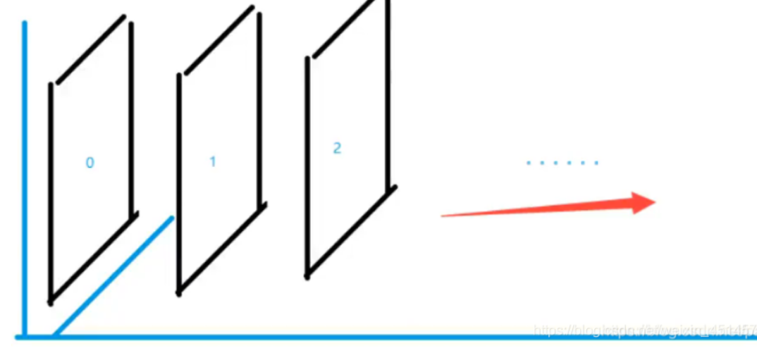
图层-z-index:默认是0,最高无限~999
css代码:
#content{
    width: 380px;
    padding: 0px;
    margin: 0px;
    overflow: hidden;
    font-size: 12px;
    line-height: 25px;
    border: 1px solid yellow;
}
ul,li{
    padding: 0px;
    margin: 0px;
    list-style: none;
}
/*父级元素相对定位*/
#content ul{
    position: relative;
}
.tipText,.tipBg{
    position: absolute;
    width: 380px;
    height: 25px;
    top:216px
}
.tipText{
    color: white;
    z-index: 999;
}
.tipBg{
    background: orange;
    opacity: 0.5;/*背景透明度*/
    filter: alpha(opacity=50);
}
html代码:
<!DOCTYPE html>
<html lang="en">
<head>
    <meta charset="UTF-8">
    <title>Title</title>
    <link rel="stylesheet" href="css/style.css" type="text/css">
    <style></style>
</head>
<body>
<div id="content">
    <ul>
        <li><img src="images/2020.jpg" alt=""/></li>
        <li class="tipText">学习微服务</li>
        <li class="tipBg"></li>
        <li>时间:2099-01-01</li>
        <li>地点:月球一号基地</li>
    </ul>
</div>
</body>
</html>
7、动画及视野拓展
css做动画过于繁琐,已有很多工具间接性做出
百度搜索canvas动画、卡巴斯基监控站(仅作了解)
8、总结
0220808095259141.png" alt=“image-20220808095259141” style=“zoom:33%;” />
图层-z-index:默认是0,最高无限~999
css代码:
#content{
    width: 380px;
    padding: 0px;
    margin: 0px;
    overflow: hidden;
    font-size: 12px;
    line-height: 25px;
    border: 1px solid yellow;
}
ul,li{
    padding: 0px;
    margin: 0px;
    list-style: none;
}
/*父级元素相对定位*/
#content ul{
    position: relative;
}
.tipText,.tipBg{
    position: absolute;
    width: 380px;
    height: 25px;
    top:216px
}
.tipText{
    color: white;
    z-index: 999;
}
.tipBg{
    background: orange;
    opacity: 0.5;/*背景透明度*/
    filter: alpha(opacity=50);
}
html代码:
<!DOCTYPE html>
<html lang="en">
<head>
    <meta charset="UTF-8">
    <title>Title</title>
    <link rel="stylesheet" href="css/style.css" type="text/css">
    <style></style>
</head>
<body>
<div id="content">
    <ul>
        <li><img src="images/2020.jpg" alt=""/></li>
        <li class="tipText">学习微服务</li>
        <li class="tipBg"></li>
        <li>时间:2099-01-01</li>
        <li>地点:月球一号基地</li>
    </ul>
</div>
</body>
</html>
7、动画及视野拓展
css做动画过于繁琐,已有很多工具间接性做出
百度搜索canvas动画、卡巴斯基监控站(仅作了解)
8、总结


 1994
1994


 被折叠的 条评论
为什么被折叠?
被折叠的 条评论
为什么被折叠?
 到【灌水乐园】发言


