


导入pyplot,numpy模块
import matplotlib.pyplot as plt
import numpy as np
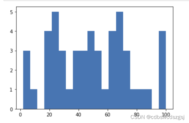
直方图
创建画布
fig = plt.figure()在画布上添加绘图区域
ax = fig.add_subplot(111)调用绘图方法绘制图表
data = np.random.randint(0,101,50)
ax.hist(data,bins=20,histtype='stepfilled')
展示图表
plt.show()结果
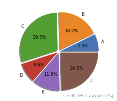
饼图
创建画布
fig = plt.figure()在画布上添加绘图区域
ax = fig.add_subplot(111)准备数据
data = np.array([16,40,65,19,26,54])
pie_labels = np.array(['1', '2', '3', '4', '5', '6'])
explode_position = [0.05,0.05,0.05,0.05,0.05,0.05]
调用绘图方法绘制图表
ax.pie(data, explode=explode_position, radius=1, labels=pie_labels, autopct='%3.1f%%',shadow=True)展示图表
plt.show()结果
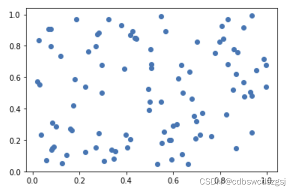
散点图
创建画布
fig = plt.figure()在画布上添加绘图区域
ax = fig.add_subplot(111)准备数据
num = 100
x_data = np.random.rand(num)
y_data = np.random.rand(num)
调用绘图方法绘制图表
ax.scatter(x_data,y_data)展示图表
plt.show()结果
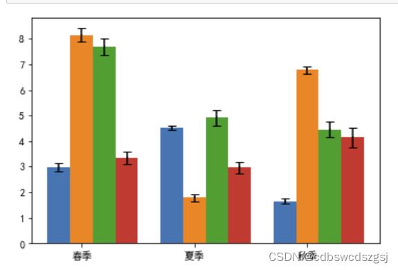
误差棒图
显示中文
plt.rcParams['font.family'] = 'SimHei'
plt.rcParams['axes.unicode_minus'] = False
创建画布
fig = plt.figure()在画布上添加绘图区域
ax = fig.add_subplot(111)准备数据
准备 x 轴和 y 轴的数据
x = np.arange(3)
y1 = np.array([2.98, 4.54, 1.64])
y2 = np.array([8.15, 1.79, 6.79])
y3 = np.array([7.69, 4.91, 4.46])
y4 = np.array([6.34, 2.97, 4.15])
指定测量偏差
error1 = [0.16, 0.08, 0.10]
error2 = [0.27, 0.14, 0.14]
error3 = [0.34, 0.32, 0.29]
error4 = [0.23, 0.23, 0.39]
bar_width = 0.2
# 调用绘图方法绘制图表
width = 0.2
ax.bar(x, y1,width=bar_width)
ax.bar(x+width, y2,align='center',tick_label=['春','夏','秋'],width=bar_width)
ax.bar(x+2*width, y3,width=bar_width)
ax.bar(x+3*width, y4,width=bar_width)
添加误差棒
ax.errorbar(x,y1,yerr=error1,capsize=4,capthick=1,fmt='k,')
ax.errorbar(x+width,y2,yerr=error2,capsize=4,capthick=1,fmt='k,')
ax.errorbar(x+2*width,y3,yerr=error3,capsize=4,capthick=1,fmt='k,')
ax.errorbar(x+3*width,y4,yerr=error4,capsize=4,capthick=1,fmt='k,')
展示图表
plt.show()
结果


 123
123

 被折叠的 条评论
为什么被折叠?
被折叠的 条评论
为什么被折叠?
 到【灌水乐园】发言


